


- Web templates
- E-commerce Templates
- CMS & Blog Templates
- Facebook Templates
- Website Builders
FAQs
General Tutorials
Featured templates
MonsterONE Subscrioption


In this tutorial we provide an overview of the Cherry Options in CherryFramework4. You can configure various aspects of your WordPress website behavior and appearance under Cherry options section.
CherryFramework 4. Framework Options overview
To access Cherry Options, log into your admin panel, open Cherry > Options page:

Cherry Options comprise several sections:
.jpg)
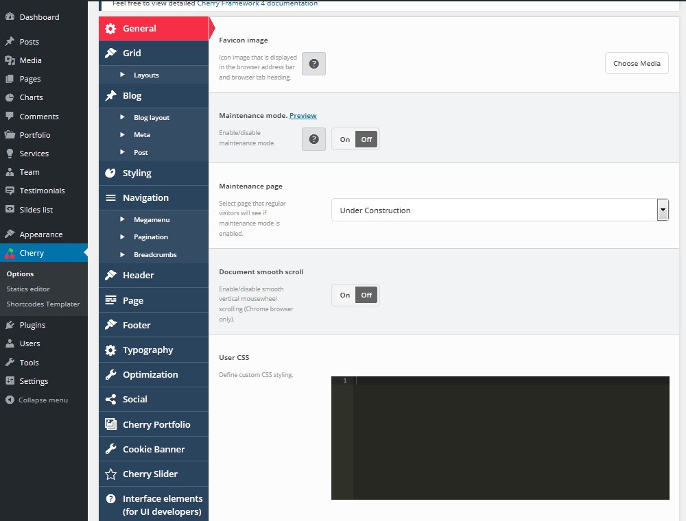
The General tab allows you to change the global Cherry Framework configuration settings:
Favicon image. Icon image that is displayed in the browser address bar and browser tab heading.
Maintenance mode. Enable/disable maintenance mode. Set this option to On to enable Under Construction page. Logged in administrator gets full access to the site while regular visitors will be redirected to the page chosen below.
From the Maintenance page dropdown select page that regular visitors will see if maintenance mode is enabled.
Document smooth scroll option allows you to enable/disable smooth vertical mousewheel scrolling (Chrome browser only).
Define custom CSS styling under User CSS field.
This section contains global layout configuration settings.
You can enable/disable Responsive grid.
Container width section will let you specify width of header/content/footer container in pixels.
Click Layouts tab under the Grid one to change your site pages layout. You can choose if you want to display sidebars and how you want to display them.
You can apply changes for the following pages:
Page
Blog posts
Portfolio posts
Services posts
Team posts
Testimonials posts
You will find the following layouts available here:
Left sidebar
Right sidebar
Left and right sidebar
Two sidebars on the right
No sidebar
The section contains settings for WordPress blog pages (listing and single post types).
Featured Media displays Featured Image, Gallery, Audio, Video in blog posts listing depending on post type.
Featured Image Size. You can set dimensions for post featured images.
Set alignment for post featured images under the Featured Image Alignment section. You have 4 alignments available: none, right, left and center.
Post content allows you to select how you want to display post content in blog listing (part, full, none).
Excerpt length. Specify number of words displayed in excerpt in blog listing.
Enable/Disable read more button in blog listing under the More button field.
More button label. Specify read more button label text.
You can show/hide elements below under the Blog > Meta page:
Date
Author
Comments
Categories
Tags
Open Blog > Post page to change the following settings:
You can select whether to display Featured Image on the single post page or not.
Size of Featured Image. Set dimensions for single post featured images.
Alignment of Featured Image. Set alignment for single post featured images (none, left, right or center).
Author bio. Enable/disable author bio block. Author bio block is displayed on the post page.
Related posts. Enable/disable related posts block. Related posts block is displayed on the post page.
Enable/disable comments for blog posts under the Allow comments section.
Gallery slider. Replace default WordPress gallery shortcode with enhanced jQuery carousel.
Lightbox for images and videos. Automatically adds lightbox for images and videos.
The section contains theme styling settings. Here you can edit the main theme colors. You can set background for body container and specify background image or color, set background repeat, position and attachment.
Color themes section allows you to change the following colors:
Primary color
Secondary color
Success color
Info color
Warning color
Danger color
Primary gray color
Navigation section defines website navigation settings, menus typography and colors, pagination and breadcrumbs settings. You can see the following settings available:
Header Menu Typography. Main header navigation typography settings. You can configure main menu color and font.
Footer Menu Typography. Main footer navigation typography settings. You can configure footer menu color and font.
You can select whether you want to enable Arrows markup or not.
Navigation section has the following subcategories:
Megamenu
Main theme menu location. Select menu location for main theme menu (primary or secondary).
Mega menu enabled. Enable/Disable Mega menu.
Mobile starts from. Select window width to switch on mobile menu.
Enter mobile navigation label to the Mobile nav label field.
Menu direction. Select menu items direction (horizontal or vertical.)
Animation effect. Select animation effect: Slide from top, Slide from bottom, Slide from left, Slide from right.
Event. Select activation event: hover or click.
Menu parent container CSS selector. Enter CSS selector name for mega menu parent container (if needed).
Pagination
Pagination position. Select where you want to display pagination: After post loop, Before post loop, Both.
Prev/next buttons. Show/hide previous and next buttons in pagination.
Pagination label. Enter text displayed before pagination buttons. Text or HTML can be used.
Prev button label and Next button label Previous/Next button label text. Text or HTML can be used.
Show all the pages. If set to On, then it will show all the pages instead of a short list of the pages near the current page.
End size. How many pages to display either at the top or at the end of the list.
Mid size. How many numbers to display to either side of current page, but not including current page.
Breadcrumbs
Breadcrumbs. Enable/disable breadcrumbs navigation.
Page title. Enable/disable page title in breadcrumbs.
Breadcrumbs mobile. Enable/disable breadcrumbs on mobile devices.
Home page breadcrumbs. Enable/disable breadcrumbs on home page.
Item separator. You can enter Breadcrumbs separator symbol.
Breadcrumbs prefix. Text displayed before breadcrumbs navigation.
Header allows you to change your site header settings: logo, background, sticky header, etc.
Background. Header background settings. You can select background color, upload header background image, set its background position, attachment and repeat.
Grid type. Select layout pattern for header website. Wide layout will fit window width. Boxed layout will have fixed width.
Boxed width. Header width for `boxed` layout. Should not be more than `Grid -> Container width` value.
Sticky header. Enable\disable fixed header that sticks to the top.
Sticky selector. Select the block selector that will be used to build sticky panel. You can use tag name, class name, or id.
Logo
Logo type. Select whether you want your main logo to be an image or text.
Logo image. Click Choose Media button to select logo image from the media library or upload your image.
Logo typography. Configuration settings for text logo. Here you can select logo font family, size, color, etc.
Page allows you to change general page options.
Background. Page background settings. You can select background color, upload footer background image, set its background position, attachment and repeat.
Grid type. Select layout pattern for main website container. Wide layout will fit window width. Boxed layout will have fixed width and left/right indents.
Boxed width. Main content width for `boxed` layout. Should not be more than `Grid -> Container width` value.
Featured Images. Enable/disable featured images for pages.
Page comments. Enable/disable comments by default for pages. For pages that have already been published you need to enable comments individually in page settings.
Settings for the footer section:
Background. Footer background settings. You can select background color, upload footer background image, set its background position, attachment and repeat.
Typography. Typography settings for footer text.
Grid type. Select layout pattern for footer website. Wide layout will fit window width. Boxed layout will have fixed width.
Boxed width. Footer width for `boxed` layout. Should not be more than `Grid -> Container width` value.
Footer Info text. Set custom text for Footer info static.
Footer Logo
Logo type. Select whether you want your footer logo to be an image or text.
Logo image. Click Choose Media button to select logo image from the media library or upload your image.
Logo typography. Configuration settings for text logo. Here you can select logo font family, size, color, etc.
You can configure the following typography settings:
Body text. Main website text typography options.
Link color
Link hover color
Input text
Breadcrumbs typography
Heading 1, Heading 2, Heading 3, Heading 4, Heading 5, Heading 6.
Change settings for your site optimization
Concatenate/minify CSS. Select if you want to merge\minify CSS files for performance optimization.
Dynamic CSS output. Output dynamic CSS into separate file or into style tag.
Enable / Disable Mega menu caching under the Mega menu caching enabled section.
CherryFramework4 allows you to configure portfolio settings:
Portfolio listing layout. Choose portfolio listing view layout:
Masonry
Grid
Justified
List
Pagination mode. Choose portfolio pagination mode:
Ajax pagination
More button
Loading animation. Choose posts loading animation:
Fade animation
Scale animation
Move Up animation
Flip animation
Helix animation
Fall perspective animation
Portfolio hover animation. Choose posts images hover animation:
Fade
Scale
Custom
Filter type. Select if you want to filter posts by tag or by category.
Filters. Enable/disable listing filters.
Order filters. Enable/disable order filters.
Column number. Select number of columns for masonry and grid portfolio layouts (Min 2, max 20).
Post per page. Select how many posts per page you want to display.
Item margin. Select portfolio item margin (outer indent) value.
Justified fixed height. Select portfolio item justified height value.
Crop image. Choose if you want to activate images cropping.
Cropped image width. Set width of the cropped image.
Cropped image height. Set height of the cropped image.
More button text. Set text for portfolio “read more” buttons.
You an change page template settings. Choose templates for the following pages:
Masonry template.
Grid template.
Justified template.
List template.
Standard post template.
Image post template.
Gallery post template.
Audio post template.
Video post template.
Display Cookie Banner? Enable/Disable cookie banner.
Message. Enter the cookie banner message.
You can modify the following Cherry Slider settings:
Slider name
Number of slides
Slides order
Slider width
Slider 992px breakpoint height
Slider 768px breakpoint height
Slider visible size
Slider forceSize
Slider orientation
Slide distance
Slide animation duration
Slide fading
Slider navigation
Slider fade navigation
Slider pagination
Slider autoplay
Slider fullScreen
Slider shuffle
Slider loop
Thumbnails
Thumbnail arrows
Thumbnails Position
Thumbnail width
Thumbnail height
Reach video action
Text input. Regular single line text input field.
Textarea input. Multiline text input field ( 16 rows x 20 cols ).
Select box. Select box with single option.
Filtered select. Select box with filter option.
Multi-select box. Select box with multiple select capability.
Checkbox (Checkbox label). Regular HTML checkbox: checkbox value 1 and checkbox value 2.
Switcher. Analogue of the regular HTML radio buttons.
Switcher (alternative). Alternative switcher with custom labels.
Stepper. Adds a number input used to define numeric values.
Slider. Draggable slider with stepper. Used to define some numeric value.
Slider (ranged). Draggable slider with range capability. Used to define numeric range.
Radio buttons. Adds radio buttons group. Lets user to select one option from the list.
Radio buttons (image). Adds image based radio buttons group. Behaves as HTML radio buttons.
Colorpicker. Adds a color picker.
Media library element. Allows to add content from WordPress media library.
Background image. Allows to add background image from the media library and define its background settings like background repeat, position, attachment, origin.
Typography. Provides typography configuration options such as Google Font family name, font size, line height, style, letter spacing, characters sets, text align and color. Below options you can see font preview.
Css editor. Embedded CSS editor with syntax highlighting.
Title layout editor. Visual editor based on HTML box model. You can define element margin, padding, size, border.
Links repeater. This option allows you to create a custom links list. For each link you can define URL, class and label.
WYSIWYG editor. Adds an input section with WYSIWYG editor. Behaves as WordPress post or page editing area.
Feel free to check the detailed video tutorial below:
