


- Web templates
- E-commerce Templates
- CMS & Blog Templates
- Facebook Templates
- Website Builders
FAQs
General Tutorials
MonsterONE Subscrioption


This tutorial shows how to change the main menu items size for different screen resolutions and how to keep the main menu items in one line.
How to change the main menu items size for different screen resolutions
Our templates are designed to keep menu items as big as possible without breaking the menu into two lines. It is important for easy navigation and nice user experience. Sometimes you need to add more menu items than there are in the original template. It may lead to menu collapsing into two or more lines. The easiest way to fix the arising issue is to reduce the font-size of your menu items. We are going to show you how this can be achieved for different window widths:

In order to change the menu font-size, you should perform the following:
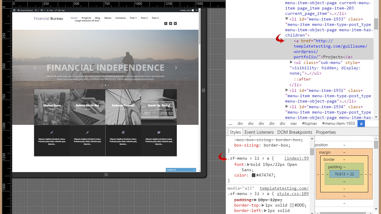
Locate the exact CSS selector that specifies the font-size attribute for your menu items. It requires a web inspector tool (FireBug or Google Web Inspector). You need to inspect the menu item link and locate the spot in the code where the font-size is set. It is usually set for an <a> element. The size can also be set up using the shorthand font attribute. Take a look at the following example:
			.sf-menu > li > a {
			font: bold 19px/22px Open Sans;
			}
Here 19px/22px specifies font-size/line-height:
Now as you got the CSS selector you can write your own rule. Before doing that we recommend you picking up the right font-size by changing the property value in the web inspector tool. As you’ve selected the correct font-size value that’ll be small enough to keep your menu items in one row, you can compose a rule. For example:
		.sf-menu > li > a {
		font-size: 16px !important;
		}
Pay attention to the !important attribute. Depending on the template framework and file you’re going to place your code, you may need to set the rule as important to overwrite the default value. So, try to utilize the code without this property, if it doesn’t work, only then use the !important attribute.
Choose a file to place your code in. You can put it in any CSS file of your site, but there is a list of recommended files for each engine we’ve prepared for you.
Now you need to specify the font-size value for each of the defined browser window widths. To do that, put the code inside @media query for each width. Use the inspector tool to adjust the correct size of the font. Below you’ll find @media queries prepared for you:
			@media only screen and (min-width: 768px) {
			.sf-menu > li > a {
			font-size: 11px !important;
			}
			}
			@media only screen and (min-width: 980px) {
			.sf-menu > li > a {
			font-size: 14px !important;
			}
			}
			@media only screen and (min-width: 1280px) {
			.sf-menu > li > a {
			font-size: 16px !important;
			}
			}
Save the changes in the CSS file and upload it to the server. Your final result should look like this:

Feel free to check the detailed video tutorial below:
How to change the main menu items size for different screen resolutions
