


- Web templates
- E-commerce Templates
- CMS & Blog Templates
- Facebook Templates
- Website Builders
FAQs
General Tutorials
Featured templates
MonsterONE Subscrioption


We are glad to provide you with the step-by-step tutorial on using Bootstrap grid system in Multipurpose Website templates that shows how to manage page’s responsive layout.
The page’s content is organized in rows that include column elements within. Your page’s content (like images or text) is wrapped by <div> selectors with specific col-XX-Y classes. Here
col says it’s actually a ‘column’ included to the row,
X defines the type of a device (xs/sm/md/lg)
and Y stands for the number of grid columns (1-12).
Let’s take a closer look into this.
First, we should specify the type of a device we’re defining the layout for – there can be large desktop or small mobile screen, etc. To set the exact device type in your code, use the following suffixes in the class name (instead of XX):
xs – for extra-small screen width, such as regular mobile phones in portrait mode;
sm – for small devices, such as regular mobile phones in landscape mode, or smartphone screens;
md – for medium-sized devices, such as tablets;
lg – for large devices, such as any desktop computer;
So your classes will look like col-sm-Y , col-md-Y , col-lg-Y , etc (where Y is a number).
Be sure to specify ALL the 4 col-XX classes for your content to make it appear correctly on all the devices.
Next, we have to define the exact width of each element. To do this, use the number from 1 to 12 instead of Y in the class name. So, to create a fullwidth row with some text in it, use 12. The half with of a page will be taken with 6 in class name, and so on.
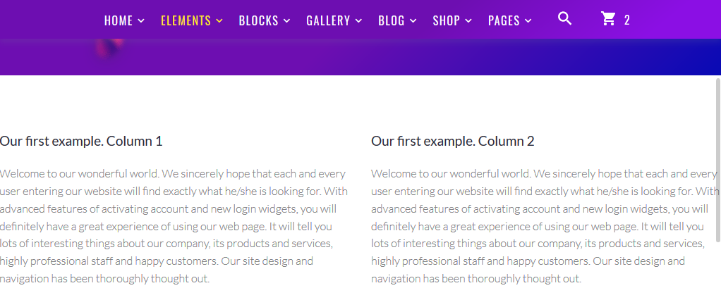
Let’s proceed to some live examples now. We will create a row with 2 equal columns in it, and each of these columns will take half of page’s width on desktop and tablet, but become fullwidth on mobile. To do this, we’ll need the following code:
	<div class="row">
		<div class="col-xs-12 col-sm-12 col-md-6 col-lg-6">
			<h5>Our first example. Column 1</h5>
			<p>Welcome to our wonderful world. We sincerely hope that each and every user entering our website will find exactly what he/she is looking for. With advanced features of activating account and new login widgets, you will definitely have a great experience of using our web page. It will tell you lots of interesting things about our company, its products and services, highly professional staff and happy customers. Our site design and navigation has been thoroughly thought out.</p>
		</div>
	</div>

	<div class="row">
		<div class="col-xs-12 col-sm-12 col-md-6 col-lg-6">
			<h5>Our first example. Column 2</h5>
			<p>Welcome to our wonderful world. We sincerely hope that each and every user entering our website will find exactly what he/she is looking for. With advanced features of activating account and new login widgets, you will definitely have a great experience of using our web page. It will tell you lots of interesting things about our company, its products and services, highly professional staff and happy customers. Our site design and navigation has been thoroughly thought out.</p>
		</div>
	</div>
On the live website it will appear the following way:
Desktop (since we have col-lg-6 set, each column will take 6/12 – half of page on large devices):
Mobile device(since we have col-sm-12 set, each column will take 12/12 – full page on small devices):

Your template may include the page with ready-to-use code samples – look for Grid system page and just copy the rows to the pages you need (refer to an example below). Simply replace the text content with yours then.

More information and examples on using Bootstrap Grid can be found at the official framework’s website. You may play around with codes to get as structured layout as your page design requires (i.e., nest the rows one inside another), and make it meet your needs perfectly. Wish you good luck!
