PrestaShop Documentation v1.4
Custom modules and extensions
Smart Blog
Smart blog - a set of modules that allows creating blog in your store. It consists of the following modules:
- Smart Blog
- RSS Smart Blog Feed
- Smart Blog Archive
- Smart Blog Categories
- Smart Blog Home Latest
- Smart Blog Latest Comments
- Smart Blog AddThis Module
- Smart Blog Popular Posts
- Smart Blog Recent Posts
- Smart Blog Related Post
- Smart Blog Search
- Smart Blog Tags
It also has its hooks where the blog modules can appear on the site, they can also show up in the standard hooks (only columns).
Smart Blog
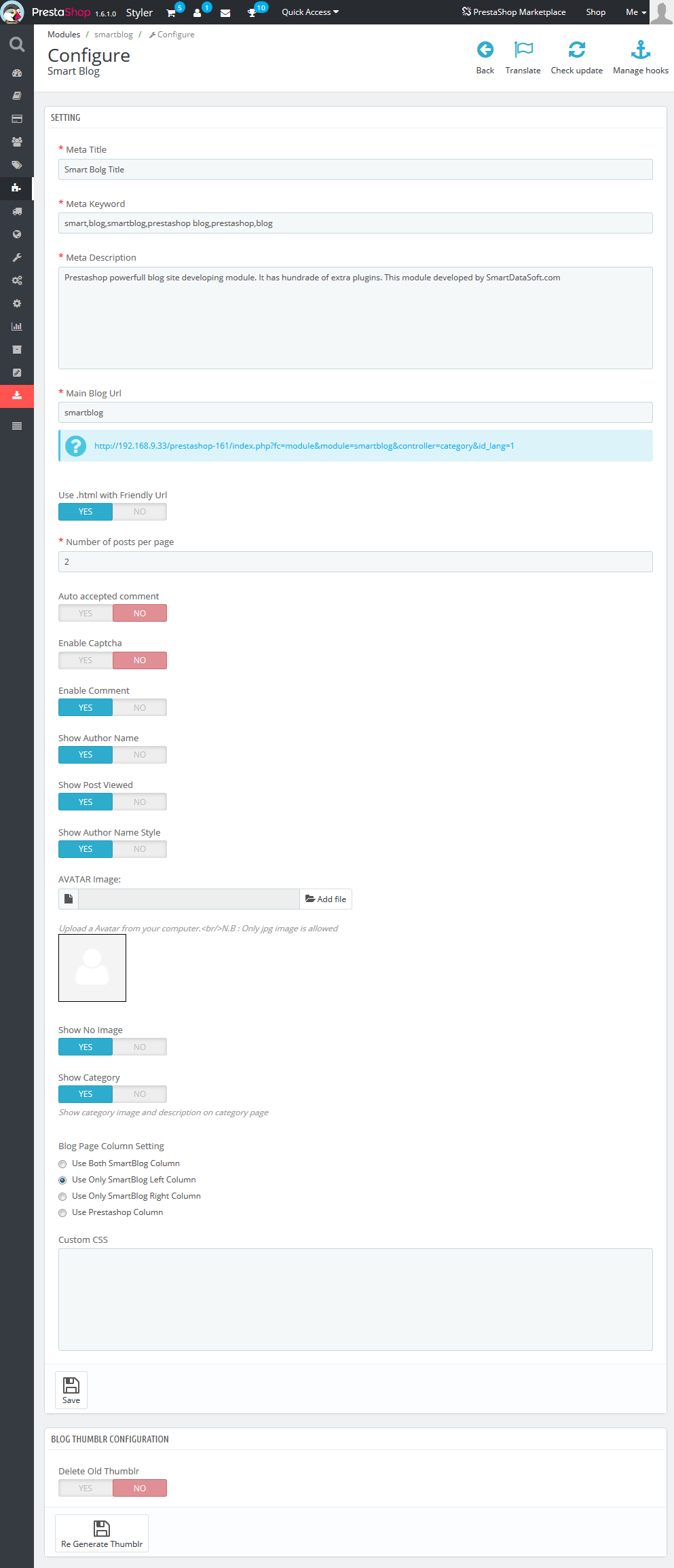
This is the main module that contains many settings for blog functionality. After its installation the Blog menu tab will show up in the main menu of your admin panel where you can add/remove/edit the posts/categories or select the type of images and their dimensions used in the posts (types and dimensions of post images are different from product images settings in your store). To add the frontend settings of the module, please navigate to Smart Blog (Modules->Front Office Features->Smart Blog) and add all the parameters.
Description of parameters:
-
- Meta Title
- the title of your blog that will show up on all its pages.
-
- Meta Keyword
- keywords that will be used by search engines for better SEO optimization.
-
- Meta Description
- description of your blog used by search engines for better SEO optimization.
-
- Main Blog Url
- the URL of your Blog.
-
- Use .html with Friendly Url
- enable/disable adding .html to the blog pages URLs using Friendly Urls.
-
- Number of posts per page
- number of posts that show up per page (category/archives pages, etc.).
-
- Auto accepted comment
- enable/disable the auto accepted user comments, if enabled, comments will be available without admin moderation.
-
- Enable Captcha
- enable/disable Captcha under Leave Comment form on products pages.
-
- Enable Comment
- enable/disable leaving comments by users.
-
- Show Author Name
- enable/disable showing posts author on the blog pages and post single pages
-
- Show Post Viewed
- enable/disable showing number of times the users viewed the post. It will show up under the post on the blog pages and blog single pages.
-
- Show Author Name Style
- changing the format of the author name.
-
- AVATAR Image:
- adding the standard avatar image for all users.
-
- Show No Image
- enable/disable the image. No Image is set if there is no image for post/category, etc.
-
- Show Category
- enable/disable the category image and description on the blog category pages.
-
- Blog Page Column Setting
- setting the display of Blog related modules. It often requires additional settings, therefore it is recommended that you install additional modules in the same way that standard PrestaShop modules are installed.
-
- Custom CSS
- you can add additional styles in this field. Be careful using the classes that are already used in the theme, since some conflicts may occur.
-
- Delete Old Thumblr
- is used to regenerate blog images in case image dimensions were changed or the new type of image was added. To regenerate, select Yes and click Regenerate.
ONLY AFTER THIS other blog related modules can be installed. The process of removal is opposite FIRST, YOU SHOULD DELETE ALL RELATED MODULES and only then delete Smart Blog module.
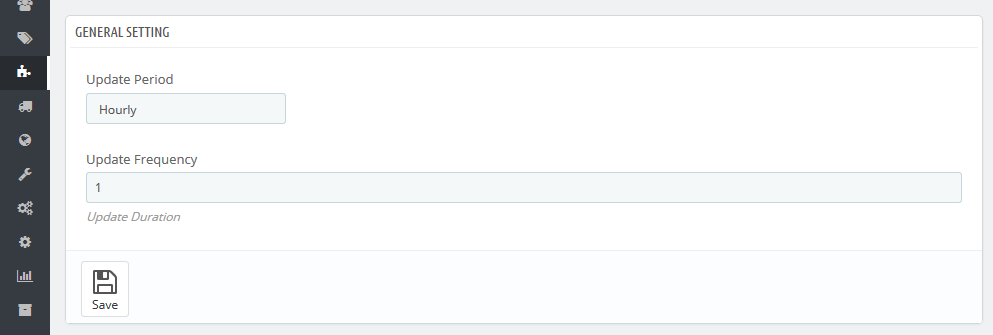
RSS Smart Blog Feed
The module generating the new feed for your Blog.
Has several settings in the admin panel:
-
- Update Period
- allows to display posts from specific time period (hour/day/week/month/year).
-
- Update Frequency
- allows to set the frequency of update (1 week, 2 hours, etc.).
At the top there is a file path where news will be generated. It consists of the website URL + /modules/smartblogfeed/rss.php.
Smart Blog Archive
This block shows up in the left/right column and is used to sort posts by period of time (month) .
It does not have any additional settings.
Smart Blog Categories
This block shows up in the left/right column and is used to sort posts by category.
It does not have any additional settings.
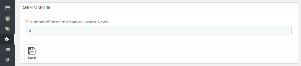
Smart Blog Home Latest Posts
This block shows up only in homepagecontent hook and is used to display latest posts on the home page.
Settings:
-
- Number of posts to display in Latest News
- number of posts that will show up on home page.
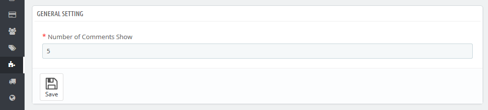
Smart Blog Latest Comments
This block shows up in the left/right column and is used to display the latest comments added for the Blog posts.
Settings:
-
- Number of Comments to Show
- numbers of comments shown in the block.
Smart Blog AddThis Module
This block shows up on the post single page and allows to share this post in social networks.
It does not have any additional settings.
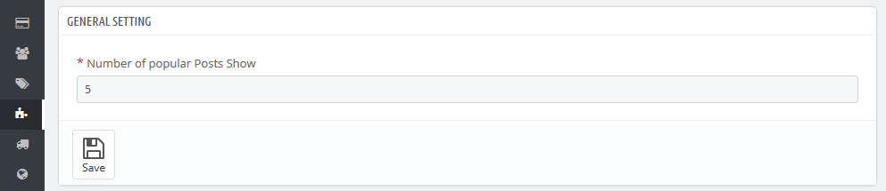
Smart Blog Popular Posts
This block shows up in the left/right column and is used to display the most popular posts viewed.
Settings:
-
- Number of popular Posts to Show
- numbers of popular posts shown in the block.
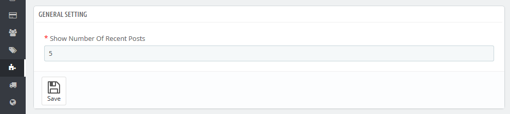
Smart Blog Recent Posts
This block shows up in the left/right column and is used to display the latest posts.
Settings:
-
- Show Number Of Recent Posts
- numbers of recent posts shownin the block.
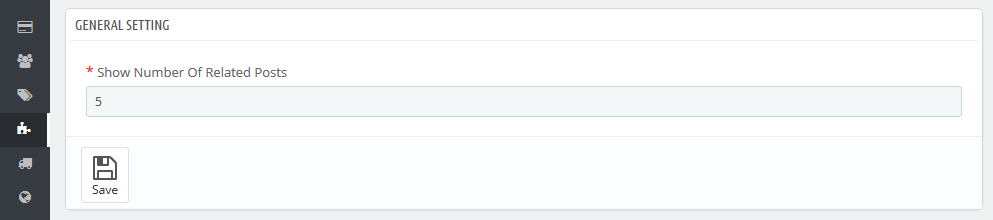
Smart Blog Related Posts
This block shows up on the post single page and is used to show up related posts.
Settings:
-
- Show Number Of Related Posts
- number of related postsshown in the block.
Smart Blog Search
This block shows up in the left/right column and is used to search through the blog.
It does not have any additional settings.
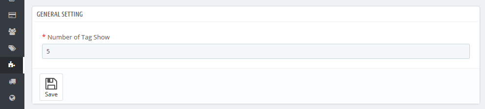
Smart Blog Tag
This block shows up in the left/right column and is used to display tags used in the blog.
Settings:
-
- Number of Tag to Show
- number of tags shown in the block.
TM Mega Menu
The module is designed to create complex menus. The module provides the ability to display one item (without sub-menu), a menu item with a sub-menu and a menu item with sub-menu by way of a multi-row and multi-column block. The module can be used in different positions, but it will display the same content. Available positions: top(displayTop), left(displayLeftColumn), right(displayRightColumn), footer(displayFooter). You can add categories (with subcategories), CMS categories (with subcategories), manufacturers (one or a list), suppliers (one or a list), stores (if multistore is used), links to any product, information block about the product, custom links are not limited in quantity, custom HTML blocks are not limited in number, and banners. See below for more details.
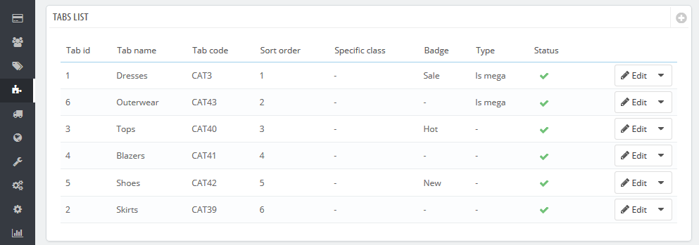
TM Mega Menu Tabs
TM Mega Menu tabs are the basic items which are the top menu part.

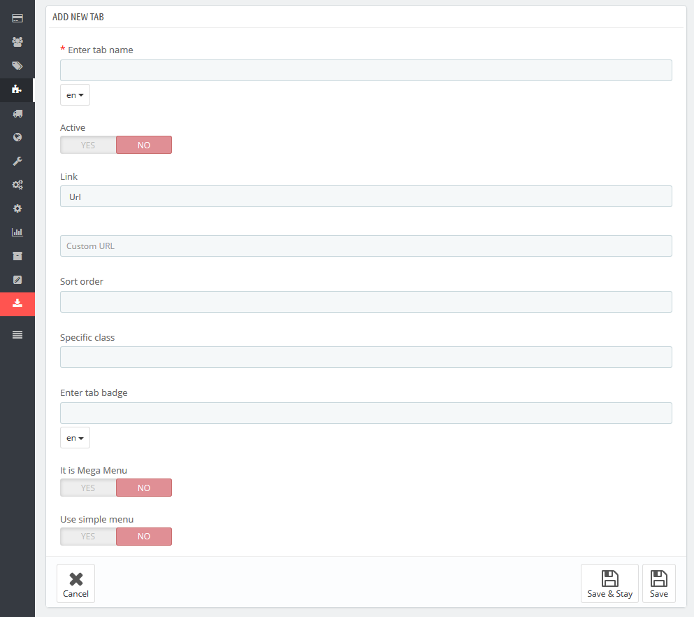
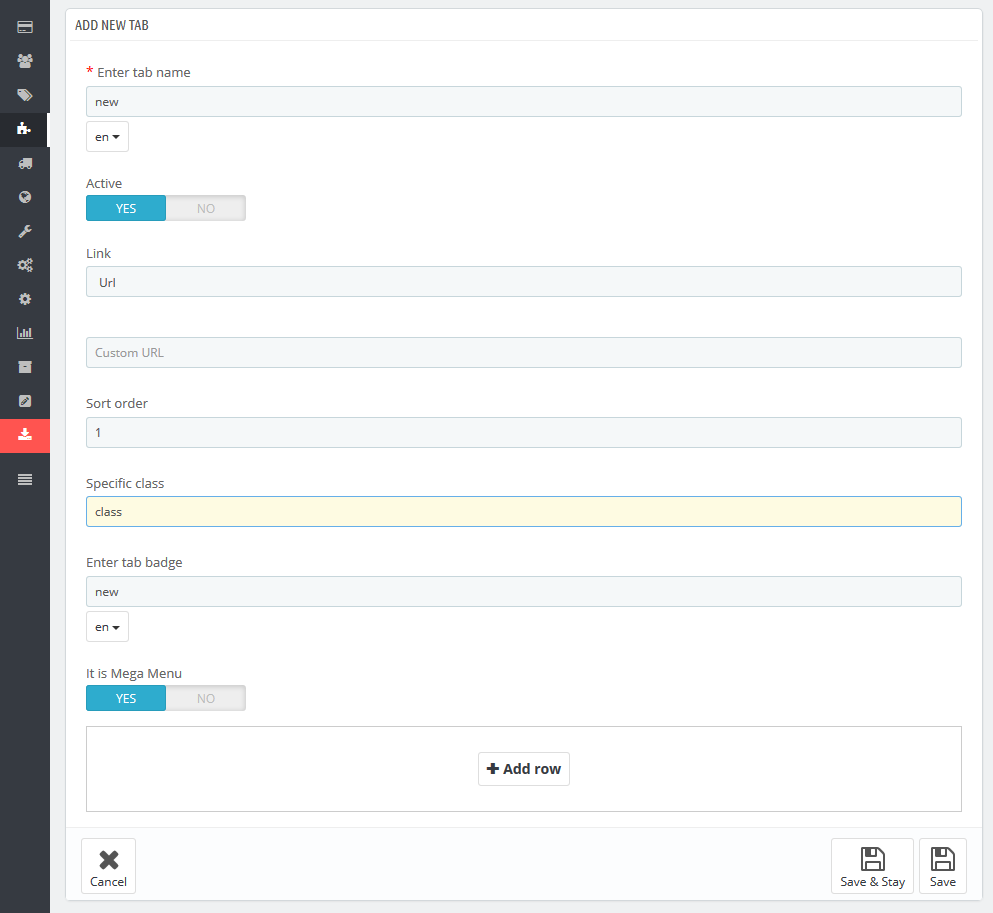
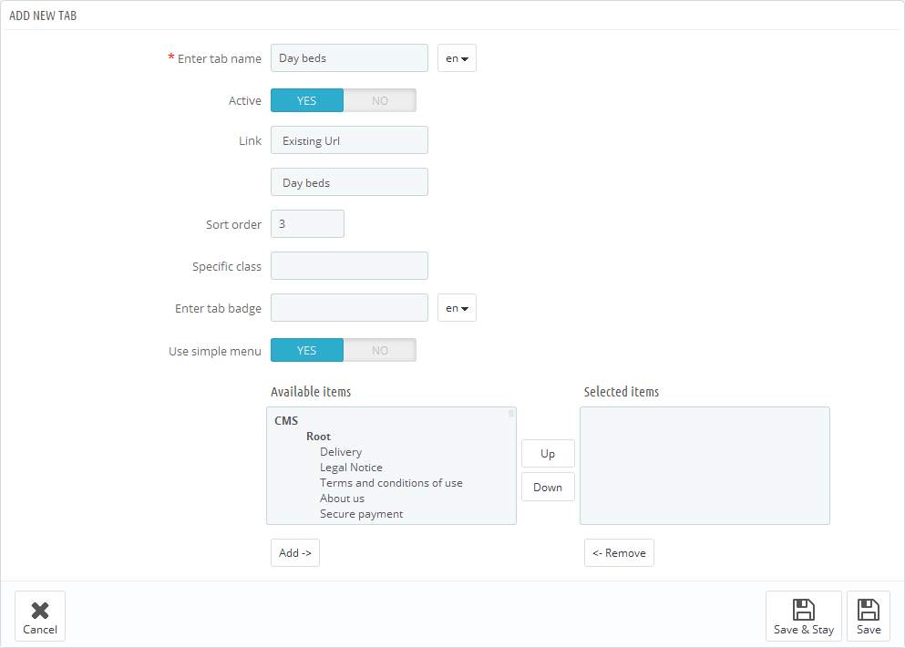
In order to create a new tab, open the TM Mega Menu module and click + in the Tabs list table.
In the form that appears, fill in the required fields.
-
- Enter tab name
- the tab title which is mandatory to be filled in for the default language, if the additional languages fields are not filled in, the tab gives its name from the default language. Field is mandatory.
-
- Active
- active/inactive tab.
-
- Link
- a link that is assigned to this tab. You can enter a custom link, or choose from existing options (categories, CMS categories). If you leave the field blank, the link of this tab is inactive.
-
- Sort order
- the order of tabs to be displayed.
-
- Specific Class
- the class which is added to emphasize the item (CSS class).
-
- Enter tab badge
- is filled in depending on multi-languages.
-
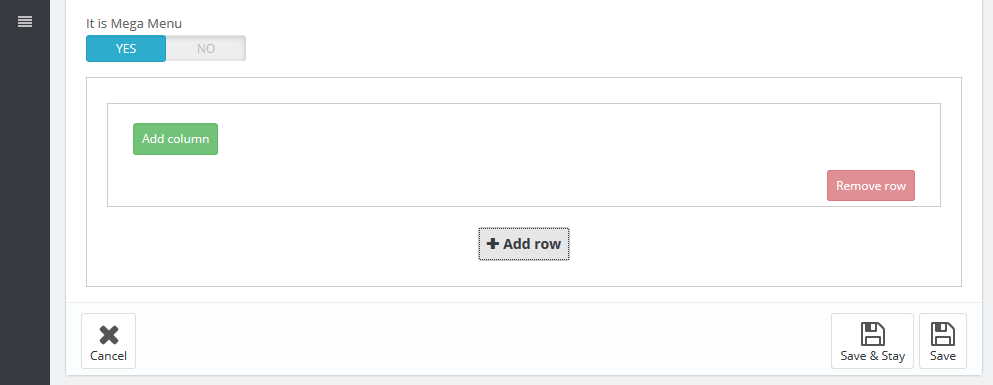
- It is Mega Menu
- given tab sub-menu is a Mega Menu. *
-
- Use simple menu
- given tab sub-menu is a simple menu. **
* It is Mega Menu. If this option is selected, there will be a form to create a complex menu (Mega Menu).
** Use simple menu. If this option is selected, there will be a form to create a simple menu. This is a menu that displays the selected content in a single column. If the menu has embedded content, the new column is added.
Complex menu consist of rows and columns in rows.
The Row is a part of the Mega Menu structure. It includes the menu columns. The existing row can be removed by clicking the appropriate button. The row will be removed with the content it includes. The rows quantity is not limited.
The Column is a part of the Mega Menu structure, which is placed inside the rows. (The Class) The width of the column cannot be less than 2 and more than 12. In order to make the menu display properly, the total column width cannot exceed 12. The width (class) is a Bootstrap column type, corresponds to the same values.
In order to create the menu, click the Add row button
In the form appeared, click Add column button
The pop up window appears, where you need to specify the column class (from 2 to 12). The column itself appears next where you need to set necessary settings,
here you can change the column class, add CSS class, and also the required content from the list provided. You can add/remove content by double clicking the required item, or by highlighting required items and clicking the corresponding button.
Block can be removed by clicking Remove block button in the footer of the block.
By removing the row, the included columns are also removed.
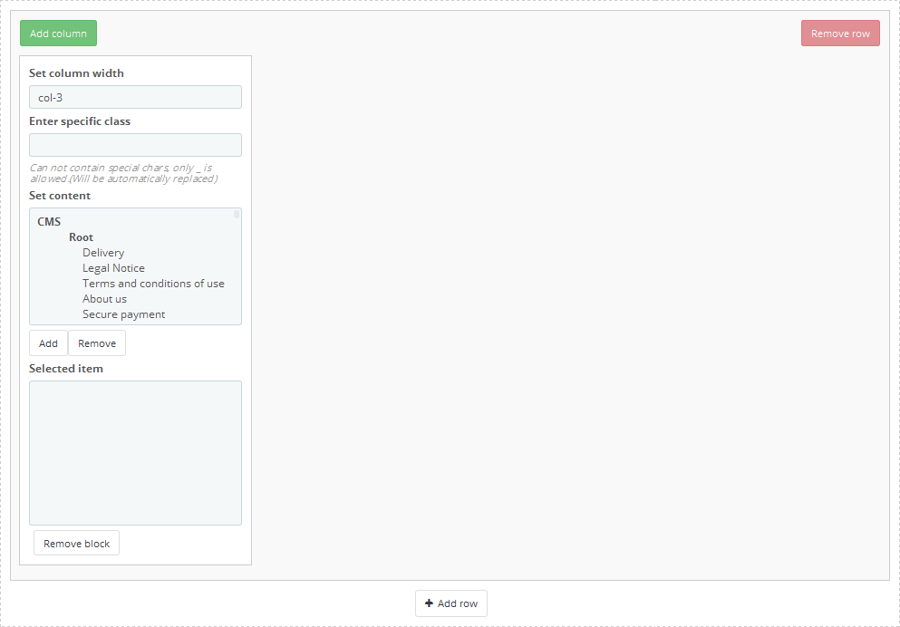
In order to move the content available in the selected menu, double-click or highlight the desired content and press the corresponding button.
Inactive menu information is saved while switching between menu types and you can always change the type of menu.
TM Mega Menu HTML
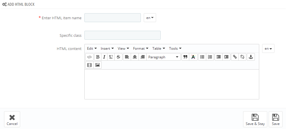
In this section we will explain how to create a custom HTML block in the Mega Menu.
The module has a table listing all the available blocks to which you can add a new block by clicking the + button in the top right of the table.
In the form that appears, fill in the required fields.
-
- Enter HTML item name
- HTML block name, is mandatory to be filled in for the default language.
-
- Specific class
- block's CSS class.
-
- HTML content
- HTML content.
Added block will appear in the list of blocks, as well as in the list of available content while creating menu blocks.
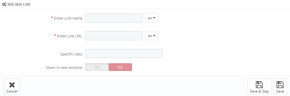
TM Mega Menu Links
In this section we will show how to create custom links in the Mega Menu.
The module has a table listing all the available links to which you can add a new link by clicking the + button in the top right of the table.
In the form that appears, fill in the required fields.
-
- Enter Link name
- link name, is mandatory to be filled in for the default language.
-
- Enter Link URL
- link URL, is mandatory to be filled in for the default language.
-
- Specific class
- block's CSS class.
-
- Open in new window
- open link in a new window.
Added link will appear in the list of links, as well as in the list of available content while creating menu blocks.
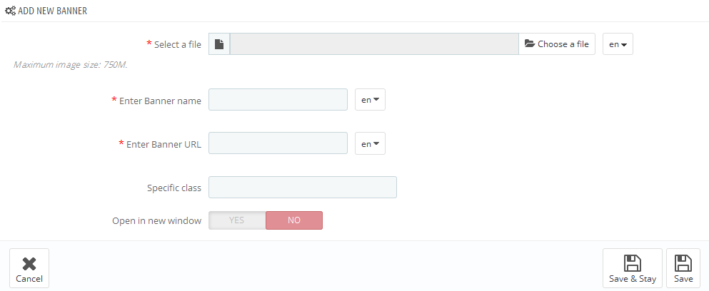
TM Mega Menu Banners
In this section we will explain how to create banners in the Mega Menu.
The module has a table listing all the available banners to which you can add a new banner by clicking the + button in the top right of the table.
In the form that appears, fill in the required fields.
-
- Select a file
- select a file, is mandatory to be filled in for the default language.
-
- Enter Banner name
- banner title, is mandatory to be filled in for the default language.
-
- Enter Link URL
- link URL, is mandatory to be filled in for the default language.
-
- Specific class
- block's CSS class.
-
- Open in new window
- open link in a new window.
Added banner will appear in the list of banners, as well as in the list of available content while creating menu blocks.
Media Parallax Module
What is parallax effect?
Parallax scrolling is a special scrolling technique in computer graphics, wherein background images move by the camera slower than foreground images, creating an illusion of depth in a 2D video game and adding to the immersion. Web designers began incorporating parallax scrolling in 2011, using HTML5 and CSS3. Websites with parallax backgrounds are becoming an increasingly popular strategy, as advocates argue it is a simple way to embrace the fluidity of the Web. Additionally, proponents use parallax backgrounds as a tool to better engage users and improve the overall experience that a website provides. Parallax scrolling allows for the creation of dynamic, interactive user experience that has the potential to improve visual appeal.
This module allows to add parallax effects to your website without any additional skills and effort. It is possible to add both images and background video.
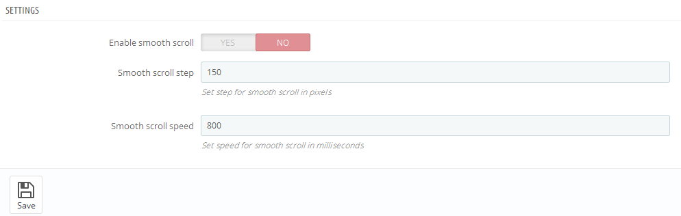
Settings: (only for Google Chrome)
-
- Enable smooth scroll for Google Chrome browser
- enable additional effect.
-
- Smooth scroll time
- time of smooth scroll effect.
-
- Smooth scroll distance
- distance of smooth scroll effect.
Adding Media parallax module
- It is required to add the id or class in the content of your HTML page. You can also use a unique tag, this element should not be repeated.
- Create the image of the required size(it is desirable to create the image of larger size than the block where the effect will be added). In case you want to add the video, you will have to prepare it in 3 formats: .mp4,.webm and .ogv, and also to add the preview image of the same size(.png, .jpg and .gif)
-
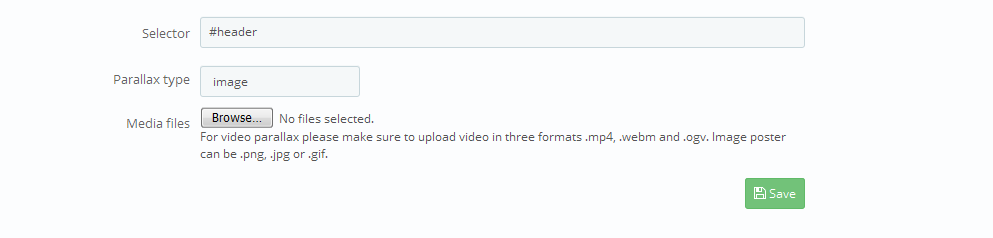
Click Add container button in the Add new block .
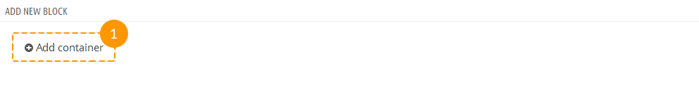
-
In the appeared screen add all the required settings.
Settings:
-
- Selector
- element where the effect will be added (id or unique tag).
-
- Parallax type
- type of effect that will be used (image or video).
-
- Media files
- upload all the required files.
- Click Save button.
-
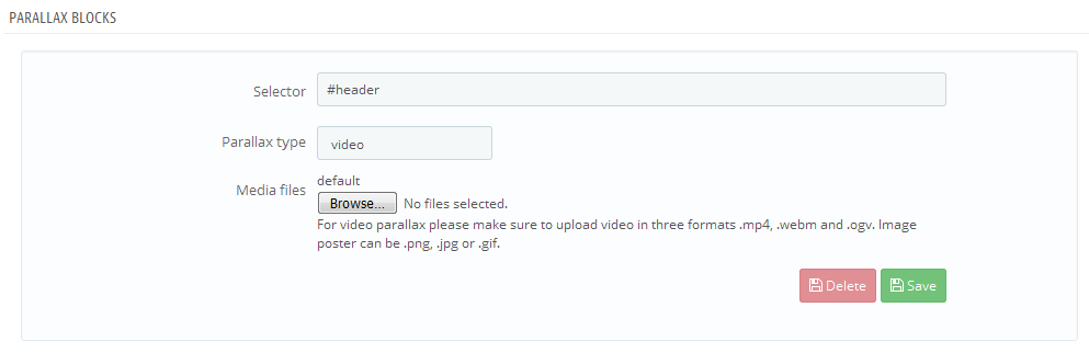
Media parallax module customization
In the list of Parallax blocks find the required block and change the settings.
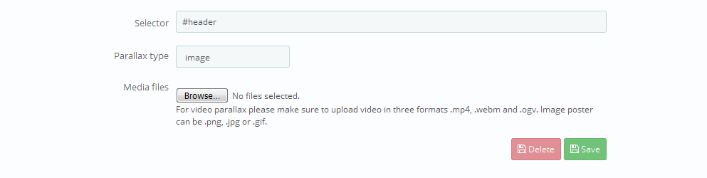
Media parallax module removal
In the list of Parallax blocks find the required block and click Delete button.

Video Background Module
This module allows to add the background video to any block in your HTML page (there should be the id or unique tag).
To add the background video, you can follow the steps below:
- Upload the video files and preview images to modules/tmvideobackground/video folder (or any other folder on server) via FTP. The video should be uploaded in 3 formats: .mp4, .ogv, .webm, all files having the same names (ocean.mp4, ocean.ogv, ocean.webm). Preview images should be also in 3 formats: .jpg, .gif, .png and have the same names (ocean.jpg, ocean.gif, ocean.png).
- In your admin panel open
Video background module (Modules->Front Office Features->Video background module) and perform
the required settings.
Settings:
-
- Video selector
- element of HTML page where the background video will be added (id or unique tag (body, header, footer, etc.).
-
- Video path
- path to your video files (the path should have / at the end), the files can be located in any folder on server, but we recommend that you upload them to modules/tmvideobackground/video/ folder.
-
- Video files name
- names of your video files. Only name should be added (there is no need to write the format. For example,"ocean").
- Click Save button.
-
To display the video, there should be no other background added for this element.
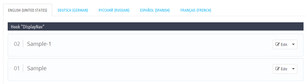
TM HTML Content
This module allows to display any content(image, HTML, links, etc.) in the following positions: displayNav, home, top, topColumn, left and right (displayLeftColumn/displayRightColumn), footer. It is used to expand design opportunities and add advertisement/information blocks to your store. It is a multilanguage module and can also work in the multistore website.
To add the content, you should follow the steps below:
Navigate to Modules->Front Office Features->TM HTML Content (if it is not installed, install it).
- Click Add new button.
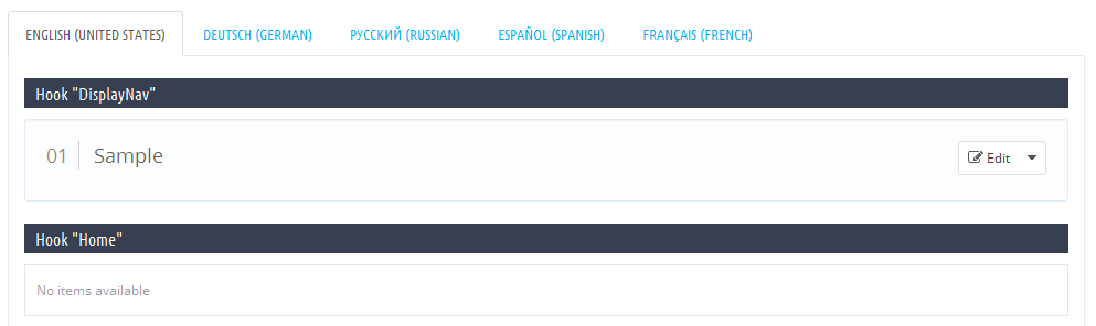
- The list of available languages. You can view the available elements for all languages by switching the language tabs.
- The list of elements added for specific position and language.
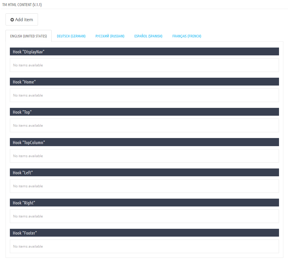
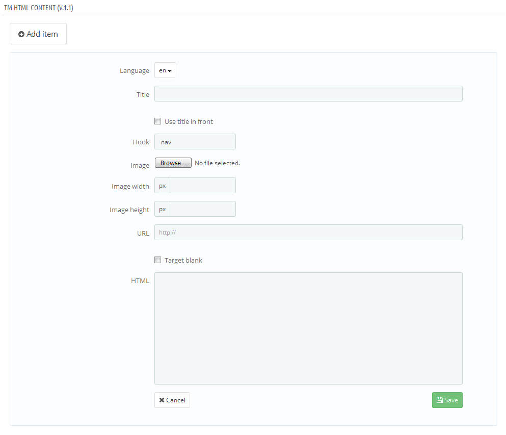
Adding the element. Click Add item button and fill in the required settings (none of the fields are mandatory).
-
- Language
- select the required language from the drop-down list.
-
- Title
- title of the element.
-
- Use title in front
- display the title of the element at the frontend (the title will show up in front of the element).
-
- Hook
- position where the element is added.
-
- Image
- upload the image from your computer.
-
- Image width
- image width shown at the frontend.
-
- Image height
- image height shown at the frontend.
-
- URL
- add the link (the whole block will be wrapped in the link).
-
- Target blank
- open link in new tab.
-
- HTML
- HTML code (except the link if you have added it in the URL field) or text.
-
- Save
- click to save the element.
All elements of one language added to the same position will be displayed as a list at the backend and frontend.
Editing and removing the element
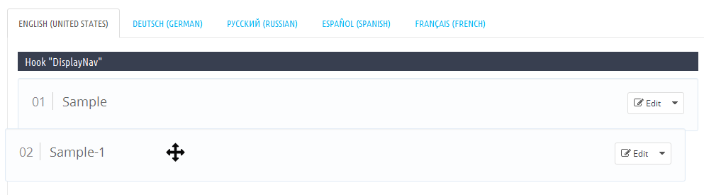
When you add the element, it shows up in the corresponding list.
- The language where the elements were added.
- Position where the elements were added.
- Edit button with the drop-down list.
- Delete button.
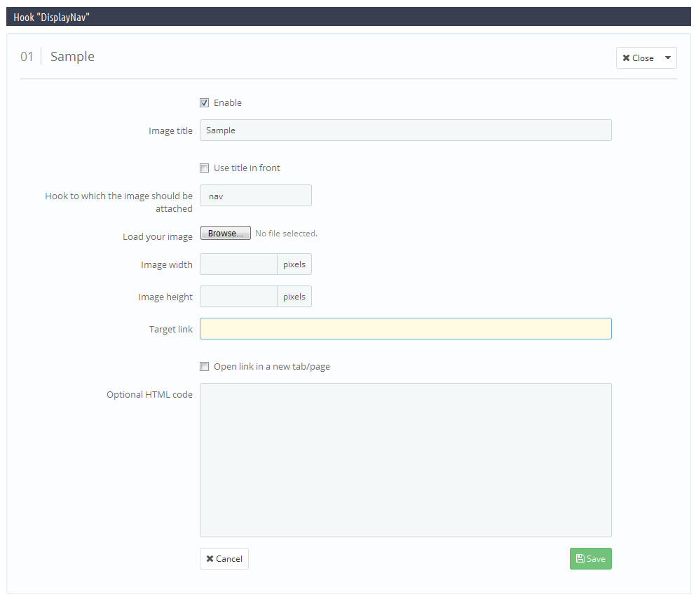
Editing
Click Edit button to modify the element.
In the appeared screen change all the required fields.
-
- Enable
- display the element at the frontend.
-
- Image title
- title of the element.
-
- Use title in front
- show up title at the frontend.
-
- Hook to which the image should be attached
- position of the element.
-
- Load your image
- image of the element.
-
- Image width
- image width at the frontend.
-
- Image height
- image height at the frontend.
-
- Target link
- assign link to the element.
-
- Open link in a new tab/page
- Open link in new tab.
-
- Optional HTML code
- edit HTML code.
-
- Save
- save changes.
Changing order of elements in the list

To change the order of elements, you should just drag the element to the position you need.
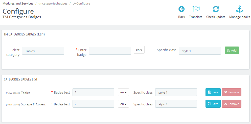
TM Categories Badges
This module allows to add badges to the sidebar categories of the default Prestashop Categories module ("Blockcategories"). The badges can be added to the category of any level and in any language. The text field of the label is mandatory and should be filled in all languages. If this field is left blank in any language, then it will automatically take the text of the default language.
Installation and Deleting
The module is installed and deleted like any other Prestashop module.
Module Configuration
After installation you can change its settings on the module configuration page.
You can add badges to any category after selecting it from the drop down list. Attention! You can add only one badge for each category. Then, you can add text that will show up in the badge and select the style from the drop-down list (the styles may differ in different templates).
You can see the list of existing badges below. Here you can edit or delete badges with the help of corresponding buttons.
The module is multilanguage and supports the multi-stores. You can add badges for group of stores or all stores at once. They will show up in the list as separate elements.
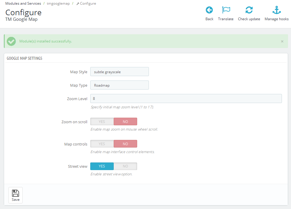
TM Google Map
This module allows to add Google map with your stores location and short description about them on your front page. The map will show up the addresses of all stores related to your online shop. You can edit your stores details under Preferences->Store Contacts tab.
Installation and Deleting
The module is installed and deleted like any other Prestashop module.
Module configuration
After installation you can change its settings on the module configuration page.
You can configure the style and elements of your map.
Select the map style from the first list (all styles are taken from Snazzymaps). You can also add the style from this website. Find instructions on adding them at the end of this instruction.
Select the view type from the second list (satellite view or street view).
You can also select the zoom ratio for your map from 1 to 17.
Zoom option if scrolling on the map area.
You can disable the map control and ability to view the streets.
The module supports the multi-stores. You can change the map styles for each store.
Adding custom styles
You can add any custom style from Snazzymaps to your module. To do this, you should select the style from the website, copy JavaScript Style Array to .js file and save it in the module folder /js/styles/(for the file name use the style name replacing the spaces with underscores and removing all special characters. For example: for Subtle Grayscale style - subtle_grayscale.js file, for Apple Maps-esque style - apple_maps-esque.js file). Then, navigate to your module configuration page and select the required style from the styles drop-down list.
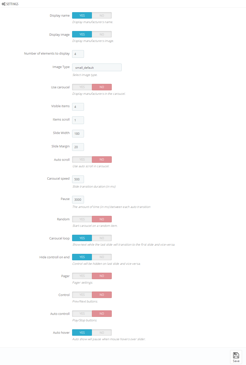
TM Manufacturers Block
This module shows up manufacturers available in your store. The list of manufacturers may consist of the image and title. The list can also show up as a carousel.
Installing and Deleting
The module is installed and deleted like any other Prestashop module.
Module configuration
After installation you can change its settings on the module configuration page.
-
- Display name
- show the manufacturer's name.
-
- Display image
- show the image of the manufacturer.
-
- Number of elements to display
- select the number of elements displayed in the module.
-
- Image Type
- select the image type (you can select the image from the images related to the manufacturer).
-
- Use carousel
- show up the list as a carousel.
-
- * Visible items
- number of visible manufacturers.
-
- * Items scroll
- number of manufacturers shown in one carousel scroll.
-
- * Slide Width
- the width of the element in the carousel.
-
- * Slide Margin
- the margin of the element in the carousel.
-
- * Auto scroll
- automatic scrolling.
-
- * Carousel speed
- speed of the carousel.
-
- * Pause
- pause between scrolls(if "Auto scroll" is enabled).
-
- * Random
- carousel start from the random element.
-
- * Carousel loop
- carousel returns back to the beginning when all elements have been scrolled.
-
- * Hide control on end
- hide next/previous buttons.
-
- * Pager
- show pagination.
-
- * Control
- show next/previous buttons.
-
- * Auto control
- show play/pause buttons.
-
- * Auto hover
- pausing when hovering over carousel elements.
* - settings are available only if carousel is enabled.
The module supports multi-stores.
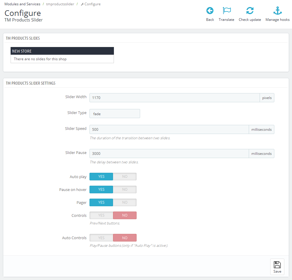
TM Products Slider
The module shows up store products in the slider.
Installation and deleting
The module is installed and deleted like any other Prestashop module.
After installation you can change its settings on the module configuration page.
You can set the order of products in your slider using drag-and-drop method. You can also enable/disable product display in the slider.
You can set the width of slider, sliding effect, slider speed, pause, auto scroll, pause when hovering over carousel elements, slider control, next/previous buttons, play/pause buttons.
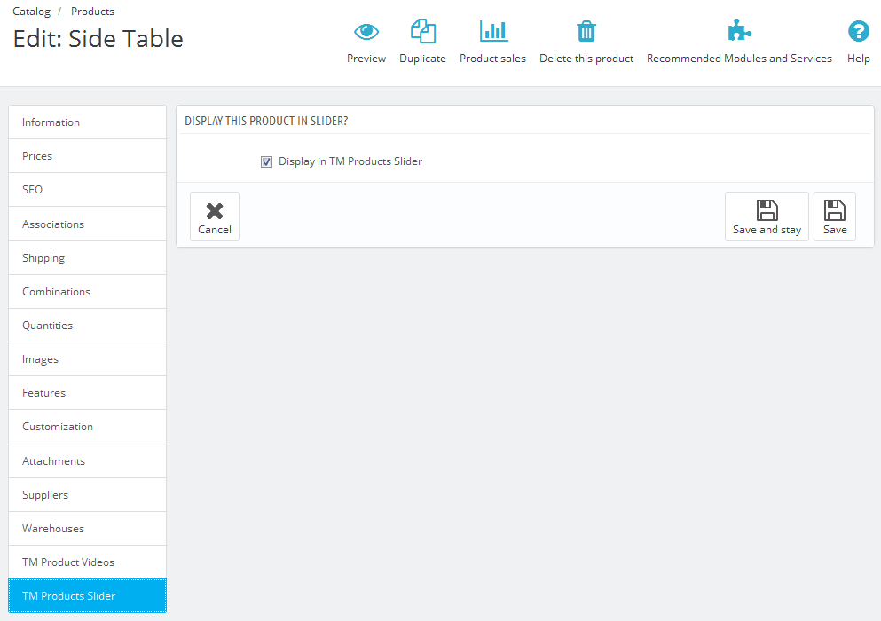
After module installation you will see the new tab in your product configuration page (Catalog-> Product-> select any product - TM Products Slider).
Here you can set whether the product will show up in the slider or not. After making the changes, click Save/Save and Stay button to save them.
The module supports multi-stores. You can change settings for each store, group of stores or all stores at a time.
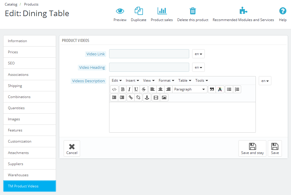
TM Product Videos
This module allows to add unlimited number of videos to any product in any language and store.
Installation and deleting
The module is installed and deleted like any other Prestashop module. It has no configuration page and supports multi-stores.
After module installation you will see the new tab in your product configuration page (Catalog-> Product-> select any product - TM Product Videos).
To add a video to any product, you should fill in the required fields (the link field is mandatory). The module is multilanguage, so you will have to fill in the fields for all languages this video is related to. If the Link field is not filled for any language, then the video will not be added for this language. The module is supposed to show up videos from Youtube and Vimeo, so you need to add links only from these resources. After making the changes, click Save/Save and Stay button to save them.
Examples of links
To display video properly, the links should have the following format:
-
- Youtube
https://www.youtube.com/v/K6VcTyaym90
-
- Vimeo
http://player.vimeo.com/video/66140585
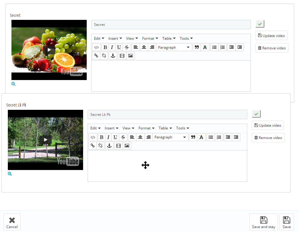
If the product has video related to this language, you will see the list of videos below.
To save, delete or edit the list, there is no need to click Save/Save and Stay button. Use the buttons located in the video blocks. To change the order of videos, use drag-and-drop method to change their position. To enable/disable the video, use the button next to video. To edit the videos, fill in the fields with required data and click Update button.
To remove the video from the list, click Remove video button.
While switching languages, only the list of videos related to the language will show up.
To view the video in zoomed format, click Zoom button under the video you want.
TM Social Feeds
This module loads the social networks feeds on your website. It enables the site visitors to be aware of the latest news and posts shared on the social networks.
Installation and Deleting
The module is installed and deleted like any other Prestashop module.
Module configuration
After installation you can change its settings on the module configuration page.
In the upper form you should add global settings for each social network. Different social networks have different settings.
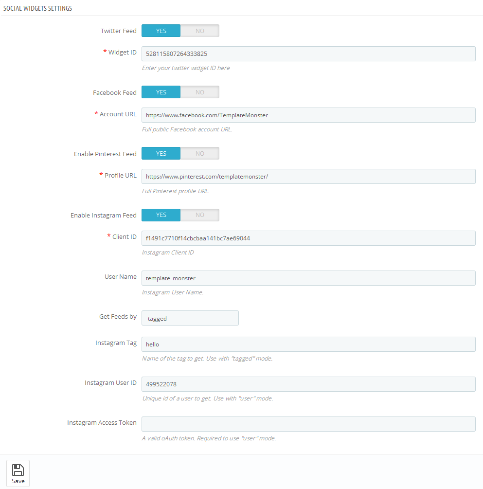
It is enough to add a Widget ID which can be taken from your Twitter account.
-
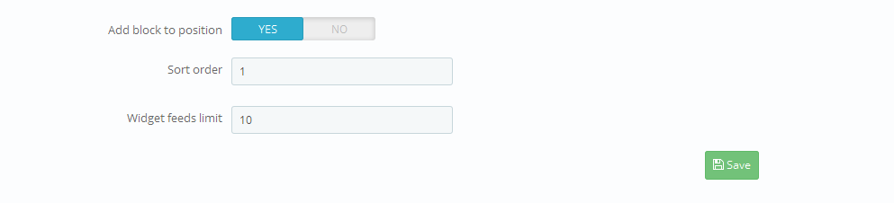
- Add block to position
- display block in specific position.
-
- Select theme
- color scheme of the block for this position.
-
- Sort order
- sort order (order number of the block in this position).
-
- Widget width
- block width in this position.
-
- Widget height
- block height in this position.
-
- Widget feeds limit
- number of feeds in the block.
-
- Enable header
- show block title.
-
- Enable footer
- show footer of the block.
-
- Enable border
- show border of the block.
-
- Show replies
- display replies to the posts.
-
- Show scroll
- show block scroll.
-
- Show background
- add block background or leave it transparent.
Paste the full path to the Facebook page which feeds will be loaded. The page should be public.
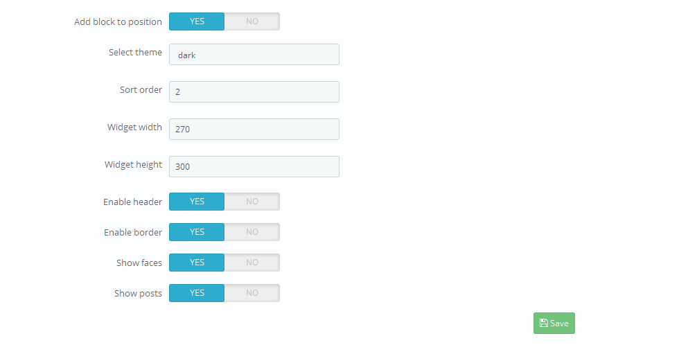
-
- Add block to position
- display block in specific position.
-
- Select theme
- color scheme of the block for this position.
-
- Sort order
- sort order (order number of the block in this position).
-
- Widget width
- block width in this position.
-
- Widget height
- block height in this position.
-
- Enable header
- show block title.
-
- Enable border
- show footer of the block.
-
- Show faces
- show photos of users who liked the page.
-
- Show posts
- show posts from the page.
For Pinterest paste the full path to the page which feeds will be loaded.
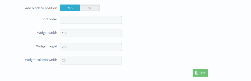
-
- Add block to position
- display block in specific position.
-
- Sort order
- sort order (order number of the block in this position).
-
- Widget width
- block width in this position.
-
- Widget height
- block height in this position.
-
- Widget column width
- width of the block column
Client ID - a unique ID assigned during widget registration on Instagram.
User Name - username used to link the owner's page.
Selection type: you can set whether the images are loaded from specific user or by tag.
Tag by which images are loaded.
Id of the user whose images will be loaded.
Instagram access token - access token of the user whom the page belongs.
In the second part of the module configuration page you can add the required module to the position you want. There are 4 positions. You can add the block settings for each position. The only global setting is the data of social networks which feeds will be loaded.
Each social network has its own settings.
-
- Add block to position
- display block in specific position.
-
- Sort order
- sort order (order number of the block in this position).
-
- Widget feeds limit
- number of feeds displayed in the block.
The module supports multi-stores.
TM Header Account
This module displays the login form and some available user account elements in the site header. It allows to log into your account staying on the active page. The module serves as a drop-down block.
Installation and Deleting
The module can be installed and deleted like any other PrestaShop module.
Module configuration
The module does not have any additional settings.
TM Homepage Products Carousel
The module adds a carousel to the main page tabs.
Installation and Deleting
The module can be installed and deleted like any other PrestaShop module.
Module configuration
The installed module settings can be configured on the module configuration page.
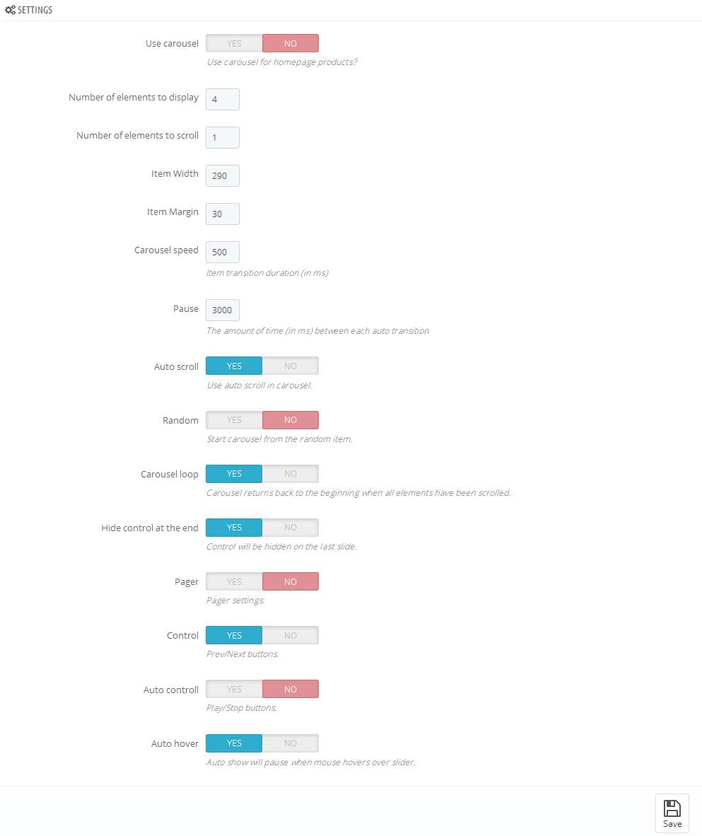
-
- Use carousel
- enable/disable carousel
-
- Number of elements to display
- the number of items to display
-
- Items scroll
- the number of items to scroll
-
- Item Width
- width of an item of the carousel list
-
- Item Margin
- margin between items in the carousel list
-
- Carousel speed
- item transition duration
-
- Pause
- the amount of time between each auto transition (if the "Auto scroll" option is enabled)
-
- Auto scroll
- enable carousel auto scroll
-
- Random
- start carousel on a random item
-
- Carousel loop
- carousel returns back to the beginning when all elements have been scrolled
-
- Hide control on end
- hide the navigation (next/previous) buttons on last slide
-
- Pager
- show pagination
-
- Control
- show next/previous buttons
-
- Auto control
- show play/pause buttons
-
- Auto hover
- pause the carousel when mouse hovers over carousel items
TM Product List Gallery
The module displays a gallery of all available product images on the products list pages.
Installation and Deleting
The module can be installed and deleted like any other PrestaShop module.
Module configuration
The module does not have any additional settings.
Additional actions
To enable the module functionality you should add the following line of the code:
{hook h='displayProductListGallery' product=$product}
to the product-list.tpl file in the root folder of your theme after
the closing tag </a> with the .product_img_link
class.
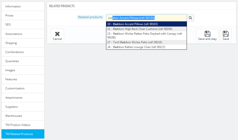
TM Related Products
Given module was designed in order to add and display the related products on the product page.
Module install/uninstall
This module can be installed/uninstalled as any other PrestaShop module.
Module settings
After module has been installed you can configure it on the module configuration page.
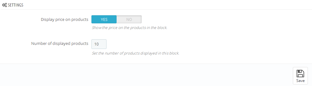
- Display product price.
- Amount of products to display.
You can add or remove related products for the main product in the product settings Catalog->Products.
- Navigate to TM Related Products
- In the product search field start input the title of the product, and choose it from the offered variants;
- In order to remove the product from the list click the X before the product;
- Once all the configuration have been made click Save and Stay or Save button
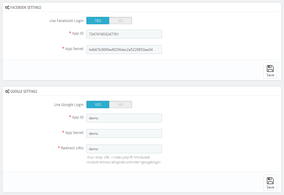
TM Social Login
This module allow to register and sign in with the help of the clients pages data in Social networks such as Facebook and Google.
Module install/uninstall
This module can be installed/uninstalled as any other PrestaShop module.
Module settings
After module has been installed you can configure it on the module configuration page.
In order to get required data for module configuration you need to create corresponding application on the needed resource.
It is not necessary to use both variants of sign in (Google, Facebook) simultaneously, you can use one of them only.
Facebook Fields
- ID of your App.
- Secret key of your App.
Google Fields
- ID of your App.
- Secret key of your App.
- Redirect path after sign in (your shop URL+index.php?fc=module&module=tmsociallogin&controller=googlelogin).
More detailed information you can get by following the links: Google App and Facebook App.
Redirect path must coincide with the one which you have indicated while creating Google App.
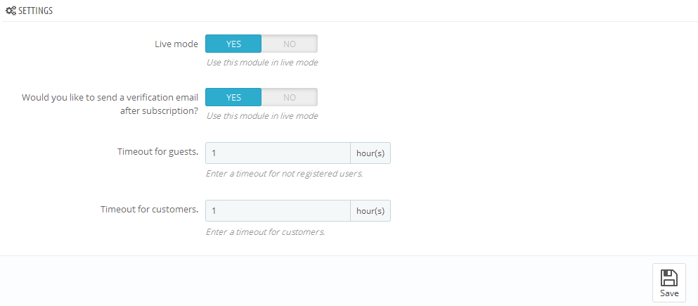
TM Newsletter
The module displays a notification with a proposal to subscribe to store newsletter in a pop-up window. The email check can be enabled in module settings by means of confirmation email. You can also adjust the timeout between reminders for registered and non-registered users. Registered users can permanently give up on reminders.
Module install/uninstall
This module can be installed/uninstalled as any other PrestaShop module.
Module settings
After module has been installed you can configure it on the module configuration page.
- Live mode - enable/disable the module.
- Would you like to send a verification email after subscription? - enable/disable confirmation email send.
- Timeout for guests - set timeout for popup reminding subscription for guests.
- Timeout for customers - set timeout for popup reminding subscription for customers.
It is necessary to install and enable "Newsletter block" for proper work of module.
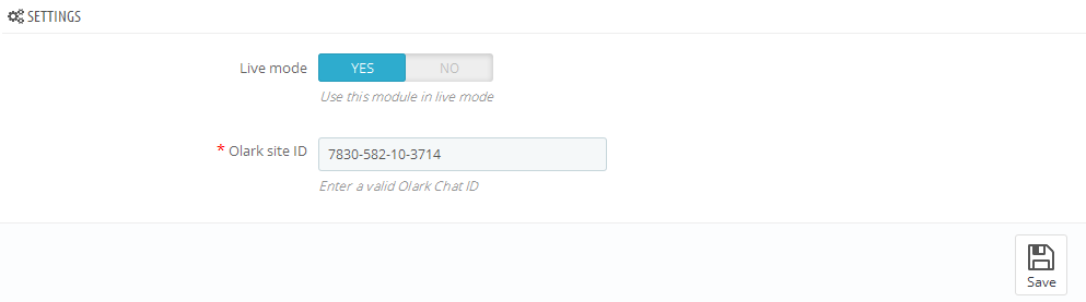
TM Olark Chat
Module to display Olark Chat on your store front-end.
Module install/uninstall
This module can be installed/uninstalled as any other PrestaShop module.
Module settings
After module has been installed you can configure it on the module configuration page.
In order to configure Olark Chat, which you can see on the live demo of the template, you need to register on the official website and to get the ID for your website. Input your ID to the field "Olark site ID" and set module under "Live mode". Now save settings by clicking Save button.