Shopify Documentation
Theme Configuration
With multiple options you are able to modify the template to your needs. You can edit font family, font color and size, theme color scheme, banner and slider images, etc.
Navigate to the Online Store > Themes section.
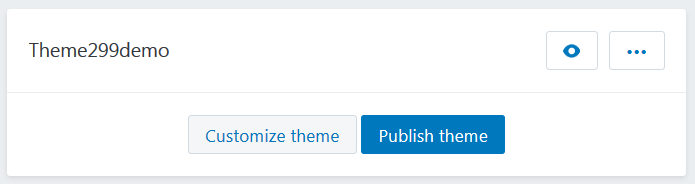
Select the theme you want to modify.
Click on the Customize theme button to open the settings editor page where you can change the appearance and content of the theme.
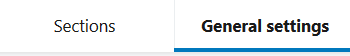
Go to the General settings tab.
This is Live editor, you can track changes in the appearance of your store without reloading the page.
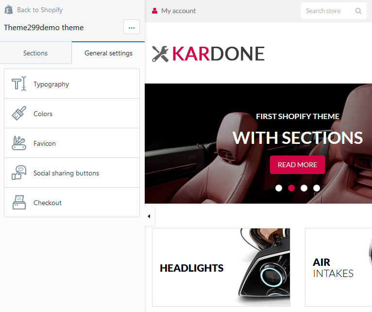
In your installed theme you will see the following options:
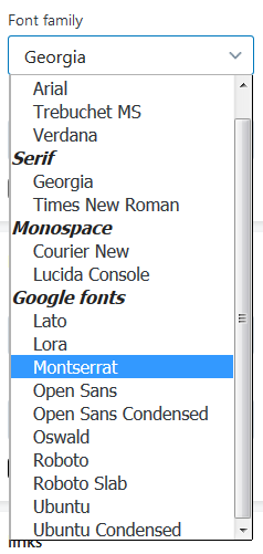
Typography
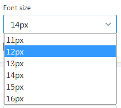
The section where you can change the typography settings, such as font family, font size and color. You can modify the following settings:
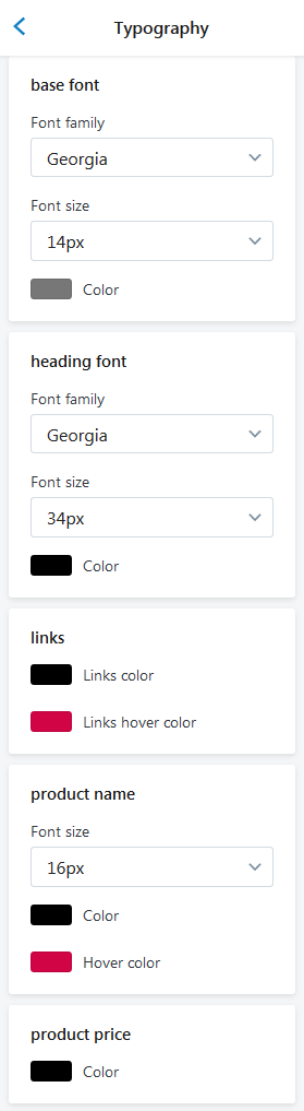
The main font style of your store pages (base font)
- Font family — choose a font family from the dropdown;
- Font size — set a font size (14 - 16px);
- Color — choose a color for the main font. You can select a color from the Color Palette.
You can use Hex Color Code to find a desired color. E.g. #58d68d.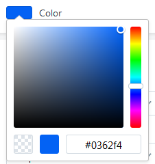

- Font Family — Roboto Slab;
- Font Size — 14px;
- Color — #7777777.
- Font Family — Ubuntu;
- Font Size — 16px;
- Color — #4b0404.
The titles' font style (heading font)
- Font family — choose a font family from the dropdown;
- Font size — set a font size (20 - 40px);
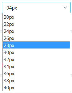
- Color — choose a color for the Titles. You can select a color from the Color Palette.
You can use Hex Color Code to find a desired color. E.g. #58d68d.
- Font Family — Arial;
- Font Size — 30px;
- Color — #000000.
- Font Family — Ubuntu;
- Font Size — 20px;
- Color — #f70013.
Links' text color (links)
- Links color — choose a color for the Links. You can select a color from the Color Palette;
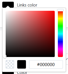
- Links hover color — choose the link color when the mouse is moved over the link.
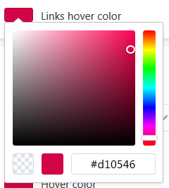

- Links color — #000000;
- Links hover color — #d10546;

- Links color — #000000;
- Links hover color — #706f70;
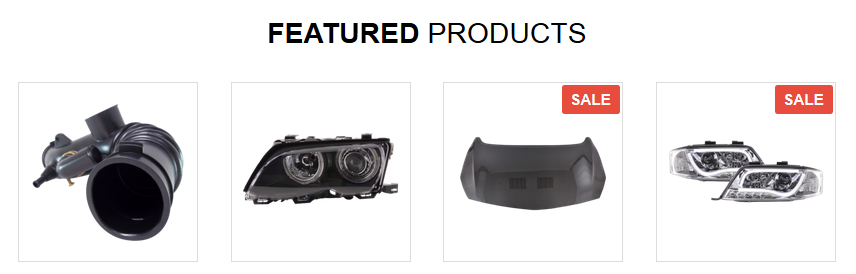
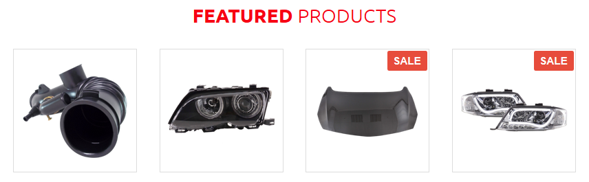
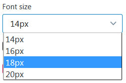
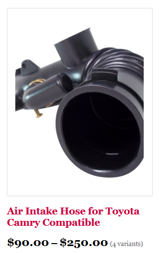
Product names
- Font size — set a font size (14 - 20px);
- Color — choose a color for the product name. You can select a color from the Color Palette.
- Hover color — choose the product name color when the mouse is moved over the name.
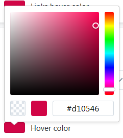 You can use Hex Color Code to find a desired color. E.g. #58d68d.
- Font Size — 18px;
- Color — #000000;
- Hover color — #d10546.
- Font Size — 20px;
- Color — #000000;
- Hover color — #d10546.
Product price
- Color — choose a color for the product price. You can select a color from the Color Palette.
You can use Hex Color Code to find a desired color. E.g. #58d68d.
- Color — #000000;
- Color — #ff0000;
Colours
Theme color scheme settings. The colors must be specified in hexadecimal format (for example, #aabbcc). Also, it is possible to select a color from a palette provided.
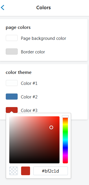
In this section, you choose the colors for your site. The section includes two subsections: Page colors and Color theme.
Let's explore the options:
The Page colors option controls the Page background color and Border color.
The Color theme is used for alternate button styles, some text and icon hover states, and other places. In this section you can adjust links, top bar, header, navigation and footer colors.
Favicon
You can change the default site favicon (small icon that appears in browser tab) with the png image of your choice.
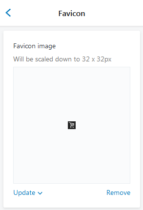
Favicon image will be scaled down to 32 x 32px.
You can upload image from your computer or select image from your library.
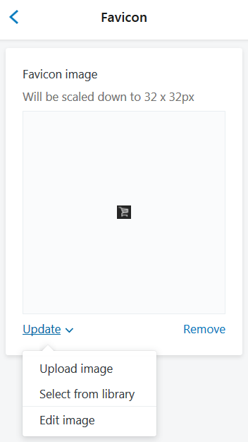
You are able to edit an image. Select Edit image from the Update dropdown.
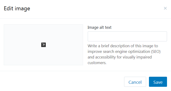
Write a brief description of this image to improve search engine optimization (SEO) and accessibility for visually impaired customers.
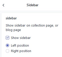
Sidebar
General settings
- Enable the Show sidebar option to display sidebar
- Choose the sidebar position.
- Remember to Save the settings.
Sidebar widgets for the Collection and Blog page
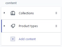
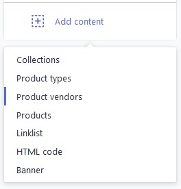
Move to the Sections tab and click on the Sidebar tab.
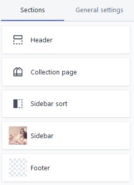
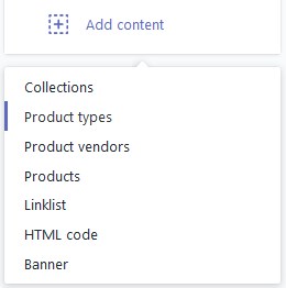
Content:
1. Collections section
2. Product types section
3. Product vendors section
3. Products section
4. Linklist section
5. Custom HTML section
6. Banner section
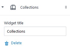
Add Collections section
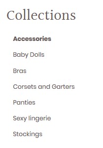
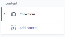
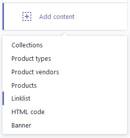
- To add the Collections section to the sidebar, press on the Add content and select Collections from the dropdown.
- The new tab will appear in the Content section.
- Click on the Collections tab to configure the section.
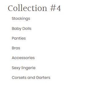
- Enter the title for the block. All in-store categories will be displayed in this section. You can add new Collections under the Products > Collections menu.
- You can delete the section as well. Click Delete in order to remove the section.
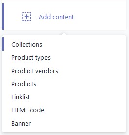
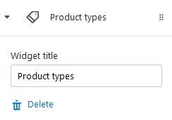
Product types section
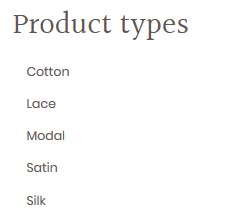
- To add the Product types section to the sidebar, press on the Add content and select Product types from the dropdown.
- The new tab will appear in the Content section.
- Click on the Product types tab to configure the section.
- Enter the title for the block.
- Click Delete to remove the section.
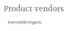
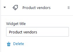
Product vendors section
- To add the Product vendors section to the sidebar, press on the Add content and select Product vendors from the dropdown.
- The new tab will appear in the Content section.
- Click on the Product vendors tab to configure the section.
- Enter the title for the block.
- Click Delete to remove the section.
Products section
- To add the Product section to the sidebar, press on the Add content and select Products from the dropdown.
- The new tab will appear in the Content section.
- Click on the Products tab to configure the section.
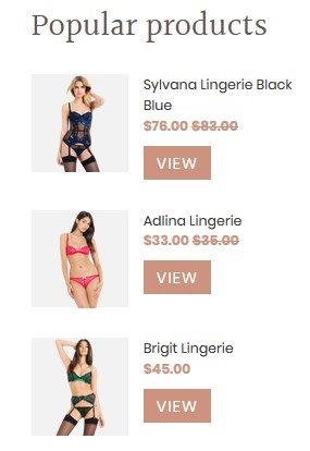
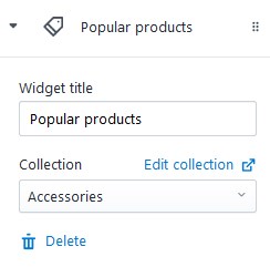
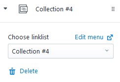
- Enter the title for the block and select the Collection.
- The last added 3 products from the selected collection will be shown in the Products section.
- Click Delete to remove the section.
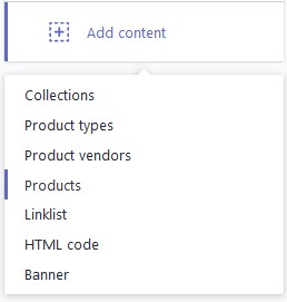
Linklist section
- To add the Linklist section to the sidebar, press on the Add content and select Linklist from the dropdown.
- The new tab will appear in the Content section.
- Click on the Linklist tab to configure the section.
- Choose the linklist to display. Add new linklist under the Online store > Navigation menu.
- Click Delete to remove the section.
Custom HTML section
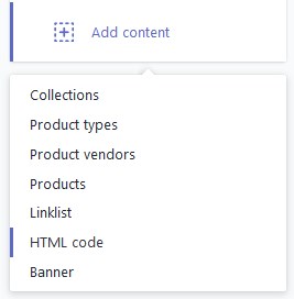
- To add the block with custom HTML to the sidebar, press on the Add content and select HTML code from the dropdown.
- The new tab will appear in the Content section.
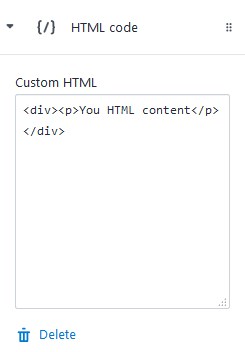
- Click on the {/} HTML code tab to configure the section.
- Enter the code in the Custom HTML option field.
- Click Delete to remove the section.
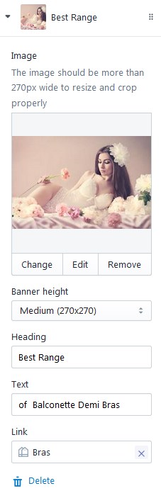
Add Banner section
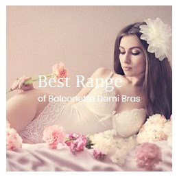
- To add the Banner to the sidebar, press on the Add content and select Banner from the dropdown.
- The new tab will appear in the Content section.
- Click on the Banner (Title) tab to configure the section.
- To chose the image for the banner, press the Select image button. To upload image, go to the Settings > Files menu and click Upload files button. Note, the image should be more than 270 px wide.
- Set the banner height (Small/Medium/Large).
- Specify the Heading for the banner and add some Text you want yo display on the banner.
- You also can attach the link to the banner.
- Click Delete to remove the section.
Social Sharing Buttons
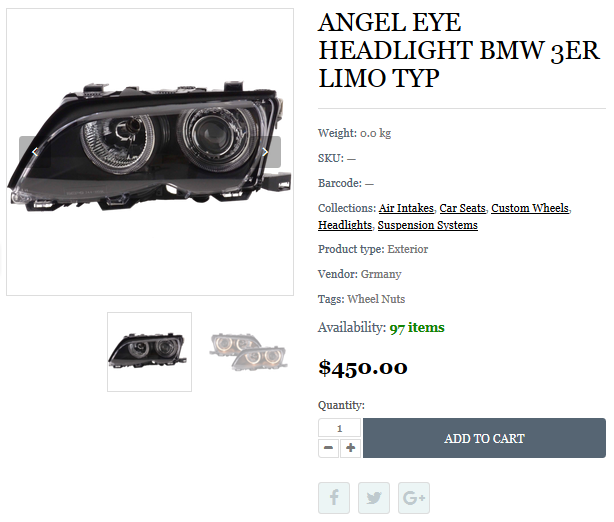
Show your social media icons on the Product Page.
Show/Hide product social sharing buttons. In order to hide the social share button, disable the Checkbox.
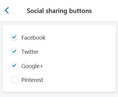
Result:
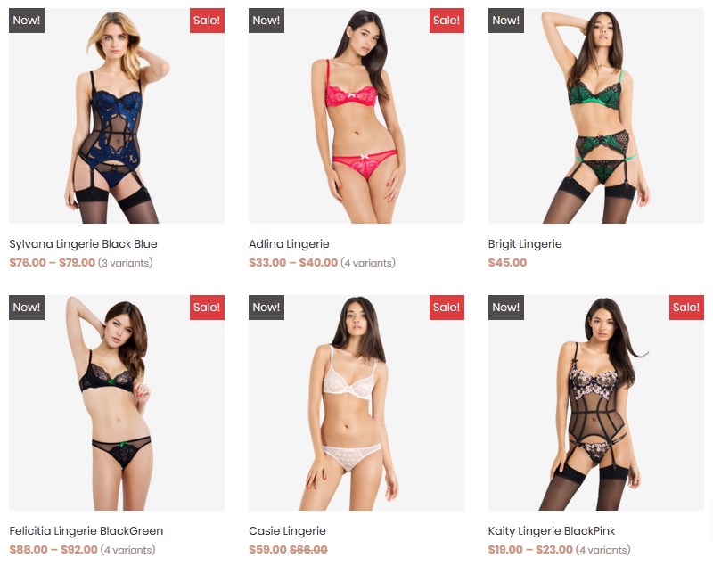
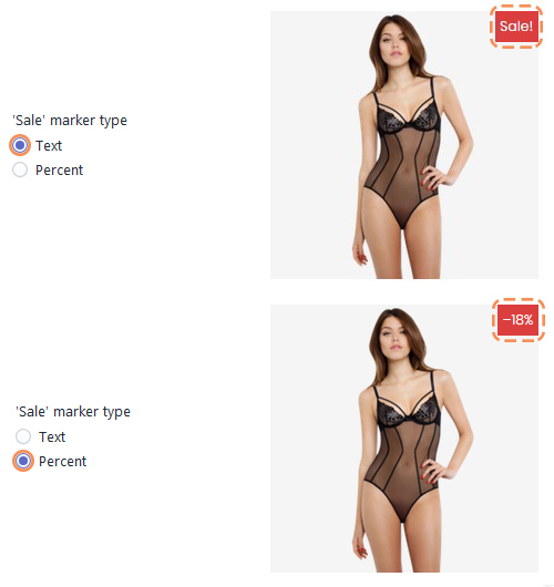
Products Badge
Add "New" and "Sale" badges to product images for the collection page.
Let's review the options available:
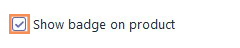
- To show the labels, you should first enable the Show badge on product option.
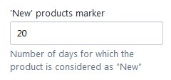
- 'New' products marker — enter the number of days the product is considered as "New" (the time period starts from the date the product was added).
- 'Sale' marker type — set the "Sale" label type (Text or Percent). The "Sale" label appears automatically after the Compare at price is set under the Products > All products section, in case the Show badge on product option is activated.
Remember to Save the settings.
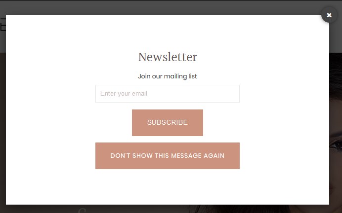
Newsletter Popup
Email newsletter has always been the important part of every marketing strategy. Displays the popup window with subscription form right after the client visits your site.
Let's review the options available:
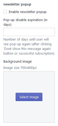
- To display the labels, you should first activate the Enable newsletter popup option.
- Pop-up disable expiration (in days) — set the number of days to show the pop-up again after the user clicks the 'Don't show this message again' button.
- Background image — download the background image for the newsletter. The image should not exceed 700x400px size.
Remember to Save the settings.
Checkout
This section presents the appearance settings for the order page. You can customize the banner, logo, page title, as well as the buttons color.
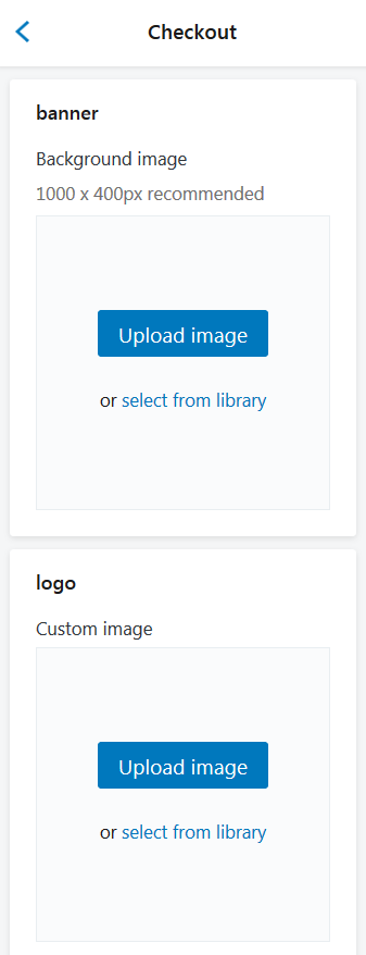
Let's review the Checkout configuration:
| Banner | - | set a background image. The recommended size is 1000 x 400px. You can upload image from your computer or select image from your library. |
| Logo | - | set a custom image for Logo. You can upload image from your computer or select image from your library. |
| Position (Logo position) | - | select a suitable Logo position from the option dropdown (Left/Center/Right). |
| Logo size | - | select a suitable Logo size from the option dropdown (Small/Medium/Large). |
| Main content area: | ||
| Background image | - | set a background image. You can upload image from your computer or select image from your library. Image repeats vertically and horizontally. |
| Background color | - | set a background image (in case Background image is disabled). You can select a color from the Color Palette. |
| Form fields | - | use this field if you want to have Form fields white or transparent. |
| Order summary: | ||
| Background image | - | set a background image. You can upload image from your computer or select image from your library. Image repeats vertically and horizontally. |
| Background color | - | set a background color (in case Background image is disabled). You can select a color from the Color Palette. |
| Typography: | ||
| Headings | - | choose a font family for headings from the dropdown. |
| Body | - | choose a font family for the checkout main text from the dropdown. |
| Colors: | ||
| Accents | - | choose a color for links, highlights, and checkmarks. You can select a color from the Color Palette. |
| Buttons | - | choose a color for gift card/discount and next step buttons. You can select a color from the Color Palette. |
| Errors | - | choose a color for messages and invalid fields. You can select a color from the Color Palette. |
Wishlist
A wishlist is an eCommerce feature that allows shoppers to create personalized collections of products they want to buy.
Create the new page
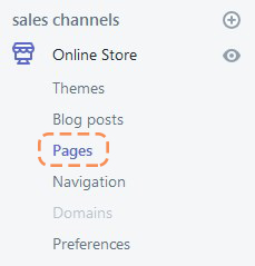
Login to you Shopify store Admin Panel and go to Online Store, then tap Pages.
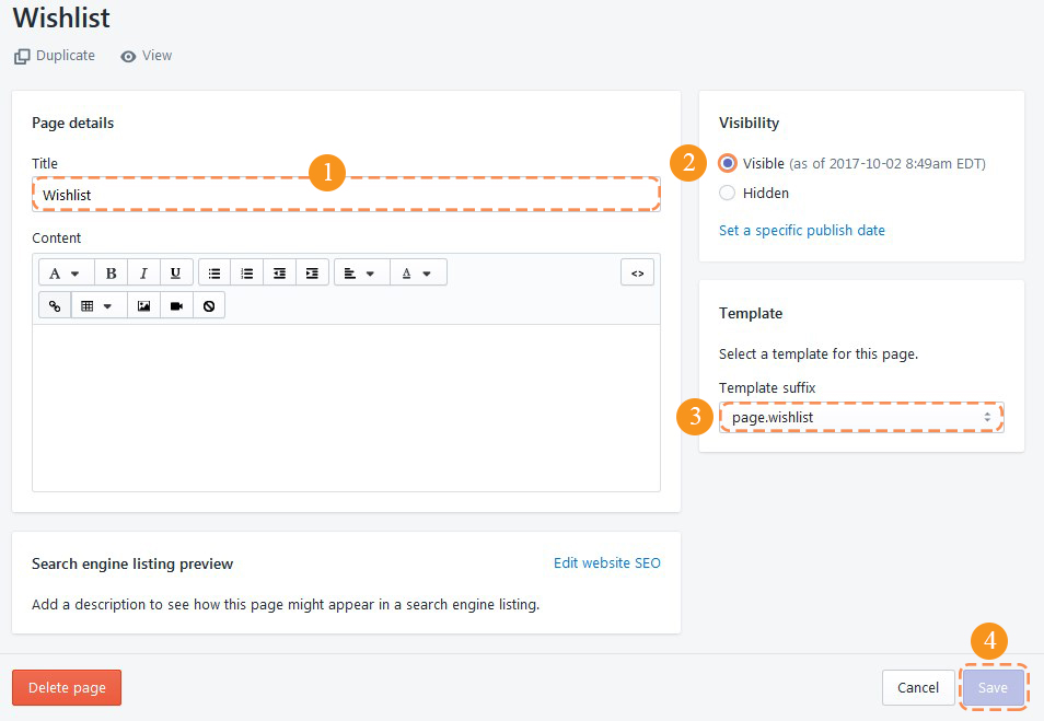
Click the Add page button.
Enter the Title for the page (1). Note, the title is visible on the frontend.
Set the page as Visible (2) and select the template for this page (3).
Save the page (4).
Let's review the options available:
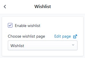
- Activate the Enable wishlist option to use the "Wishlist" functionality for your store.
- Then choose the page for the wishlist.
Remember to Save the settings.
Settings for the Wishlist Page
- Product image size — set the products image size (Amall/Medium/Large)
- Product image alignment — choose the alignment type for the product images