Shopify Documentation
Настройка шаблона
Благодаря множеству опций, вы можете производить тонкую настройку шаблона по своему усмотрению, изменяя гарнитуру, кегль и цвет шрифта, цветовую схему, изображения баннеров и слайдера, а также многое другое.
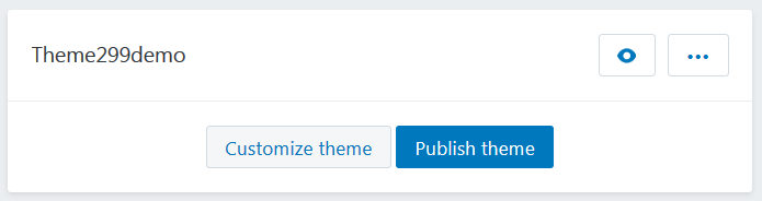
Перейдите к разделу Online Store > Themes.
Выберите тему, внешний вид которой хотите изменить.
При клике на кнопку Customize theme откроется страница редактора настроек, с помощью которого вы можете изменять внешний вид и содержимое шаблона.
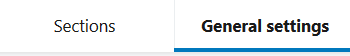
Перейдите во вкладку General settings.
Это Live editor: вы можете отслеживать изменения внешнего вида вашего магазина без перезагрузки страницы.
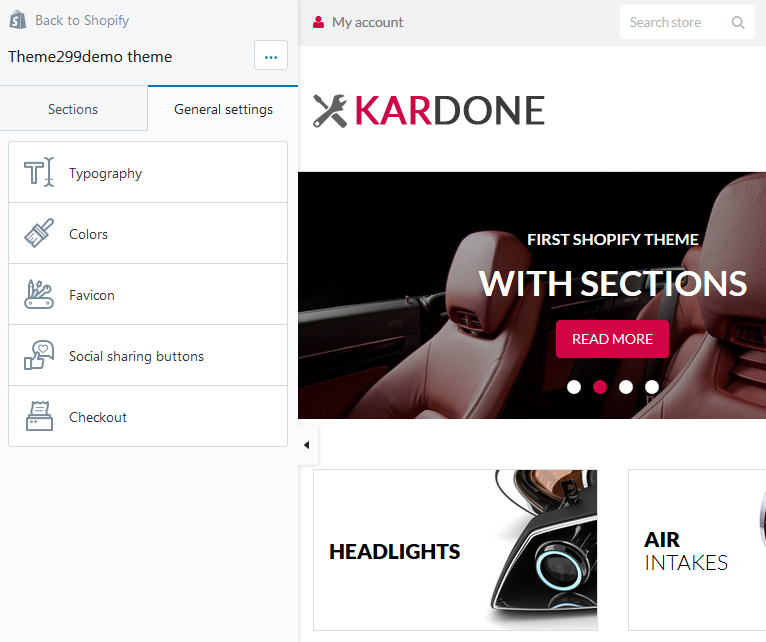
Здесь вы можете увидить следующие опции:
Typography
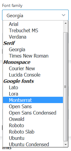
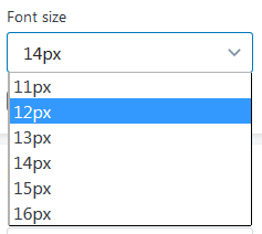
Вкладка настройки типографики шаблона. С помощью представленных опций вы можете выбрать нужный шрифт, а также его цвет и размер. Вы можете изменять:
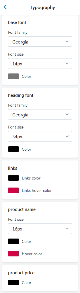
Основной шрифт страниц магазина (base font)
- Font family — выберите нужный шрифт из выпадающего списка опции;
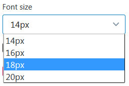
- Font size — задайте размер шрифта основного текста (от 14 до 16px);
- Color — задайте нужный цвет для основного шрифта. Вы можете выбрать цвет из цветовой палитры.
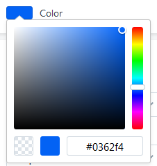 Используйте Hex Color Code, чтобы найти нужный цвет для основного текста сайта. Напр., #58d68d.

- Font Famile — Roboto Slab;
- Font Size — 14px;
- Color — #7777777.

- Font Famile — Ubuntu;
- Font Size — 16px;
- Color — #4b0404.
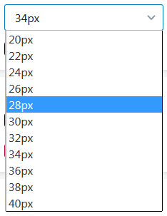
Стиль шрифта заголовков (heading font)
- Font family — выберите нужный шрифт из выпадающего списка опции;
- Font size — задайте размер шрифта основного текста (от 20 до 40px);
- Color — задайте нужный цвет заголовков на вашем сайте. Вы можете выбрать цвет из цветовой палитры;
Используйте Hex Color Code, чтобы найти нужный цвет для основного текста сайта. Напр., #58d68d.
- Font Famile — Arial;
- Font Size — 30px;
- Color — #000000.
- Font Famile — Ubuntu;
- Font Size — 20px;
- Color — #f70013.
Цвет текста ссылок (links)
- Links color — задайте нужный цвет для неактивных ссылок. Вы можете выбрать цвет из цветовой палитры;
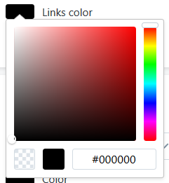
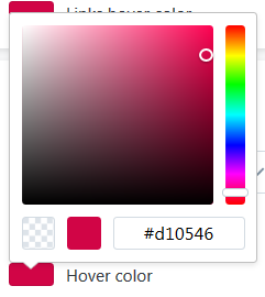
- Links hover color — выберите цвет ссылки при наведении (для активной ссылки).
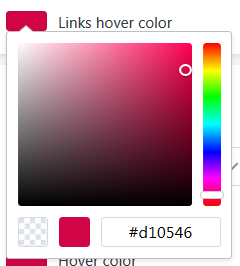

- Links color — #000000;
- Links hover color — #d10546;

- Links color — #000000;
- Links hover color — #706f70;
Стиль шрифта для заголовков (названий) продуктов (product name)
- Font size — задайте размер шрифта основного текста (от 14 до 20px);
-
Color — задайте нужный цвет заголовков (названий) продуктов на вашем сайте. Вы можете выбрать цвет из цветовой палитры;
- Hover color — choose the product name color when the mouse is moved over the name.
- Font Size — 18px;
- Color — #000000;
- Hover color — #d10546.
- Font Size — 20px;
- Color — #000000;
- Hover color — #d10546.
Product price
-
Color — задайте нужный цвет для цены продуктов на вашем сайте. Вы можете выбрать цвет из цветовой палитры;
Используйте Hex Color Code, чтобы найти нужный цвет для основного текста сайта. Напр., #58d68d.
- Color — #000000;
- Color — #ff0000;
Colours
В этом разделе вы можете настравать цвета шаблона. Вы можете выбрать цвет из цветовой палитры. Используйте Hex Color Code, чтобы найти нужный цвет. Напр., #58d68d.
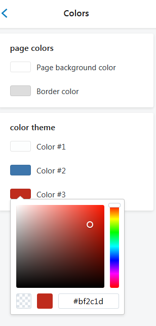
Секция имеет два подраздела: Page colors и Color theme.
Более подробно рассмотрим возможности настройки цветов сайта:
Опции подраздела Page colors помогают изменить фоновые цвета страницы и цвета границ блоков.
Опции подраздела Color theme служат для изменения цвета кнопок, некоторого текста и активных иконок (при наведении или нажатии). В этом подразделе вы можете настроить цвет ссылок, верхней панели, верхней части страницы (header), панели навигации и цвет нижней части страницы (footer).
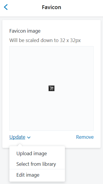
Настройка иконки сайта (Favicon)
С помощью этой опции вы сможете менять иконку вашего сайта (маленькая иконка, которая отображается на вкладке страницы вашего сайта в браузере). Для иконки используйте любое изображение формата .png (является наиболее подходящим форматом).
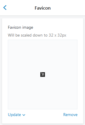
Изображение иконки будет сжато до размеров 32 x 32px.
У вас есть возможность загрузить изображение для иконки с вашего компьютера, либо выбрать изображение из библиотеки.
Редактируйте изображение. Для этого выберите Edit image из раскрывающегося списка опции Update.
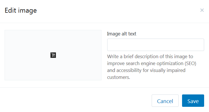
Напишите краткое описание изображения, что бы улучшить поисковую оптимизации (SEO) и повысить уровень доступности изображения для людей со сниженной остротой зрения.
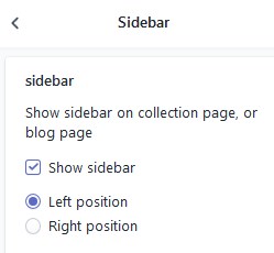
Sidebar
General settings
- Enable the Show sidebar option to display sidebar
- Choose the sidebar position.
- Remember to Save the settings.
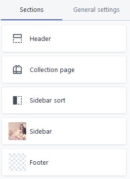
Sidebar widgets for the Collection and Blog page
Move to the Sections tab and click on the Sidebar tab.
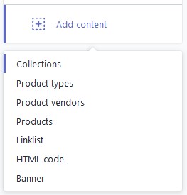
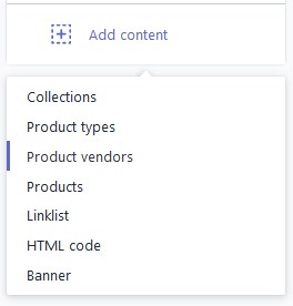
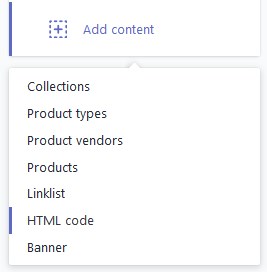
Content:
1. Collections section
2. Product types section
3. Product vendors section
3. Products section
4. Linklist section
5. Custom HTML section
6. Banner section
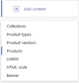
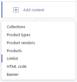
Add Collections section
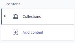
- To add the Collections section to the sidebar, press on the Add content and select Collections from the dropdown.
- The new tab will appear in the Content section.
- Click on the Collections tab to configure the section.
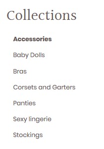
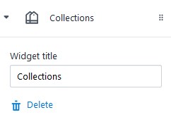
- Enter the title for the block. All in-store categories will be displayed in this section. You can add new Collections under the Products > Collections menu.
- You can delete the section as well. Click Delete in order to remove the section.
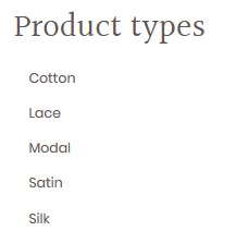
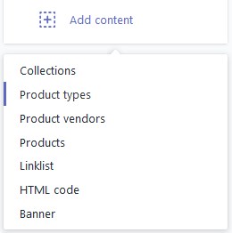
Product types section
- To add the Product types section to the sidebar, press on the Add content and select Product types from the dropdown.
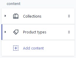
- The new tab will appear in the Content section.
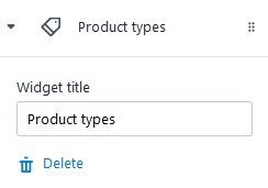
- Click on the Product types tab to configure the section.
- Enter the title for the block.
- Click Delete to remove the section.
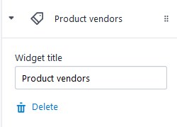
Product vendors section
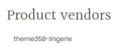
- To add the Product vendors section to the sidebar, press on the Add content and select Product vendors from the dropdown.
- The new tab will appear in the Content section.
- Click on the Product vendors tab to configure the section.
- Enter the title for the block.
- Click Delete to remove the section.
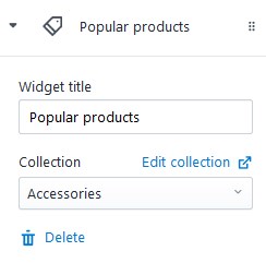
Products section
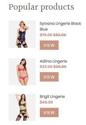
- To add the Product section to the sidebar, press on the Add content and select Products from the dropdown.
- The new tab will appear in the Content section.
- Click on the Products tab to configure the section.
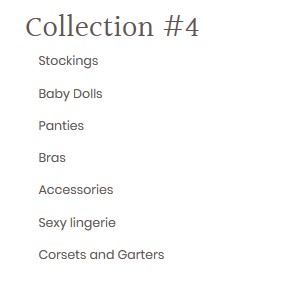
- Enter the title for the block and select the Collection.
- The last added 3 products from the selected collection will be shown in the Products section.
- Click Delete to remove the section.
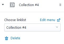
Linklist section
- To add the Linklist section to the sidebar, press on the Add content and select Linklist from the dropdown.
- The new tab will appear in the Content section.
- Click on the Linklist tab to configure the section.
- Choose the linklist to display. Add new linklist under the Online store > Navigation menu.
- Click Delete to remove the section.
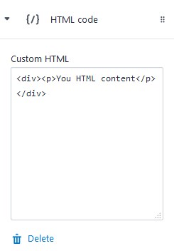
Custom HTML section
- To add the block with custom HTML to the sidebar, press on the Add content and select HTML code from the dropdown.
- The new tab will appear in the Content section.
- Click on the {/} HTML code tab to configure the section.
- Enter the code in the Custom HTML option field.
- Click Delete to remove the section.
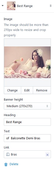
Add Banner section
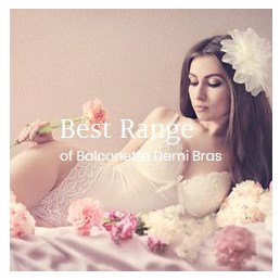
- To add the Banner to the sidebar, press on the Add content and select Banner from the dropdown.
- The new tab will appear in the Content section.
- Click on the Banner (Title) tab to configure the section.
- To chose the image for the banner, press the Select image button. To upload image, go to the Settings > Files menu and click Upload files button. Note, the image should be more than 270 px wide.
- Set the banner height (Small/Medium/Large).
- Specify the Heading for the banner and add some Text you want yo display on the banner.
- You also can attach the link to the banner.
- Click Delete to remove the section.
Настройка кнопок "Поделиться"
Отображайте на странице описания товара кнопки "Поделиться" самых известных социальных сетей, таких как Facebook, Twitter, Google+, Pinterest.
Отображайте/Скрывайте кнопки "Поделиться". Для этого, уберите галочки напротив той социальной сети, кнопку которой хотите скрыть.
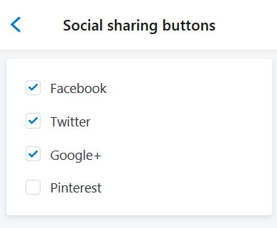
Результат:
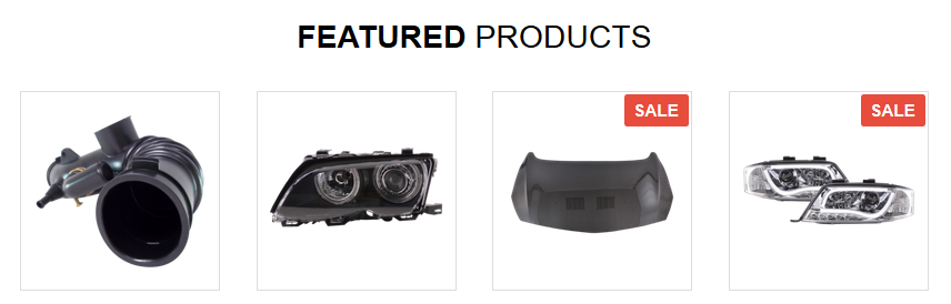
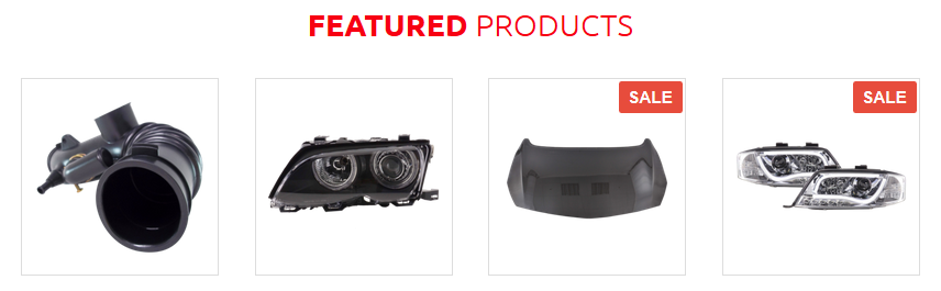
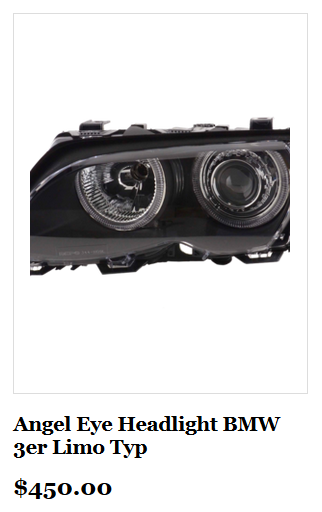
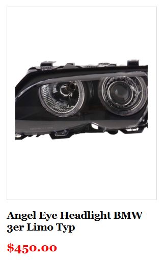
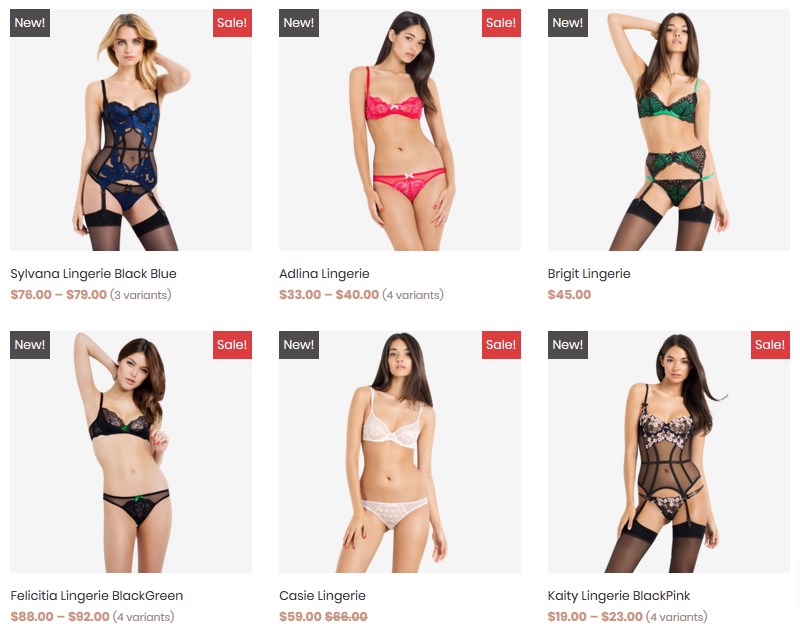
Products Badge
Add "New" and "Sale" badges to product images for the collection page.
Let's review the options available:
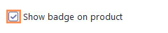
- To show the labels, you should first enable the Show badge on product option.
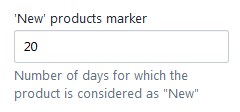
- 'New' products marker — enter the number of days the product is considered as "New" (the time period starts from the date the product was added).
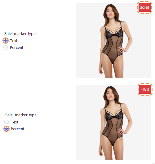
- 'Sale' marker type — set the "Sale" label type (Text or Percent). The "Sale" label appears automaticaly after the Compare at price is set under the Products > All products section, in case the Show badge on product option is activated.
Remember to Save the settings.
Newsletter Popup
Email newsletter has always been the important part of every marketing strategy. Displays the popup window with subscription form right after the client visits your site.
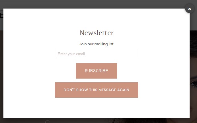
Let's review the options available:
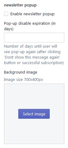
- To display the labels, you should first activate the Enable newsletter popup option.
- Pop-up disable expiration (in days) — set the number of days to show the pop-up again after the user clicks the 'Don't show this message again' button.
- Background image — download the background image for the newsletter. The image should not exceed 700x400px size.
Remember to Save the settings.
Страница оплаты (Checkout)
В этом разделе представлены настройки внешнего вида страницы оформления заказа. Вы можете настроить баннер, логотип, заголовок страницы, а также цвета кнопок.
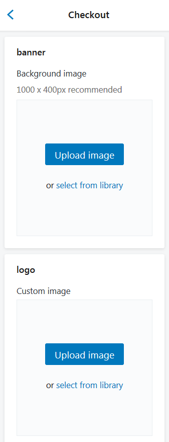
Более подробно рассмотрим параметры настройки страницы оплаты:
| Banner | - | задайте изображение для баннера. Рекомендованный размер изображения — 1000 x 400px. У вас есть возможность загрузить изображение для баннера с вашего компьютера, либо выбрать изображение из библиотеки. |
| Logo | - | выберите изображение для логотипа. У вас есть возможность загрузить изображение для логотипа с вашего компьютера, либо выбрать изображение из библиотеки. |
| Position (Logo position) | - | задайте наиболее подходящее расположение для логотипа (Left/Center/Right). |
| Logo size | - | выберите наиболее подходящий размер для логотипа (Small/Medium/Large). |
| Main content area: | ||
| Background image | - | задайте фоновое изображение. У вас есть возможность загрузить фоновое изображение с вашего компьютера, либо выбрать изображение из библиотеки. Изображение будет повторяться по горизонтали и по вертикале. |
| Background color | - | задайте цвет фона (в случае, если фоновое изображение не выбрано). |
| Form fields | - | сделайте поля форм белыми, либо прозрачными. |
| Order summary: | ||
| Background image | - | задайте фоновое изображение. У вас есть возможность загрузить фоновое изображение с вашего компьютера, либо выбрать изображение из библиотеки. Изображение будет повторяться по горизонтали и по вертикале. |
| Background color | - | задайте цвет фона (в случае, если фоновое изображение не выбрано). |
| Typography: | ||
| Headings | - | выберите нужный шрифт для заголовков из выпадающего списка опции. |
| Body | - | выберите нужный шрифт для основного текста страницы оплаты из выпадающего списка опции. |
| Colors: | ||
| Accents | - | выберите цвет для ссылок, подчеркиваний и боксов. Вы можете выбрать цвет из цветовой палитры. Используйте Hex Color Code, чтобы найти нужный цвет. Напр., #58d68d. |
| Buttons | - | выберите цвет для подарочной карты/скидки и для кнопки следующего шага. Вы можете выбрать цвет из цветовой палитры. Используйте Hex Color Code, чтобы найти нужный цвет. Напр., #58d68d. |
| Errors | - | выберите цвет для сообщений об ошибке и цвет, которым будут выделяться незаполненные поля. Вы можете выбрать цвет из цветовой палитры. Используйте Hex Color Code, чтобы найти нужный цвет. Напр., #58d68d. |
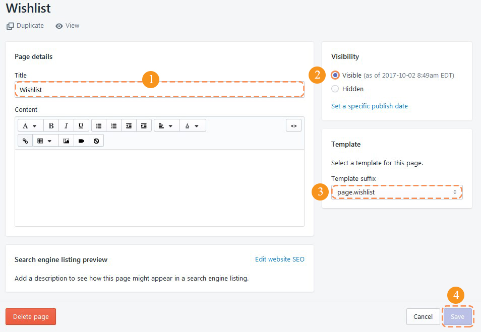
Wishlist
A wishlist is an eCommerce feature that allows shoppers to create personalized collections of products they want to buy.
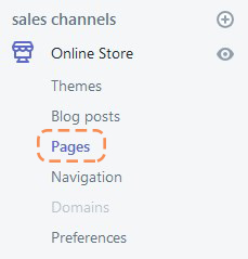
Create the new page
Login to you Shopify store Admin Panel and go to Online Store, then tap Pages.
Click the Add page button.
Enter the Title for the page (1). Note, the title is visiable on the frontend.
Set the page as Visible (2) and select the template for this page (3).
Save the page (4).
Let's review the options avaliable:
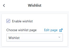
- Activate the Enable wishlist option to use the "Wishlist" functionality for your store.
- Then choose the the page for the wishlist.
Remember to Save the settings.
Settings for the Wishlist Page
- Product image size — set the products image size (Amall/Medium/Large)
- Product image alignment — choose the aligment type for the product images