Monstroid Theme Documentation
Cherry Options
Template has an advanced Theme Options panel that is loaded within Cherry Options. Cherry Framework 4 contains a vast number of theme configuration options. You can configure various aspects of your WordPress website behavior and appearance. We have the options organized into logical tabbed sections, and each option has a description of what it will do on the front end. There are too many options to go over in these docs, but please take some time and navigate through each tab to see what we offer. Go to Cherry > Options in your WordPress admin to access the theme options panel. See below for screenshots of our options panel. Cherry Options comprises several sections:
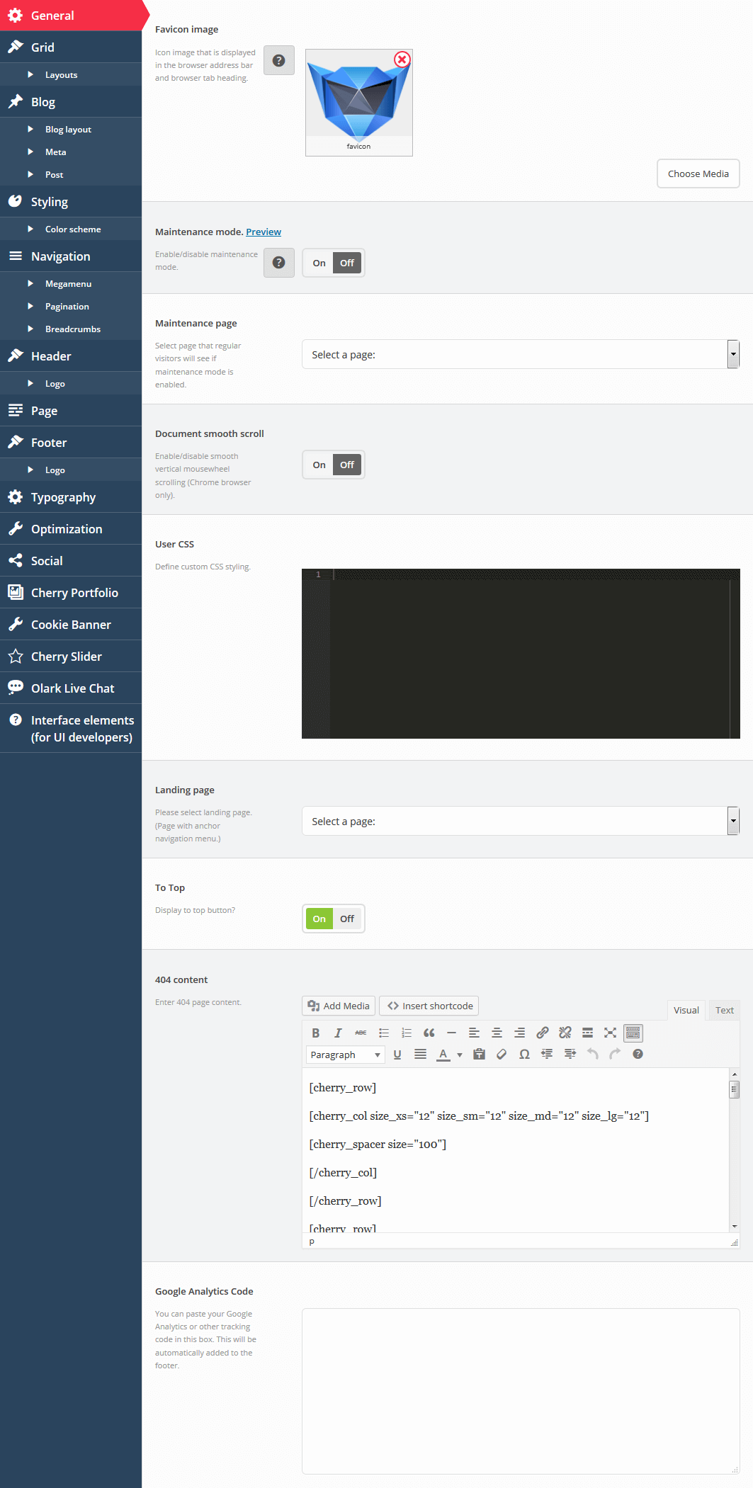
General
The General section contains global Cherry Framework configuration settings.
-
- Favicon image.
- Icon image that is displayed in the browser address bar and browser tab heading. Max icon (.ico) size is 32x32 px. You can also upload favicon for retina displays. Max retina icon size: 152x152 px.
-
- Maintenance mode
- Enable/disable maintenance mode. Logged in administrator gets full access to the site while regular visitors will be redirected to the page chosen below. You can also preview the maintenance page without enabling maintenance mode.
-
- Maintenance page
- Select a page that regular visitors will see if maintenance mode is enabled. You can select any WordPress page from here, including your custom ones.
-
- Document smooth scroll
- Enable/disable smooth vertical mousewheel scrolling (Chrome browser only).
-
- User CSS
- Define custom CSS styling.
-
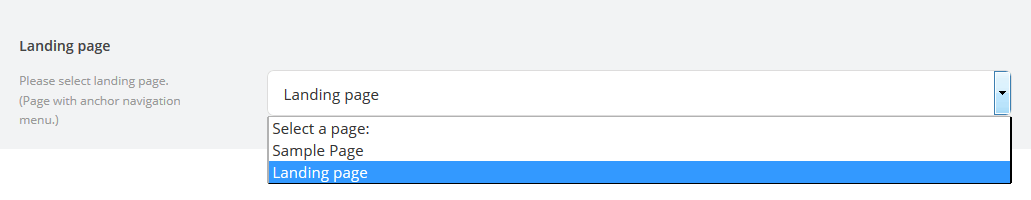
- Landing page
- Define the page in which will be use landing navigation.
-
- To Top
- Define - display or hide "To top" button.
-
- 404 content
- Visual editor for crating 404 page content.
-
- Google Analytics Code
- Text area for Google Analytics code. For more information, how to add Google Analytics code, please visit our video tutorial
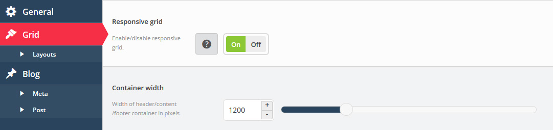
Grid
This section contains global layout configuration settings.
-
- Responsive grid
- Enable/disable responsive grid. If for any reason you want to disable the responsive layout for your site, you are able to turn it off here.
-
- Container width
- Width of the main website container in pixels.
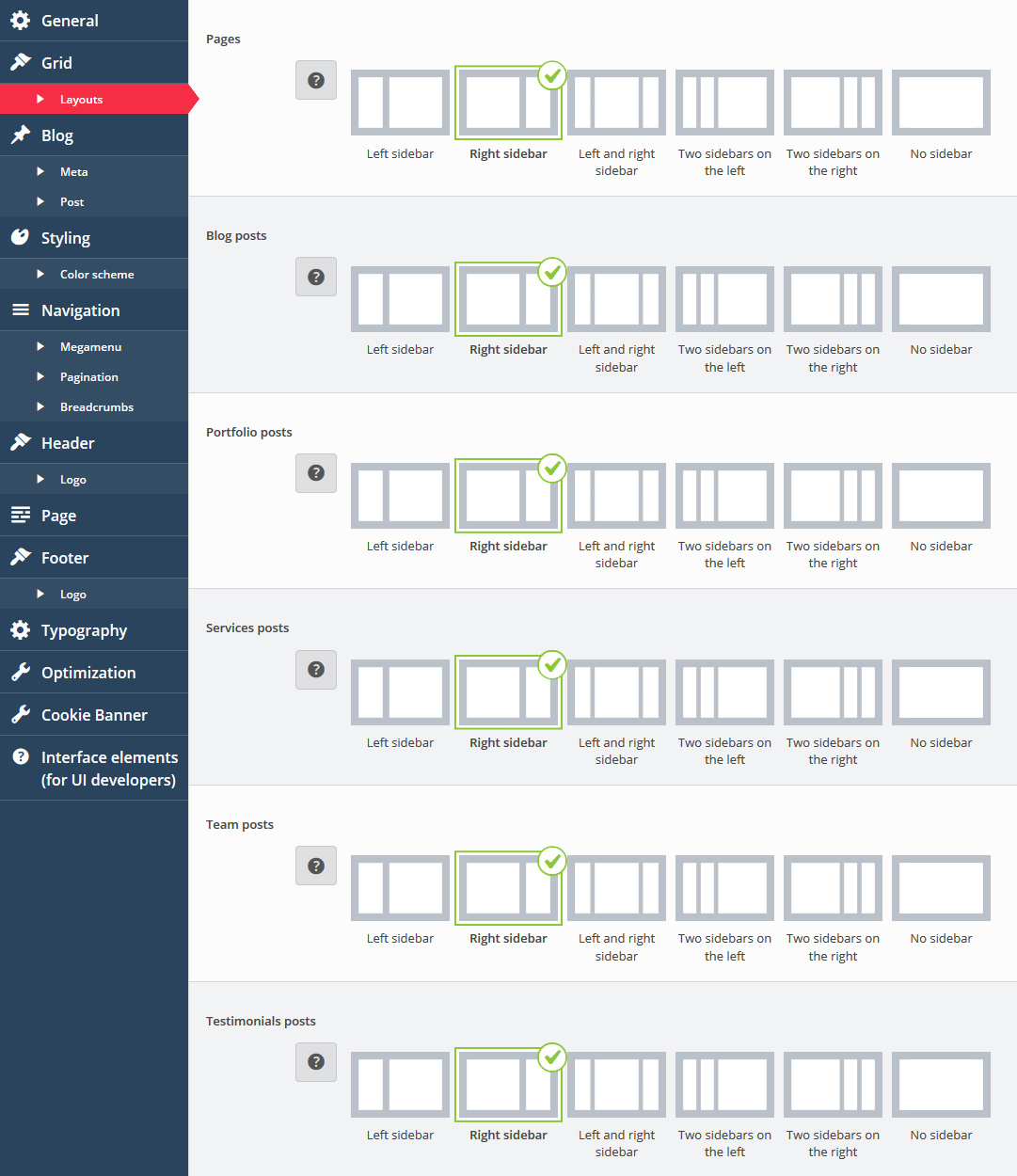
Layouts
-
- Pages
- Choose the way you want to display the pages.
-
- Blog posts
- Choose the way you want to display the blog posts.
Blog
The section contains settings for WordPress blog pages (listing and single post types).
-
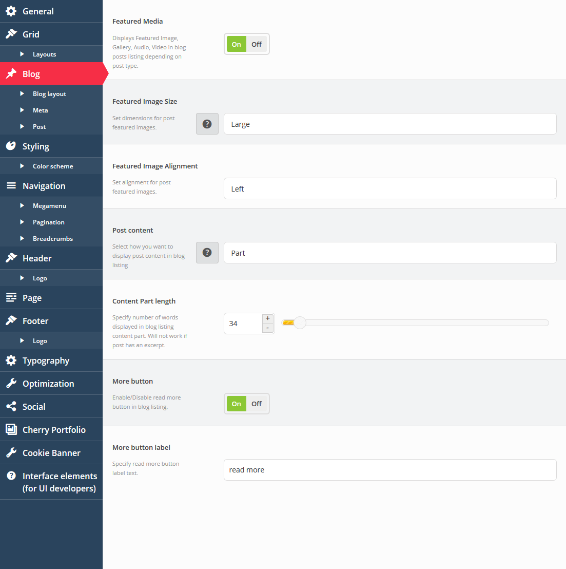
- Featured Media
- Displays Featured Image, Gallery, Audio, Video in blog posts listing depending on post type.
-
- Featured Image Size
- Set dimensions for post featured images.
-
- Featured Image Alignment
- Set alignment for post featured images.
-
- Post content
- Select how you want to display post content in blog listing
-
- Content Part length
- Specify the number of words displayed in blog listing content part. Will not work if post has an excerpt.
-
- More button
- Enable/Disable read more button in blog listing.
-
- More button label
- Specify read the "More" button label text.
-
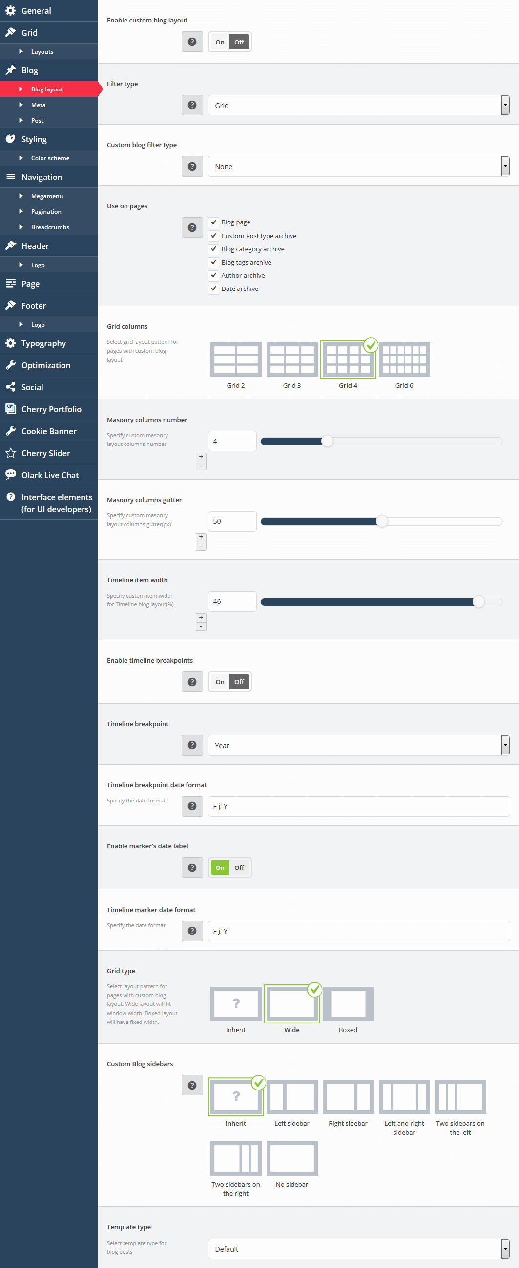
- Enable custom blog layout
- Enable/disable custom blog layout.
-
- Filter type
- Select if you want to filter posts by tag or by category.
-
- Custom blog filter type
- Select blog filter type.
-
- Use on pages
- Please specify pages that will use custom blog layout.
-
- Grid columns
- Select grid layout pattern for pages with custom blog layout.
-
- Masonry columns number
- Specify custom masonry layout columns number.
-
- Masonry columns gutter
- Specify custom masonry layout columns gutter(px).
-
- Timeline item width
- Specify custom item width for Timeline blog layout(%).
-
- Enable timeline breakpoints
- Enable/disable timeline breakpoints.
-
- Timeline breakpoint
- Select timeline breakpoint type.
-
- Timeline breakpoint date format
- Specify the date format.
-
- Enable marker's date label
- Enable/disable marker's date label.
-
- Timeline marker date format
- Specify the date format.
-
- Grid type
- Select layout pattern for pages with custom blog layout. Wide layout will fit window width. Boxed layout will have fixed width.
-
- Custom Blog sidebars
- You can choose if you want to display sidebars and how you want to display them. The latest Monstroid update allows you to switch between 1/3 and 1/4 layout types.
-
- Template type
- Select template type for blog posts.
-
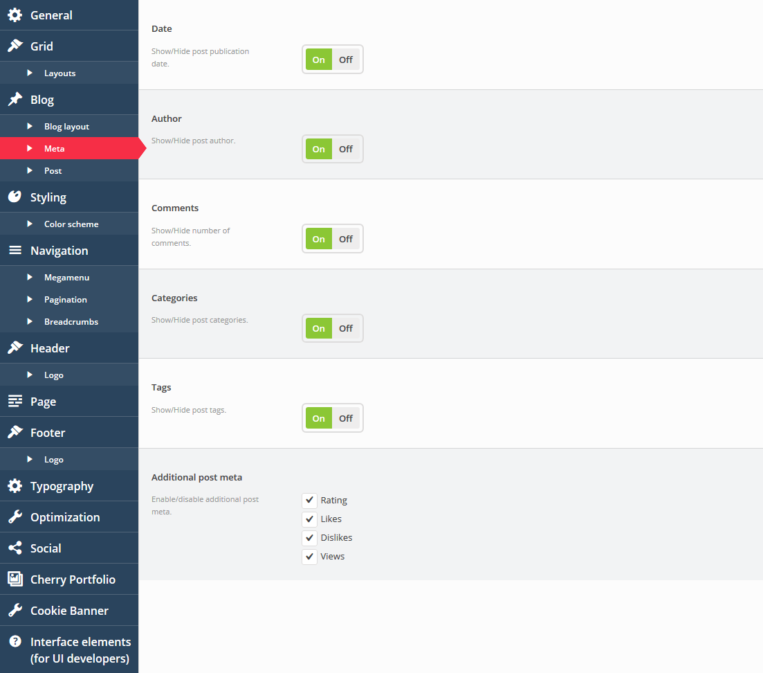
- Date
- Show/Hide post publication date.
-
- Author
- Show/Hide post author.
-
- Comments
- Show/Hide number of comments.
-
- Categories
- Show/Hide post categories.
-
- Tags
- Show/Hide post tags.
-
- Additional post meta
- Enable/disable additional post meta.
-
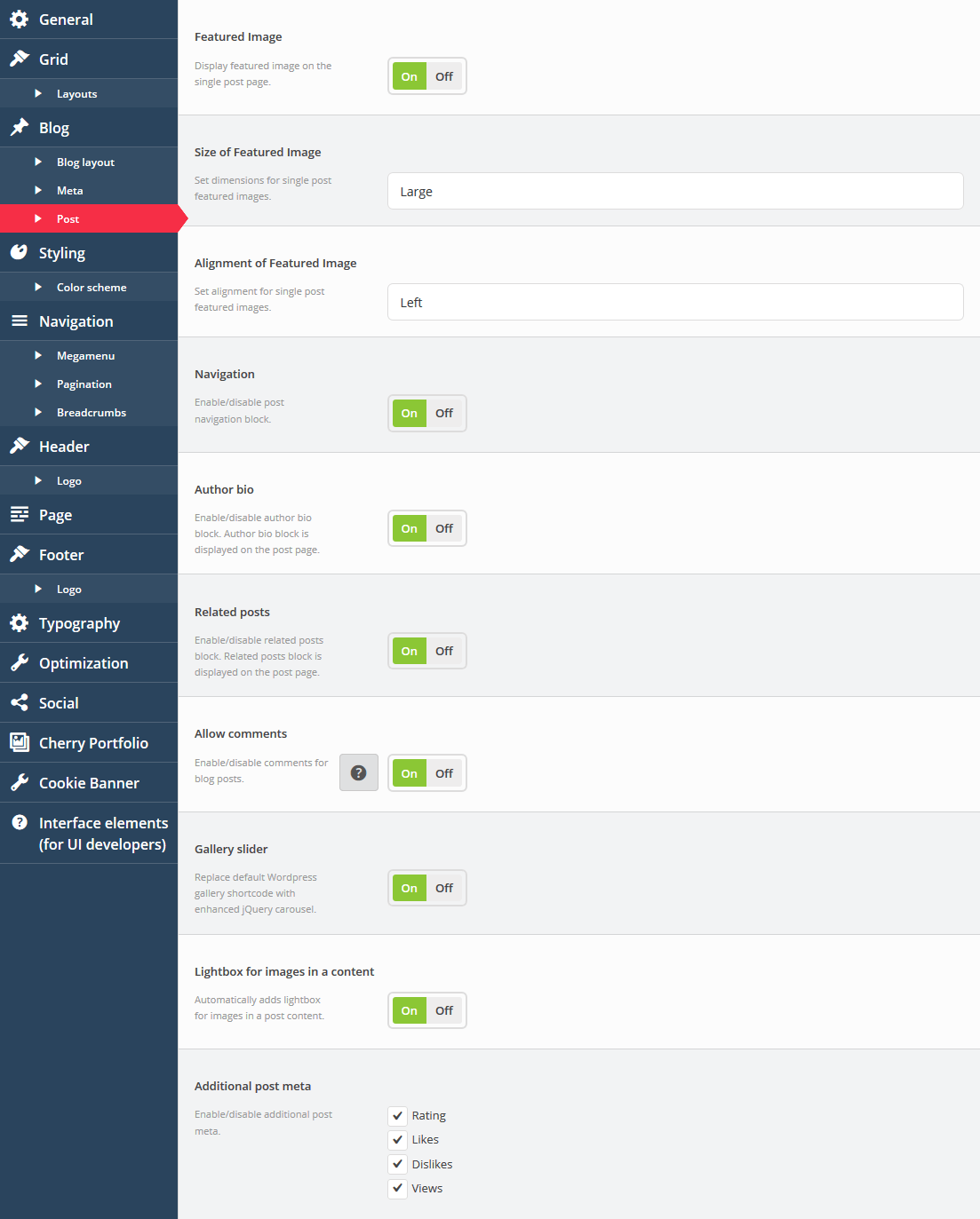
- Featured Image
- Display featured image on the single post page.
-
- Size of Featured Image
- Set dimensions for single post featured images.
-
- Alignment of Featured Image
- Set alignment for single post featured images.
-
- Navigation
- Enable/disable post navigation block.
-
- Author bio
- Enable/disable author bio block. Author bio block is displayed on the post page.
-
- Related posts
- Enable/disable related posts block. Related posts block is displayed on the post page.
-
- Allow comments
- Enable/disable comments for blog posts.
-
- Gallery slider
- Replace default Wordpress gallery shortcode with enhanced jQuery carousel.
-
- Lightbox for images in a content
- Automatically adds lightbox for images in a post content.
-
- Additional post meta
- Enable/disable additional post meta.
Blog > Layout
Blog > Meta
Blog > Post
Styling
The section contains theme styling settings. Here you can edit the main theme colors.
-
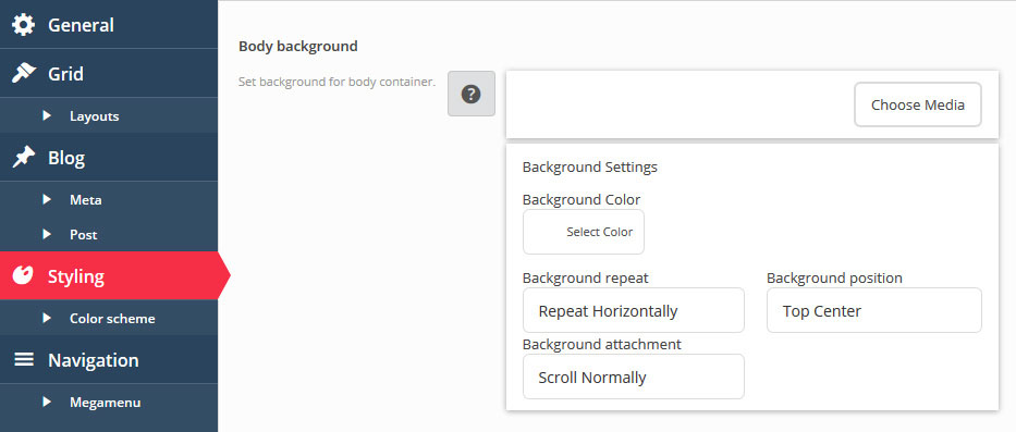
- Body background
- Set the background for body container. You can specify the background image or color, set background repeat, position and attachment.
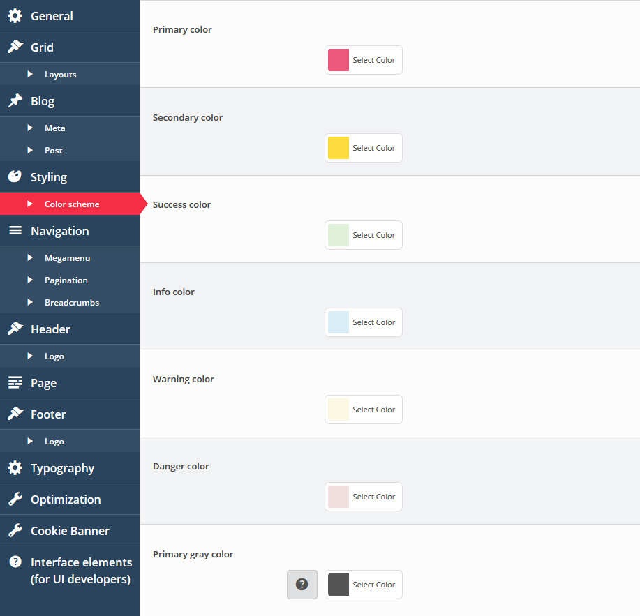
Color schemes
Changes colors for various theme elements like forms, typography elements, blocks with default styling, etc.
Primary color
Secondary color
Success color
Info color
Warning color
Danger color
-
Primary gray color. Select the main gray color hue. Additional colors will be created automatically:
- gray-darker: darken(20%)
- gray-dark: darken(15%)
- gray-light: lighten(15%)
- gray-lighter: lighten(20%).
Navigation
Define the website navigation settings. Menus typography and colors, pagination and breadcrumbs settings.
-
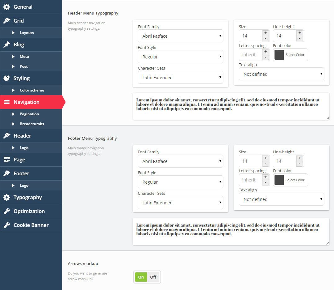
- Header Menu Typography
- The main header navigation typography settings. You can configure menu font and color.
-
- Footer Menu Typography
- The main footer navigation typography settings. You can configure menu font and color.
-
- Arrows markup
- Do you want to generate arrow mark-up?
Pagination
-
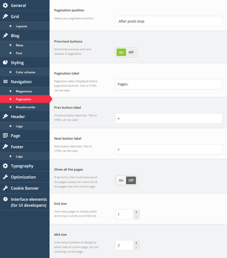
- Pagination position
- Select where you want to display pagination.
-
- Prev/next buttons
- Show/hide previous and next buttons in pagination.
-
- Pagination label
- Pagination label is displayed before pagination buttons. Text or HTML can be used.
-
- Prev button label
- Previous button label text. Text or HTML can be used.
-
- Next button label
- Next button label text. Text or HTML can be used.
-
- Show all the pages
- If set to On, it will show all of the pages instead of a short list of pages near the current page.
-
- End size
- How many pages to display on either the start or the end list edges.
-
- Mid size
- How many pages to display to either side of the current page, but not including the current page.
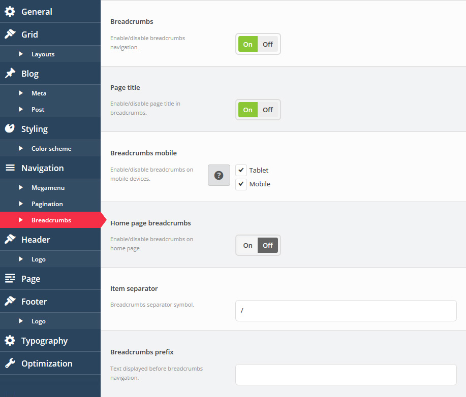
Breadcrumbs
-
- Breadcrumbs
- Enable/disable breadcrumbs navigation.
-
- Page title
- Enable/disable page title in breadcrumbs.
-
- Breadcrumbs mobile
- Enable/disable breadcrumbs on mobile devices.
-
- Home page breadcrumbs
- Enable/disable breadcrumbs on the home page.
-
- Item separator
- The breadcrumbs separator symbol.
-
- Breadcrumbs prefix
- Text displayed before the breadcrumbs navigation.
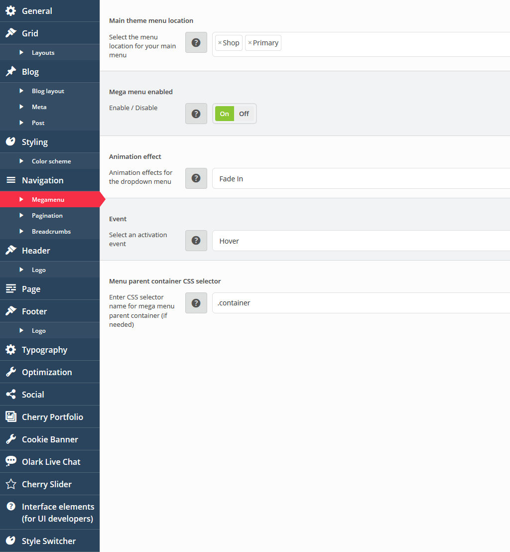
Megamenu
The section contains settings for Megamenu plugin.
-
- Main theme menu location
- Define the menu location for your main navigation.
-
- Mega menu enabled
- Display / Hide megamenu.
-
- Animation effect
- Define animation effects for the dropdown menu.
-
- Event
- Define an activation event for megamenu.
-
- Navigation parent container CSS selector
- Define the CSS selector for mega menu parent container (if needed). By default - ".container"
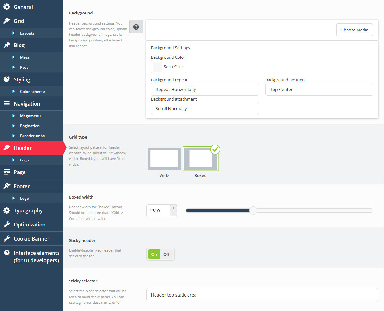
Header
Settings for the website header section. Logo, background, sticky header, etc.
-
- Header background
- Header background settings. You can select the background color, upload the header background image, set the background position, attachment and repeat.
-
- Grid type
- Select the layout pattern for the website header. Wide layout will fit the window width. Boxed layout will have fixed width.
-
- Boxed width
- Header section width if boxed layout is active, should not be more than the Grid -> Container width value.
-
- Sticky header
- Enable\disable fixed stick-to-top header.
-
- Sticky selector
- Select the block selector that will be used to build a sticky panel. You can use tag name, class name or id.
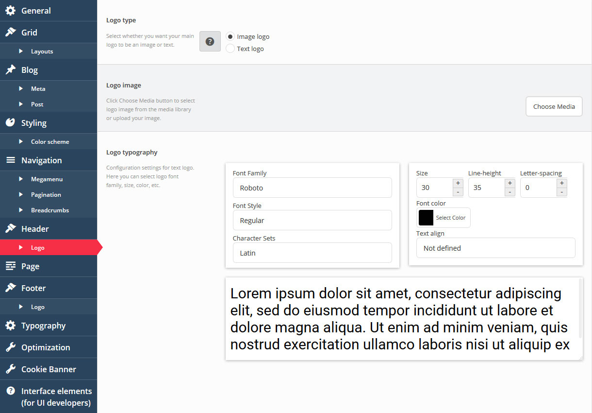
Header Logo
-
- Logo type
- Select whether you want your main logo to be an image or text. If you select "image", you can choose a logo image from the media library in the next option, and if you select "text", your WordPress Site Title will be shown instead.
-
- Image
- Click the Choose Media button to select the logo image from the media library or upload your image.
-
- Logo typography
- Configuration settings for text logo. Here you can select the logo font family, size, color, etc.
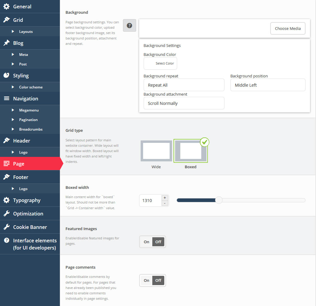
Page
General page options section.
-
- Background
- Page background settings. You can select the background color, upload page background image, set the background position, attachment and repeat.
-
- Grid type
- Select the layout pattern for the main website container. Wide layout will fit the window width. Boxed layout will have fixed width and left/right indents.
-
- Boxed width
- Header section width if boxed layout is active, should not be more than the Grid -> Container width value.
-
- Featured Images
- Enable/disable featured images for pages.
-
- Page comments
- Enable/disable comments by default for pages. For pages that have already been published, you need to enable comments individually in page settings.
Footer
Settings for the website footer section.
-
- Footer background
- Footer background settings. You can select the background color, upload footer background image, set the background position, attachment and repeat.
-
- Typography
- Typography settings for footer texts.
-
- Grid type
- Select the layout pattern for website footer. Wide layout will fit the window width. Boxed layout will have fixed width.
-
- Boxed width
- Header section width if boxed layout is active, should not be more than the Grid -> Container width value.
-
- Footer Info text
- Set custom text for your Footer area.
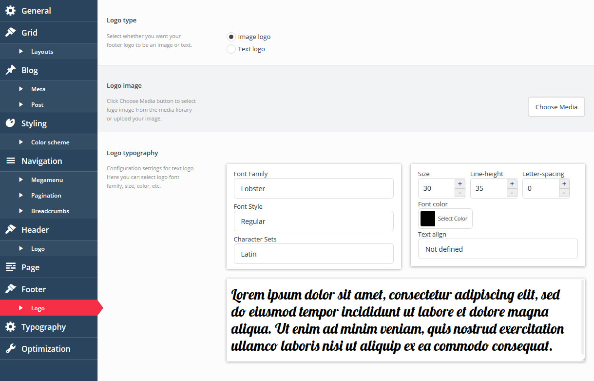
Footer Logo
-
- Logo type
- Select whether you want your main logo to be an image or text. If you select "image", you can choose a logo image from the media library in the next option, and if you select "text", your WordPress Site Title will be shown instead.
-
- Image
- Click the "Choose Media button" to select the logo image from the media library or upload your image.
-
- Logo typography
- Configuration settings for text logo. Here you can select the logo, font family, size, color, etc.
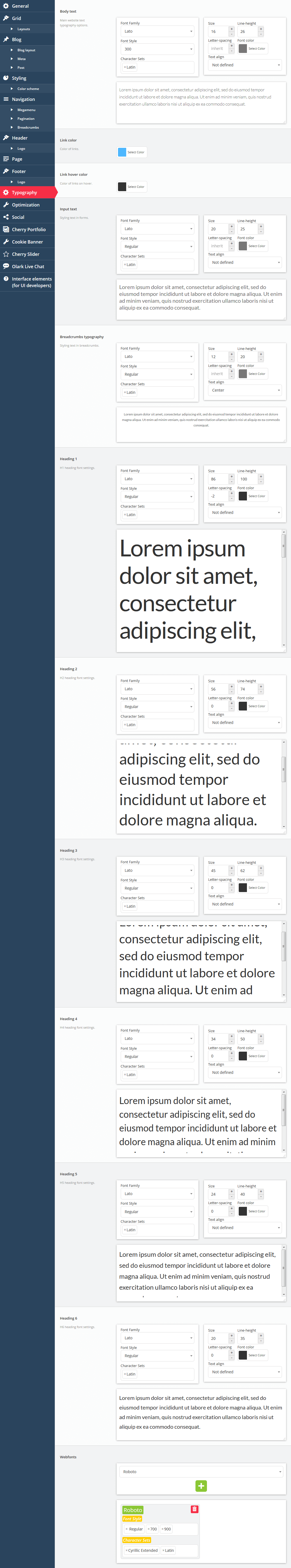
Typography
Theme typography settings. You can configure all aspects of website typography, fonts, colors, etc.
-
- Body text
- Main website text typography options.
-
- Link typography
- Typography for links.
-
- Link hover color
- Color for links on hover.
-
- Input text
- Styling of the text in forms.
-
- Breadcrumbs typography
- Styling of the text in breadcrumbs.
-
- Heading 1
- H1 heading font settings.
-
- Heading 2
- H2 heading font settings.
-
- Heading 3
- H3 heading font settings.
-
- Heading 4
- H4 heading font settings.
-
- Heading 5
- H5 heading font settings.
-
- Heading 6
- H6 heading font settings.
-
- Webfonts
- Define custom Font style and Character Sets for selected web font.
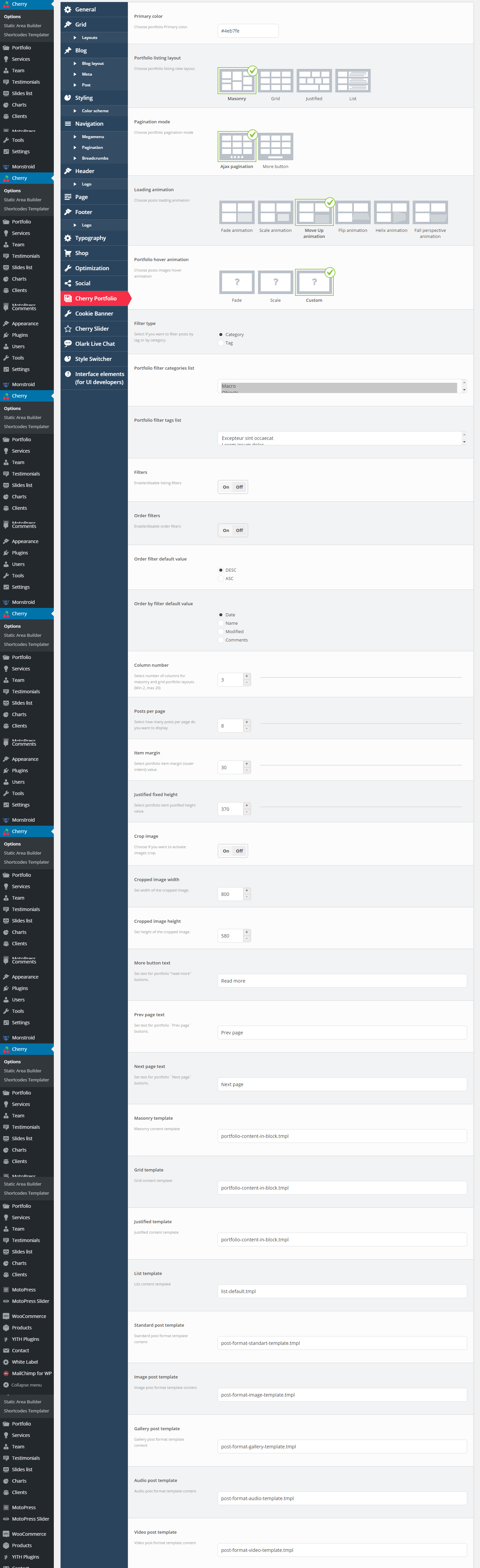
Portfolio
The section contains settings for WordPress blog pages (listing and single post types).
-
- Primary color
- Allows to change background color for portfolio elements view.
-
- Portfolio listing layout
- Defines the portfolio listing layout.
-
- Pagination mode
- Defines the type of the pagination for portfolio listing.
-
- Loading animation
- Defines the animation type that is used for loading portfolio posts.
-
- Portfolio hover animation
- Defines the animation type that appears when hovering portfolio post.
-
- Filter type
- Defines the type of portfolio posts filter.
-
- Filters
- Enable / Disable listing filtering.
-
- Order filters
- Enable / Disable listing ordering.
-
- Order filter default value
- Specify the order filter value
-
- Order by filter default value
- Choose the order criteria
-
- Column number
- Defines the number of columns in post listing for masonry and grid view.
-
- Posts per page
- Defines the number of posts at the listing page.
-
- Item margin
- Defines margin values for listing elements.
-
- Justified fixed height
- In case you select justified list view, this options allows you to define the height of the elements.
-
- Crop image
- Enable / Disable image cropping.
-
- Cropped image width
- Defines cropped image width.
-
- Cropped image height
- Defines cropped image height.
-
- Prev page text
- Set text for portfolio `Prev page` buttons.
-
- Next page text
- Set text for portfolio `Next page` buttons.
-
- More button text
- Defines “More” button text.
-
- Masonry template
- Defines template that allows to display posts in Masonry layout.
-
- Grid template
- Defines template that allows to display posts in Grid layout.
-
- Justified template
- Defines template that allows to display posts in Justified layout.
-
- List template
- Defines default listing view template.
-
- Standard post template
- Defines template that allows to display post content in Standard format.
-
- Image post template
- Defines template that allows to display post content in Image format.
-
- Gallery post template
- Defines template that allows to display post content in Gallery format.
-
- Audio post template
- Defines template that allows to display post content in Audio format.
-
- Video post template
- Defines template that allows to display post content in Video format.
For more details, about shortcode templates, please, check the following article.
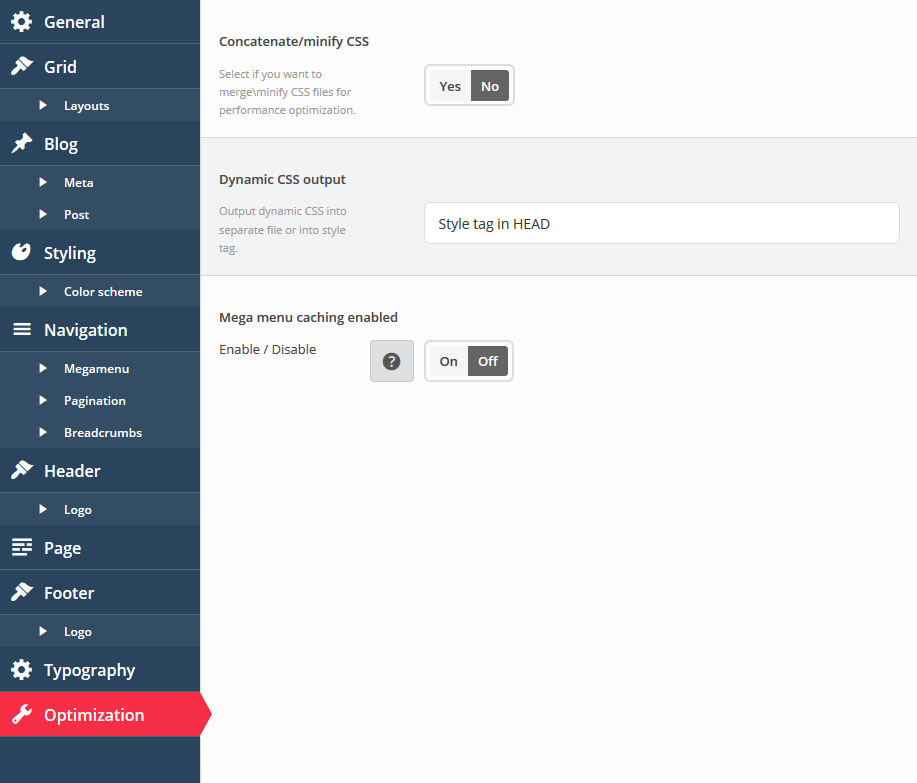
Optimization
-
- Concatenate/minify CSS
- Select if you want to merge or minify CSS files for performance optimization.
-
- Dynamic CSS output
- Output dynamic CSS into a separate file or into style tag.
-
- Mega menu caching enabled
- Enable / Disable caching of mega menu navigation.
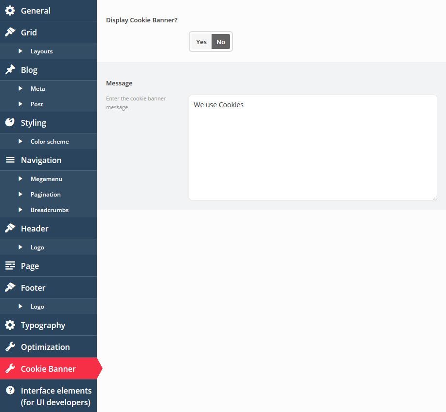
Cookie Banner
-
- Display Cookie Banner?
- Specify if you want to display cookie banner.
-
- Message
- Enter the cookie banner message.
Landing Page
In case you need to create a landing page for your website, please do the following:
- Create new page
-
Adding landing page content use anchor parameter in row shortcode to create navigation anchors
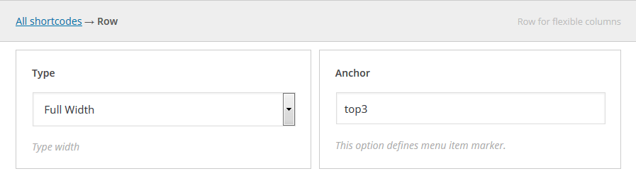
- When you are done adding page content, go to Cherry Options
-
In General section find Lading Page option. Select your recently created page to serve as landing page
- Save Cherry Options to apply changes
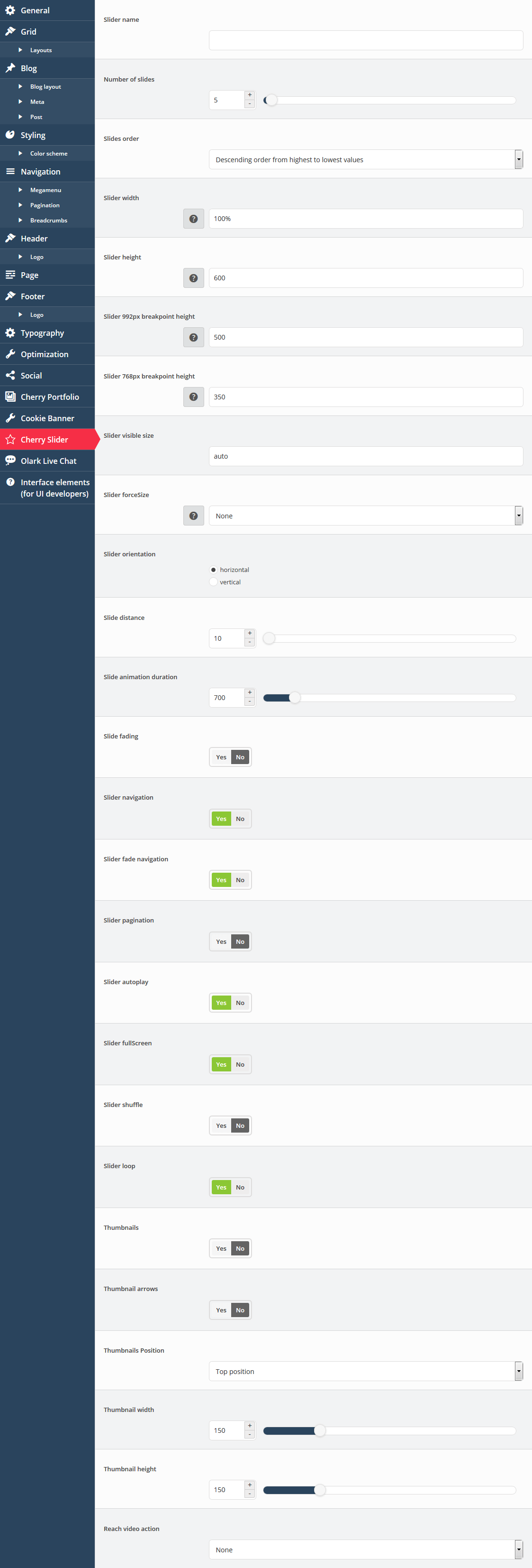
Simple slider
The section contains options for displaying and settings slider on site
-
- Slider name
- Define slider name
-
- Number of slides
- Define total number of slides
-
- Slides order
-
Define order type of slide, it takes two parameters:
- Descending order from highest to lowest values
- Ascending order from lowest to highest values
-
- Slider width
- Define the width of the slider
-
- Slider height
- Define the height of the slider
-
- Slider 992px breakpoint height
- Define specific breakpoints which allow changing the look and behavior of the slider when the page resizes to 992px.
-
- Slider 768px breakpoint height
- Define specific breakpoints which allow changing the look and behavior of the slider when the page resizes to 768px.
-
- Slider visible size
- Define the size of the visible area, allowing more slides to become visible near the selected slide.
-
- Slider force Size
- Indicates if the size of the slider will be forced to full width or full window.
-
- Slider orientation
- Indicates whether the slides will be arranged horizontally or vertically.
-
- Slide distance
- Defines the distance between the slides.
-
- Slide animation duration
- Defines the duration of the slide animation.
-
- Slide fading
- Enable / Disable - indicates if fade effect will be used.
-
- Slider navigation
- Enable / Disable slider navigation. You also can change name of the navigation buttons.
-
- Slider fade navigation
- Indicates whether the arrows will fade in only on hover.
-
- Slider pagination
- Enable / Disable slider pagination.
-
- Slider autoplay
- Enable / Disable slider autoplay.
-
- Slider full Screen
- Indicates whether the full-screen button is enabled.
-
- Slider shuffle
- Indicates if the slides will be shuffled.
-
- Slider loop
- Enable / Disable slider loop.
-
- Thumbnails
- Enable / Disable slider thumbnails.
-
- Thumbnail arrows
- Enable / Disable slider thumbnails arrows.
-
- Thumbnails Position
- Define the position of the thumbnail scroller.
-
- Thumbnail width
- Define the thumbnail width
-
- Thumbnail height
- Define the thumbnail height
-
- Reach video action
- Define the action that the video will perform when its slide container is selected.
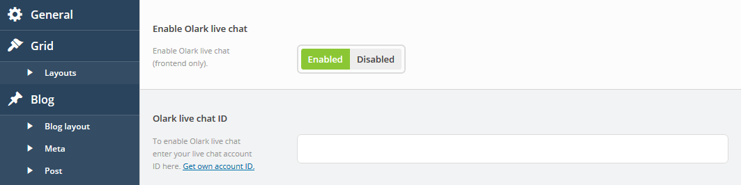
Olark live chat
The section contains options for setting external Olark live chat plugin.
-
- Enable Olark live chat
- Enable Olark live chat (frontend only).
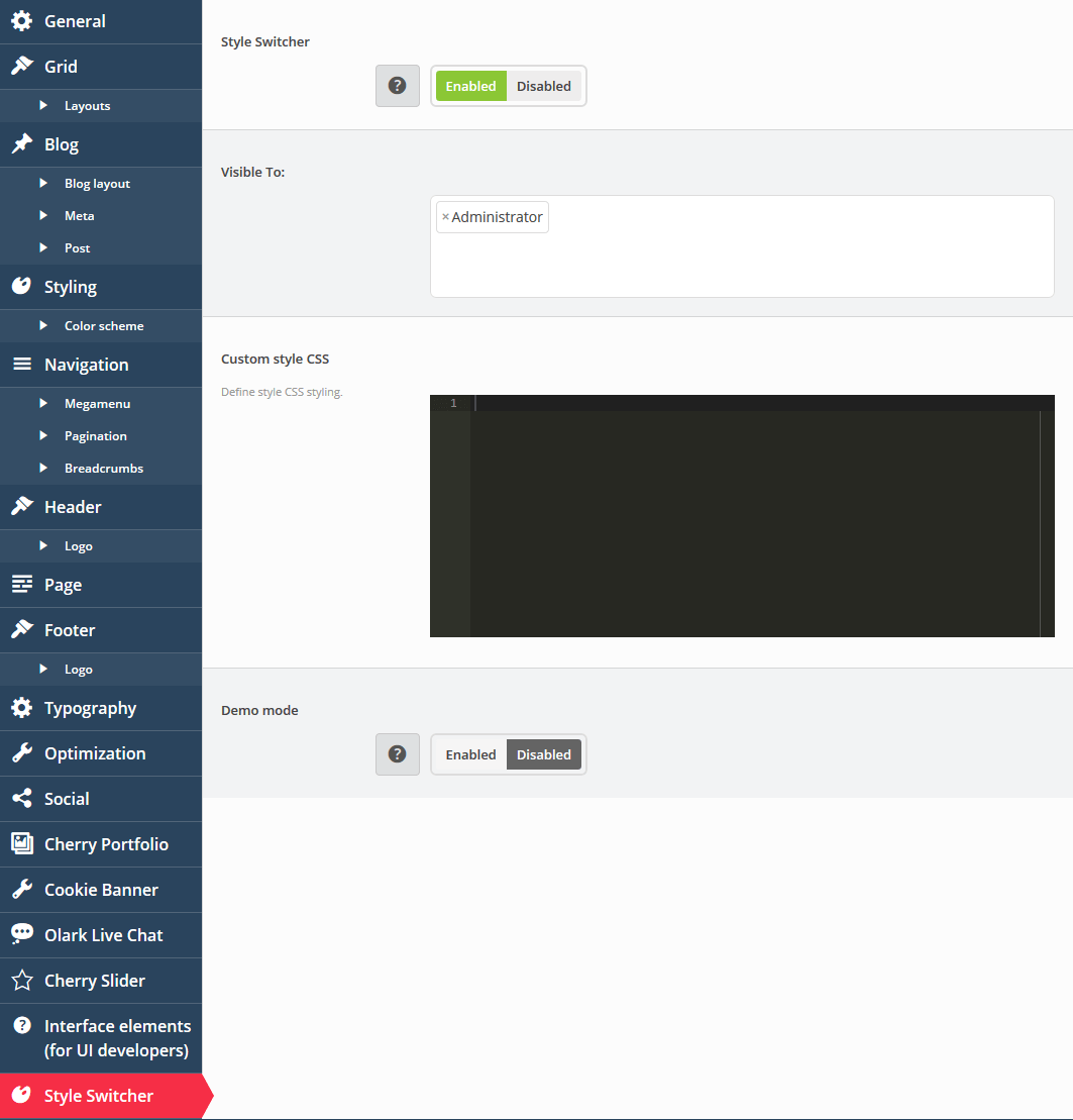
Style switcher
The section contains options for customizing the appearance of your site.
-
- Style Switcher
- Enable / Disable displaying of setting sidebar, on a public version of site
-
- Visible To:
- Define user group access, for using setting sidebar on a public version of site
-
- Custom style CSS
- Visual editor for custom css styles
-
- Demo mode
- Enable / Disable demo mode for unregistered users