


- Web templates
- E-commerce Templates
- CMS & Blog Templates
- Facebook Templates
- Website Builders
FAQs
General Tutorials
MonsterONE Subscrioption


WordPess. How to hide menu items in mobile menu but keep them on desktop layout
This tutorial shows how to hide menu items in mobile menu but keep them on desktop layout in WordPress.
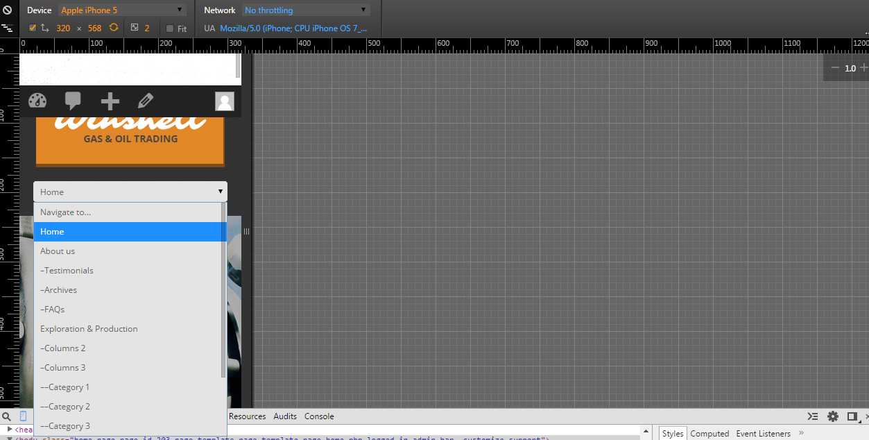
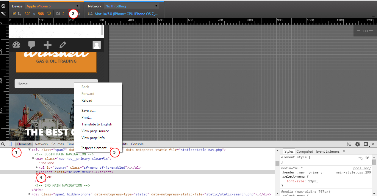
We have enabled emulation of mobile devices in built-in inspector of Chrome browser. Press F12 in order to open the inspector. Inspect mobile menu. Expand section with menu:
You can see the list of menus. Let’s hide About us menu item in mobile menu using CSS only. About us menu appears third in the list. Basically, you should specify this number in CSS selector:
Go to Appearance -> Editor. Add the following CSS code and save changes:
.select-menu option:nth-child(3) {
	display: none !important;
	visibility: hidden !important;
}
In this code 3 is a number of element in the list. You should replace it with appropriate number. In order to hide several menus, you should add the same code and change number in option:nth-child(3) section:

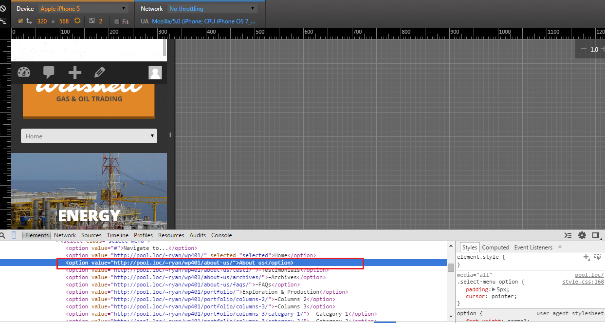
Clear browser cache, cookies and check your site. You can see that About us menu item is hidden. Screenshot shows te code that hides about us menu:
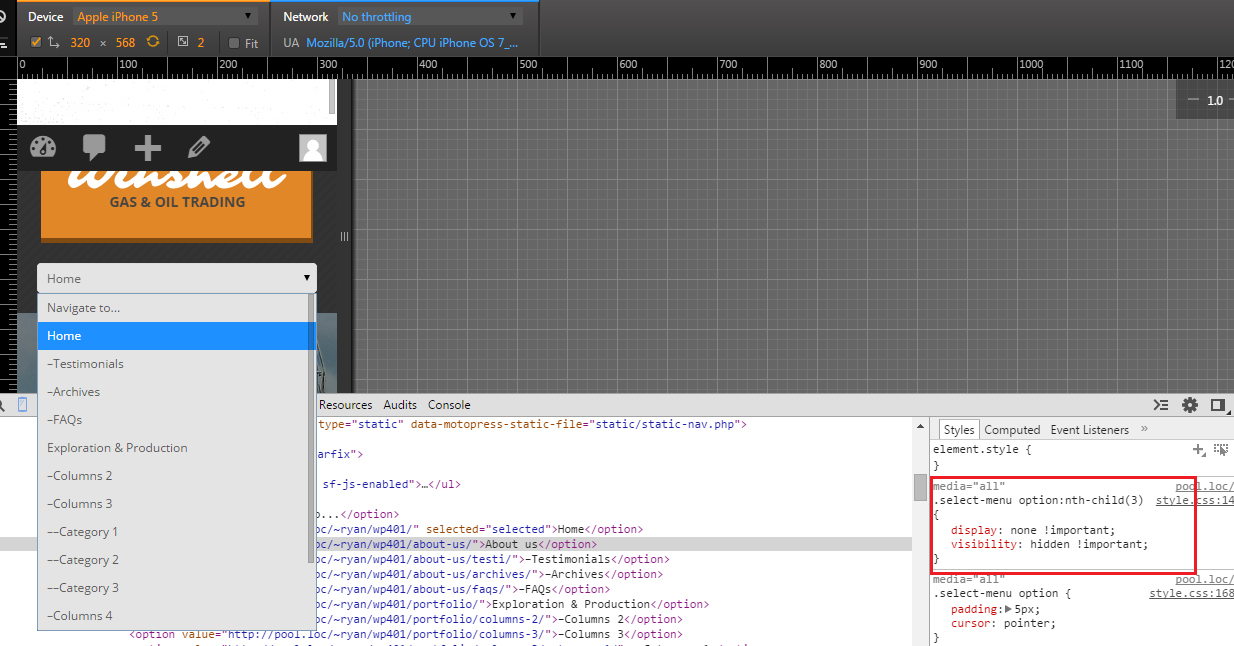
You can see that menu About us still appears on Desktop layout:

Feel free to check the detailed video tutorial below:
WordPess. How to hide menu items in mobile menu but keep them on desktop layout
