


- Web templates
- E-commerce Templates
- CMS & Blog Templates
- Facebook Templates
- Website Builders
FAQs
General Tutorials
Featured templates
MonsterONE Subscrioption


Our support team is glad to present our new guide on working with WordPress grid (column) shortcodes that shows how to create the required page content layout.
WordPress. How to use grid (columns) shortcodes
.jpg)
Go to Pages -> All pages section in your WordPress dashboard.
Click on Shortcodes button once you are in Visual editing mode. Choose Columns -> row option there. It will insert code like [row][/row] to the page text:
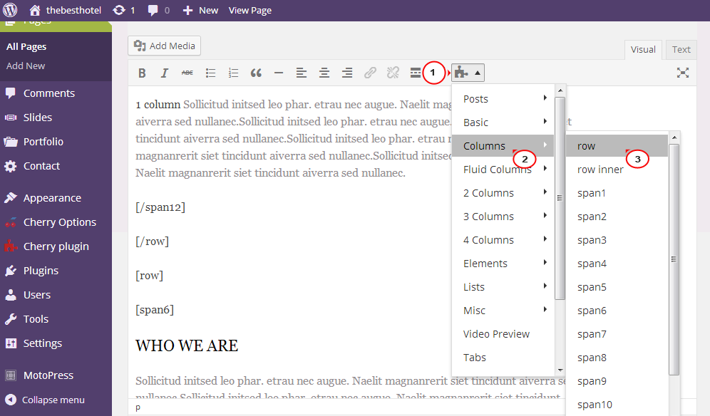
Repeat the same procedure to insert [spanX] element to the page between [row][/row] code. As a result, you should receive the structure like the following:
[row][spanX][/spanX][/row], where X is a number from 1 to 12.
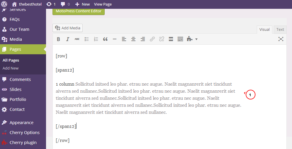
Insert your content between [spanX][/spanX] elements like the following:
[row][spanX] content goes here… [/spanX][/row]
Let’s check how to set the desired number of columns to the page content:
1 column is used for making part of content appear fullwidth. Code looks like the following:
[row][span12] content goes here… [/span12][/row]
2 equal columns can be created on your page/post using Shortcodes -> Columns -> 2 Columns -> 1/2 | 1/2 in Visual editing mode:
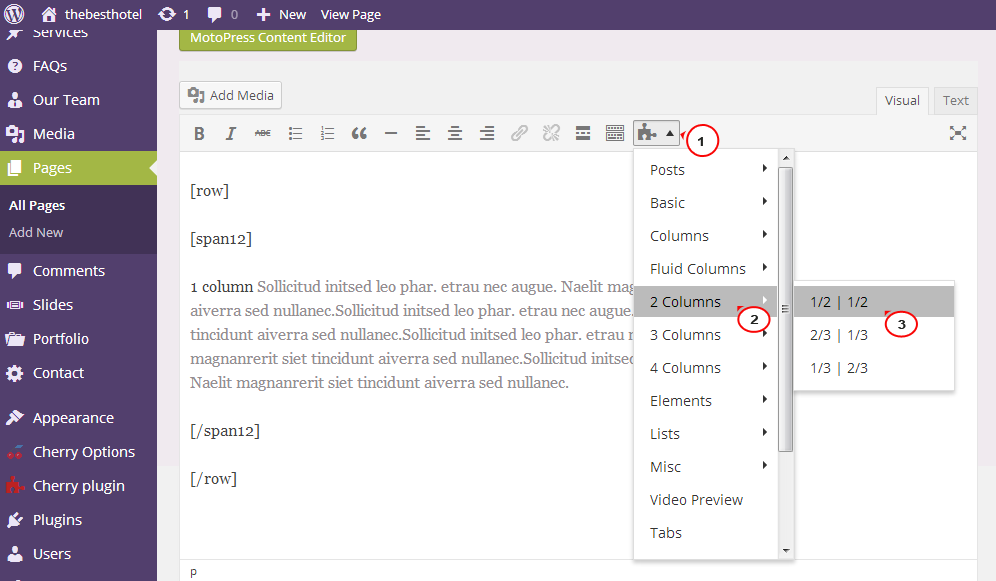
Or adding this code to your page in Text mode:
					[row]
					[span6] 1st column content goes here... [/span6]
					[span6] 2nd column content goes here... [/span6]
					[/row]
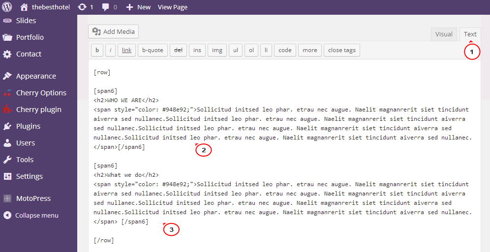
To make the content appear in 2 columns with different width, there can be used any other option from Shortcodes -> Columns -> 2 Columns dropdown in Visual editing mode or code with different number for [spanX] elements in Text mode. The only requirement is to keep 12 per row, for example using [span3] + [span9] or [span8] + [span4] codes. Example:
					[row]
					[span4] 1st column content goes here... [/span4]
					[span8] 2nd column content goes here... [/span8]
					[/row]
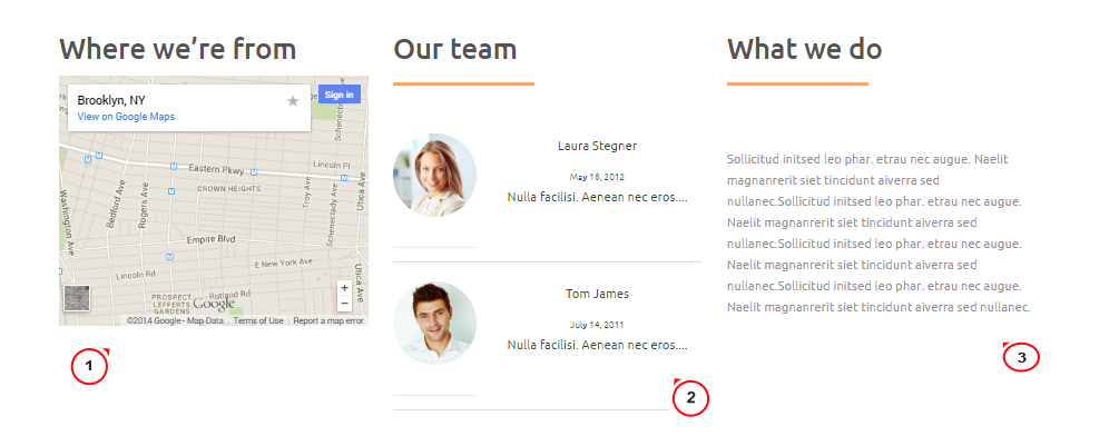
The result appears on the screenshot below:

3 columns layout may be set by choosing Shortcodes -> 3 Columns -> 1/3 | 1/3 | 1/3 or this code:
					[row]
					[span4] 1st column content goes here... [/span4]
					[span4] 2nd column content goes here... [/span4]
					[span4] 3rd column content goes here... [/span4]
					[/row]
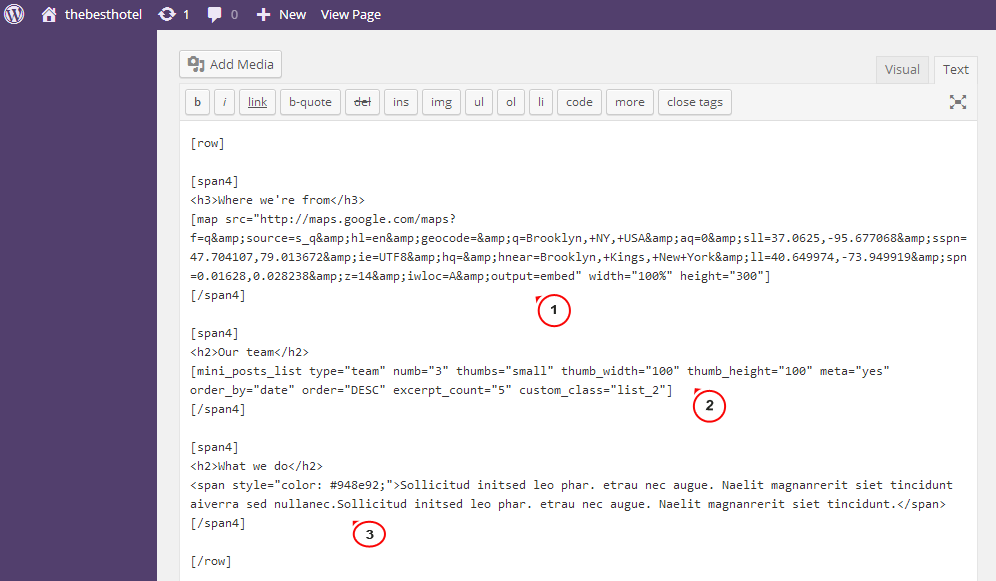
You may use shortcodes on the content part (between [spanX][/spanX] elements), not plain text only. On the page it will look the following way:
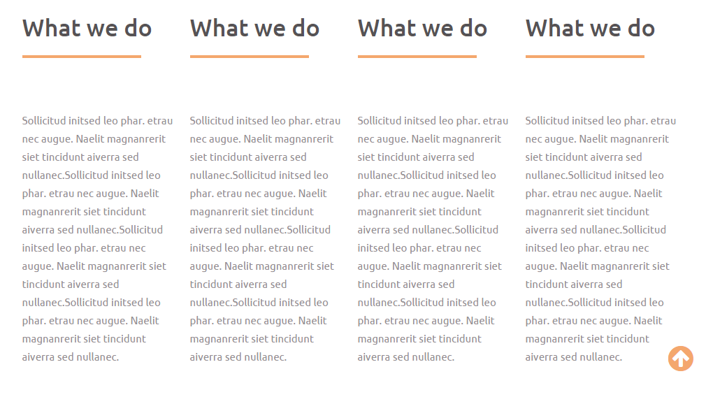
4 columns layout may be set the same way choosing Shortcodes -> 4 Columns -> 1/4 | 1/4 | 1/4| 1/4 or with this code:
					[row]
					[span3] 1st column content goes here... [/span3]
					[span3] 2nd column content goes here... [/span3]
					[span3] 3rd column content goes here... [/span3]
					[span3] 4th column content goes here... [/span3]
					[/row]
You may also choose Shortcodes -> Fluid Columns option to insert fluid row between [spanX] shortcode on the page. This means that you can divide page row into 2 columns, for example, and then consider certain column (like only first one) as a fluid row, dividing it into 2, 3 or 4 sub-columns. You may play around with codes to get as structured layout as your page design requires, and make it meet your needs perfectly.
Thanks for reading this article!
Feel free to check the detailed video tutorial below:
