


- Web templates
- E-commerce Templates
- CMS & Blog Templates
- Facebook Templates
- Website Builders
FAQs
General Tutorials
MonsterONE Subscrioption


This tutorial presents a brief overview of CSS Media Queries.
Media Queries is a CSS3 module allowing content rendering to adapt to conditions such as screen resolution (e.g. smartphone screen vs. computer screen). A media query consists of a media type and one or more expressions, involving media features, which resolve to either true or false. The result of the query is true if the media type specified in the media query matches the type of device the document is being displayed on and all expressions in the media query are true. When a media query is true, the corresponding style sheet or style rules are applied.
In this tutorial we will cover the following media queries: Max Width, Min Width, and Multiple Media Queries. Specifically, we will see how those queries can be applied to media type screen.
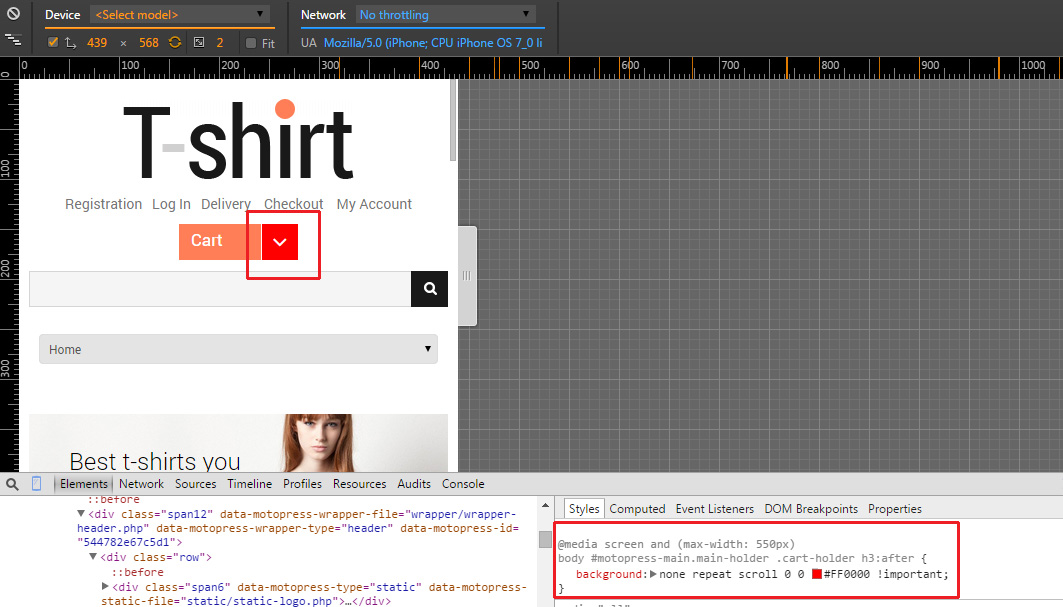
Max Width. The following CSS will apply if the viewing area is smaller than 550px:
@media screen and (max-width: 550px) {
  .class {background: #FF0000;}
}
Please check a live example on the screenshot below:
Min Width. The following CSS will apply if the viewing area is greater than 1200px.
@media screen and (min-width: 1200px) {
.class {background: #6666FF;}
}
Please check a live example on the screenshot below:

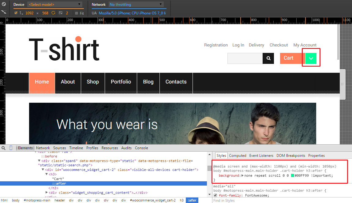
Multiple Media Queries. You can combine media queries. The following code will apply if the viewing area is between 1050px and 1100px.
@media screen and (min-width: 1050px) and (max-width: 1100px) {
.class {background: #00FF99;}
}
Please check a live example on the screenshot below:
In this tutorial you have found out how to use Media queries.
We would recommend you to view our Bootstrap Admin Themes and find out more about CSS functionality.
