OpenCart 2 Documentation
Extension configuration
Catalog Page
A page with all products and their detailed descriptions. The page displays 6 products (the quantity is optional) in the left column. The right column displays the description of the first product. When the user scroll down to the 2nd product, the right column loads and displays the information about the second product. This happens till the user scrolls down to the last (6th) product, then they may load the next 6 products by pressing the 'Load products' button (this is Infinity Scroll).
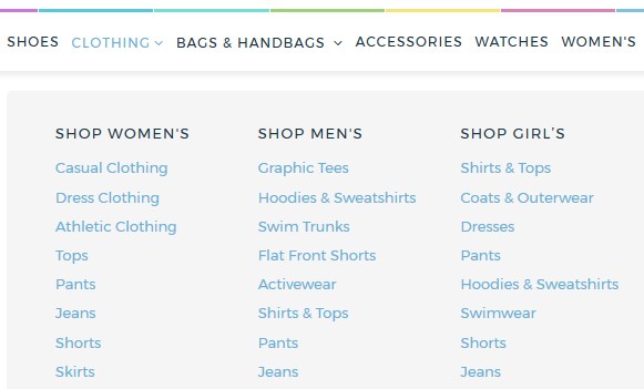
TM Megamenu
This module allows you to create complex menus. The module provides the ability to display a single item (without submenus), an item with a submenu and an item with the multi-row and multi-column submenu block. This module can be displayed in the various positions, but with the same content.
General information
-
Menu activation
In order to enable megamenu you should navigate to the Extensions > Modules > TM Megamenu page, press the Edit button next to the appropriate item and choose the Enabled option in the new window.
Megamenu configuration
-
Megamenu items. Main items in the menu root.
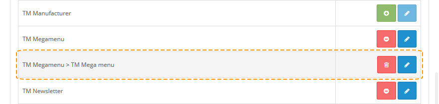
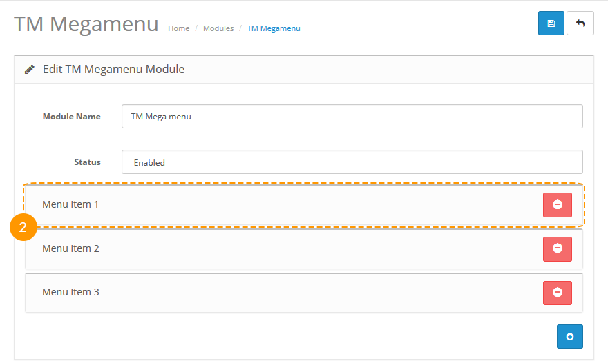
Megamenu editing starts here. In order to edit megamenu parameters, open your website admin panel and navigate to the Extensions > Modules > TM Megamenu > TM Megamenu page, as on screenshot below.
On the next page you will be able to create, remove and edit menu items.
Attention: This module supports multilanguage, so you can configure it for each shop language separately.
-
Click on one of the menu items to start editing. Fill in the following fields:
- Menu Item type — type of the menu (regular/megamenu);
For 'Custom' option:
- Menu title — menu item label;
- Menu link — menu item link;
- Show megamenu — megamenu display;
-
If the "Show megamenu"(3) option is set to "Yes", the following additional fields appear. Fill in these fields:
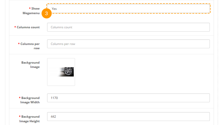
- Columns count — number of columns;
- Columns per row — number of columns per row;
- Background image — background image;
- Background image width — width of the background image;
- Background image height — height of the background image;
-
After filling in the "Columns count" field, the following options become available: "Column N". Fill in the tabs:
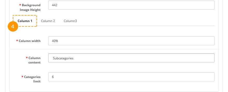
- Column width — width of the column;
- Columns content — content of the column;
- Categories(Products) limit — maximum number of categories or products to display in the column;
- Module — name of the module to display;
- Category name — name of the category;
- Show Category name — category name display;
For 'Category' option:
- Menu item submenu type — submenu type;
-
After selecting the "Megamenu" type in the "Menu Item type" field, the following additional megamenu settings become available:
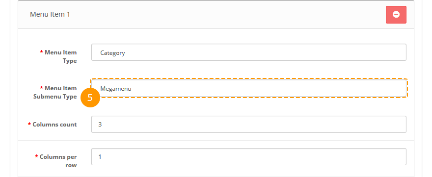
- Columns count — number of columns;
- Columns per row — number of columns per row;
- Background image — background image;
- Background image width — width of the background image;
- Background image height — height of the background image;
-
After filling in the "Columns count" field, the following options become available: "Column N". Fill in the tabs:

- Column width — width of the column;
- Columns content — content of the column;
- Categories(Products) limit — maximum number of categories or products to display in the column;
- Module — name of the module to display;
Parallax
Parallax-scroll is a specific scrolling technique used in computer graphics that shows background images appearing slower than the site content itself, thereby creating the illusion of depth and the effect of immersion in a two-dimensional video game. This module allows you to add a parallax effect to your site with no additional skills and efforts.
When the module is installed, you can configure it on the module settings page.
How to manage Parallax module
Navigate to Extensions > Extensions.
Choose Modules in the Extension type dropdown.
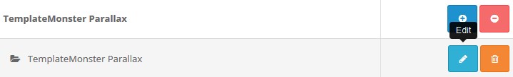
Find the TemplateMonster Parallax section. Press the edit button to configure the existing module.
Use Ctrl+F to simplify the search process.
You will be brought to the settings window:
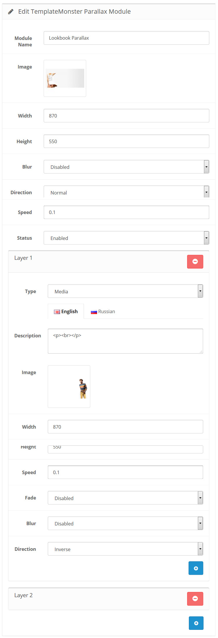
Available settings:
- Module Name — the name of the module;
- Width — module image width;
- Height — module image height;
- Blur — turn on/off the effect of blurring the image when its size is too small;
-
Direction — sets the direction of parallax motion. Normal — parallax scrolling moves in the opposite direction, Inverse — parallel to it;
- Speed — sets the speed ratio for the parallax, relative to the base rate. Value: from 0 to 2;
- Status — module status (enabled/disabled).
Image width and height should be corresponding to the original (used by default), otherwise the effect may not meet your expectations.
How to add a new Parallax module
Navigate to Extensions > Extensions.
Choose Modules in the Extension type dropdown.
Find the TemplateMonster Parallax section. Press the Add New button to create a new module.
Use Ctrl+F to simplify the search process.
You will be brought to the settings window:
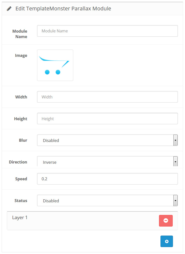
Fill in the required fields:
- Module Name — enter the name of the module;
- Width — set the module image width;
- Height — set the module image height;
- Blur — turn on/off the effect of blurring the image when its size is too small;
-
Direction — set the direction of parallax motion. Normal — parallax scrolling moves in the opposite direction, Inverse — parallel to it;
- Speed — set the speed ratio for the parallax, relative to the base rate. Value: from 0 to 2;
- Status — define the module status (enabled/disabled).
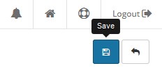
Scroll the page up and click the Save button at the top right of the screen to save changes:
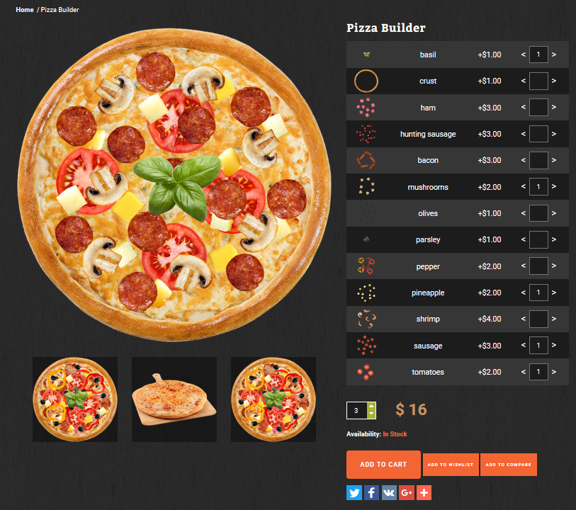
TemplateMonster Product Builder
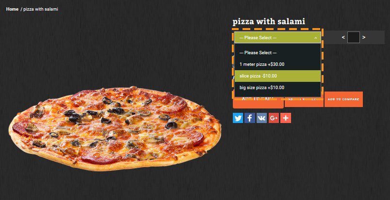
Product builder is useful shopping tool, it allows potential customers to "build" an ideal version of a product by combining different options.
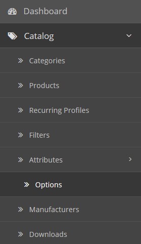
How to add the new option
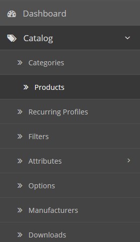
Navigate to Categories > Options.
Press the Add New button.
You will be brought to the settings window:
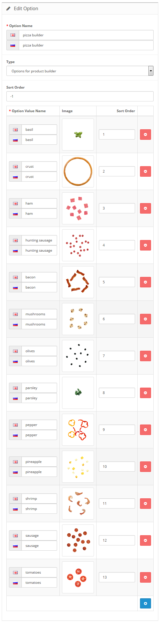
Available settings:
The Product Builder supports multilanguage, so you can configure it for each shop language separately.
- Option Name — assign the name to the option;
- Type — choose the option type.
- Sort Order — set the display order;
- Option Value Name — enter the option value name;
- Image — upload an image for the value;
- Sort order — set the display order for the value.
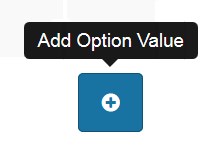
You are able to create the new option value pressing the Add Option Value.
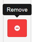
Delete the option value by pressing the Remove button.
Options for product builder type:
List with quantity options type:
When complete, tab Save.
How to add Product Builder to the product
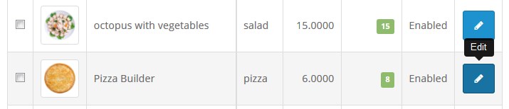
Navigate to Catalog > Products.
Find the previously created product you want to add the Product Builder to.
Find the TemplateMonster Newsletter section. Press Add New button to create a new module.
Press edit button.
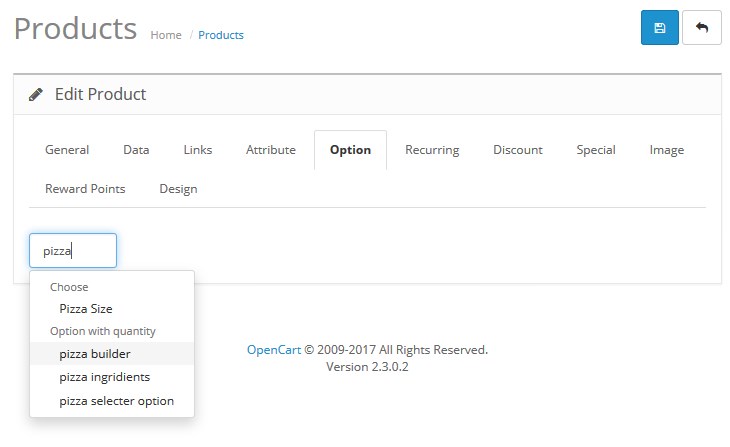
Navigate to the Option tap. Enter the name of the option you want to add to the product in the Option field.
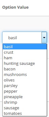
Press the Add Option Value button.
Select the Option value from the option dropdown.
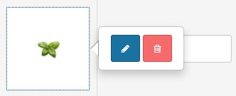
Choose the image for the option value. Double-click on the image area and press the edit button.
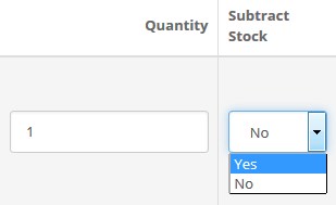
Set the default option value quantity and subtrack status.
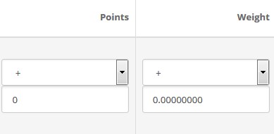
Enter the price change value. Set the points and the weight option.
Delete the option value pressing the remove button.
When complete, tab Save.
Comments Plugin
The comments plugin lets people comment on content on your site using their Facebook account. People can choose to share their comment activity with their friends (and friends of their friends) on Facebook as well. The comments plugin also includes built-in moderation tools and social relevance ranking.
How configure the Comments Plugin
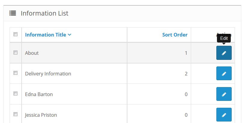
Navigate to Catalog > Information.
Press the edit button next to the About information list.
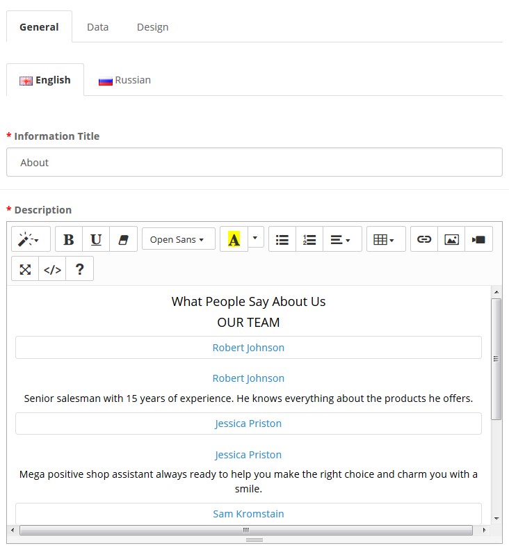
You will be brought to the settings window:
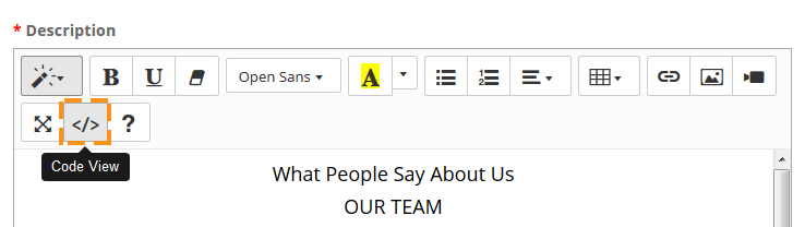
Press the Code View button in the editor toolbar.
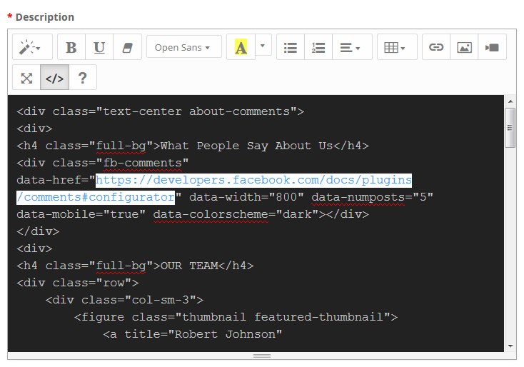
Insert the page URL you want people to comment.
You need to insert the URL after the <div class="fb-comments" data-href=" code part.
When complete, tab Save.
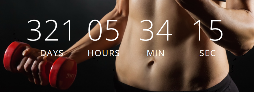
TM CountDown
This module allows you to create countdown counters. There are two types available, numeric and radial timers.
Numeric:
Radial:
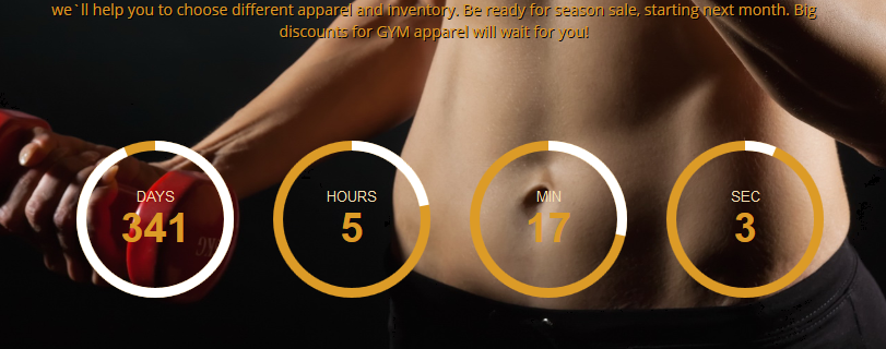
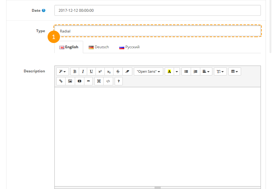
In order to change counter type to radial you need to select "Radial" option in the "Type" field. In this case additional settings for the radial timer become available:
Settings:
Module primary settings are the following:
-
- Module Name
- module title;
-
- Status
- module status (enabled/disabled);
-
- Date
- Date in the yyyy-mm-dd hh:mm:ss format (e.g.: 2012-12-12 00:00:00);
-
- Type
- Counter type (standard/radial);
-
- Description
- timer caption (description);
-
- Title on Days
- days counter title;
-
- Title on Hours
- hours counter title;
-
- Title on Minutes
- minutes counter title;
-
- Title on Seconds
- seconds counter title;
-
- Show days
- whether to show/hide days counter;
-
- Show hours
- whether to show/hide hours counter;
-
- Show minutes
- whether to show/hide minutes counter;
-
- Show seconds
- whether to show/hide seconds counter;
-
- Animation Type
- counter animation type, the ticking or smooth animation;
-
- Direction of animation
- animation direction relatively to the clockwise (along or against the clockwise direction);
-
- Background circle color
- color of the timer inner circle;
-
- Days circle color
- color of the days timer inner circle;
-
- Hours circle color
- color of the hours timer inner circle;
-
- Minutes circle color
- color of the minutes timer inner circle;
-
- Seconds circle color
- color of the seconds timer inner circle;
-
- Foreground circle width
- thickness of the timer outer circle;
-
- Background circle width
- width of the timer inner circle;
Product Page Zoom
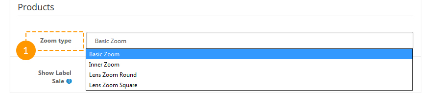
This setting allows changing product zoom type on the product page. You can find the options in the store settings (System > Settings > Options) in the Products section.
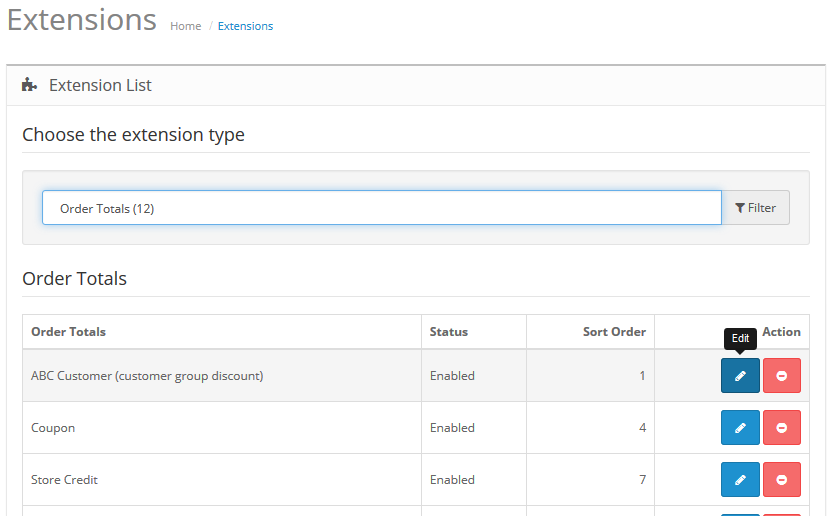
TM ABC Customers
This module serves for setting up discounts for different customer groups. The order amount is recalculated, when the order is placed, with the discount percentage set for a specific group of customers.
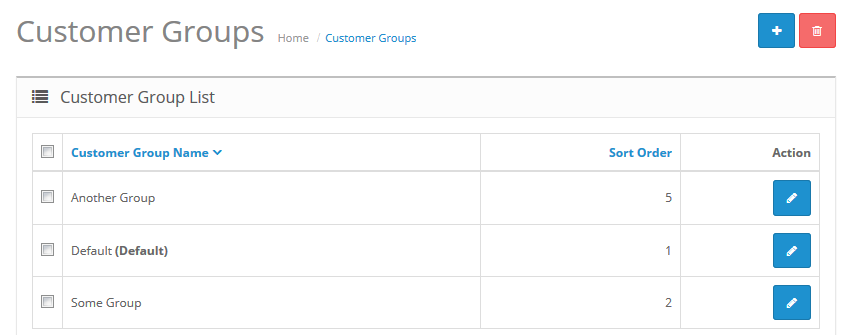
Client groups settings:
It's necessary to create and set up client groups.
-
- Customer Group Name
- The name of the group;
-
- Description
- The description of the customer group;
-
- Approve New Customers
- Admin can approve new customers registrations (YES | NO);
-
- Sort Order
- Display order.
Settings for client groups:
-
- Customers Discount
- Client discounts percentage;
-
- Status
- Module status (enabled | disabled );
-
- Sort Order
- Display order;
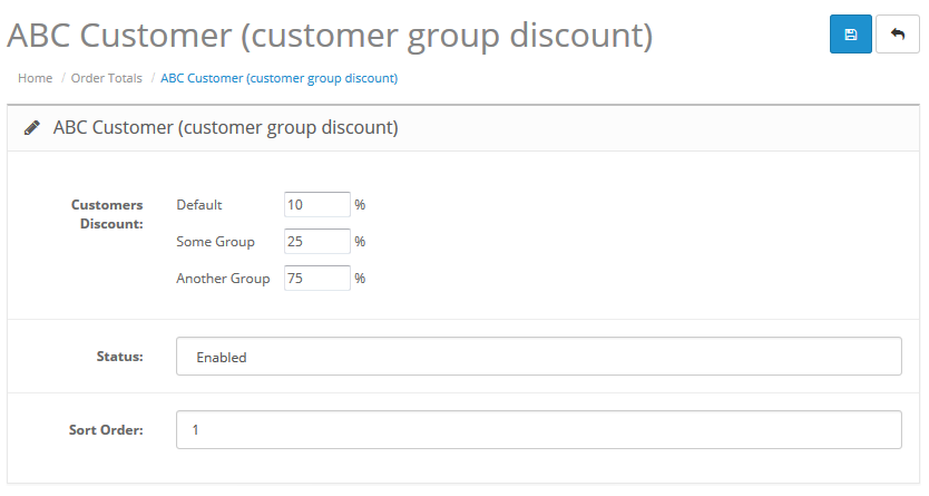
After specifying the discount percentage for each of the groups (0-100%), press the Save button.
TM Layout Builder
This module serves for quick, simple and handy creation of different variants of the store main page.
Module basic settings:
-
- Status
- Module status (Enabled/Disabled);
-
- Module Name
- The name of the module;
-
- Module Class
- The class of the module;
-
- Module ID
- ID of the module.
To create a new layout, press the New Layout View button, then, press the Add Row (1) button. After adding a row, add columns. To add columns, press the Add Column (2) button.
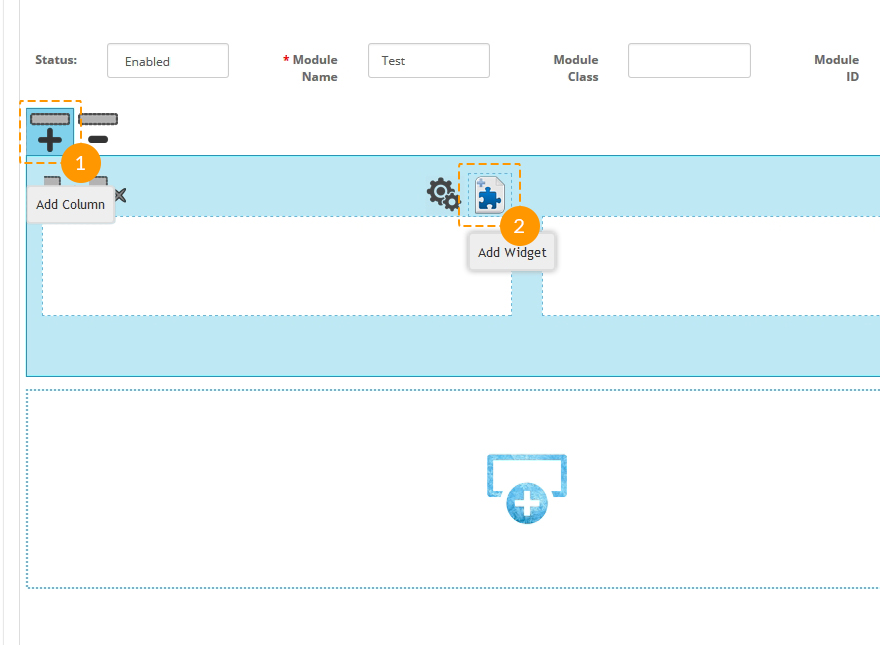
The number of columns in the row is unlimited, and you can add as many columns as you need. The width of the columns can be set right after adding them with the help of the Drag and drop function by dragging the right border of the column.
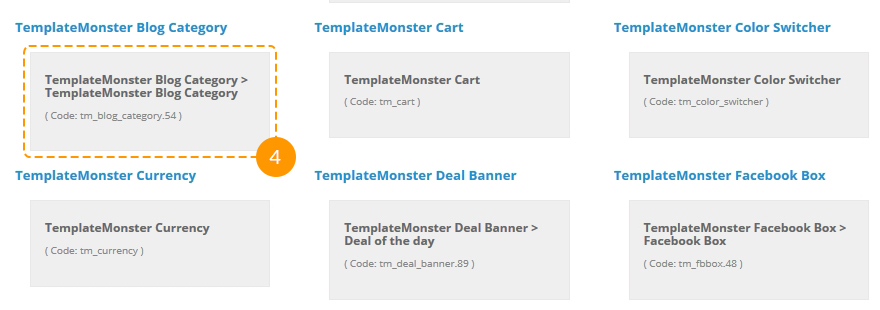
After adding columns, you should fill them with content (modules). To add a module, press the Add Widget button and select the needed one from the dropdown.
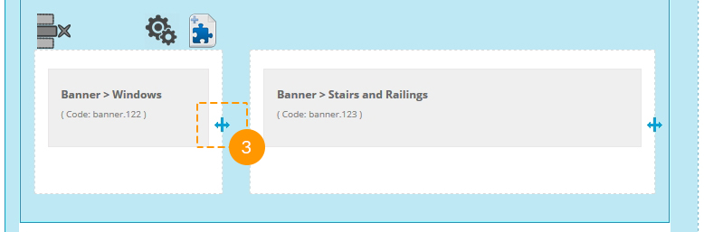
After adding a module, you can edit or delete it,
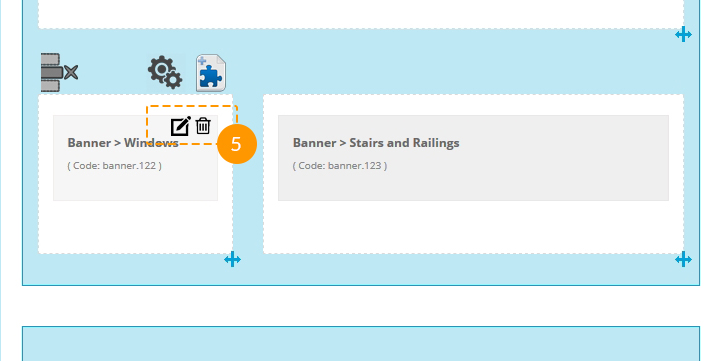
and also move it to another column.
After setting up all the rows, columns and modules, save the Builder module and display it in one of the positions on the store main page.
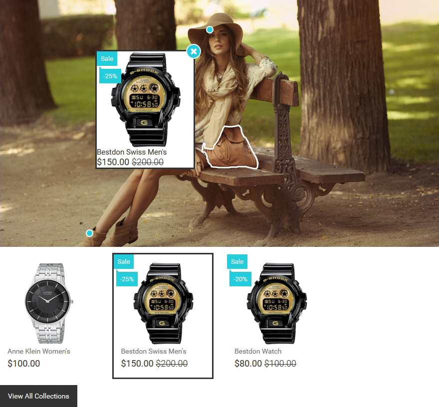
TM Lookbook
The lookbook is a set of photos, where you can mark any part of the image. This module serves for displaying the products of one or of the several brands.
When the module is installed, you can configure it on the module settings page.
How to manage TemplateMonster Lookbook module
Navigate to Extensions > Extensions.
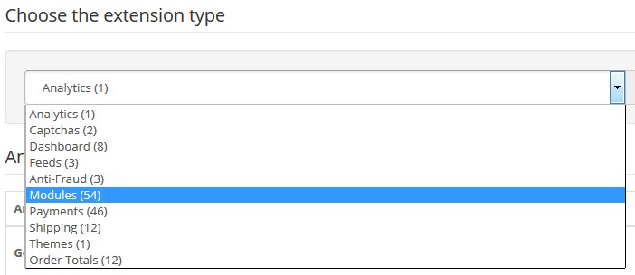
Choose Modules in the Extension type dropdown.
Find the TemplateMonster Lookbook section. Press the edit button to configure the existing module.
Use Ctrl+F to simplify the search process.
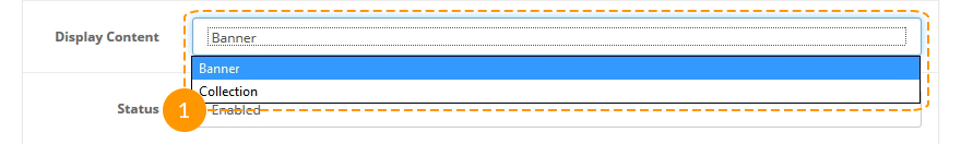
The module has two display modes for being displayed in the store position: in form of a Banner (1) or in form of a Collection (2).
-
Banner display mode;

-
Collection display mode.
For changing the module display mode, select the necessary display type in the "Display Content" field.
Settings:
Basic settings:
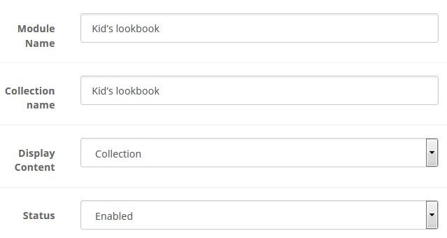
- Module Name — the name of the module;
- Collection name — the name of the collection; it's used as the title on the collection page;
- Display Content — The module display mode in the store position;
- Status — Module status (Enable/Disable).
Banner settings:
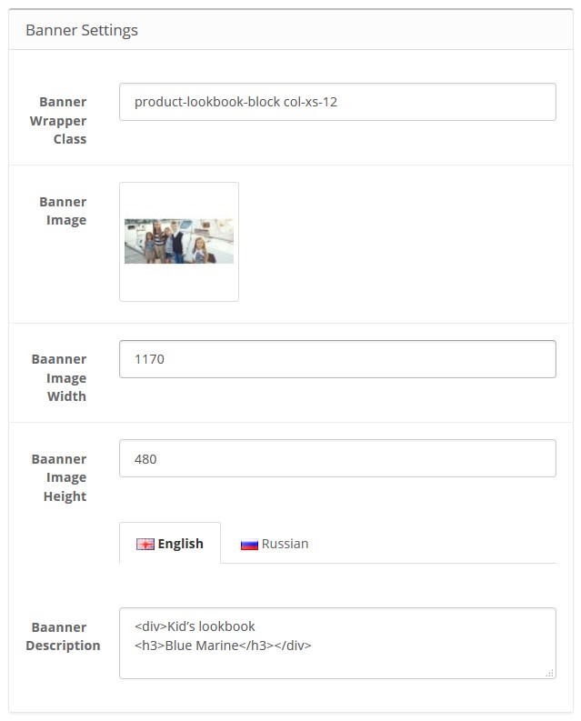
- Banner Wrapper Class — the class of the banner wrapper;
- Banner Image — the image of the banner;
- Banner Image Width — the width of the banner image;
- Banner Image Height — the height of the banner image;
- Banner Description — the description of the banner. The text which will be displayed on the banner. The field supports HTML;
Collection settings:
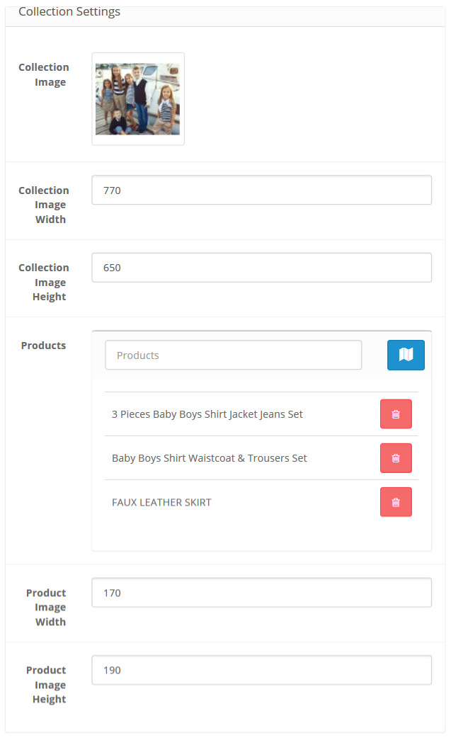
- Collection Image — the image of the collection;
- Collection Image Width — the width of the collection image;
- Collection Image Height — the height of the collection image;
- Products — collection products;
- Product Image Width — the width of the product images;
- Product Image Height — the height of the product images.
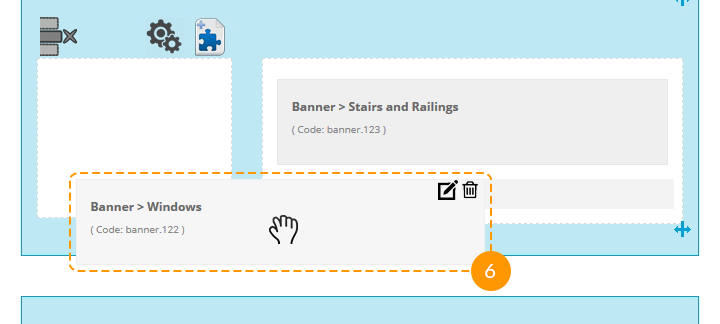
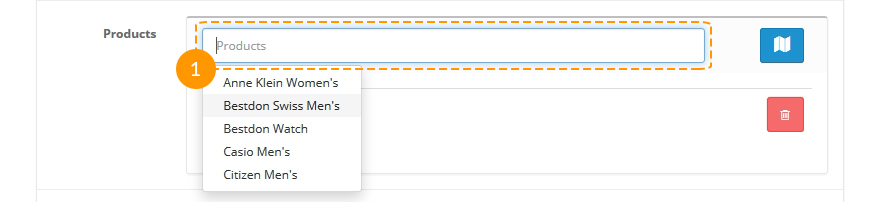
Connecting products with the collection image, adding product selection area:
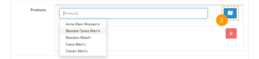
To add a product to a collection, select it in the Products field:
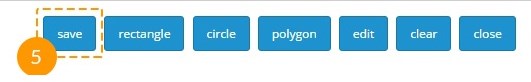
To mark the selected products on the image, press the "Add Image Map" button:
After pressing the "Add Image Map" button you'll see a window, which allows creating selection areas and adding products to such areas (at the bottom).
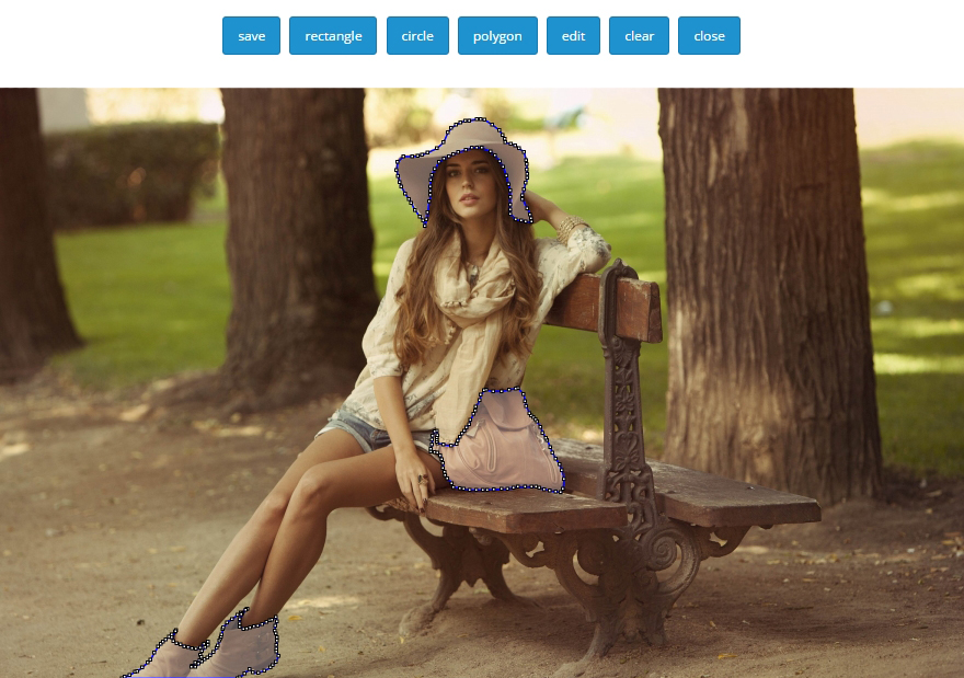
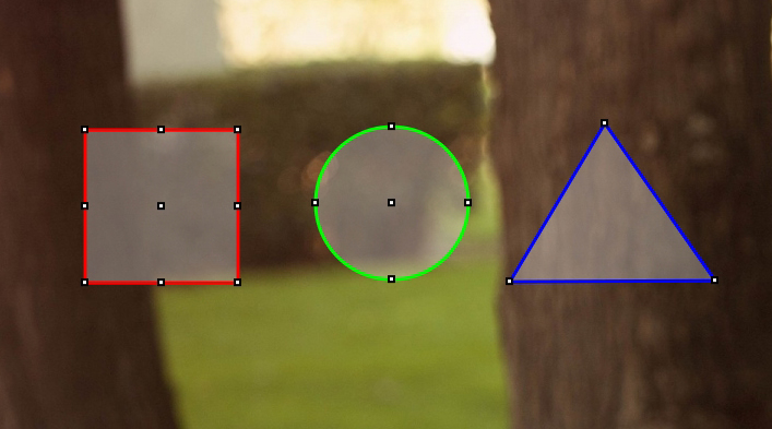
The areas that you create can be of 3 different forms: square, round, and complex (polygonal).
To create a selection area on the picture, press the button, the name of which corresponds to the necessary form of selection area.

After choosing the form, place it on the picture. Left-click the necessary part of the image, draw the area.
Note: Polygonal selection should always be closed, make the first and the last point coincide.
After placing the selection area on the image, choose the product that is displayed in the selected area. To do this, press the "Edit" button.

Next, double-click the area and select the needed product in the dropdown, then press the "Save" button.
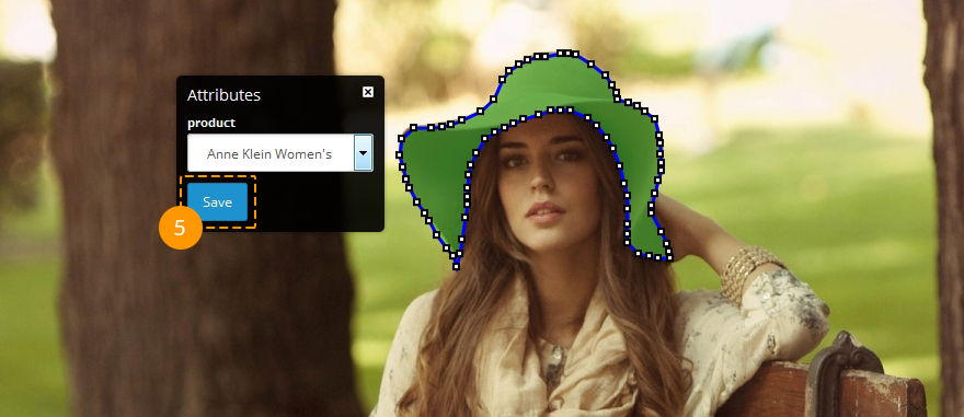
After marking all the areas and mapping all the products, press the Save button.
Save module settings.
Module installation
Module installation process includes several steps. Navigate to your administration panel (by adding /admin to your website url in the browser address bar — www.yoursite.com/admin).
Navigate to Extensions > Extensions.
Choose Modules in the Extension type dropdown.
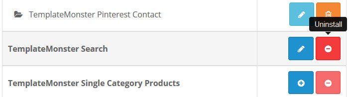
You will see the list of installed and ready-to-install modules. If you see the Uninstall button next to any module, it means that the module is already installed.
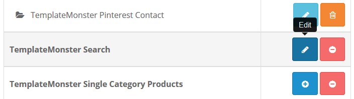
You can modify module settings by clicking Edit.
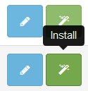
By clicking the Install button you will start module installation process.
In order to remove the module, you have to click the Uninstall button, so the module will be deleted.
Note that removing the module means all the settings added earlier will be erased and cannot be reverted back.
When the installation is finished, you need to configure the module. The settings can differ depending on the specific module, but the Status field is the same for all — the field allows you to turn the module on/off.
In order to add the module to a certain page, you need to go to the list of pages.
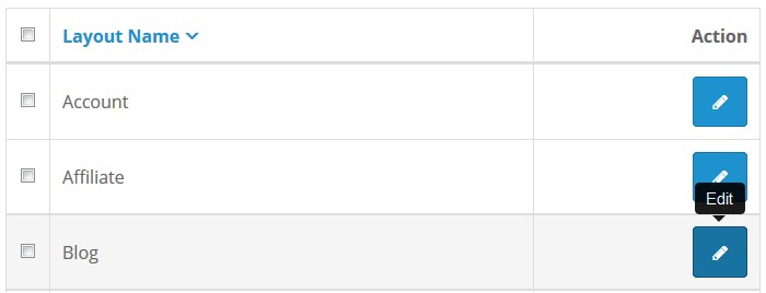
In the side menu navigate to Design > Layout.
In the page list select the page where you want to place the module and click Edit.
You can see a list of the modules and module positions that are already added to the page.
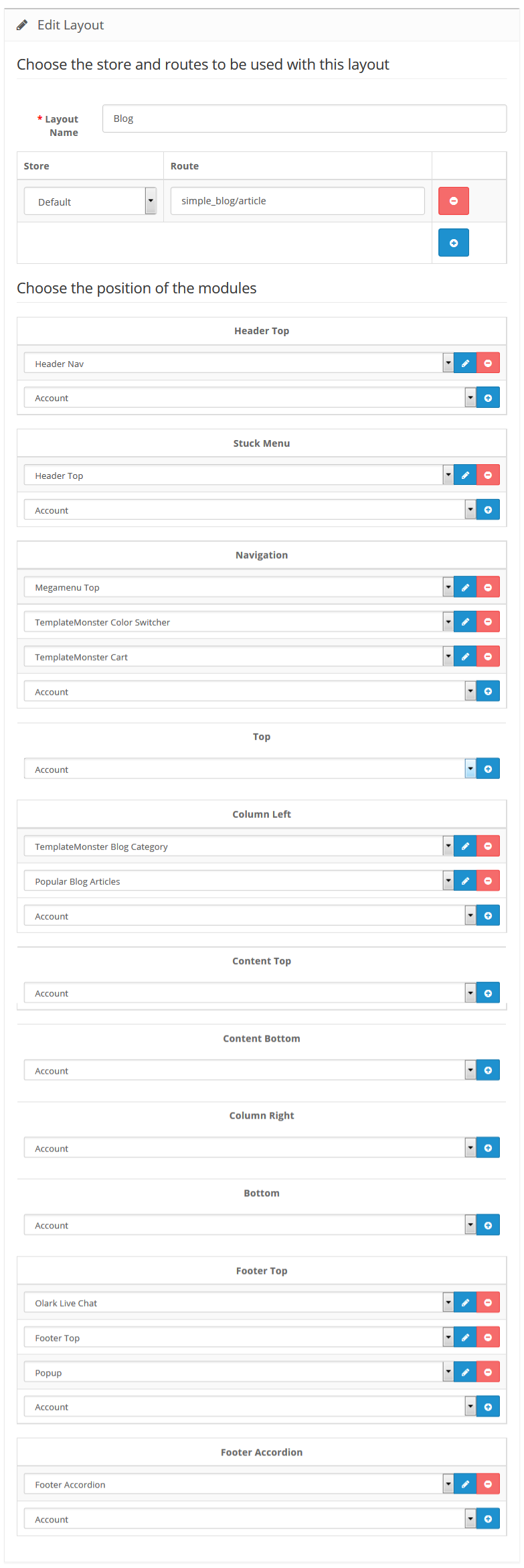
The following module positions are available (respectively to the display order):
- Header Top (after the Header section);
- Column-left (left side panel);
- Column-right (right side panel);
- Content-top;
- Content-bottom;
- Footer.
The Sort Order field shows the display order of the modules assigned to the same position. In order to add a module to a page, click Add Module. Select the required module and module position and click Save. The module installation is completed.
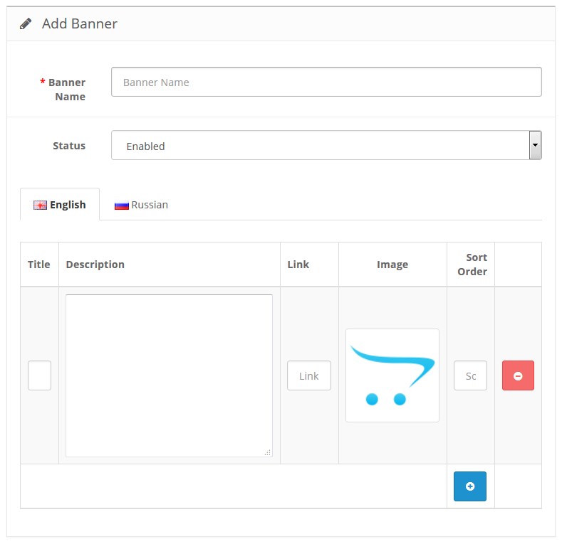
Creating banners
TemplateMonster Description for banners modification
The modification allows you to add banner description. In order to turn the modification off or remove it, navigate to Extensions > Modifications, find the "TemplateMonster Description for banners" extension and click Disable or Delete.
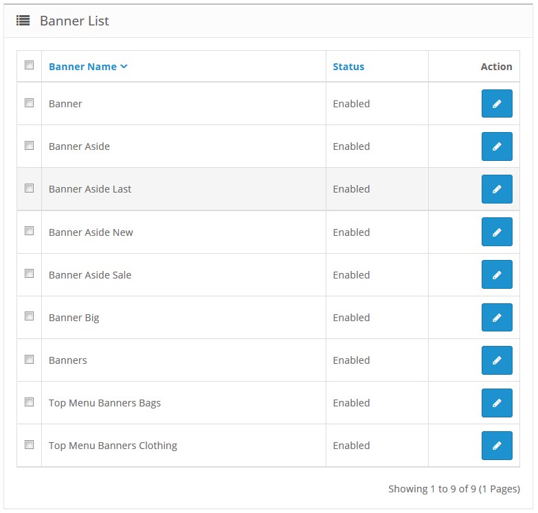
Some of the modules include a field to select a banner. Navigate to the Design > Banners section.
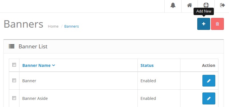
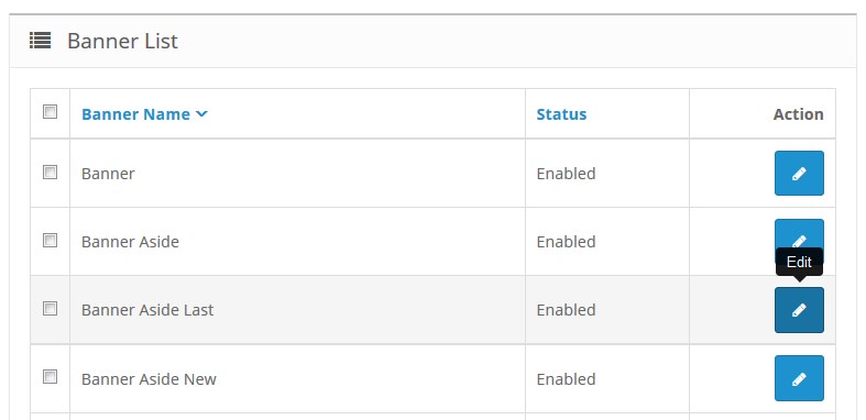
The page displays the list of the created banners.
To create a new banner, click on the Add New button.
To edit existing banner, click Edit.
You will see the where you should enter the following values:
- Banner Name;
- Description — the text that shows up in a banner (it supports html-markup);
- Link — specify a link relative to the site URL (for example, index.php?route=product/product&product_id=47), this field is not required;
- Image;
- Banner order — there can be more than one banner, the field is required to fill in.
TemplateMonster Category
The module allows to display categories with the accordion view, it also allows to display all the subcategories. Usually it is used in the side panel.
When the module is installed, you can enable / disable it on the configuration page.
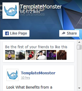
TemplateMonster Facebook Box
TemplateMonster Facebook Box is a module that allows displaying your Facebook page on the website:
When the module is installed, you can configure it on the module settings page.
How to manage TemplateMonster Facebook Box module
Navigate to Extensions > Extensions.
Choose Modules in the Extension type dropdown.
Find the TemplateMonster Facebook Box section. Press the edit button to configure the existing module.
Use Ctrl+F to simplify the search process.
You will be brought to the settings window:
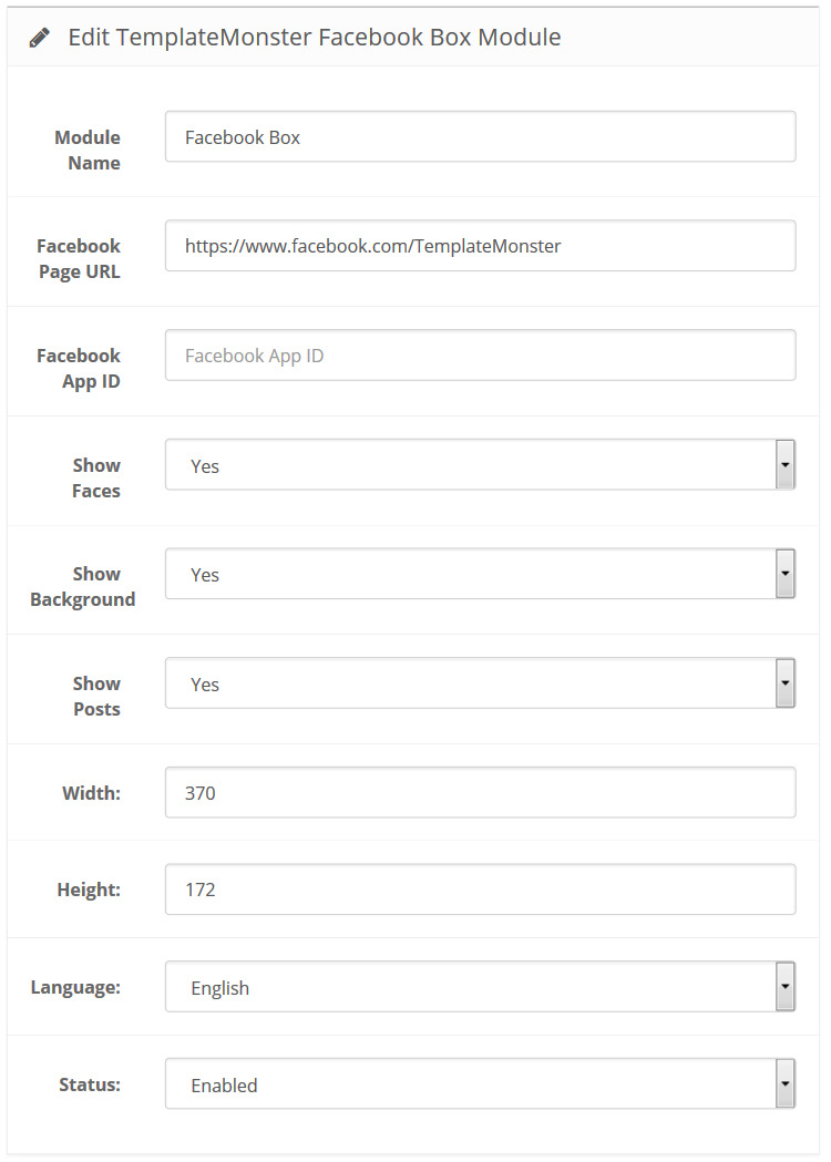
Available settings:
- Module Name — the name of the module;
- Facebook Page URL — allows specifying custom Facebook Page URL;
-
Facebook App ID — it's a Facebook App Identifier;
- Show Faces — enabling this option allows profile photos to be shown in the module.
- Show Background — allows you to show module background;
- Show Posts — allows you to show posts from the Page's timeline;
- Width — the pixel width of the widget;
- Height — the pixel height of the widget;
- Language — assign a language to this module;
- Status — define the module status (enabled/disabled).
How to add a new TemplateMonster Facebook Box module
Navigate to Extensions > Extensions.
Choose Modules in the Extension type dropdown.
Find the TemplateMonster Facebook Box section. Press the Add New button to create a new module.
Use Ctrl+F to simplify the search process.
You will be brought to the settings window:
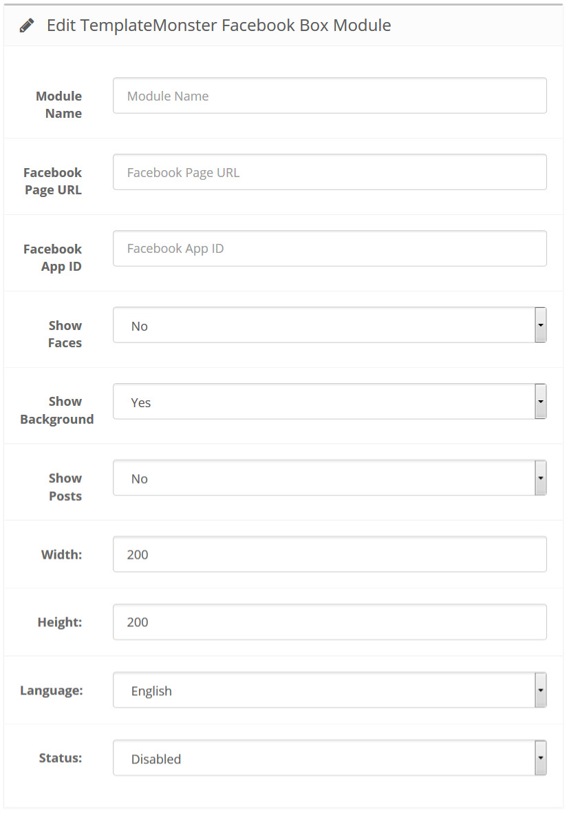
Fill in the required fields:
- Module Name — enter the name of the module;
- Facebook Page URL — allows specifying custom Facebook Page URL;
-
Facebook App ID — a Facebook App Identifier.
- Show Faces — enabling this option allows profile photos to be shown in the module.
- Show Background — allows you to show module background
- Show Posts — show posts from the Page's timeline;
- Width — the pixel width of the widget;
- Height — the pixel height of the widget;
- Language — assign a language to this module;
- Status — define the module status (enabled/disabled).
Just follow the simple instructions, and you'll have got the identifier in no time.
Step-by-Step Guide
1. Login to Facebook
Before creating a developer account, login in to your Facebook account.
Login to Facebook2. Developer Account
You'll need Facebook developer account to get started. If you don't have one, upgrade your personal Facebook account to a Facebook Developer account now. Skip this step if you already have a developer account.
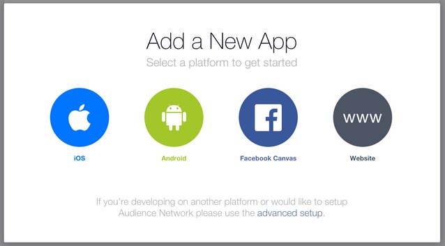
Create Developer Account3. Create new Facebook app
Choose Apps in the header navigation and select Add a New App or use the button below.
Create new Facebook App4. Choose Platform
Choose the platform you want to add. If your app is on multiple platforms, you'll be able to add them to your Facebook app later.
5. Choose a Name
Choose a name for your app and select Create New Facebook App ID. Choose a category for your app. If you're creating a test version of an existing Facebook app, select the app you're testing.
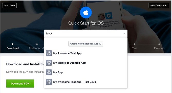
6. Follow "Quick Start" Steps
The quick start wizard will help you to set up your Facebook app for the selected platform. You can come back to the quick start wizard at a later time to either continue your setup or add a new platform to your app.
7. App ID
Your app will have a unique app ID. You will use this ID whenever you use one of our SDKs or Open Graph tags for sharing. You can find your app ID in your app's dashboard.
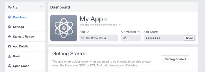
8. Protect your App Secret
Facebook auto-generates an app secret associated with your application. The application secret authenticates requests made by your application to Facebook servers and should be treated like a password.
Do not output your Facebook application secret into your web page markup; be careful when committing files containing this value into source control software such as a public Git or Subversion repository.
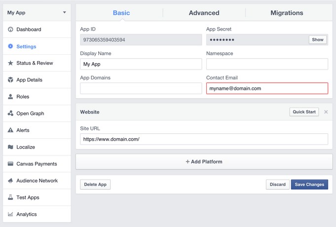
9. Contact Email
You need to add a contact email for each app. Go to your app's dashboard, select the Settings navigation item in the left sidebar and provide a valid contact email.
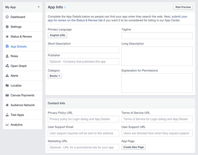
10. App Details
Select the App Details on the left sidebar to view and add additional information about your app.
If you want your app to be listed in the apps center, turn on the App Center Listed Platform setting for your website or mobile site. Add icons, promotional images and videos. Make sure to follow the App Center Guidelines to be approved for listing in App Center.
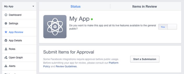
11. Disable Development Mode
New Facebook apps exist in development mode by default. This limits published actions and related objects such as friend tagging to Facebook Timelines owned by a developer of the application.
Once your application is ready for public use you can switch from the development mode to public mode to allow your app to interact with Facebook accounts not associated with your app.
Scroll the page up and click the Save button at the top right of the screen to save changes:
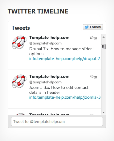
TemplateMonster Twitter Box
This module allows you to display posts from Twitter. It helps your site visitors to be aware of the latest updates and messages in Twitter social network.
When the module is installed, you can configure it on the module configuration page.
How to manage TemplateMonster Twitter Box module
Navigate to Extensions > Extensions.
Choose Modules in the Extension type dropdown.
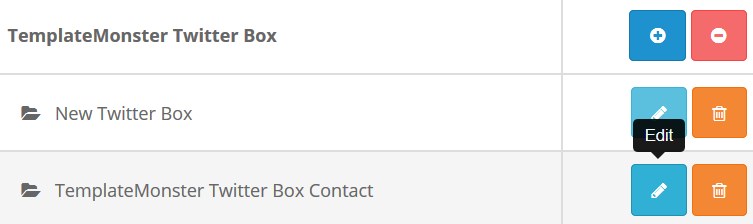
Find the TemplateMonster Twitter Box section. Press the edit button to configure the existing module.
Use Ctrl+F to simplify the search process.
You will be brought to the settings window:
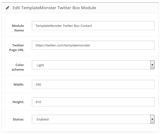
Available settings:
- Module Name — the name of the module;
- Twitter Page URL — allows specifying custom Twitter Page URL;
- Color Scheme — select the color scheme (light, dark);
- Width — the pixel width of the widget;
- Height — the pixel height of the widget;
- Status — define the module status (enabled/disabled).
How to add a new TemplateMonster Twitter Box module
Navigate to Extensions > Extensions.
Choose Modules in the Extension type dropdown.
Find the TemplateMonster Twitter Box section. Press the Add New button to create a new module.
Use Ctrl+F to simplify the search process.
You will be brought to the settings window:
Fill in the required fields:
- Module Name — enter the name of the module;
- Page URL — specify custom Twitter Page URL;
- Color Scheme — select the color scheme (light, dark);
- Width — set the pixel width of the widget;
- Height — set the pixel height of the widget;
- Status — define the module status (enabled/disabled).
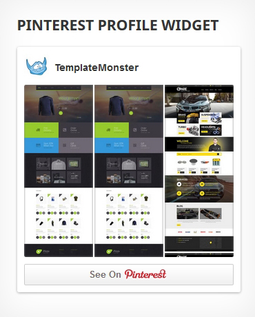
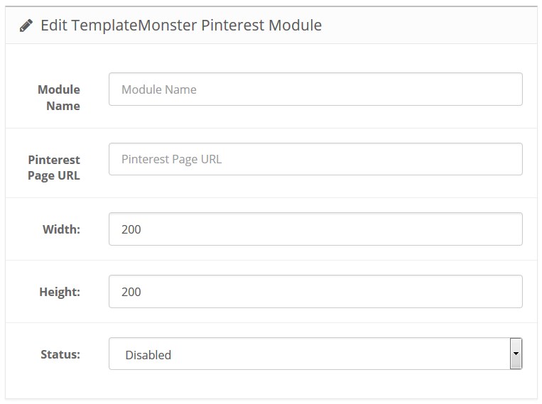
TemplateMonster Pinterest
TemplateMonster Pinterest module allows displaying Pinterest gallery on your store. This module can help you to display Pinterest Profile Pins or Board Pins. Width and Height are scalable.
When the module is installed, you can configure it on the module configuration page.
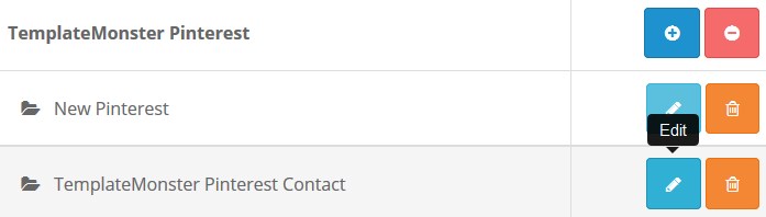
How to manage TemplateMonster Pinterest module
Navigate to Extensions > Extensions.
Choose Modules in the Extension type dropdown.
Find the TemplateMonster Pinterest section. Press the edit button to configure the existing module.
Use Ctrl+F to simplify the search process.
You will be brought to the settings window:
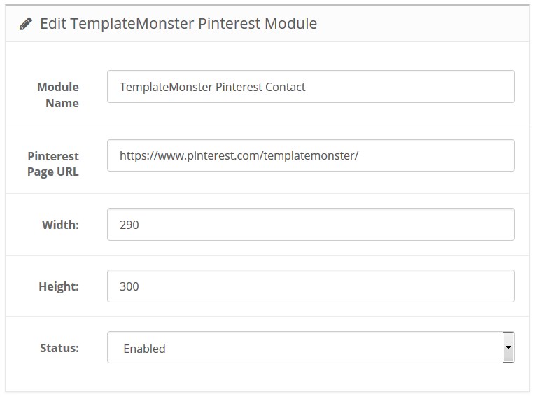
Available settings:
- Module Name — the name of the module;
- Pinterest Page URL — full path to the page that displays the gallery;
- Width — the pixel width of the widget;
- Height — the pixel height of the widget;
- Status — module status (enabled/disabled).
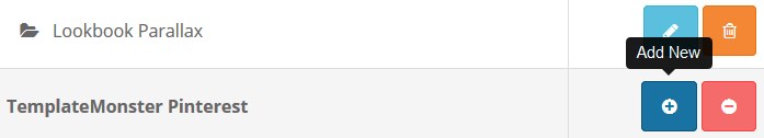
How to add a new TemplateMonster Pinterest module
Navigate to Extensions > Extensions.
Choose Modules in the Extension type dropdown.
Find the TemplateMonster Pinterest section. Press the Add New button to create a new module.
Use Ctrl+F to simplify the search process.
You will be brought to the settings window:
Fill in the required fields:
- Module Name — enter the name of the module;
- Pinterest Page URL — specify the full path to the page that displays the gallery;
- Width — set the pixel width of the widget;
- Height — set the pixel height of the widget;
- Status — define the module status (enabled/disabled).
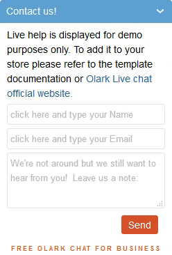
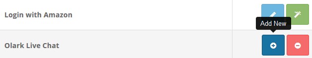
Olark Live Chat
Olark Live Chat module for OpenCart.
When the module is installed, you can configure it on the module configuration page.
Feel free to check more details at the official website.
How to manage Olark Live Chat module
Navigate to Extensions > Extensions.
Choose Modules in the Extension type dropdown.
Find the Olark Live Chat section. Press an edit button to configure the existing module.
Use Ctrl+F to simplify the search process.
You will be brought to the settings window:
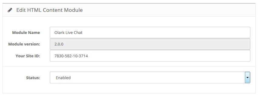
Available settings:
- Module Name — the name of the module;
- Your Site ID — website ID that can be found on the https://www.olark.com/install page after you register and fill in the required fields;
- Status — define the module status (enabled/disabled).
How to add a new Olark Live Chat module
Navigate to Extensions > Extensions.
Choose Modules in the Extension type dropdown.
Find the Olark Live Chat section. Press the Add New button to create a new module.
Use Ctrl+F to simplify the search process.
You will be brought to the settings window:
Fill in the required fields:
- Module Name — enter the name of the module;
- Your Site ID — enter the website ID that can be found on the https://www.olark.com/install page after you register and fill in the required fields;
- Status — define the module status (enabled/disabled).
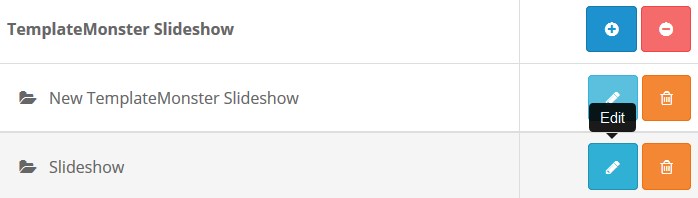
TemplateMonster Slideshow
This module allows you to display Camera slideshow on your website.
When the module is installed, you can configure it on the module configuration page.
How to manage TemplateMonster Slideshow module
Navigate to Extensions > Extensions.
Choose Modules in the Extension type dropdown.
Find the TemplateMonster Slideshow section. Press the edit button to configure the existing module.
Use Ctrl+F to simplify the search process.
You will be brought to the settings window:
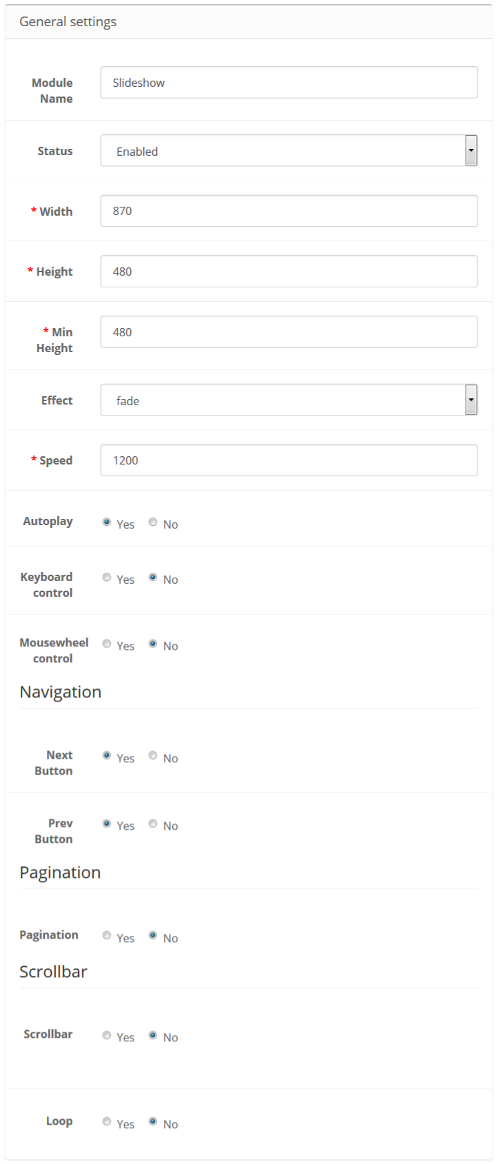
Available settings:
- Module Name — the name of the module;
- Status — define the module status (enabled/disabled);
- Width — the pixel width of the block;
- Height — the pixel height of the block;
- Min Height — set the minimum height of the slider;
- Effect — the animation effect of the slides. Can be "slide", "fade", "cube", "coverflow" or "flip";
- Speed — duration of transition between slides (in ms)(0-1);
- Autoplay — delay between transitions (in ms). If this parameter is not specified, autoplay will be disabled;
-
Keyboard control — set to true to enable navigation through slides using keyboard right and left, top and bottom keyboard arrows;
- Mousewheel control — set to true to enable navigation through slides using mouse wheel;
- Mousewheel release on edges — allow page scrolling when swiper is on edge positions (in the beginning or in the end);
- Next Button — if true, the "Next" button will be displayed;
- Prev Button — if true, the "Prev" button will be displayed;
- Pagination — if true, the slides pagination will be displayed;
- Scrollbar — if true, the Scrollbar will be displayed;
- Loop — if true, continuously loop from the last slide to the first slide.
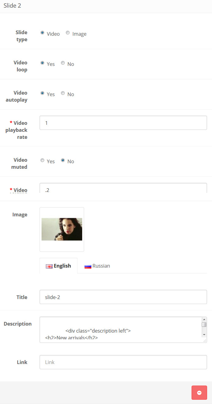
Slide type — choose a slide type (image or video);
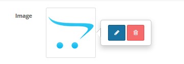
- Image — choose an image file. In order to choose the image, press the "edit button";
- Title — specify the image slide title;
- Description — some further information, Slide description;
- Link — link a slide to another page on your store or on the external website.
- Video loop — if disabled, the video will only play once, each time the video is played initially;
- Video autoplay — the video starts automatically, once the webpage is loaded;
- Video playback rate — enables you to select the video playback rate (0 -1);
- Video muted — choose to mute the video's volume if it normally has sound;
- Video volume — set the default volume level for the video (0-1);
- Image — show this image on mobile devices instead of a video;
- Title — specify the video slide title;
- Description — some further information, Slide description;
- Link — link a slide to another page on your store or on the external website.
Slides settings
You can create a new slide by pressing the "Add Slide" button.

Delete the slide pressing the "Remove Slide" button.

Image:

Video:
How to add a new TemplateMonster Slideshow module
Navigate to Extensions > Extensions.
Choose Modules in the Extension type dropdown.
Find the TemplateMonster Slideshow section. Press the Add New button to create a new module.
Use Ctrl+F to simplify the search process.
You will be brought to the settings window:
Fill in the required fields:
- Module Name — enter the name of the module;
- Status — define the module status (enabled/disabled);
- Width — set the pixel width of the block;
- Height — set the pixel height of the block;
- Min Height — set the minimum height of the slider;
- Effect — choose the animation effect of the slides. Can be "slide", "fade", "cube", "coverflow" or "flip";
- Speed — specify the duration of transition between slides (in ms)(0-1);
- Autoplay — specify the delay between transitions (in ms). If this parameter is not specified, autoplay will be disabled;
-
Keyboard control — set to true to enable navigation through slides using keyboard right and left, top and bottom keyboard arrows;
- Mousewheel control — set to true to enable navigation through slides using mouse wheel;
- Mousewheel release on edges — choose whether to allow page scrolling when swiper is on edge positions (in the beginning or in the end);
- Next Button — if true, the "Next" button will be displayed;
- Prev Button — if true, the "Prev" button will be displayed;
- Pagination — if true, the slides pagination will be displayed;
- Scrollbar — if true, the Scrollbar will be displayed;
- Loop — if true, continuously loop from the last slide to the first slide.
Slide type — choose a slide type (image or video);
- Image — choose an image file. In order to choose the image, press the "edit button";
- Title — specify the video slide title;
- Description — add some further information, Slide description;
- Link — link a slide to another page on your store or on the external website.
- Video loop — if disabled, the video will only play once each time the video is initially played;
- Video autoplay — the video starts automatically, once the web-page is loaded;
- Video playback rate — enables you to select the video playback rate (0 -1);
- Video muted — choose to mute the video's volume if it normally has sound;
- Video volume — set the default volume level for the video (0-1);
- Image — show this image on mobile devices instead of a video;
- Title — specify the video slide title;
- Description — add some further information, description about the Slide;
- Link — link a slide to another page on your store or on the external website.
Slides settings
You can create a new slide by pressing the "Add Slide" button.
Delete the slide pressing the "Remove Slide"
Image:
Video:
TemplateMonster Google Map
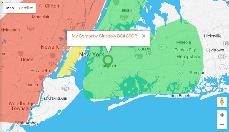
TemplateMonster Google Map lets you add an unlimited number of markers to maps, letting you highlight locations of interest. You can add colorful polygons, too.
The center of the map and one of the markers (main) are defined in store settings — System > Settings, in the Store tab, Geocode field.
Once you click on a marker, you will see the pop up window with the Address bar.
When the module is installed, you can configure it on the module configuration page.
How to manage TemplateMonster Google Map module
Navigate to Extensions > Extensions.
Choose Modules in the Extension type dropdown.
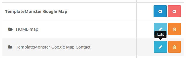
Find the TemplateMonster Google Map section. Press edit button to configure the existing module.
Use Ctrl+F to simplify the search process.
You will be brought to the settings window:
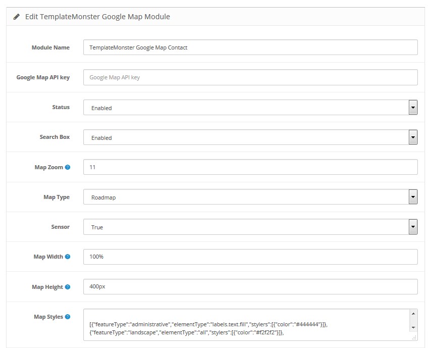
Available settings:
- Module Name — the name of the module;
- Google Map API key — API key for Google Map. You can find more details at the official website;
- Status — define the module status (enabled/disabled);
- Search Box — you can enable the Seach Box for the Google Map. Using the Search Box clients can find the custom address on the map;
-
Map Zoom — numerical value. Initial scaling used when displaying a map. A value of 0 corresponds to the lowest level of scaling. When increasing this value, map zooms in;
- Map Type — map type. There are 4 options available:
- Roadmap — road map, the one used by default;
- Terrain (Landscape) — topographical map based on terrain information;
- Hybrid — a combination of a basic map and satellite images;
- Satellite — Google Earth images taken by satellite;
- Sensor — indicates whether sensor that determines users location is used or not.
- Map Width — the width of the map. You should specify unit of measurement (% or px);
- Map Height — the height of the map. You should specify unit of measurement (% or px);
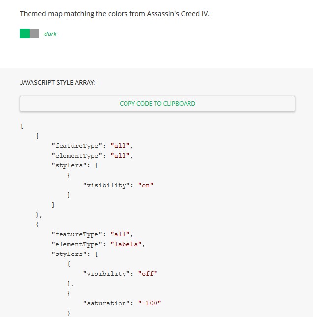
- Map Styles — sets the style of the map. The variety of styles is available at https://snazzymaps.com/;
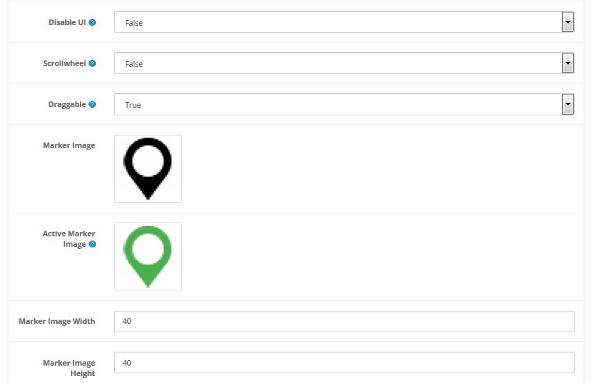
- Disable UI — enables/disables user interface by default;
- Scrollwheel — enables/disables map scaling with the help of mouse wheel;
- Draggable — enables/disables the option to move the map (Drag & Move);
- Marker Image — sets marker image. If you leave the field empty, it will apply default marker;
- Active Marker Image — sets marker image when clicking;
- Marker Image Width — sets marker image width;
- Marker Image Height — sets marker image height;
Copy the code and paste it into the Map Styles option field:
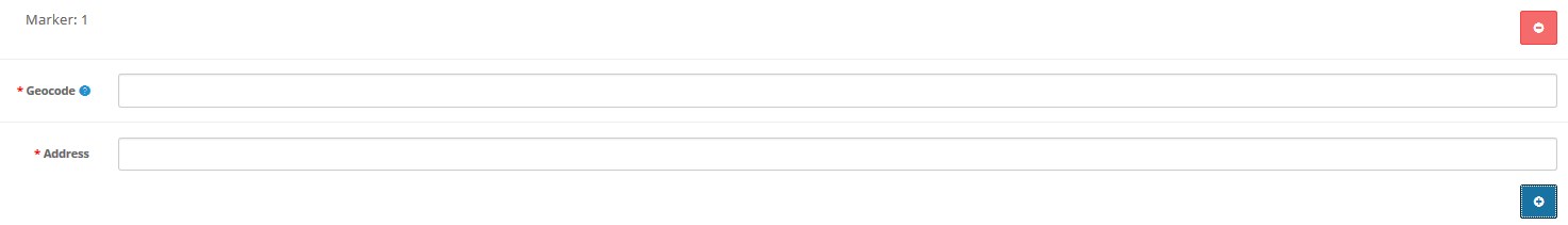
In order to add a marker, click Add Marker. In the Geocode field specify marker coordinates (latitude, longitude - Example: 40.6700 , -73.9400 ) and in the Address field enter the information that will show up when clicking the marker. Required coordinates can be found at http://www.mapcoordinates.net. In order to remove the marker, click Delete Marker.
Polygons:
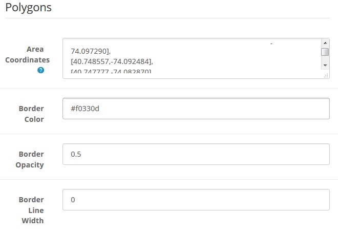
- Area Coordinates — enter the area(s) coordinates;
- Border Color — define the border color. Use Hex Color Code. E.g. #58d68d. You can find the desired Hex Color Code here;
- Border Opacity — set the border opacity (from 0 to 1);
- Border Line Width — set the border line width in px;
- Fill Color — define the areas fill color. Use Hex Color Code. E.g. #58d68d. You can find the desired Hex Color Code here.
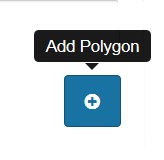
In order to add a polygon, click Add Polygon.
How to find the Area Coordinates
You can get the Area Coordinates here.
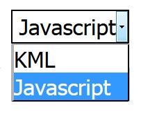
Select the Polygon from the option dropdown.
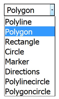
Select the Javascript from the option dropdown.
Mark the desired area on the map.
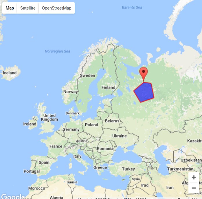
Copy the area coordinates.
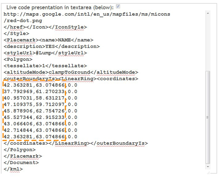
You'll obtain data as: 42.363281,63.074866,0.0 37.792969,61.270233,0.0 40.957031,58.631217,0.0 47.109375,59.712097,0.0 45.878906,62.754726,0.0 45.527344,62.915233,0.0 43.066406,63.074866,0.0 42.714844,63.074866,0.0 42.363281,63.074866,0.0.
You need to make the data as:
[42.363281,-63.074866], [37.792969,-61.270233], [40.957031,-58.631217], [47.109375,-59.712097], [45.878906,-62.754726], [45.527344,-62.915233], [43.066406,-63.074866], [42.714844,-63.074866], [42.363281,-63.074866]
Insert the final data in the Area Coordinates option field.
When complete, tab Save.
TemplateMonster Category Menu
This module allows to display the categories and 2 levels of the subcategories in the sidebar panel and including the images of the first level subcategories.
When the module is installed, you can enable/disable it on the module settings page.
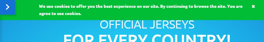
TemplateMonster Cookie Policy
This module notifies site visitors of using cookies. Following the Cookie Law conditions, you should add appropriate modules to your website that will display a warning message about the cookies used on your website.
Cookies are small text files which websites place on visitors computers. They’re typically used to identify the particular visitors and provide them with a better experience. Cookies are a crucial part of many website functions which we take for granted.
For instance, it’s usually cookies which allow online shops to remember what items you have in your shopping cart. They’re also used to keep you logged in to a website, or to provide valuable usage statistics and information to website owners.
If you run a website, it almost certainly uses cookies. Their most likely function is to monitor visitor numbers and behaviors through tools like Google Analytics. They may also be used to display relevant adverts to visitors, or – if you sell online – to power key parts of your online shopping system.
26th May 2012 — The ICO released a change to the enforcement, "implied consent" is now allowed as long as you make it clear where your privacy/cookie policy is.
When the module is installed, you can configure it on the module configuration page.
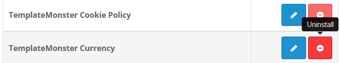
How to manage TemplateMonster Cookie Policy module
Navigate to Extensions > Extensions.
Choose Modules in the Extension type dropdown.
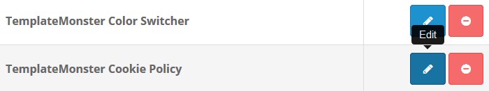
Find the TemplateMonster Cookie Policy module. Press edit button to configure the module.
Use Ctrl+F to simplify the search process.
You will be brought to the settings window:
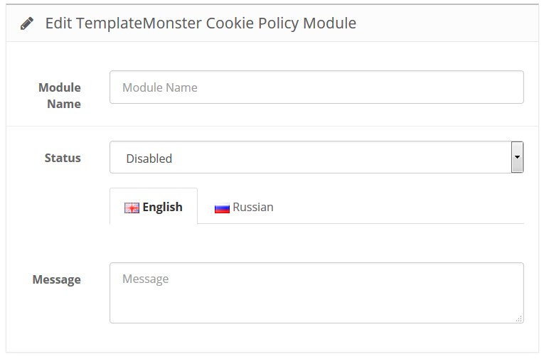
Available settings:
- Module Name — enter the name of the module;
- Status — define the module status (enabled/disabled).
- Message — the message to display to users.
Advise
To save changes, you should click the Save button.
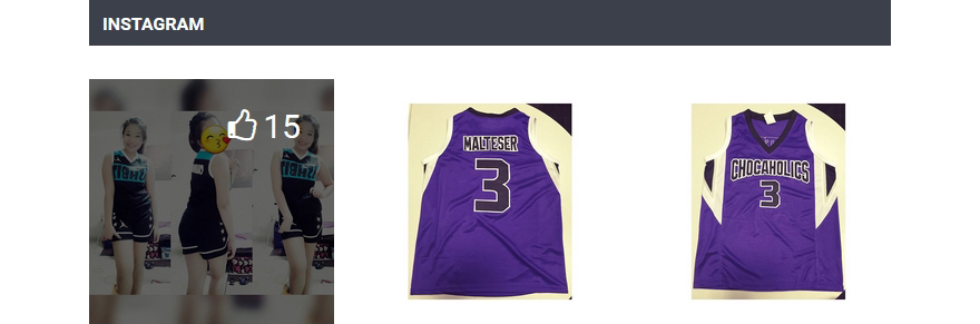
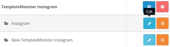
TemplateMonster Instagram
This module displays the Instagram social network pictures including the number of likes in a list.
When the module is installed, you can configure it on the module configuration page.
How to manage TemplateMonster Instagram module
Navigate to Extensions > Extensions.
Choose Modules in the Extension type dropdown.
Find the TemplateMonster Instagram section. Press the edit button to configure the existing module.
Use Ctrl+F to simplify the search process.
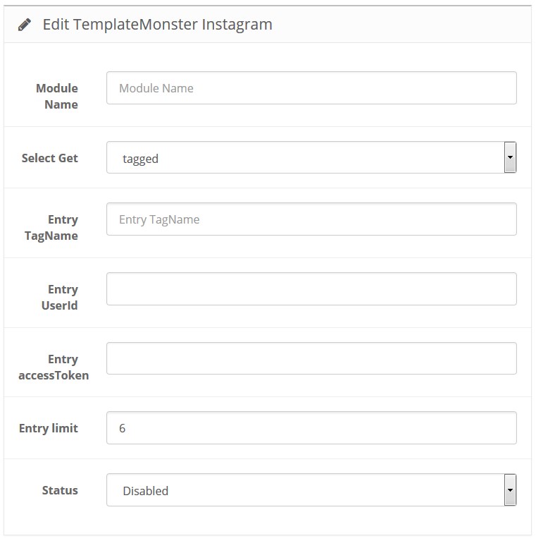
You will be brought to the settings window:
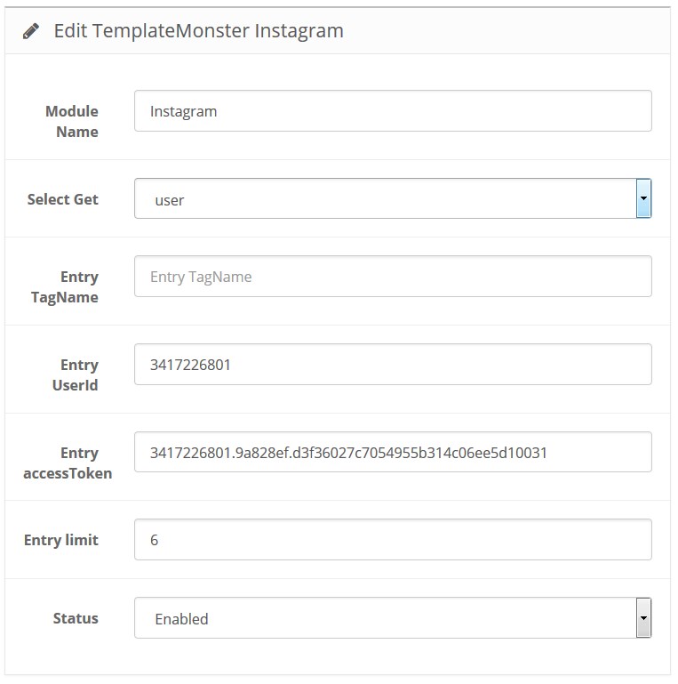
Available settings:
- Module Name — the name of the module;
-
Select Get — how to get the images. There are 2 values available (user and tagged), which means either to get the images of the exact user or using hashtag;
-
Entry TagName — tag that is used to display the images (it is used if you previously selected tagged in the "Select get" field);
- Entry Client ID — your API ID at instagram.com (it is used if you previously selected tagged in the "Select get" field);
- Entry User ID — user ID (it is used if you previously selected user in the "Select get" field);
- Entry accessToken — token to display custom image (it is used if you previously selected user in the "Select get" field);
- Entry limit — limit of entries;
- Status — module status (enabled/disabled).
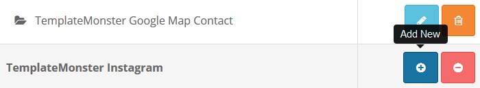
How to add a new TemplateMonster Instagram module
Navigate to Extensions > Extensions.
Choose Modules in the Extension type dropdown.
Find the TemplateMonster Instagram section. Press the Add New button to create a new module.
Use Ctrl+F to simplify the search process.
You will be brought to the settings window:
Fill in the required fields:
- Module Name — enter the name of the module;
- Select Get — how to get the images. There are 2 values available (user and tagged), which means either to get the images of the exact user or using hashtag;
- Entry TagName — tag that is used to display the images (it is used if you previously selected tagged in the "Select get" field);
- Entry Client ID — your API ID at instagram.com (it is used if you previously selected tagged in the "Select get" field);
- Entry User ID — user ID (it is used if you previously selected user in the "Select get" field);
- Entry access Token — token to display custom image (it is used if you previously selected user in the "Select get" field);
- Entry limit — limit of the entries;
- Status — module status (enabled/disabled).
To get Instagram USER ID and Access Token follow the instructions below.
What is Instagram Access Token – Brief Description
Authenticated requests need Instagram Access token. Access Token is an opaque string that identifies a user, an app or a page. It can be used by the app to make graph API calls and is unique to each user.
Instagram Access Token is essential for the usage of most Instagram-based apps.
Step-by-Step Guide for Getting Instagram Access Token
You have to complete the following 3 simple steps to get Instagram Access Token:
- Sign in to Instagram as a developer.
- Register a new Client ID.
- Get Instagram Access Token using Client ID and Client Secret.
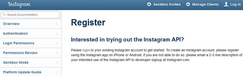
1. Sign in to Instagram as a developer
Visit the Instagram Developer Page
Before getting your Access Token you have to register as a developer in Instagram and receive Client ID and Client Secret. That’s why you should follow the link to the Instagram developer web page.
Instagram developer register page:
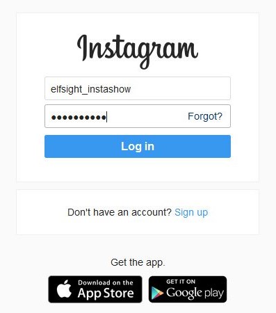
Login to Instagram
To get a Client ID and Client Secret you need to be registered in Instagram. Create an account or login using the existing account to pass on to the next step.
Instagram login complete:
Fill in the Developer Signup
Instagram demands to be registered as a developer from everyone, who wants to display Instagram feed on his website. Since you've logged into Instagram the next window will appear.
Fill in your developer signup:
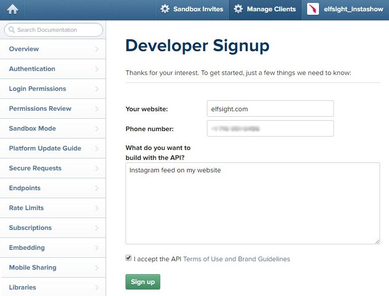
Check all the fields on the web page:
- Your website – the URL of your website.
- Phone number – any phone number.
- What do you want to build with API – any short description.
After this signup, the Instagram Developer Documentation will appear. There you will see greetings and the following overview.
Welcome, new developer!
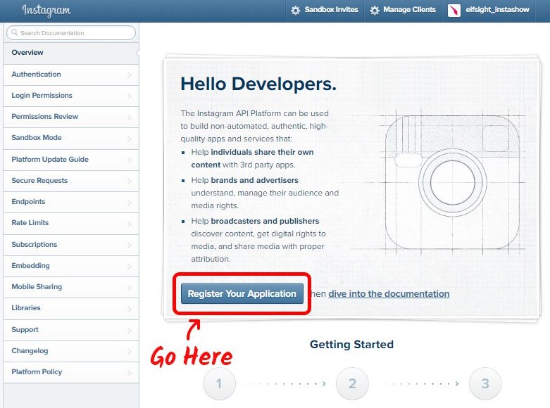
Now, as a developer, you can register your application. To do that click on the link marked above. Instagram will notify you that at the moment you don’t have any apps and will offer you to create a new one.
Now register a new client:
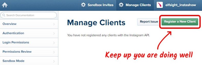
The next step is to authorize your new application and new client.
2. Register a New Client ID
The next page has 4 obligatory fields for filling so be attentive!
New client ID signup:
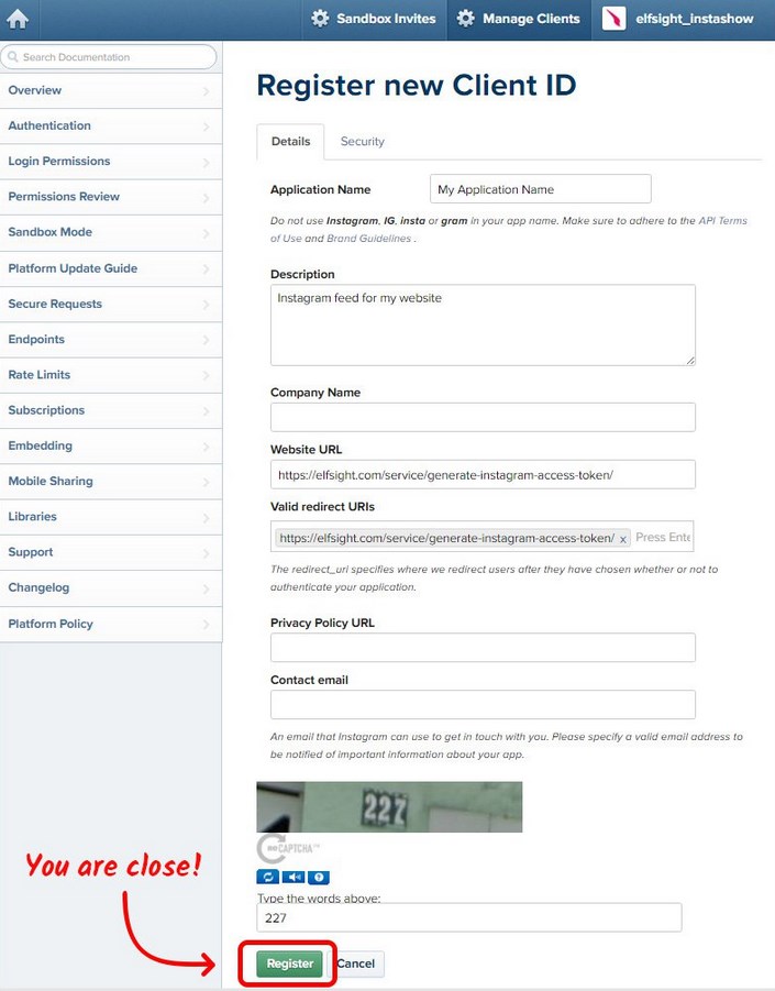
Check the fields on the web page:
- Application name – choose any appropriate name, which fits Instagram requirements.
- Description – any short description.
- Website URL – have to be https://elfsight.com/service/generate-instagram-access-token/.
-
Valid redirect URIs – have to be https://elfsight.com/service/generate-instagram-access-token/ [note that you should set the link exactly to our service].
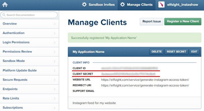
Now confirm your data and proceed to the next page. Here you can see received Instagram Client ID and Client Secret.
Here is your Client ID and Client Secret:
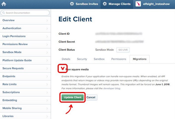
Note that if you are going to work with square photos on your website then turn on the non-square media option. Just edit your client and find “Migrations” section. Don’t forget to click “Update Plugin” so that the changes take effect.
Instagram non-square media section:
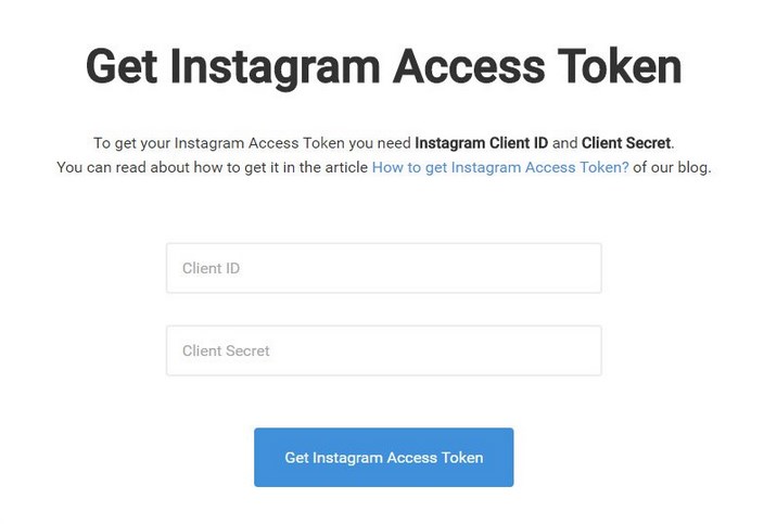
3. Get Instagram Access Token using Client ID and Client Secret
Copy your all-new Instagram Client ID and Client Secret and paste here.
Instagram Access Token page:
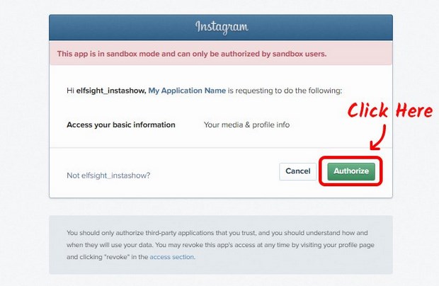
We created this page so that you will be able to get your Instagram Access Token in the fastest way. Note that Instagram will request your authorization as a sandbox user. That’s why click “Authorize” on the next page in order to complete the task.
Sandbox authorization window:
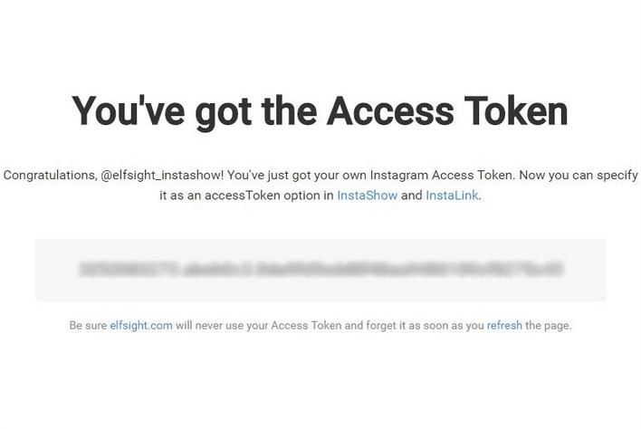
Copy the Generated Access Token
Congratulations! You’ve achieved the task and got your Instagram Access Token. Feel free to use it and display Instagram photos on your website with the help of TM Instagram plugin.
You’ve received your Access Token:
This information was taken from the official sources.
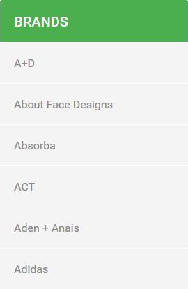
TemplateMonster Manufacturers
This module allows to display the list of the manufacturers . Manufacturers can be added in Catalog > Manufacturers menu.
When the module is installed, you can enable/disable it on the module configuration page.
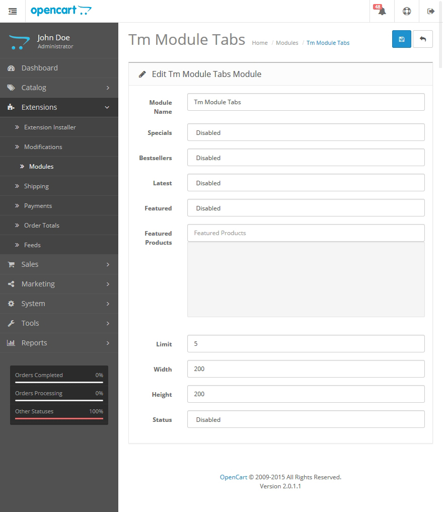
TemplateMonster Module Tabs
This module allows to display 4 main modules (Bestsellers, Featured, Specials, Latest) in tabs.
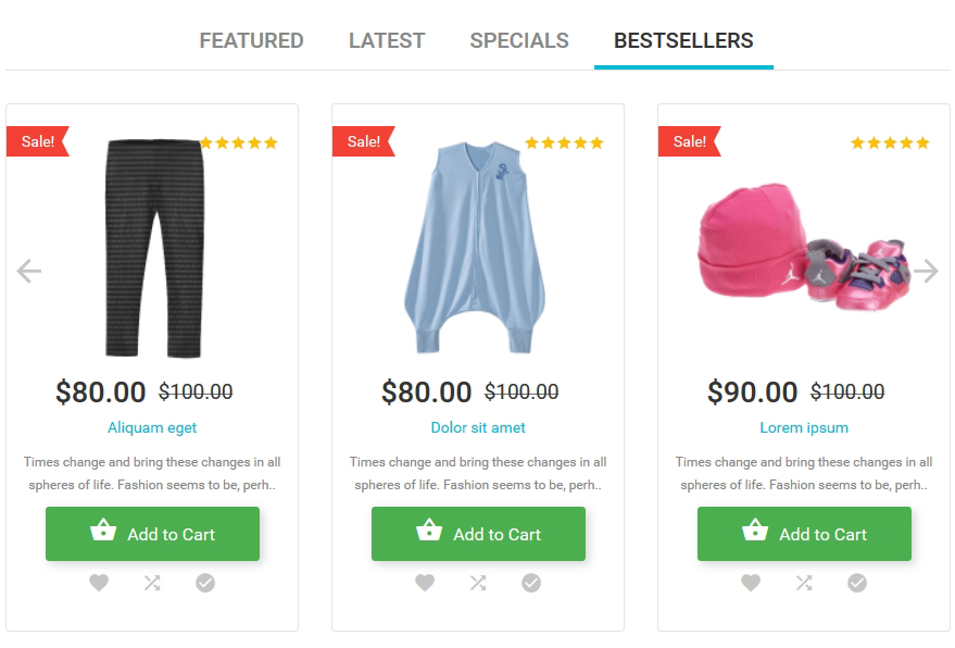
When the module is installed you can configure it on the module configuration page.
Settings:
-
- Module Name
- the name of the module;
-
- Specials
- enables/disables module Specials;
-
- Bestsellers
- enables/disables module Bestsellers;
-
- Latest
- enables/disables module Latest;
-
- Featured
- enables/disables module Featured;
-
- Products
- selection of the product list for the Featured tab;
-
- Limit
- sets the limit for the number of displayed products;
-
- Width
- product image width;
-
- Height
- product image height;
-
- Status
- module status (enabled/disabled).
TemplateMonster Newsletter
This module allows you to add newsletter block with the subscription form.
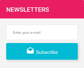
When the module is installed, you can configure it on the module configuration page.
How to manage TemplateMonster Newsletter module
Navigate to Extensions > Extensions.
Choose Modules in the Extension type dropdown.
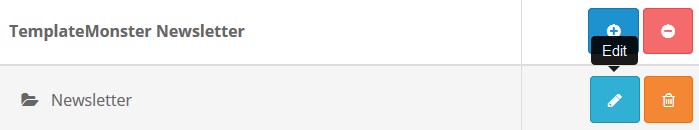
Find the TemplateMonster Newsletter section. Press the edit button to configure the existing module.
Use Ctrl+F to simplify the search process.
You will be brought to the settings window:
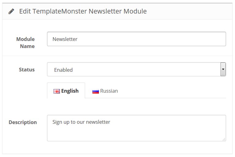
Available settings:
- Module Name — the name of the module;
-
Description — text that will be seen just before filling in the subscription form;
- Status — module status (enabled/disabled).
How to add a new TemplateMonster Newsletter module
Navigate to Extensions > Extensions.
Choose Modules in the Extension type dropdown.
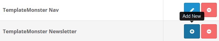
Find the TemplateMonster Newsletter section. Press the Add New button to create a new module.
Use Ctrl+F to simplify the search process.
You will be brought to the settings window:
Fill in the required fields:
- Module Name — the name of the module;
-
Description — text that will be seen just before filling in the subscription form;
- Status — module status (enabled/disabled).
How to set up newsletter
-
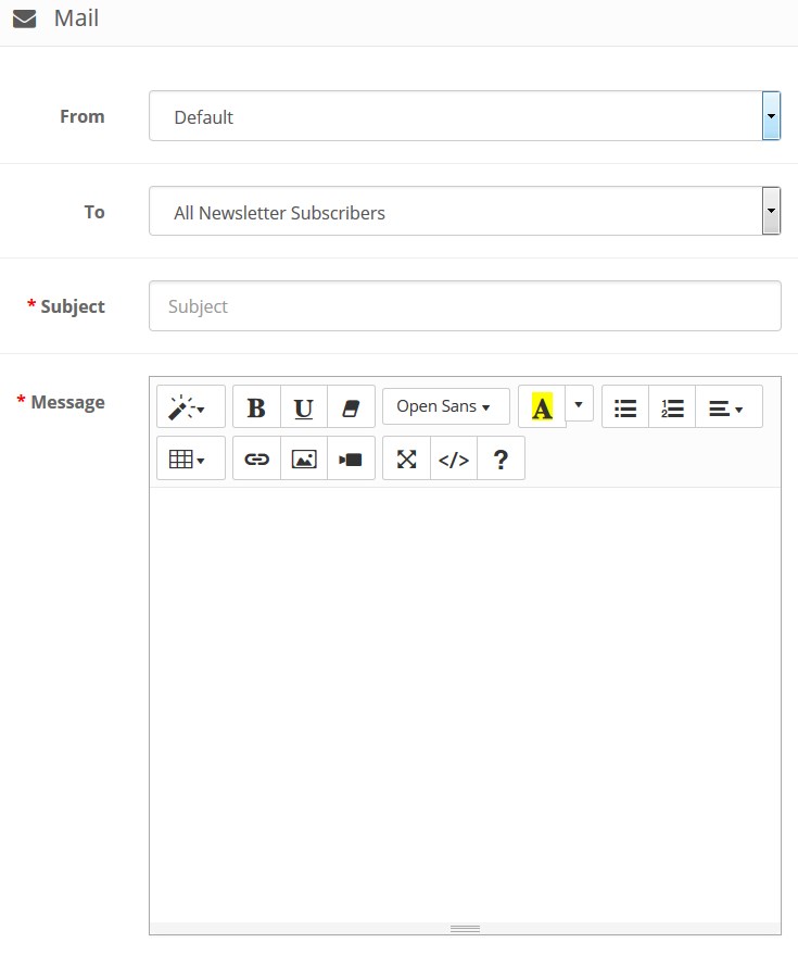
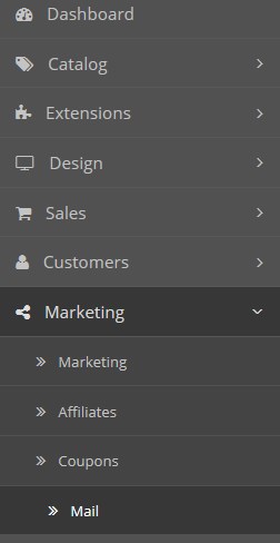
To create a newsletter for your customers, log into the admin panel and navigate to Marketing > Mail.
-
Fill in the fields with the necessary data and click Send.
-
From – by default, your store email is the sender.
-
To – by default, All Newsletter Subscribers are selected, you can change the group to send the email from the dropdown.
-
Subject – this is a required field where you need to type the title for your newsletter.
-
Message – this is also a required field, type your message text here.
-
- Click Send button.
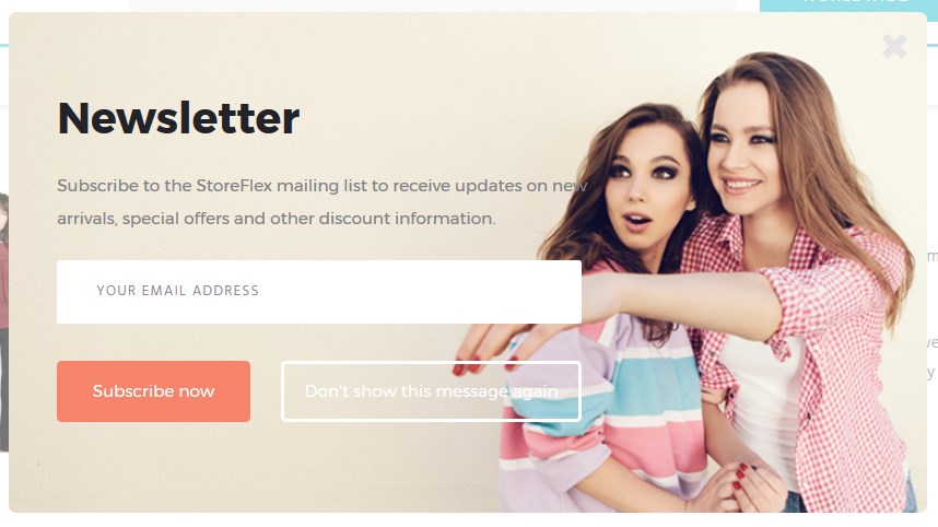
TemplateMonster Newsletter Popup
This module allows you to add a popup window with an offer to subscribe to the email newsletter when someone is viewing your site. The window is not showing up for authorized (logged in) users and those who have already subscribed.
When the module is installed, you can configure it on the module configuration page.
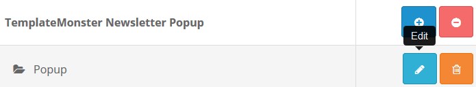
How to manage TemplateMonster Newsletter module
Navigate to Extensions > Extensions.
Choose Modules in the Extension type dropdown.
Find the TemplateMonster Newsletter section. Press the edit button to configure the existing module.
Use Ctrl+F to simplify the search process.
You will be brought to the settings window:
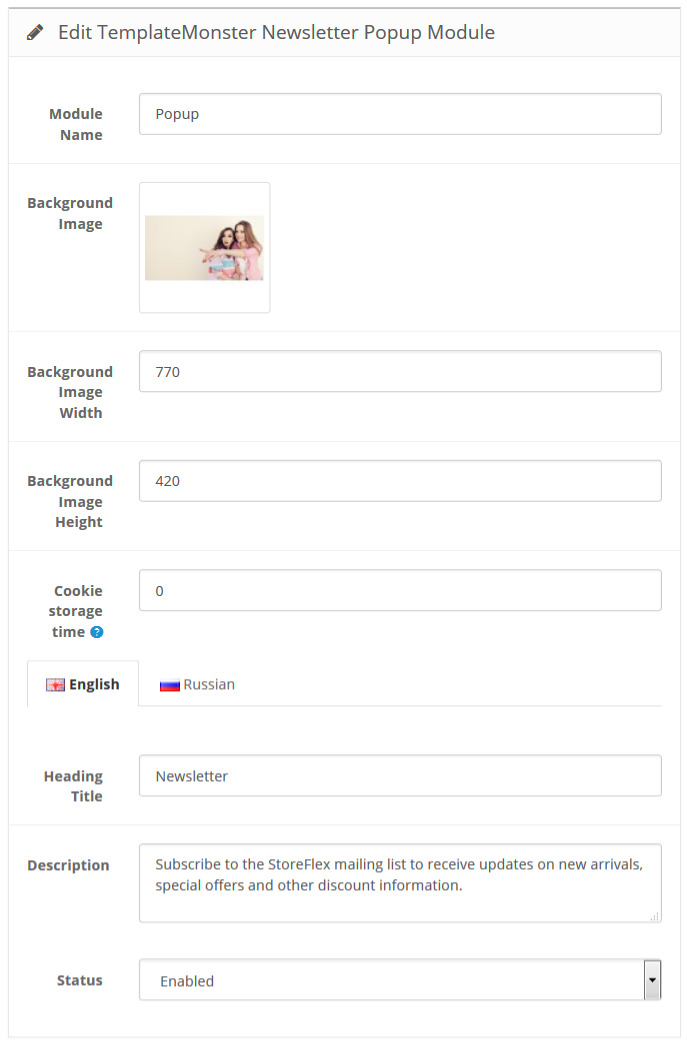
Available settings:
- Module Name — the name of the module;
- Background Image — background image set for the popup;
- Background image width — set the background image width;
- Background image height — set the background image height;
- Cookie Storage Time — specify the time before the window pops up again;
- Heading Title — enter the popup heading;
-
Description — popup description, the main text which will be displayed within the module;
- Status — module status (enabled/disabled).
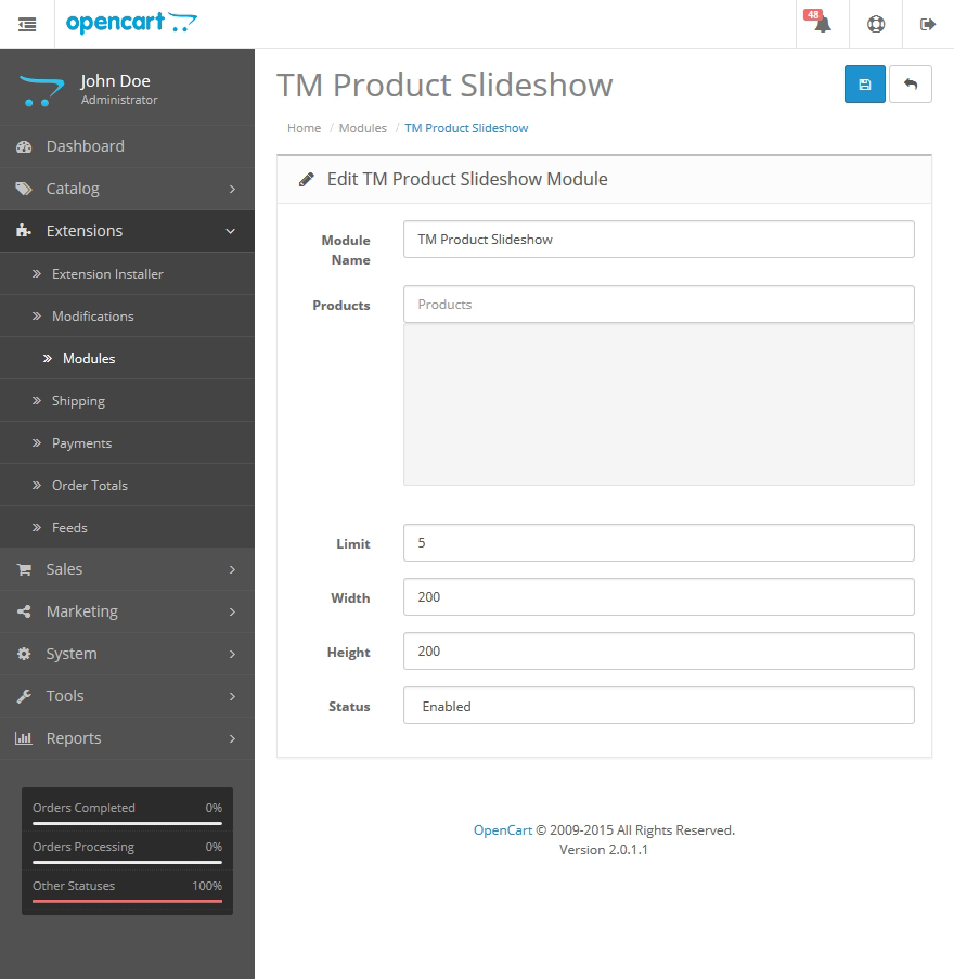
TemplateMonster Product Slideshow
This module allows to display selected products with the carousel view.
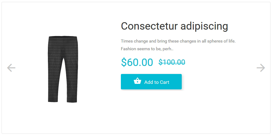
When the module is installed, you can configure it on the module configuration page.
Settings:
-
- Module Name
- the name of the module;
-
- Products
- selection of the product list;
-
- Limit
- the number of displayed products;
-
- Width
- product image width;
-
- Height
- product image height;
-
- Status
- module status (enabled/disabled).
TemplateMonster Social List
This module allows you to display the list of the popular social network links.
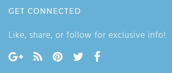
If you install the "updated" theme version, template sample content (the list of the social network links) will not be available. In order to configure the module properly, make sure to fill in the required information.
When the module is installed, you can configure it on the module configuration page. If you leave the field empty, the element will not show up in the list.
How to manage TemplateMonster Social List module
Navigate to Extensions > Extensions.
Choose Modules in the Extension type dropdown.
Find the TemplateMonster Social List section. Press the edit button to configure the existing module.
Use Ctrl+F to simplify the search process.
You will be brought to the settings window:
Available settings:
- Module Name — the name of the module;
- Title — enter the module title. The one displayed on the frontend;
- Description — module description, the main text which will be displayed within the module;
- Name — enter the name of the Social Icon.
- Link — specify the page link;
- Css — CSS class name for the Icon to use for styling of the one;
- Status — module status (enabled/disabled).
Find out more Icons styles here.
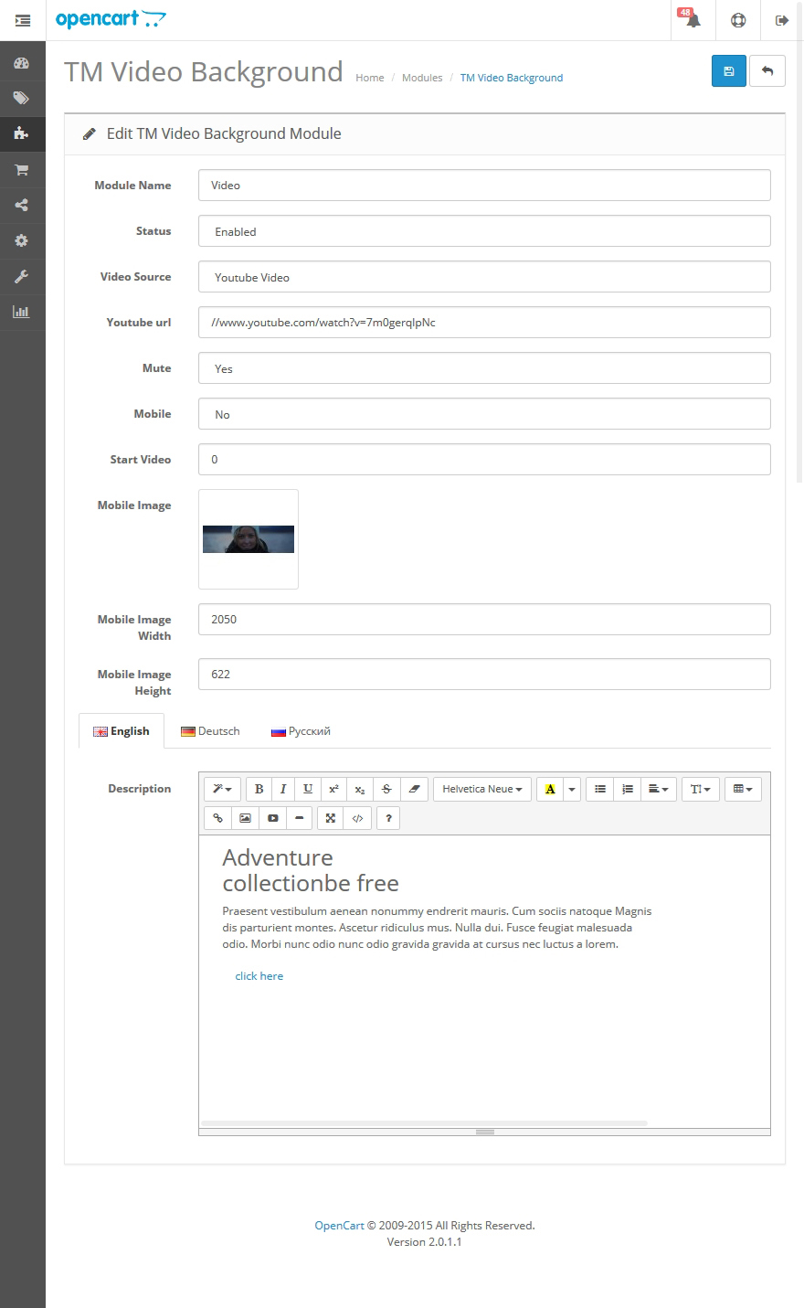
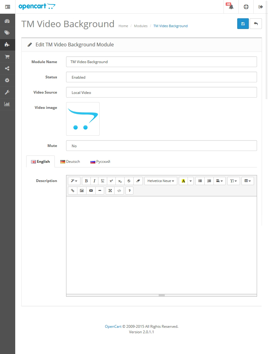
TemplateMonster Video Background
This module allows to add a block with the video background (either uploaded from your website or the one shared from YouTube service) .
When the module is installed you can configure it on the module configuration page.
Settings:
-
- Module Name
- the name of the module;
-
- Status
- module status (enabled/disabled)
-
- Video Source
- video source. There are 2 options available:
-
- local
- loading from your website;
-
- youtube
- loading from YouTube.
-
- YouTube url
- YouTube video link;
-
- Mute
- disabling volume;
-
- Mobile
- enables/disables video on mobile device. IF 'Yes', video will be showing up on mobile;
-
- Start Video
- exact time when the video starts;
-
- Mobile Image
- image that will show up on mobile if the video is disabled for mobile device;
-
- Mobile Image Width
- background image width;
-
- Mobile Image Height
- background image height;
-
- Description
- html-markup that will be showing up in from of the video.
If choosing Video Source - Local Video, set an image (banner) in ".jpg" format, that will be used for mobile devices. The folder that contains background image should also include 3 video files with the same name and using the following formats:
- *.ogv
- *.mp4
- *.webm
TemplateMonster Search
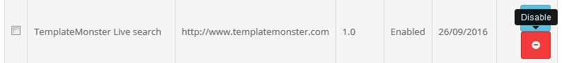
TemplateMonster Live Search modification allows you to display searched product(s) without reloading the page.
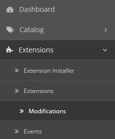
In order to remove or disable it, navigate to the Extensions > Modifications.
Select the modification from the list, and click Disable.
Use Ctrl+F to simplify the search process.
TemplateMonster Lazy load
Modification that allows you to load product images at the time they appear when scrolling the website. This extension allows you to speed up website performance. In order to change preloader image, you should replace the lazy_loader.gif file in the catalog/view/theme/themeXXX/image/folder.
Blog
The following extension allows you to manage posts and news connected to your store.
Main features:
- creating articles;
- creating categories;
- creating authors;
- commenting articles and replying to the comments;
- viewing report;
- displaying products and articles related to the certain article;
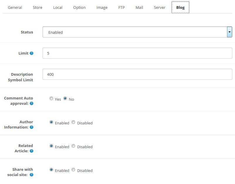
In order to change Blog global settings navigate to System > Settings. Select the store where you want to change the settings out of the list and click Edit.
Blog settings can be seen in Blog section:
- Status — blog status (enabled/disabled);
- Limit — number of posts per page;
- Description Symbol Limit — number of symbols in the article description on the main Blog page (not on single article!);
- Comment Auto approval — enables/disables automatic comment approval by administrator;
- Author Information — enables/disables information about the author on article page;
- Related Article — enables/disables related articles;
- Share with social site — enables/disables social share buttons.
In the side panel you can see a new tab — Simple Blog. It contains the following options:
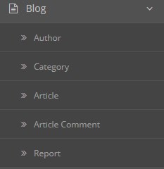
- Author — list of created authors;
- Category — list of created categories;
- Article — list of created articles;
- Article Comment — list of added comments;
- Report — views report.
Author
Author list contains basic information of them such as Author Name, Status and Date Added. To add new author click the Insert button and use edit link to change author information.
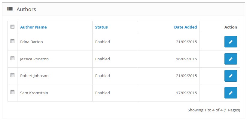
Basic action you can perform through this page is:
- Bulk action delete and edit
Choose the author by checking the box on the left panel of author list then click either delete or edit button.
Author Insert/Edit
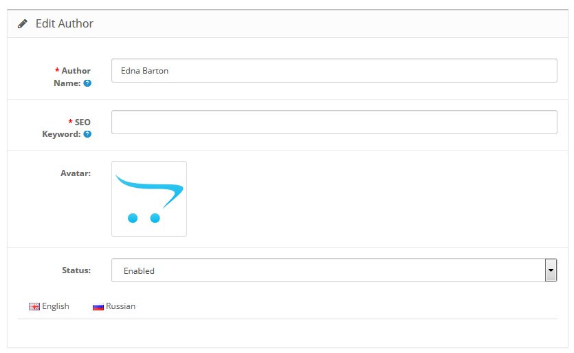
| Author Name | - | enter the author name. Author name must be unique. |
| SEO Keyword | - | do not use spaces, instead replace spaces with - and make sure the keyword is globally unique. |
| Avatar | - | choose an avatar picture. |
| Status | - | enable/disable the author. |
| Description: | - | add information about the author. |
| Meta Tag Description | - | explanation of your description content. |
| Meta Tag Keywords | - | keywords relevant to the page's content. |
Category
Category list contains all the categories you made and shows basic information of them such as Category Name, Sort Order and Status. To create a new category, click the Insert button. Use the edit link to edit your category.
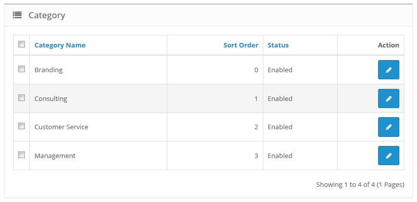
Basic action you can perform through this page is:
- Bulk action delete and edit
Choose the category by checking the box on the left panel of category list then click button either delete or edit.
Category Insert/Edit
Category Manager supports multilanguage and at this section is where you put all the data related to a category per language basis.
- General;
- Data.
General Tab
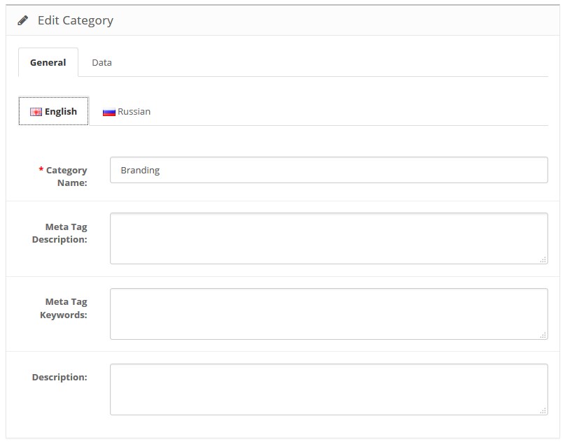
| Category Name | - | category Title. |
| Meta Tag Description | - | Explanation of your Description content. You can think of this as of a summary that appear on search engines. |
| Meta Tag Keywords: | - | keywords relevant to the page's content. |
| Description | - | category content, shows up as category description before the articles list. |
Data Tab
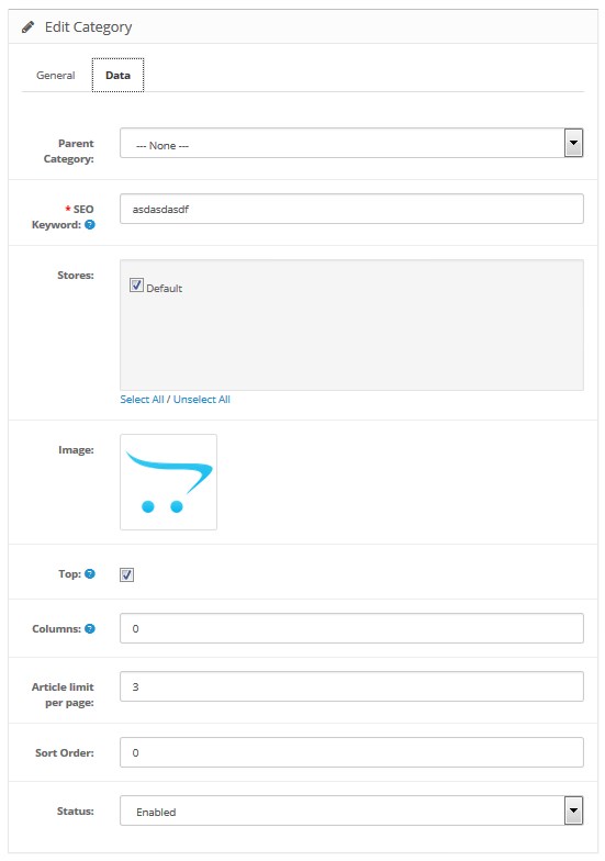
| Parent Category | - | select parent category. |
| Meta Tag Keywords | - | keywords relevant to the page's content. Keywords must be globally unique. |
| Stores | - | select on what stores you want the category to show. |
| Image | - | image to show with the category description. |
| Top | - | display in the top menu bar. Works only for the top parent categories. |
| Columns | - | number of columns to use for the bottom 3 categories. Works only for the top parent categories. |
| Article limit per page | - | indicate how many posts will be displayed per page. |
| Sort Order | - | sort categories according to the custom sort order. |
| Status | - | enable/disable the category. |
Article
Article list contains all the articles you made and shows basic information of them such as Article Title, Author Name, Status and Date Added. To create a new article, you should click the Insert button and use edit link to edit your article.
Basic action you can perform through this page is:
- Bulk action delete and edit
Choose the article by checking the box on the left panel of article list then click button either delete or edit.
Article Insert/ Edit
- General;
- Content;
- Option;
- Related.
General Tab
Blog Manager supports multilanguage and this section is where you put all the data related to your article per language basis.
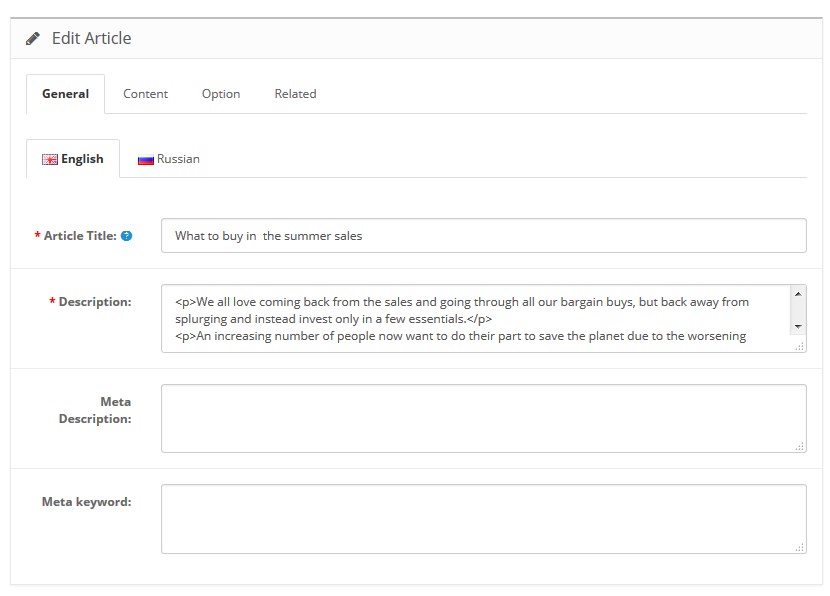
| Title | - | article Title. |
| Description | - | article Content. |
| SEO Description | - | explanation of your article content. |
| SEO Keyword | - | keywords relevant to the page's content. |
Content Tab
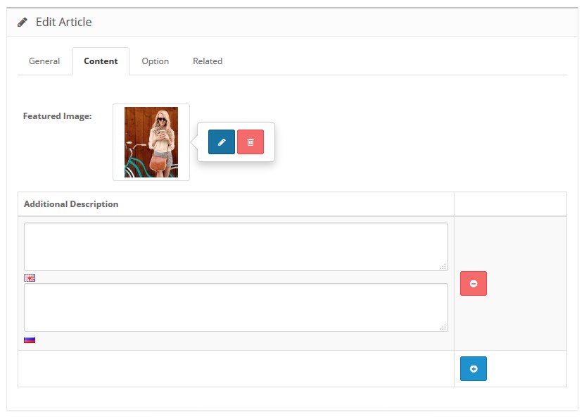
| Featured Image | - | set featured image. In order to choose the image, press the "edit button". |
| Additional Description | - | additional information on this article. |
Option Tab
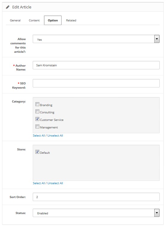
| Allow comments for this article? | - | override global setting to show or hide comment specific to this article. |
| Author Name | - | show author name. |
| SEO Keyword | - | keywords relevant to the page's content. |
| Category | - | attach article to categories. |
| Store: | - | select on what stores you want to show the article. |
| Sort Order: | - | sort posts on the blog posts page according to the custom sort order. |
| Status: | - | enable/disable the article. |
Related Tab
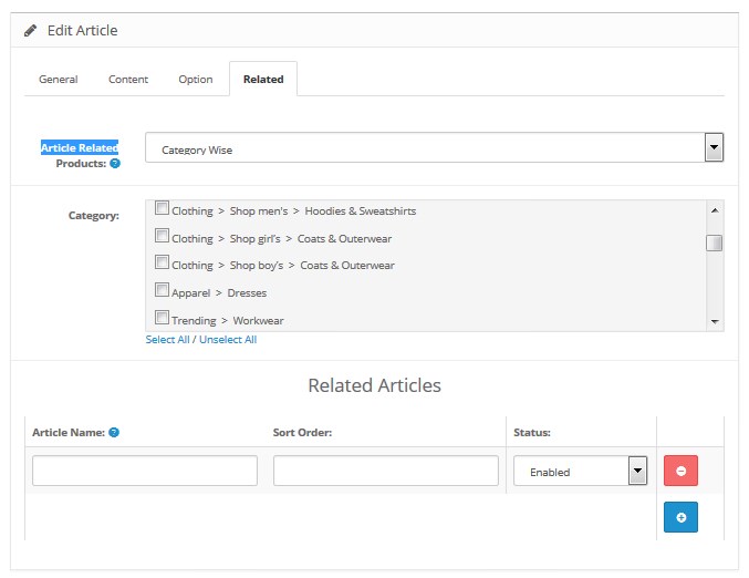
| Article Related Products | - | this article is related to single product or product category or product manufacturer, select according to requirement. |
| Category | - | select the category. |
| Related Articles | - | select related article. |
| Article Name | - | article name must be select on autocomplete. |
| Sort Order: | - | sort articles on the page according to the custom sort order. |
| Status: | - | enable/disable the article display. |
Article Comment
How to manage blog comments
-
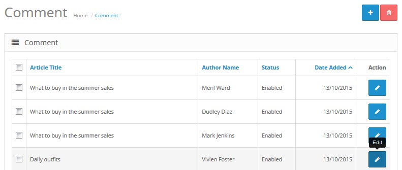
Navigate to the Blog > Article Comment section. Here you will see all the comments added to your blog articles.
-
Locate the needed comment, and press the Edit button in the right column:
-
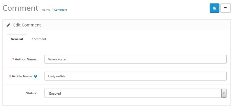
Here you can see two tabs: General and Comment. In the General tab you have the option to edit the Author Name, select the Article Name and enable or disable comment by setting its Status to 'Enabled' or 'Disabled'. Once you are done with your modifications, press the Save button above:
-
In the Comment tab you have the option to edit the Comment text itself. Also, you can add your reply by clicking the Add Comment Reply button below:
-
Except for editing the existing comments, you can also add a new one. Press the Insert button at the top under the Blog > Article Comment section.

Complete all the required fields such as Author Name, Article Name and Comment and make sure that Status is set to 'Enabled' if you need a comment to be visible on the website. Press the Save button to save your changes.
-
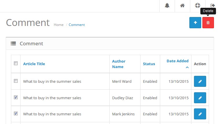
In order to delete a comment, check the box in the left column for the respective comment, and press the Delete button at the top:
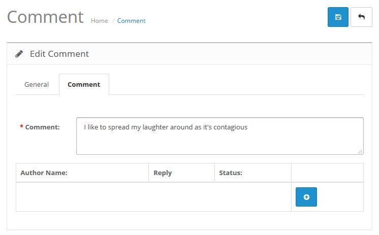
You will be able to add the Author Name, your Reply and select the Status of the reply. Once you are done with your modifications, press the Save button.
TM Blog Articles
This module allows you to display blog articles by categories.

Once the module is installed you can configure it on the module settings page.
How to manage TemplateMonster Blog Articles module
Navigate to Extensions > Extensions.
Choose Modules in the Extension type dropdown.
Find the TemplateMonster Blog Articles section. Press the edit button to configure the existing module.
Use Ctrl+F to simplify the search process.

You'll see the settings window:
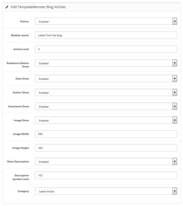
Available settings:
- Status — module status (enabled/disabled);
- Module Name — the name of the module;
-
Article limit — number of articles to display;
-
Readmore Button Show — enables/disables Read more button;
- Date Show — enables/disables date;
- Author Show — enables/disables article author;
- Comments Show — enables/disables the number of comments per article;
- Image Show — enables/disables article image;
- Image Width — image width;
- Image Height — image height;
- Description Symbol Limit — number of symbols in article description;
-
Category — you can set the category to pull articles from. There is also a possibility to display most popular articles or recently added articles.
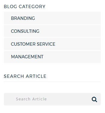
TM Blog Category
This module allows you to display blog articles according to different options.
Once the module is installed you can configure it on the module settings page.
How to manage TemplateMonster Blog Category module
Navigate to Extensions > Extensions section.
Choose Modules in the Extension type dropdown.
Find the TemplateMonster Blog Category section. Press the edit button to configure the existing module.
Use Ctrl+F to simplify the search process.
You'll see the settings window:
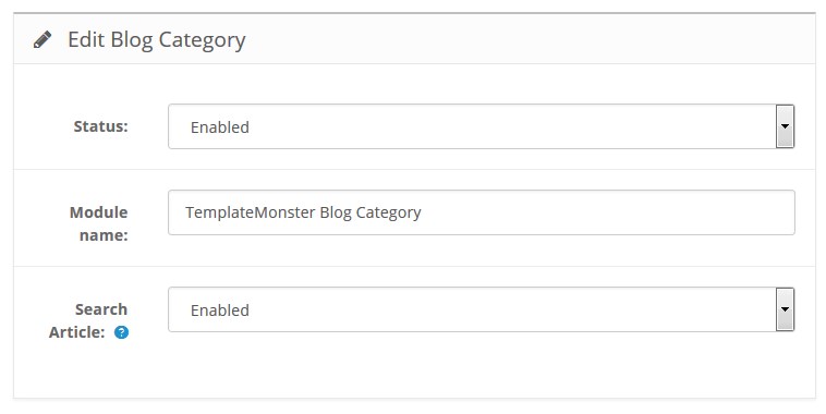
Available settings:
TemplateMonster 360-view
TemplateMonster 360-view is the module that turns image frames into animations. The aim of this module is to provide a 360 degree view of a product.
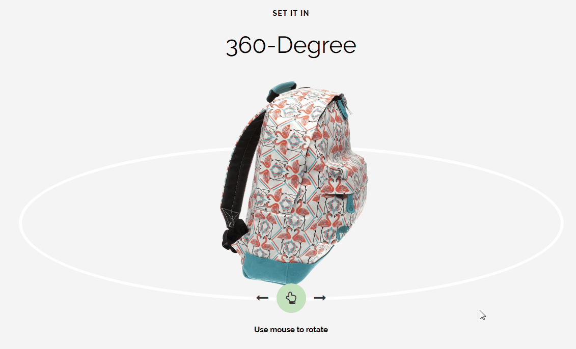
How to manage TemplateMonster 360-view module
Navigate to the Extensions > Extensions section.
Choose Modules in the Extension type dropdown.
Find the TemplateMonster 360-view section. Press the edit button to configure the existing module.
Use Ctrl+F to simplify the search process.
You will be brought to the settings window:
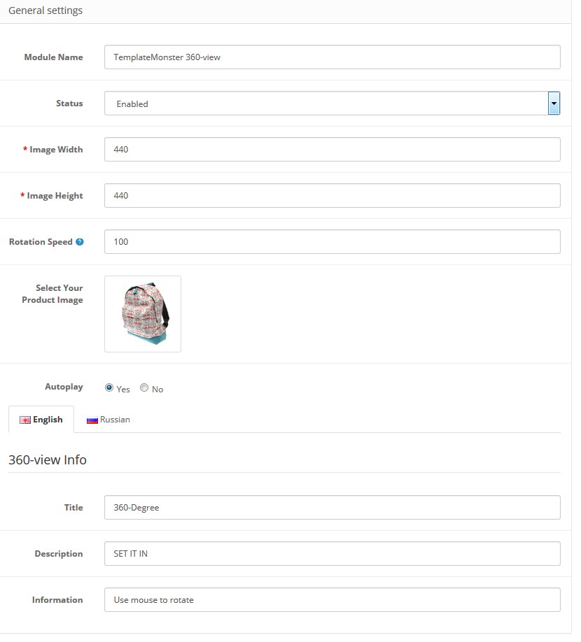
Available settings:
- Module Name — enter the module name (not visible on the frontend);
- Status — module status (enabled/disabled);
- Image Width — set the image width, it is the actual display width (in px);
- Image Height — set the image height, it is the actual display height (in px);
- Rotation Speed — you can change the speed of rotation. The default is 100. Make it spin faster by decreasing the number or slow it down by increasing the number. There is an inverse relationship between Rotation Speed value and actual speed of rotation;
- Select Your Product Image — upload images for the spin;
- Autoplay — if enabled starts the animation on load.
The TemplateMonster 360-view module supports multilanguage, so you can configure it for each shop language separately.
- Title, Description, Information — enter the informative texts you want to display within the module.
When complete, tab Save.
Requirements for the image files:
- Your images should have filenames which identify the sequence using numbers starting at 1 (e.g. 1.png, 2.png, 3.png etc).
- Use a separate folder for each image spin.
- All images should be the same size.
- The object should be on a transparent background.
- PNG image format is preferred.
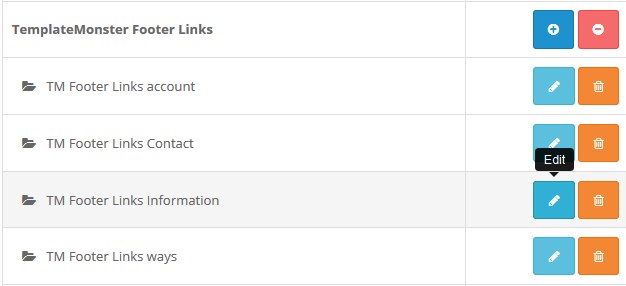
TM Footer Links
How to manage TM Footer Links module
Navigate to Extensions > Extensions.
Choose Modules in the Extension type dropdown.
Find the TM Footer Link section. Press the edit button to configure the existing module.
Use Ctrl+F to simplify the search process.
You will be brought to the settings window:
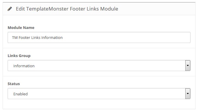
- Module Name — the name of the module;
- Links Group — choose a group of links you want to display in the footer;
- Status — define the module status (enabled/disabled).
Frontend:
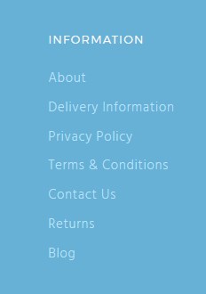
- Module Name — TM Footer Links Information;
- Links Group — Information;
- Status — enabled.
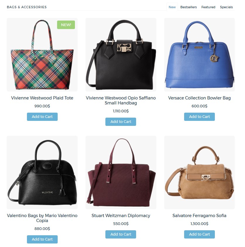
TemplateMonster Single Category Products
This module allows you to display 4 main modules (Bestsellers, Featured, Specials, Latest) with the products from certain category in the tab view.
After the module is installed you can configure it on the module settings page.
How to manage TemplateMonster Single Category Products module
Navigate to Extensions > Extensions.
Choose Modules in the Extension type dropdown.
Find the TemplateMonster Single Category Products section. Press the edit button to configure the existing module.
Use Ctrl+F to simplify the search process.
You will be brought to the settings window:
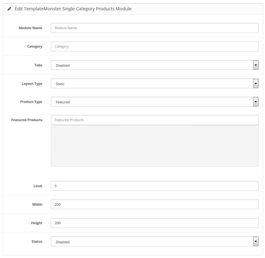
Available settings:
- Module Name — the name of the module;
- Category — allows you to select the existing product category;
- Tabs — enables/disables tab view. If disabled, there is an option to select module view type;
-
Product Type
— allows you to select module type. Available when the Tabs option is disabled.
The following values are available:
- Specials;
- Bestsellers;
- Featured;
- Latest.
- Specials — enables/disables Specials module;
- Bestsellers — enables/disables Bestsellers module;
- Featured — enables/disables Featured module;
- Latest — enables/disables Latest module;
-
Featured Products — allows you to select product list for the module Featured. Available when Featured module is enabled or Product type option is set to Featured;
- Limit — the number of products to display;
- Width — product image width;
- Height — product image height;
- Status — module status (enabled/disabled).