- Web templates
- E-commerce Templates
- CMS & Blog Templates
- Facebook Templates
- Website Builders
JS Animated. How to edit screen resolution dependent styles
July 17, 2013
This tutorial is going to show you how to edit screen resolution dependent styles on a JS Animated template.
JS Animated. How to edit screen resolution dependent stylesIf your template is Responsive JS Animated/Bootstrap, it comes with different styles dependent on different screen resolution. If you need to edit them:
- We suggest that you use the Mozilla Firefox web browser with Firebug installed.
- Go to the ‘site’ folder of your template and open the index.html file in Firefox.
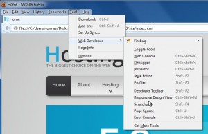
- In Firefox go to Tools -> Web Developer -> Responsive Design View (or just hit Ctrl + Shift + M):
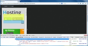
- The drop-down list of the resolutions available allows you to check how your template looks at them.
- If you want to change something in .css on your site at a particular screen resolution, use Firebug to search for the necessary file name, its location and the line to make the changes to. It is going to be the style.css file located in the ‘site/css’ folder of your template and the line is going to be one under the RESPONSIVE LAYOUTS in it. Firebug will allow you to identify the exact line number and to try making changes before you are going to apply them to .css.


Feel free to check the detailed video tutorial below:
JS Animated. How to edit screen resolution dependent styles


