Joomla 3.x Documentation
Joomla Plugins & Modules
Joomla website functionality can be enhanced by using various Joomla Plugins & Modules. Some of them are often used in our templates. This section will show you how to work with strong Plugins & Modules.
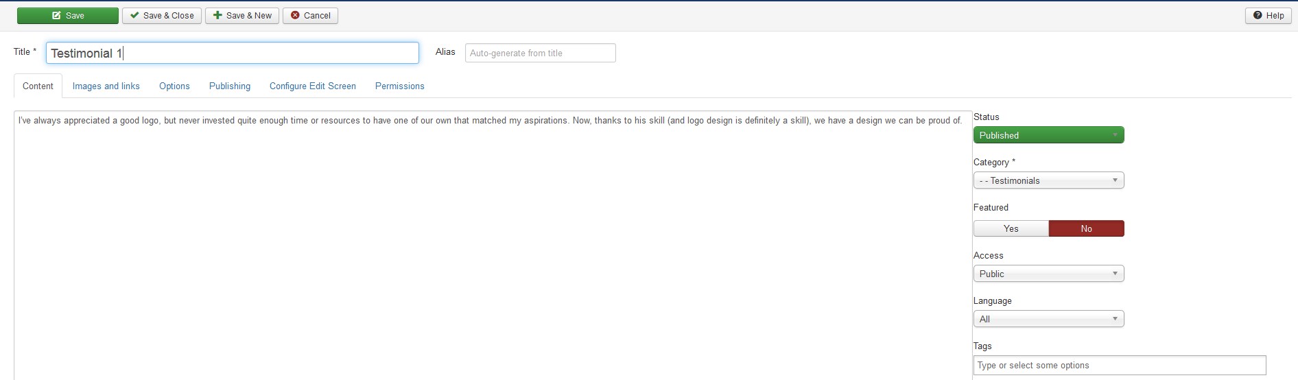
AcyMailing
AcyMailing is the subscription Joomla! component, a reliable Newsletter and email marketing extension. AcyMailing enables you to efficiently manage an unlimited number of subscribers, organize them into mailing lists and send personalized newsletters.
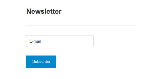
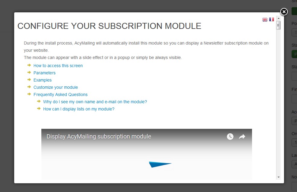
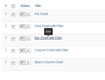
On your website you will see the following subscription form:
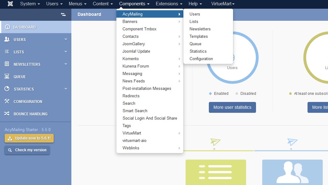
Navigate to the Components > AcyMailing section to be directed to the AcyMailing Dashboard.
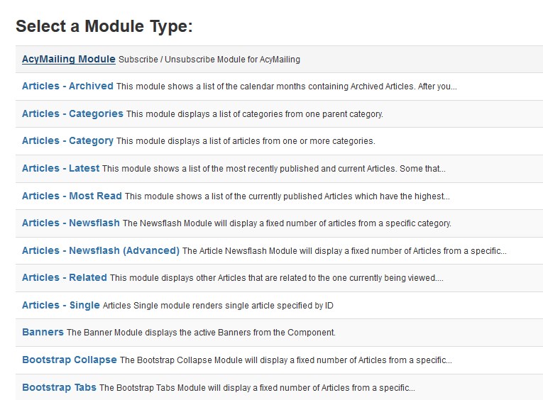
To see the main settings of this extension go to the Extensions > Modules section. Click on the New button.

Select the AcyMailing Module Subscribe from the new modules list.
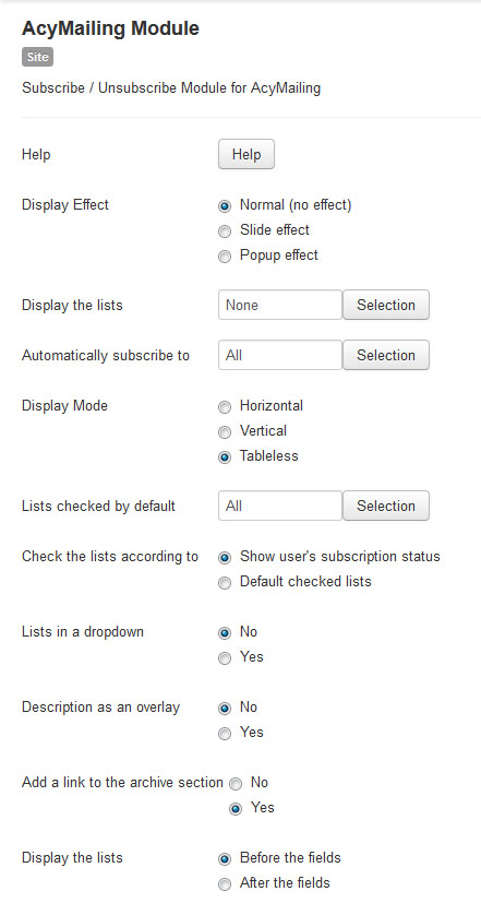
This is the settings page of the AcyМailing module:
Click on the help button in order to hide/display this help screen, where you'll find the detailed instruction. Feel free to check more details at the official website.
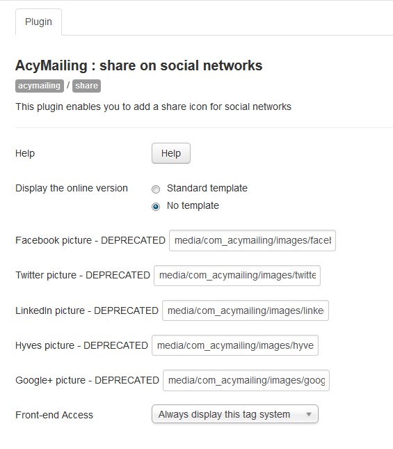
Below is a list of system plugins that get installed together with the Acymailing component. To see it navigate to Components > AcyMailing > Configuration > Plugins:
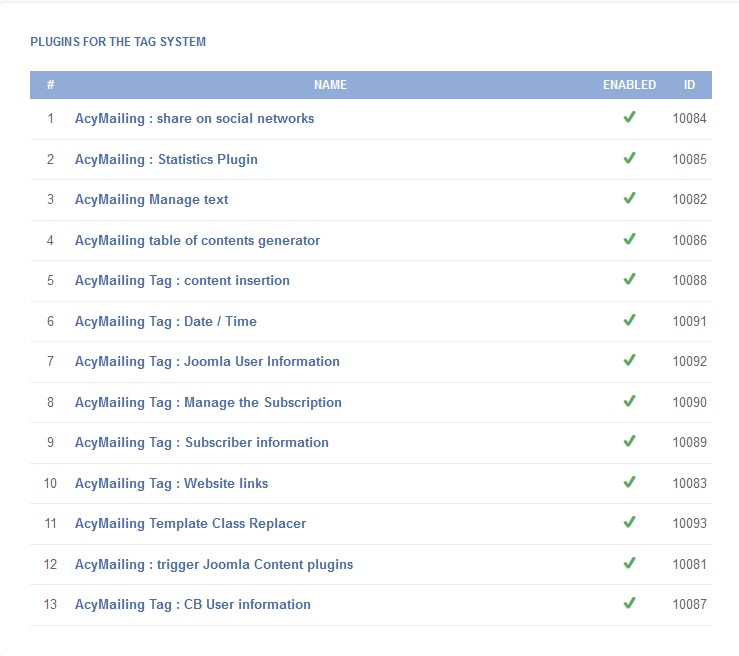
Click on the plugin title link to make the necessary adjustments. E.g., if you click on "AcyMailing : share on social networks" plugin, you'll see its settings interface.
Articles Newsflash [Advanced]
This is an enhanced version of default Joomla Articles Newsflash Module. In addition to the default module features, it has some extra configuration options and Bootstrap based module templates. To add a great deal to the polish of your Joomla-based website design, this is a dramatically higher quality module to give way to your content. Easy to use, easy to update, with some great and powerful customization options.
Available options of the extension:
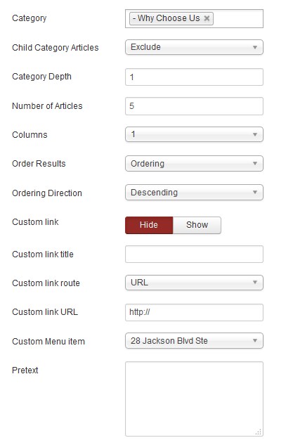
| Category | - | Select Articles from a specific Category or a set of Categories. With no selection shows all categories by default. |
| Child Category Articles | - | [Exclude/Include]. Exclude or Include Articles from child Categories. |
| Category Depth | - | The number of child category levels to return. |
| Number of Article | - | The number of Articles to display within this module. |
| Column | - | Allows displaying articles in multiple columns. |
| Ordering Results | - | Select the order in which you want query results presented. | Ordering Directions | - | Select the directions you would like Articles to be ordered by. | Custom Link | - | Allows you to display a custom link under the module content. It can be linked to an external URL or to some Joomla menu item. |
Custom Link route | - | Select if you want the custom link to lead to the menu item or custom URL. | Custom Link URL | - | Insert the URL link. |
| Pretext | - | Allows displaying custom text before the module content. |
If you want to modify "Why Choose Us" (for example) section on your site, select it from the modules list. Navigate to Extensions > Modules.
Then choose "Why Choose Us" (for example) module, which is belong to Newsflash [Advanced] type. You may use Ctrl+F to find it. Click its title link and you'll the configuration window of one.
You'll see the common interface:
Set the options as follows:
-
Columns - 2.
-
Number of Articles - 2.
Frontend:

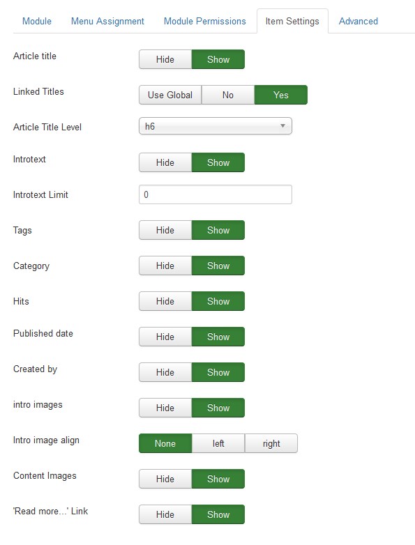
To can also find a few more additional settings in the "Item Settings" tab.
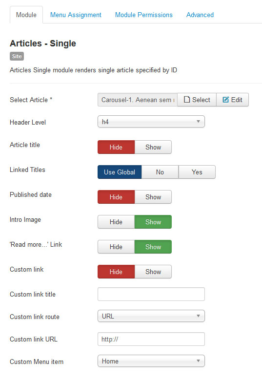
Articles Single
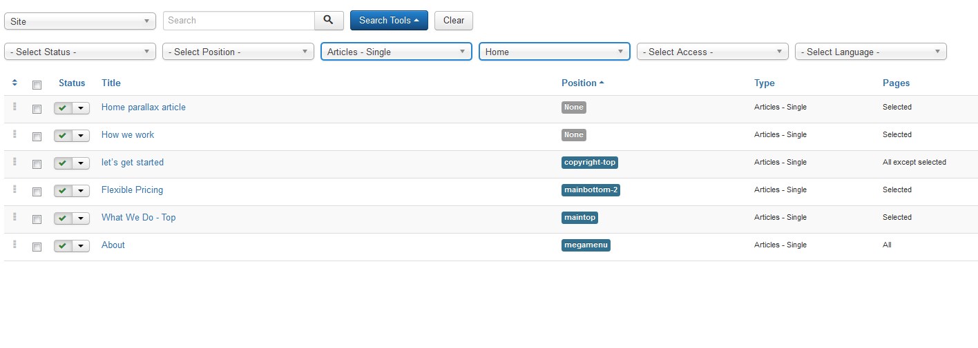
Articles Single is a module that allows you to display a single article in the desired position:

The only unusual setting of the module is Custom Link. It allows you to display a custom link under the module content. You can link it to an external URL or to a menu item of your Joomla website:
If you want to change the design of the "HOW WE WORK" (for example) section, navigate to Extensions > Modules. Then choose "How we work" module, which belongs to the Articles - Single type. You may use Ctrl+F to find it. Click its link and you'll see the configuration window.
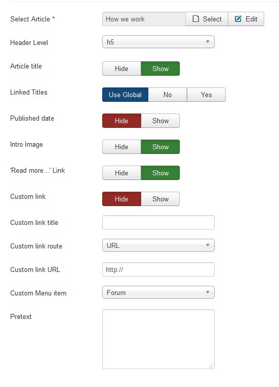
The Single Article module has the following settings:
Select Article. This field holds the article to be shown in this layout. Press the Select/Change button to open the article selection window, as shown below.
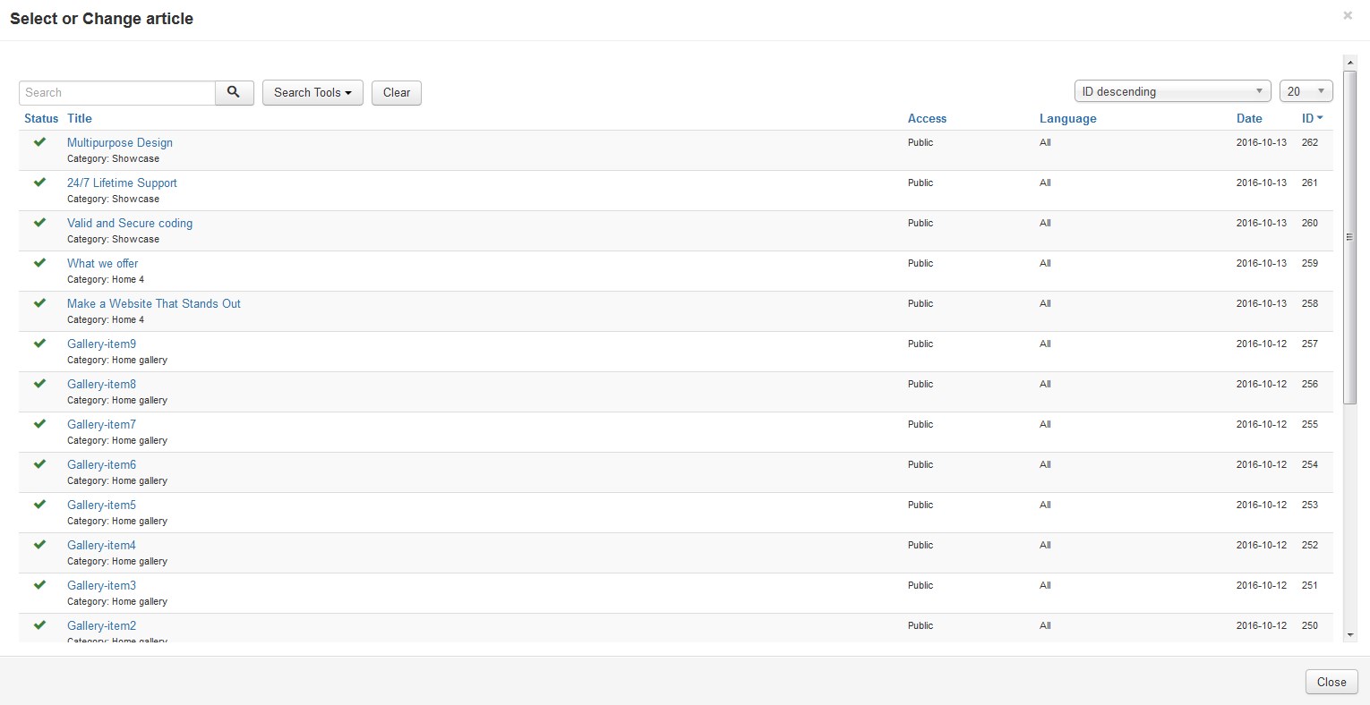
This screen is similar to the Article Manager. You can use the Filter fields to find the desired article and then click on the article's Title to select it. At that point, the modal window will close and the title will show in the Select Article field.
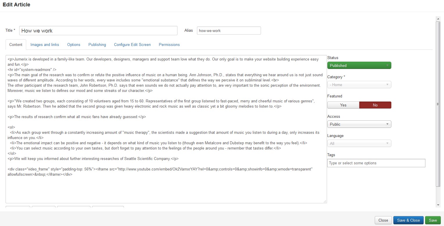
Now you have an opportunity to edit an article. Click the Edit button and you'll see the Edit Article window. Here you have an option to edit the article content with its image and links.
The Article Single has the following Article Options [Options Tab], as shown below. These options determine how the article will show up on a frontend site layout. Note that these options include "Use Global". If this is selected, the setting from the Article Manager Options will be used.
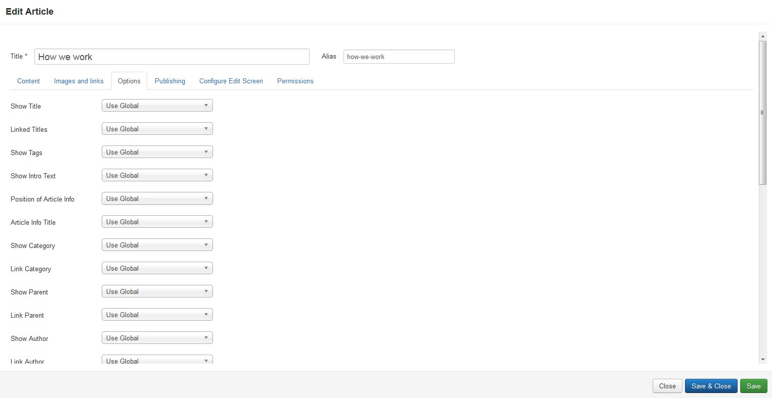
Let's learn more about the Option Tab features:
Show Title |
- | [Use Global/Hide/Show]. Whether to show the Article's Title. |
Linked Titles |
- | [Use Global/No/Yes]. If the Article's Title is shown, whether to show it as a link to the article. |
| Show Intro Text | - | [Use Global/Hide/Show]. If set to Show, the Intro Text of the article will show when you drill down to the article. If set to Hide, only the part of the article after the "Read More" break will show up. |
| Position of Article Info | - | [Use Global/Use Article Settings/Above/Below/Split]. Puts the article information block above or below the text or splits it into two separate blocks. One block is above and the other is below. |
| Article Info Title | - | [Use Global/Hide/Show]. Displays the 'Article Info' title on top of the article information block. |
| Show Category | - | [Use Global/Hide/Show]. Whether to show the Article's Category. | Link Category | - | [Use Global/No/Yes]. If the Article's Category is shown, whether to show it as a link to a Category layout [list or blog] for that Category. |
Show Parent | - | [Use Global/Hide/Show]. Whether to show the Article's Parent Category. |
Link Parent | - | [Use Global/No/Yes]. If the Article's Parent Category is shown, whether to show it as a link to a Category layout [list or blog] for that Category. |
Show Author | - | [Use Global/Hide/Show]. Whether to show the author of the Article. |
| Link Author | - | [Use Global/No/Yes]. If the Article's author is shown, whether to show it as a link to a Contact layout for that author. Note that the author must be set up as a Contact in Contact Manager: Edit. | Show Create Date | - | [Use Global/Hide/Show]. Whether to show the Article's create date. | Show Modify Date | - | [Use Global/Hide/Show]. Whether to show the Article's modify date. | Show Publish Date | - | [Use Global/Hide/Show]. Whether to show the Article's publishing date. | Show Navigation | - | [Use Global/Hide/Show]. Whether to show a navigation link [for example, Next or Previous article] when you drill down to the article. | Show Voting | - | [Use Global/Hide/Show]. Whether to show a voting icon for the article. |
Show Icons | - | [Use Global/Hide/Show]. If set to Show, Print and Email will use icons instead of text. | Show Print Icon | - | [Use Global/Hide/Show]. Show or Hide the Print Article button. | Show Email Icon | - | [Use Global/Hide/Show]. Show or Hide the Email Article button. | Show Hits | - | [Use Global/Hide/Show]. Show or Hide the number of times the article has been hit [displayed by a user]. | Show Tags |
- | Whether to hide or show any tags for this item. Use Global: Use the default value from the contacts options screen. Show: Show to allow users to select a contact in a drop down list. Hide: Do not display the Contacts list. |
Show Unauthorized Links | - | [Use Global/No/Yes]. If Yes, the Intro Text for restricted articles will show. Clicking on the "Read More" link will require users to log in to view the full article content. | Positioning of the Links | - | [Use Global/Above/Below]. If Above, links are shown above the content. Otherwise, they are shown below the content. | Menu Title | - | The title that will display for this menu item. Parent Item: The menu that this menu item [choice] will be part of. The menus defined for the site will show in the list box. |
Advise
To save the changes, you should click the Save button.
Diagrams and graphs
Transform Data into Information. Charts are a very good way to visualize a lot of data in a way that can be quickly digested.
TM Diagram and Graphs 3DCharts
To configure the TM Diagram and Graphs 3DCharts module navigate to the Extensions > Modules section.
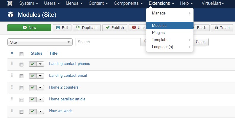
Press the "Search Tool" button and select the TM Diagram and Graphs 3DCharts in the "- Select Type -" filter dropdown list.
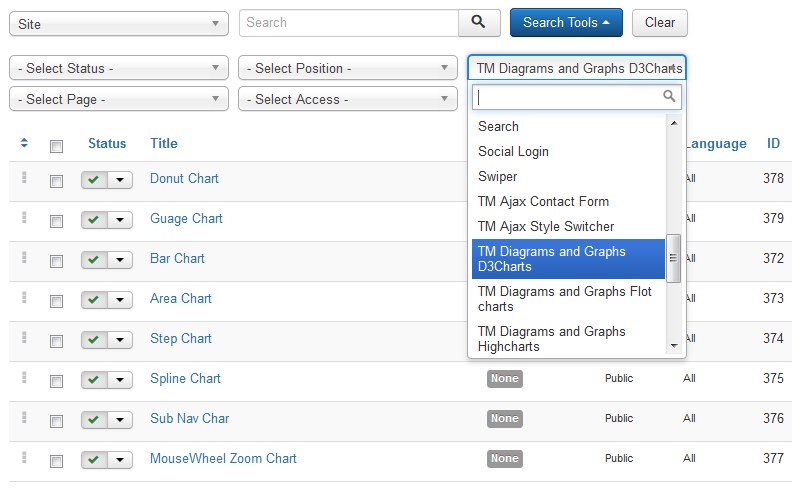
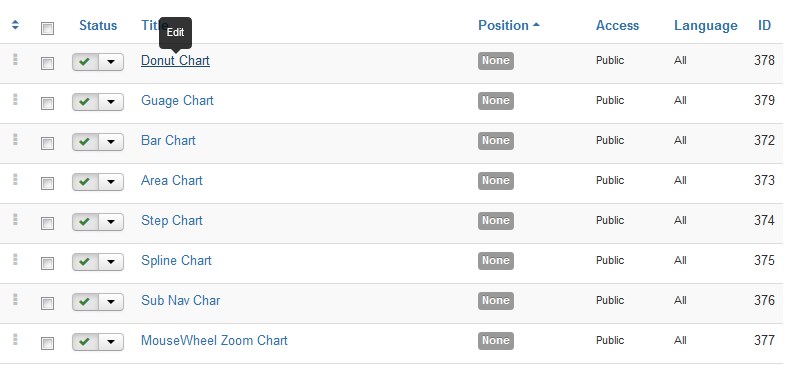
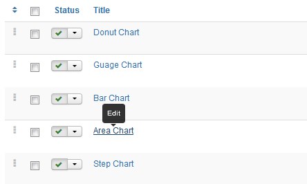
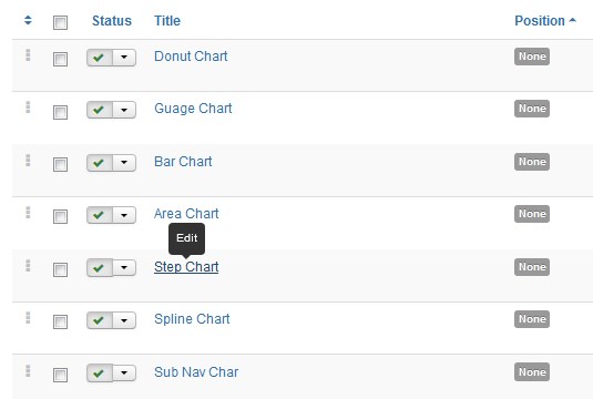
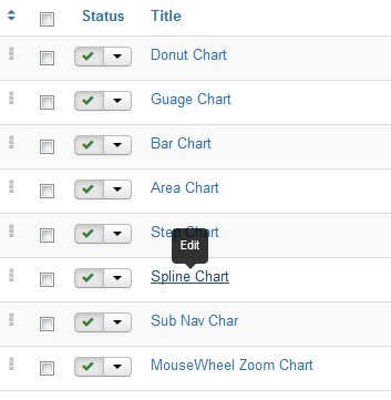
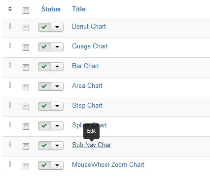
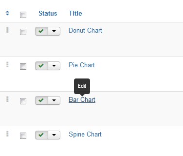
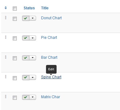
You will see 8 different modules (8 variants of TM Diagram and Graphs 3DCharts module) :
- Donut Chart;
- Guage Chart;
- Bar Chart;
- Area Chart;
- Step Chart;
- Spline Chart;
- Sub Nav Char;
- MouseWheel Zoom Chart.
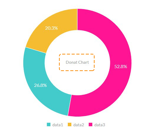
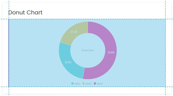
Donut Chart Type
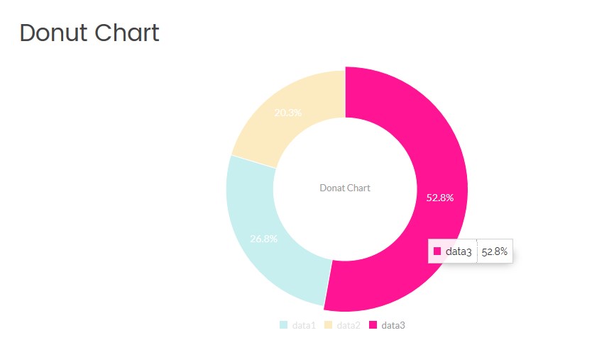
Click on the module title link ("Donut Chart") to be brought to the settings window of the module.
At the Module tab you may set up the following options:
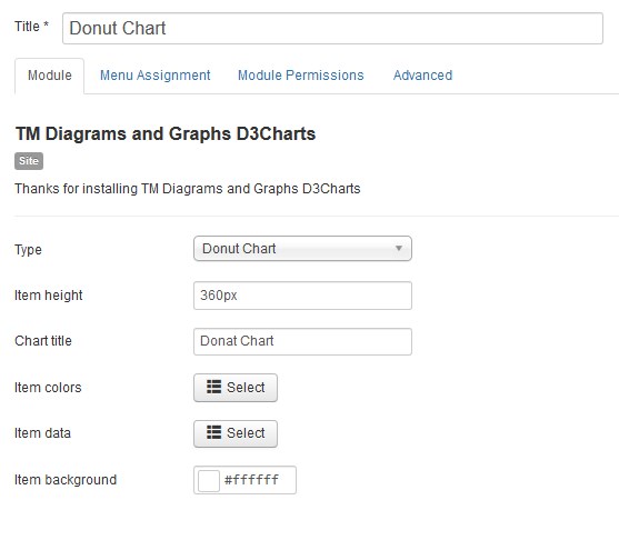
- Type — select the diagram or graph type (the Donat Chart type is selected now);
- Item height — set the diagram or graph box height in pixels only;
- Chart title — you can enter the title for your diagram.
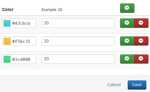
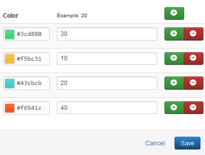
- Item colors — choose a color for each diagram sector. The color must be specified in hexadecimal format (for example, #aabbcc). Also, it is possible to select a color from a palette provided.
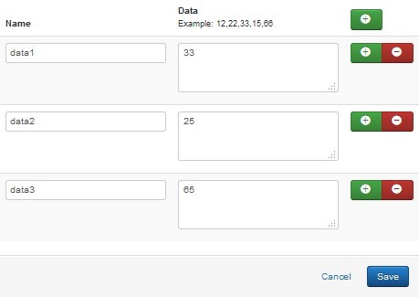
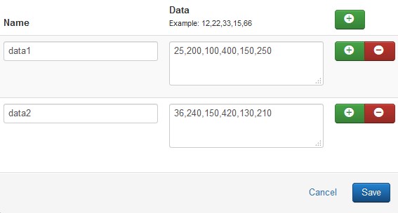
- Item data — specify the data you want to show in the diagram. Enter a numerical value in the Data field (example: 12,22,33,15,66). You can assign the name to each value. Note, the ratio in percentage terms between given values would be automatically generated.
- Item background — choose a diagram area background color. The color must be specified in hexadecimal format (for example, #aabbcc). Also, it is possible to select a color from a palette provided.
Guage Chart Type
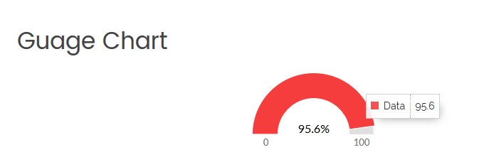
Click on the module title link ("Guage Chart") to be brought to the settings window of the module.
At the Module tab you may set up the following options:
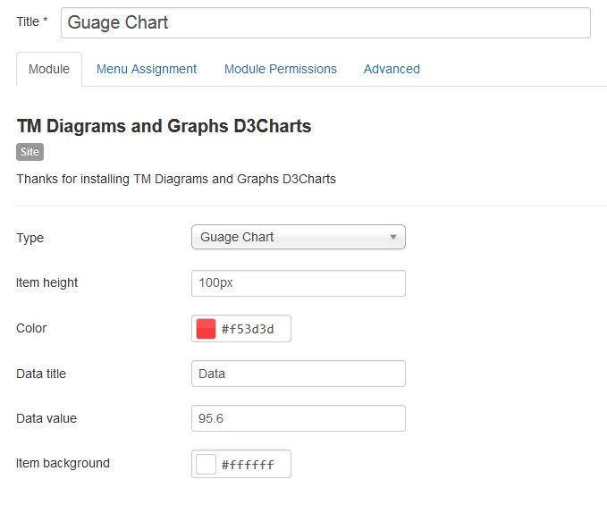
- Type — select the diagram or graph type (the Donat Chart type is selected now);
- Item height — set the diagram or graph area height in pixels only;
- Item colors — choose a color for each data group. The color must be specified in hexadecimal format (for example, #aabbcc). Also, it is possible to select a color from a palette provided.
- Item title — you can assign the name to the value.
- Item data — specify the data you want to show on the chart. Enter a numerical value in the Data field (example: 12,22,33,15,66). Note, the ratio in percentage would be automatically generated.
- Item background — choose a diagram area background color. The color must be specified in hexadecimal format (for example, #aabbcc). Also, it is possible to select a color from a palette provided.
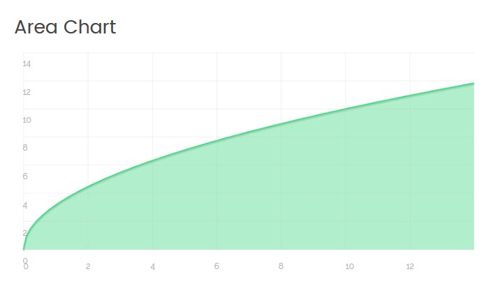
Area Chart Type
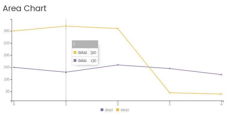
Click on the module title link ("Area Chart") to be brought to the settings window of the module.
At the Module tab you may set up the following options:
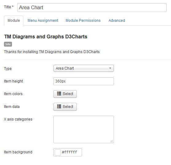
- Type — select the diagram or graph type (the Area Chart type is selected now);
- Item height — set the diagram or graph area height in pixels only;
- Item colors — choose a color for each curve. The color must be specified in hexadecimal format (for example, #aabbcc). Also, it is possible to select a color from a palette provided.
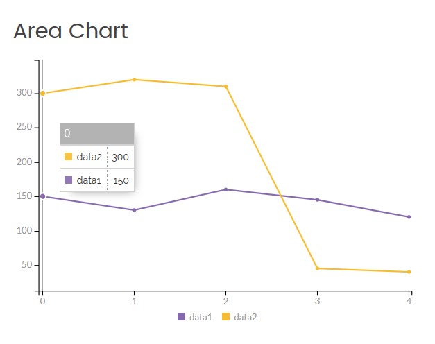
- Item data — specify the data you want to show on the chart. Enter a numerical value in the Data field (example: 12,22,33,15,66). You can assign the name to each value. The first numerical value of each data field refers to the first category (group of values) of the chart.
- X axis categories — assign the name to each category of the chart. The default categories titles are 0, 1, 2, 3, 4, etc. Enter custom titles for categories without space and separated by a comma. E.g. Jan,Feb,Mar,Apr,May,June,July,Aug .
- Item background — choose a chart area background color. The color must be specified in hexadecimal format (for example, #aabbcc). Also, it is possible to select a color from a palette provided.
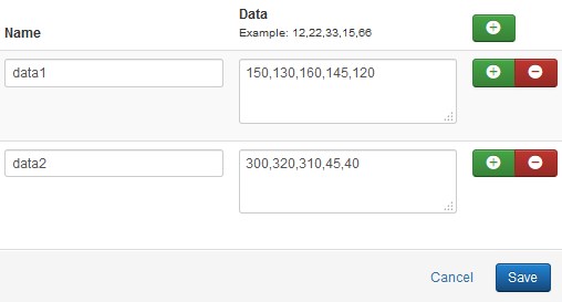
Ex., data1 - 150; data2 - 300 are illustrated in the '0' category of the chart.
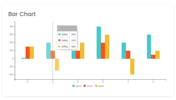
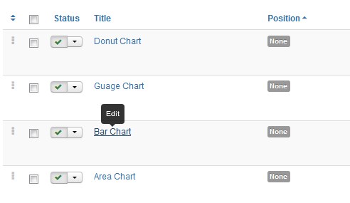
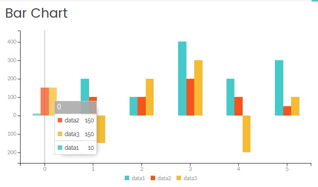
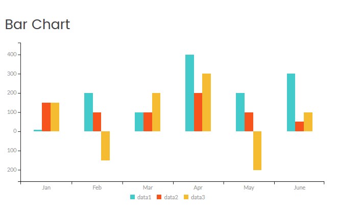
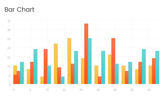
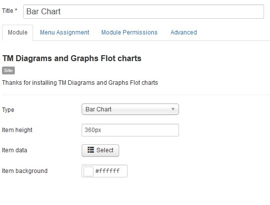
Bar Chart Type
Click on the module title link ("Bar Chart") to be brought to the settings window of the module.
At the Module tab you may set up the following options:
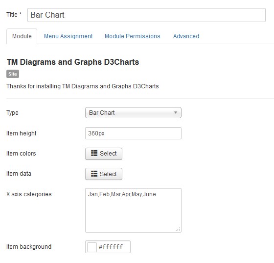
- Type — select the diagram or graph type (the Bar Chart type is selected now);
- Item height — set the diagram or graph area height in pixels only;
- Item colors — choose a color for each data group. The color must be specified in hexadecimal format (for example, #aabbcc). Also, it is possible to select a color from a palette provided.
- Item data — specify the data you want to show on the chart. Enter a numerical value in the Data field (example: 12,22,33,15,66). You can assign the name to each value. The first numerical value of each data field refers to the first bar group.
-
X axis categories — assign the name to each bar group (category) of the chart. The default categories titles are 0, 1, 2, 3, 4, etc. Enter custom titles for categories without space and separated by a comma. E.g. Jan,Feb,Mar,Apr,May,June,July,Aug .
- Item background — choose a chart area background color. The color must be specified in hexadecimal format (for example, #aabbcc). Also, it is possible to select a color from a palette provided.
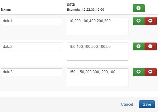
Ex., data1 - 10; data2 - 150; data3 -150 are illustrated in the '0' bar group of the chart.
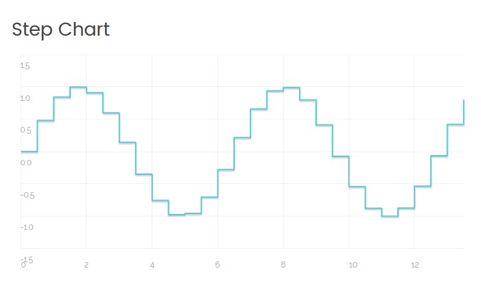
Step Chart Type
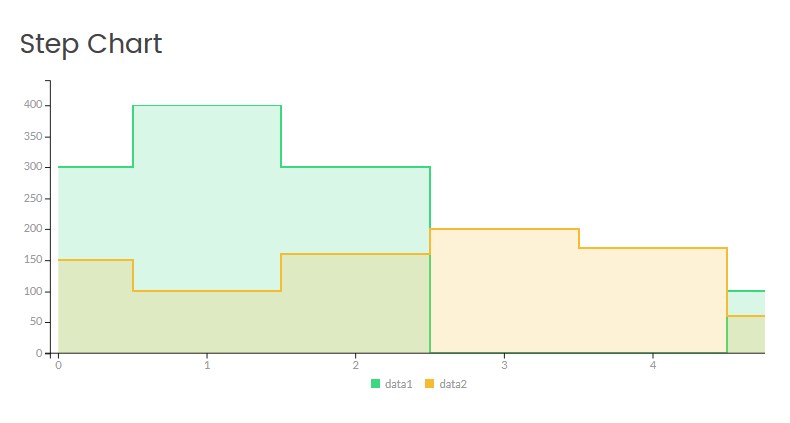
Click on the module title link ("Step Chart") to be brought to the settings window of the module.
At the Module tab you may set up the following options:
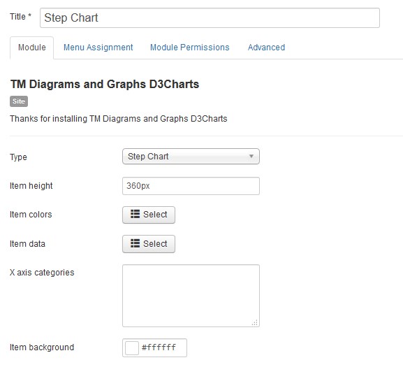
- Type — select the diagram or graph type (the Step Chart type is selected now);
- Item height — set the diagram or graph area height in pixels only;
- Item colors — choose a color for each data group. The color must be specified in hexadecimal format (for example, #aabbcc). Also, it is possible to select a color from a palette provided.
- Item data — specify the data you want to show on the chart. Enter a numerical value in the Data field (example: 12,22,33,15,66). You can assign the name to each value group. The first numerical value of each data field refers to the first category (group of values) of the chart.
-
X axis categories — assign the name to each group (category) of the chart. The default categories titles are 0, 1, 2, 3, 4, etc. Enter custom title for categories without space and separated by a comma. E.g. Jan,Feb,Mar,Apr,May,June,July,Aug .
- Item background — choose a chart area background color. The color must be specified in hexadecimal format (for example, #aabbcc). Also, it is possible to select a color from a palette provided.

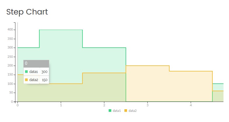
Ex., data1 - 300; data2 - 150 are illustrated in the '0' category of the chart.
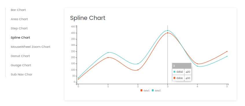
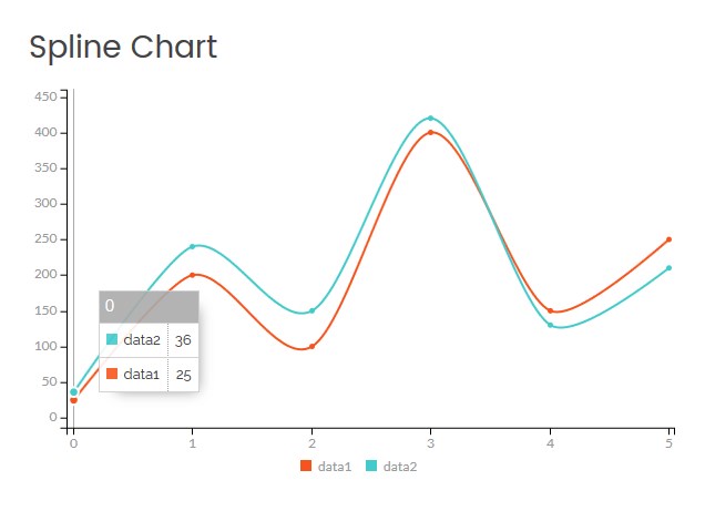
Spline Chart Type
Click on the module title link ("Spline Chart") to be brought to the settings window of the module.
At the Module tab you may set up the following options:
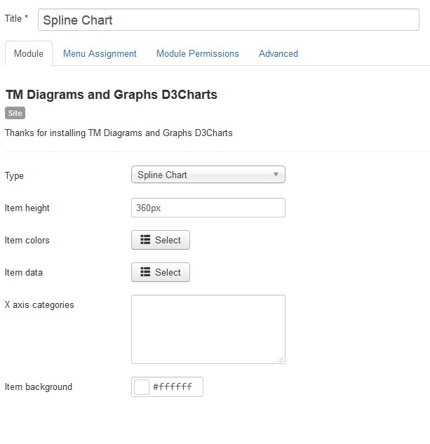
- Type — select the diagram or graph type (the Spine Chart type is selected now);
- Item height — set the diagram or graph area height in pixels only;
- Item colors — choose a color for each cu. The color must be specified in hexadecimal format (for example, #aabbcc). Also, it is possible to select a color from a palette provided.
- Item data — specify the data you want to show on the chart. Enter a numerical value in the Data field (example: 12,22,33,15,66). You can assign the name to each value. The first numerical value of each data field refers to the first category (group of values) of the chart.
-
X axis categories — assign the name to each category of the chart. The default categories titles are 0, 1, 2, 3, 4, etc. Enter custom title for categories without space and separated by a comma. E.g. Jan,Feb,Mar,Apr,May,June,July,Aug .
- Item background — choose a chart area background color. The color must be specified in hexadecimal format (for example, #aabbcc). Also, it is possible to select a color from a palette provided.
Ex., data1 - 25; data2 - 36 are illustrated in the '0' category of the chart.
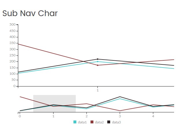
Sub Nav Type
Using the Sub Nav Type you have an ability to zoom the separate sections on the chart.
Click on the module title link ("Sub Nav Type ") to be brought to the settings window of the module.
At the Module tab you may set up the following options:
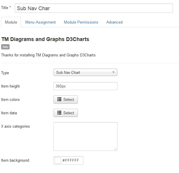
- Type — select the diagram or graph type (the Spline Chart type is selected now);
- Item height — set the diagram or graph area height in pixels only;
- Item colors — choose a color for each curve. The color must be specified in hexadecimal format (for example, #aabbcc). Also, it is possible to select a color from a palette provided.
- Item data — specify the data you want to show on the chart. Enter a numerical value in the Data field (example: 12,22,33,15,66). You can assign the name to each value. The first numerical value of each data field refers to the first category (group of values) of the chart.
-
X axis categories — assign the name to each category of the chart. The default categories titles are 0, 1, 2, 3, 4, etc. Enter custom title for categories without space and separated by a comma. E.g. Jan,Feb,Mar,Apr,May,June,July,Aug .
- Item background — choose a chart area background color. The color must be specified in hexadecimal format (for example, #aabbcc). Also, it is possible to select a color from a palette provided.
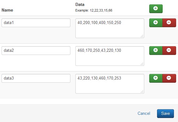
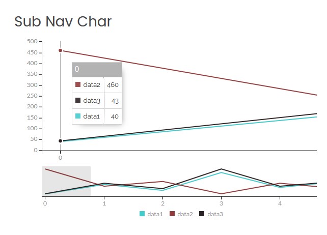
Ex., data1 - 40; data2 - 460; data3 - 43 are illustrated in the '0' category of the chart.
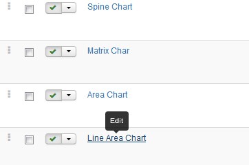
TM Diagram and Graphs Flot Charts
To configure the TM Diagram and Graphs Flot Charts module navigate to the Extensions > Modules section.
Press the "Search Tool" button and select the TM Diagram and Graphs Flot Charts in the "- Select Type -" filter dropdown list.
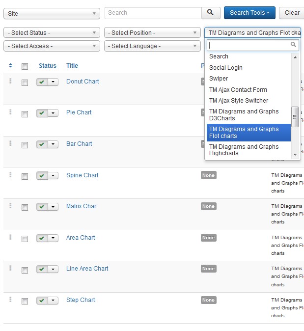
You will see 8 different modules (8 variants of TM Diagram and Graphs Flot Charts module) :
- Donut Chart;
- Pie Chart;
- Bar Chart;
- Spline Chart;
- Matrix Chart;
- Area Chart;
- line Area Chart
- Step Chart;
Donut Chart Type
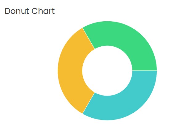
Click on the module title link ("Donut Chart") to be brought to the settings window of the module.
At the Module tab you may set up the following options:
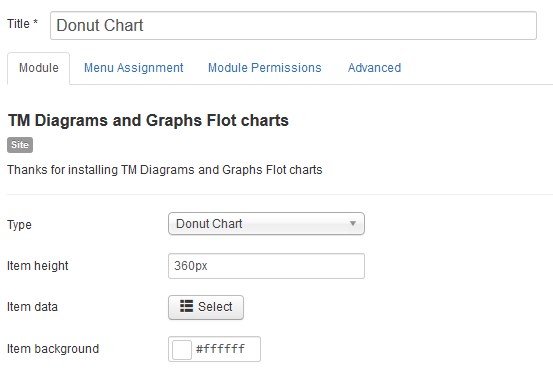
- Type — select the diagram or graph type (the Donat Chart type is selected now);
- Item height — set the diagram or graph box height in pixels only (px);
- Item data — specify the data you want to show in the diagram. Enter a numerical value in the Data field (example: 12,22,33,15,66). You can choose a color for each diagram sector. The color must be specified in hexadecimal format (for example, #aabbcc). Also, it is possible to select a color from a palette provided. Note, the ratio in percentage terms between given values would be automatically generated.
- Item background — choose a diagram area background color. The color must be specified in hexadecimal format (for example, #aabbcc). Also, it is possible to select a color from a palette provided.
Pie Chart Type
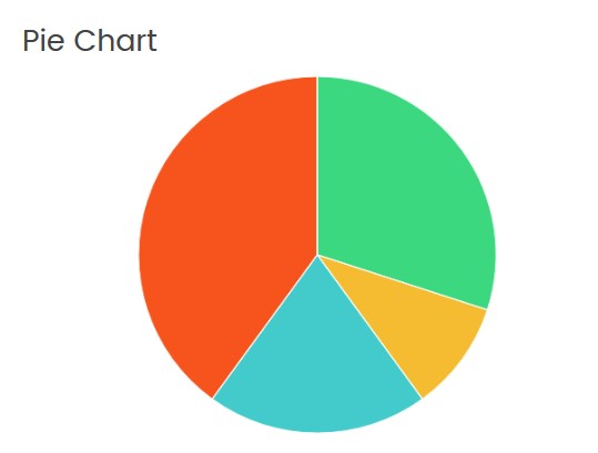
Click on the module title link ("Pie Chart") to be brought to the settings window of the module.
At the Module tab you may set up the following options:
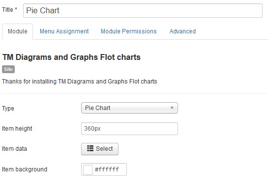
- Type — select the diagram or graph type (the Pie Chart type is selected now);
- Item height — set the diagram or graph box height in pixels only (px);
- Item data — specify the data you want to show in the diagram. Enter a numerical value in the Data field (example: 12,22,33,15,66). You can choose a color for each diagram sector. The color must be specified in hexadecimal format (for example, #aabbcc). Also, it is possible to select a color from a palette provided. Note, the ratio in percentage terms between given values would be automatically generated.
- Item background — choose a diagram area background color. The color must be specified in hexadecimal format (for example, #aabbcc). Also, it is possible to select a color from a palette provided.
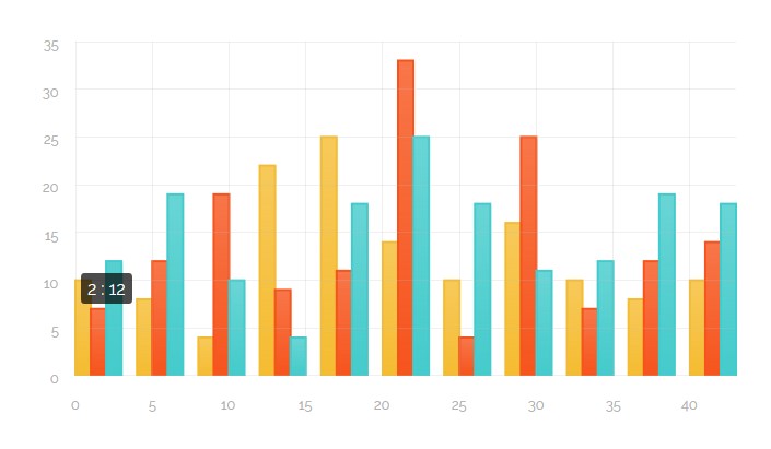
Bar Chart Type
Click on the module title link ("Bar Chart") to be brought to the settings window of the module.
At the Module tab you may set up the following options:
- Type — select the diagram or graph type (the Bar Chart type is selected now);
- Item height — set the diagram or graph box height in pixels only (px);
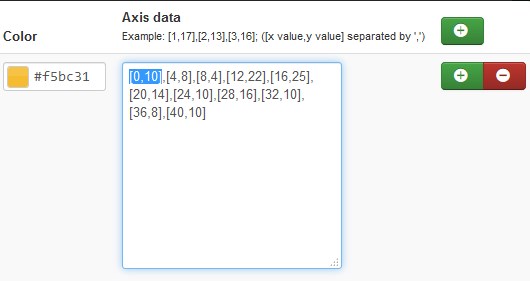
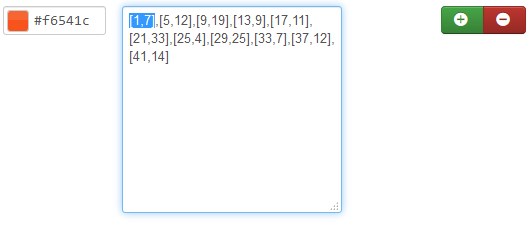
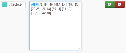
- Item data — specify the data you want to show on the chart. Enter a numerical value in the Data field. Example: [1,17],[2,13],[3,16]; ([x,y] separated by a comma. You can choose a color for each group of data. The color must be specified in hexadecimal format (for example, #aabbcc). Also, it is possible to select a color from a palette provided.
- [x = 0, y = 10].
- [x = 1, y = 7].
- [x = 2, y = 12].
- Item background — choose a chart area background color. The color must be specified in hexadecimal format (for example, #aabbcc). Also, it is possible to select a color from a palette provided.
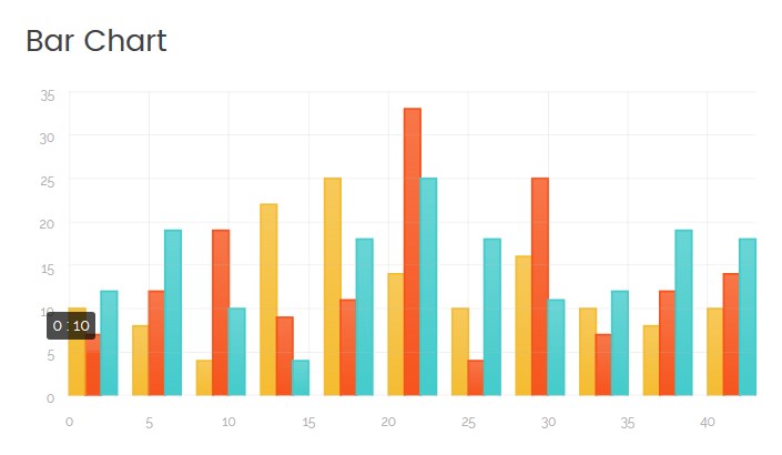
Example 1:
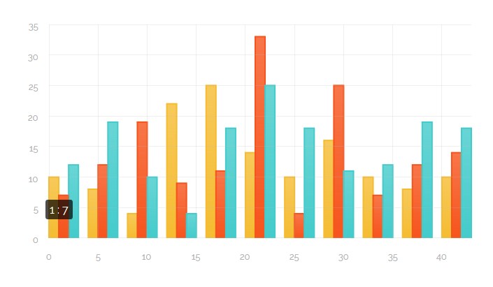
Example 2:
Example 3:
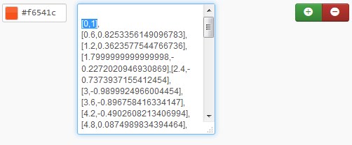
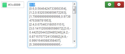
Spline Chart Type
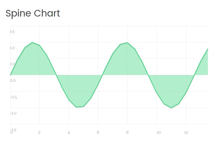
Click on the module title link ("Spline Chart") to be brought to the settings window of the module.
At the Module tab you may set up the following options:
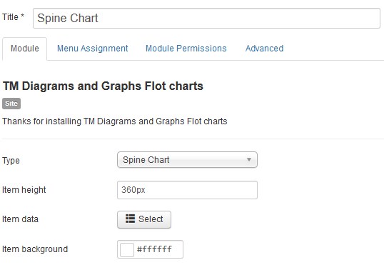
- Type — select the diagram or graph type (the Spine Chart type is selected now);
- Item height — set the diagram or graph area height in pixels only;
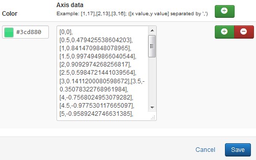
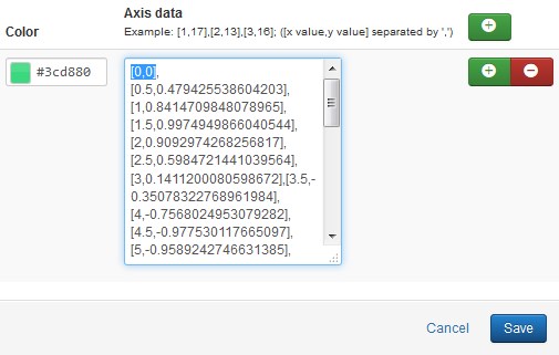
- Item data — specify the data you want to show on the chart. Enter a numerical value in the Data field. Example: [1,17],[2,13],[3,16]; ([x,y] separated by a comma. You can choose a color for each group of data. The color must be specified in hexadecimal format (for example, #aabbcc). Also, it is possible to select a color from a palette provided.
- [x = 0, y = 0].
- Item background — choose a chart area background color. The color must be specified in hexadecimal format (for example, #aabbcc). Also, it is possible to select a color from a palette provided.
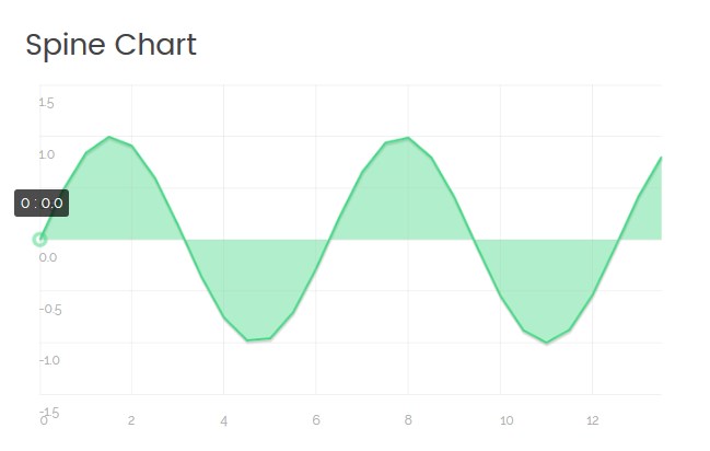
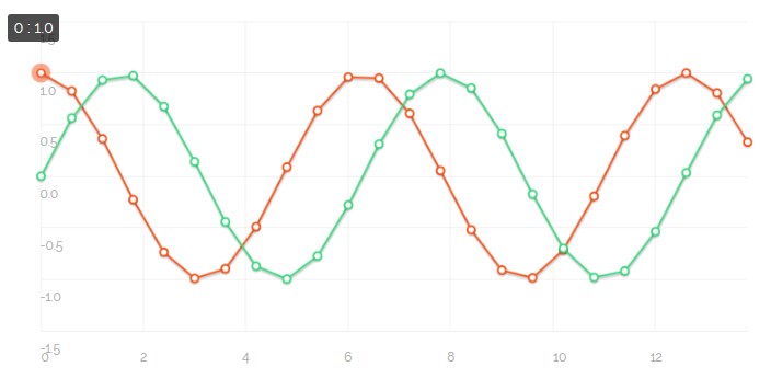
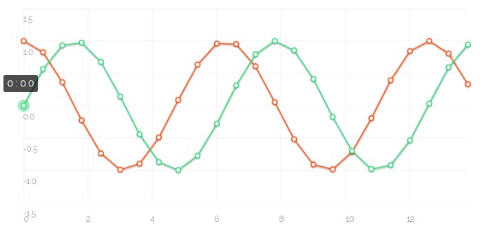
Example 1:
Matrix Chart Type
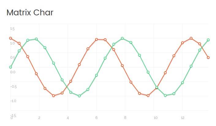
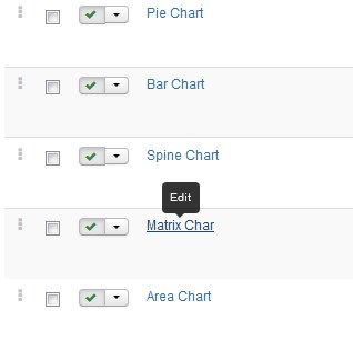
Click on the module title link ("Matrix Chart") to be brought to the settings window of the module.
At the Module tab you may set up the following options:
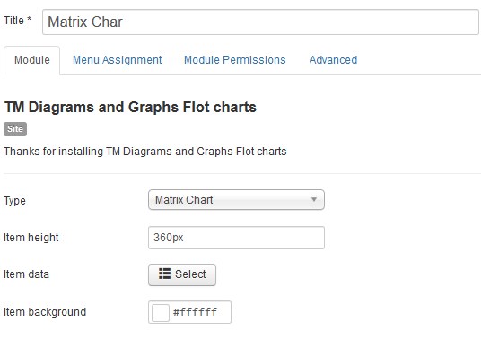
- Type — select the diagram or graph type (the Matrix Chart type is selected now);
- Item height — set the diagram or graph area height in pixels only;
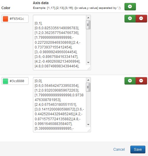
- Item data — specify the data you want to show on the chart. Enter a numerical value in the Data field. Example: [1,17],[2,13],[3,16]; ([x,y] separated by a comma. You can choose a color for each group of data. The color must be specified in hexadecimal format (for example, #aabbcc). Also, it is possible to select a color from a palette provided.
- [x = 0, y = 1].
- [x = 0, y = 0].
- Item background — choose a chart area background color. The color must be specified in hexadecimal format (for example, #aabbcc). Also, it is possible to select a color from a palette provided.
Example 1:
Example 2:
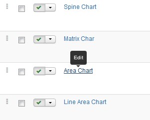
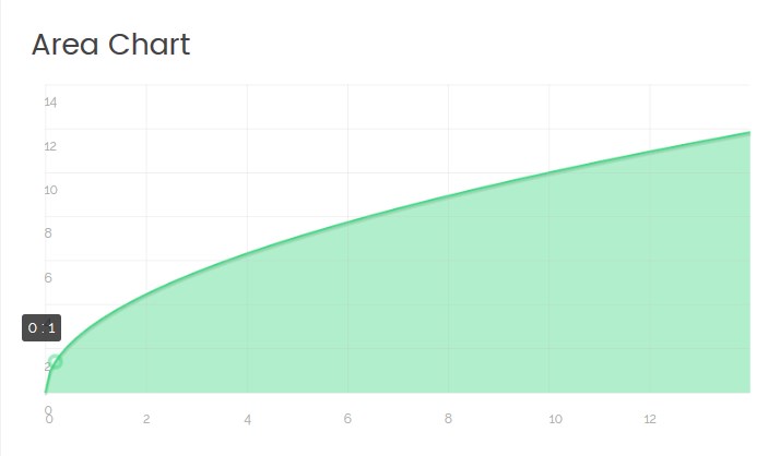
Area Chart Type
Click on the module title link ("Area Chart") to be brought to the settings window of the module.
At the Module tab you may set up the following options:
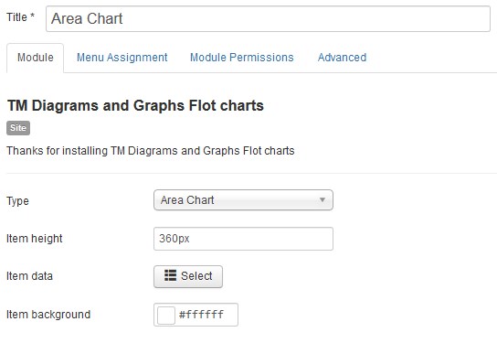
- Type — select the diagram or graph type (the Area Chart type is selected now);
- Item height — set the diagram or graph area height in pixels only;
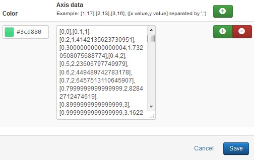
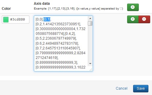
- Item data — specify the data you want to show on the chart. Enter a numerical value in the Data field. Example: [1,17],[2,13],[3,16]; ([x,y] separated by a comma. You can choose a color for each group of data. The color must be specified in hexadecimal format (for example, #aabbcc). Also, it is possible to select a color from a palette provided.
- [x = 0, y = 1].
- Item background — choose a chart area background color. The color must be specified in hexadecimal format (for example, #aabbcc). Also, it is possible to select a color from a palette provided.
Example 1:
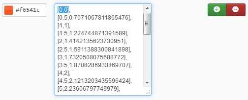
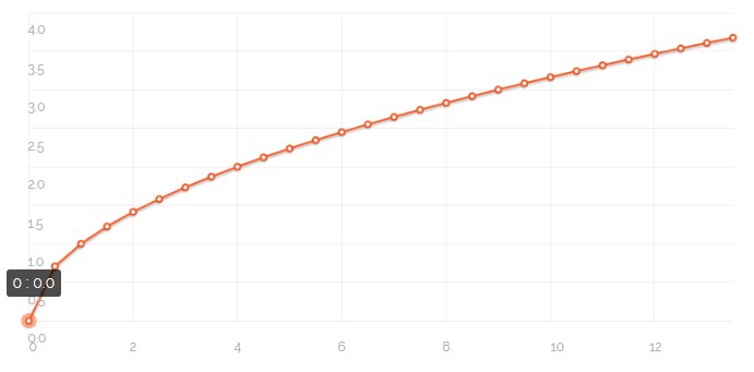
Line Area Chart Type
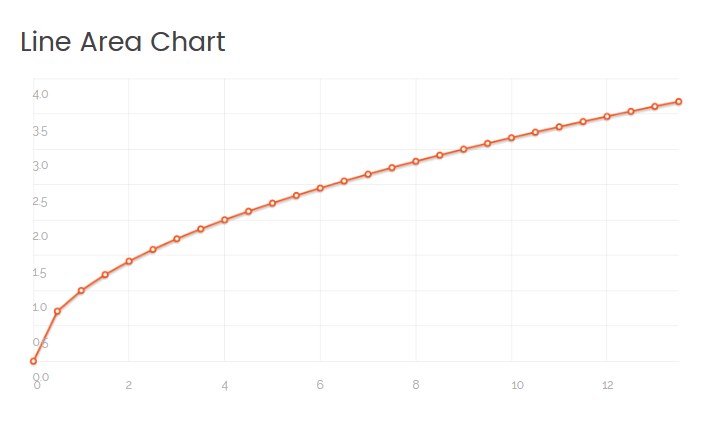
Click on the module title link ("Line Area Chart") to be brought to the settings window of the module.
At the Module tab you may set up the following options:
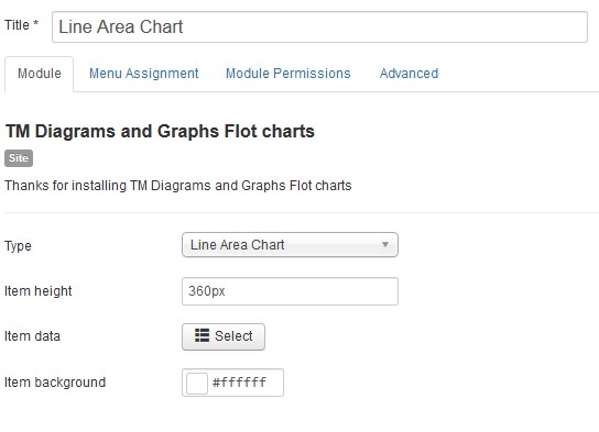
- Type — select the diagram or graph type (the Line Area Chart type is selected now);
- Item height — set the diagram or graph area height in pixels only;
- Item data — specify the data you want to show on the chart. Enter a numerical value in the Data field. Example: [1,17],[2,13],[3,16]; ([x,y] separated by a comma. You can choose a color for each group of data. The color must be specified in hexadecimal format (for example, #aabbcc). Also, it is possible to select a color from a palette provided.
- [x = 0, y = 0].
- Item background — choose a chart area background color. The color must be specified in hexadecimal format (for example, #aabbcc). Also, it is possible to select a color from a palette provided.
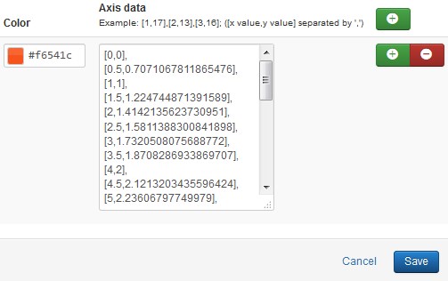
Example 1:
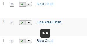
Step Chart Type
Click on the module title link ("Step Chart") to be brought to the settings window of the module.
At the Module tab you may set up the following options:
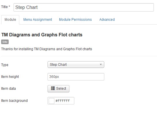
- Type — select the diagram or graph type (the Step Chart type is selected now);
- Item height — set the diagram or graph area height in pixels only;
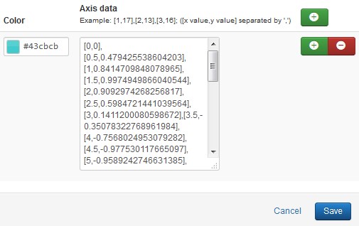
- Item data — specify the data you want to show on the chart. Enter a numerical value in the Data field. Example: [1,17],[2,13],[3,16]; ([x,y] separated by a comma. You can choose a color for each group of data. The color must be specified in hexadecimal format (for example, #aabbcc). Also, it is possible to select a color from a palette provided.
- [x = 0, y = 0].
- Item background — choose a chart area background color. The color must be specified in hexadecimal format (for example, #aabbcc). Also, it is possible to select a color from a palette provided.
Example 1:
TM Diagram and Graphs Highcharts
To configure the TM Diagram and Graphs Highcharts module navigate to the Extensions > Modules section.
Press the "Search Tool" button and select the TM Diagram and Graphs Highcharts in the "- Select Type -" filter dropdown list.
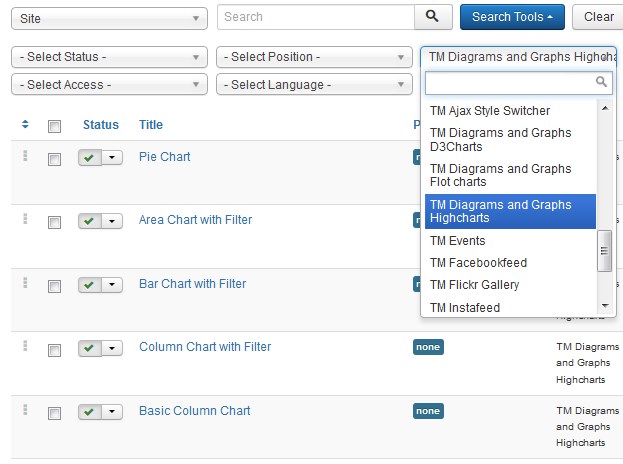
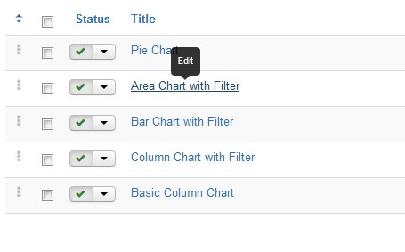
You will see 8 different modules (5 variants of TM Diagram and Graphs Highcharts module) :
- Pie Chart;
- Area Chart with Filter;
- Bar Chart with Filter;
- Column Chart with Filter;
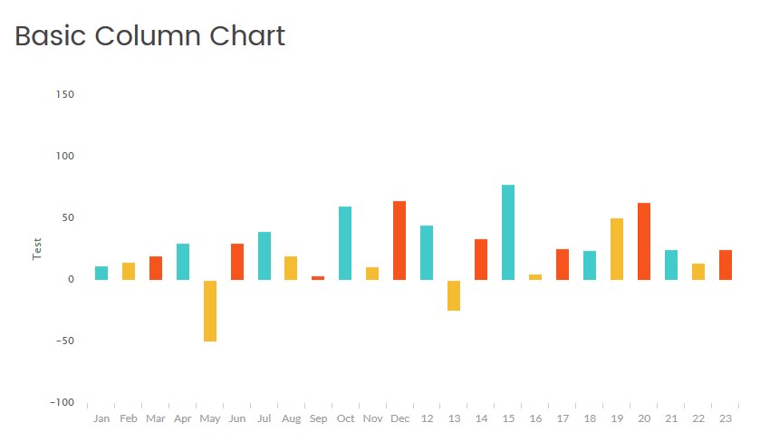
- Basic Column Chart ;
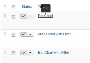
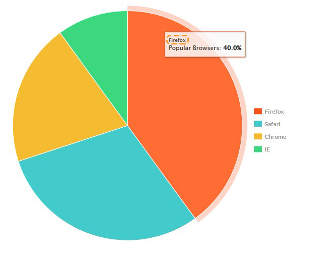
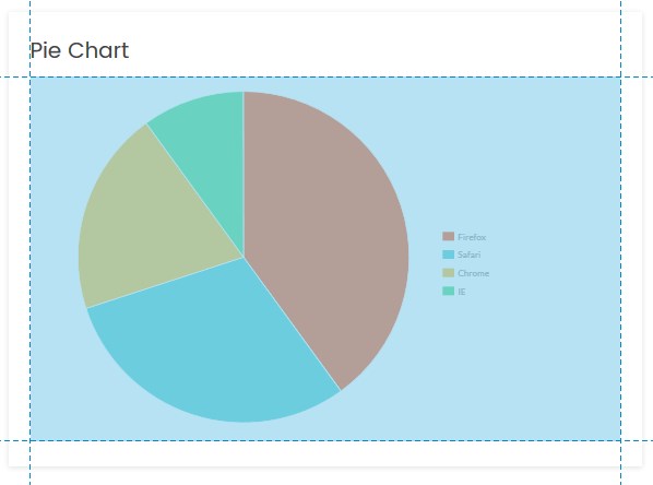
Pie Chart Type
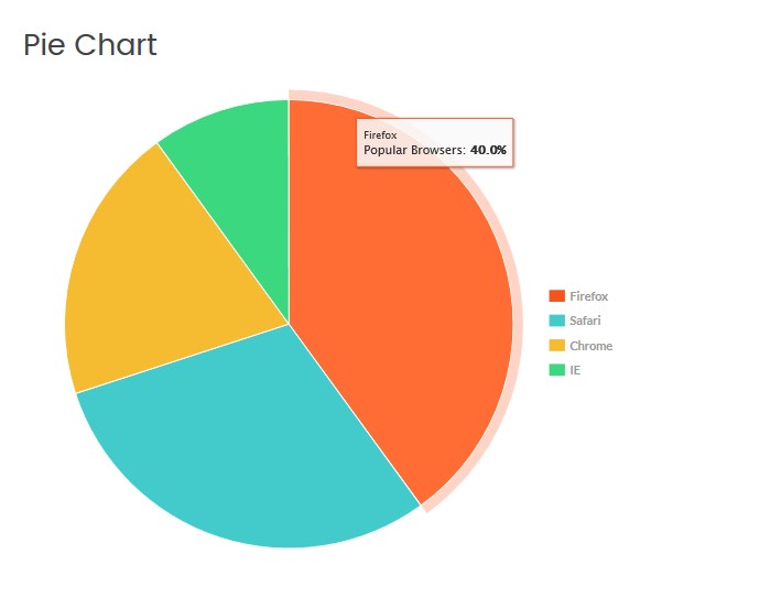
Click on the module title link ("Pie Chart") to be brought to the settings window of the module.
At the Module tab you may set up the following options:
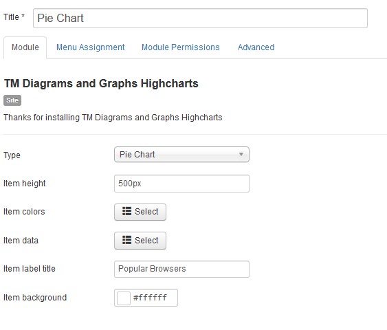
- Type — select the diagram or graph type (the Pie Chart type is selected now);
- Item height — set the diagram or graph box height in pixels only;
- Item label title — you can enter the title for your diagram.
- Item colors — choose a color for each diagram sector. The color must be specified in hexadecimal format (for example, #aabbcc). Also, it is possible to select a color from a palette provided.
- Item data — specify the data you want to show in the diagram. Enter a numerical value in the Data field (example: 12,22,33,15,66). You can assign the name to each value. Note, the ratio in percentage terms between given values would be automatically generated.
- Item background — choose a diagram area background color. The color must be specified in hexadecimal format (for example, #aabbcc). Also, it is possible to select a color from a palette provided.
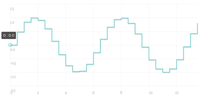
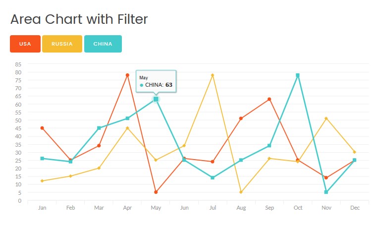
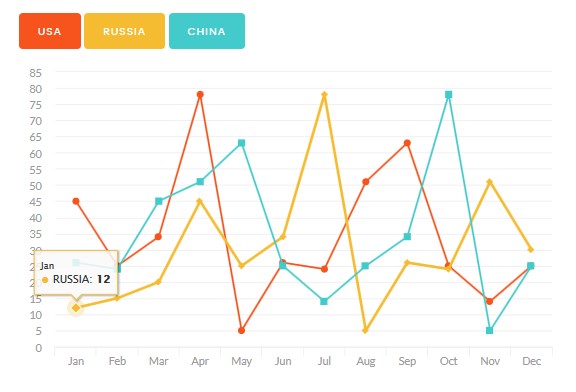
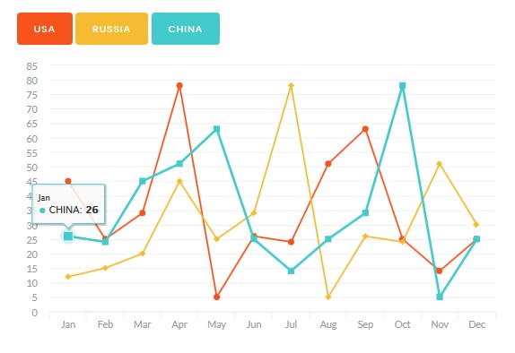
Area Chart with Filter Type
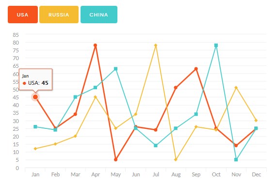
Using the Area Chart with Filter Type you have an ability to select which curves you want to see on the chart.
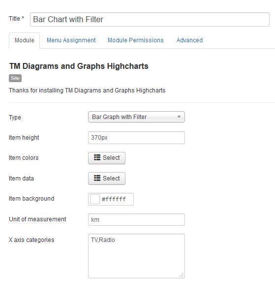
Click on the module title link ("Area Chart with Filter") to be brought to the settings window of the module.
At the Module tab you may set up the following options:
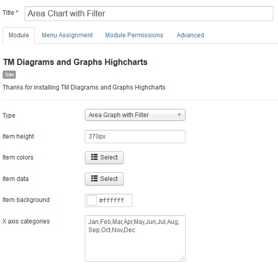
- Type — select the diagram or graph type (the Area Chart with Filter type is selected now);
- Item height — set the diagram or graph area height in pixels only;
- Item colors — choose a color for each curve. The color must be specified in hexadecimal format (for example, #aabbcc). Also, it is possible to select a color from a palette provided.
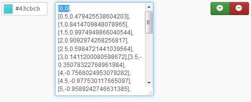
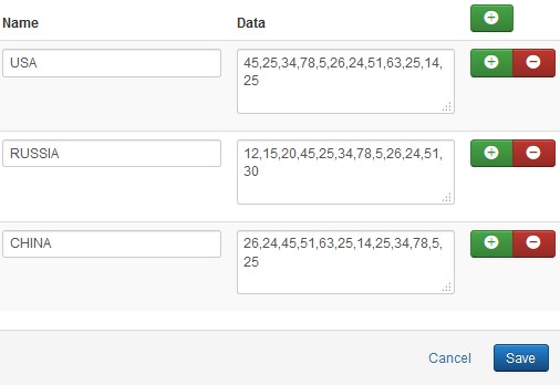
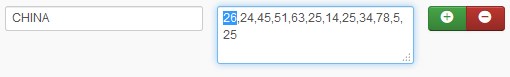
- Item data — specify the data you want to show on the chart. Enter a numerical value in the Data field (example: 12,22,33,15,66). You can assign the name to each value. The first numerical value of each data field refers to the first category (group of values) of the chart.
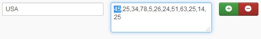
- USA - 45;
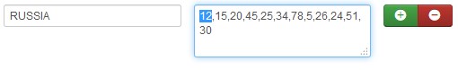
- RUSSIA - 12;
- CHINA - 26.
-
X axis categories — assign the name to each category of the chart. The default categories titles are 0, 1, 2, 3, 4, etc. Enter custom title for categories without space and separated by a comma. E.g. Jan,Feb,Mar,Apr,May,June,July,Aug .
- Item background — choose a chart area background color. The color must be specified in hexadecimal format (for example, #aabbcc). Also, it is possible to select a color from a palette provided.
Example:
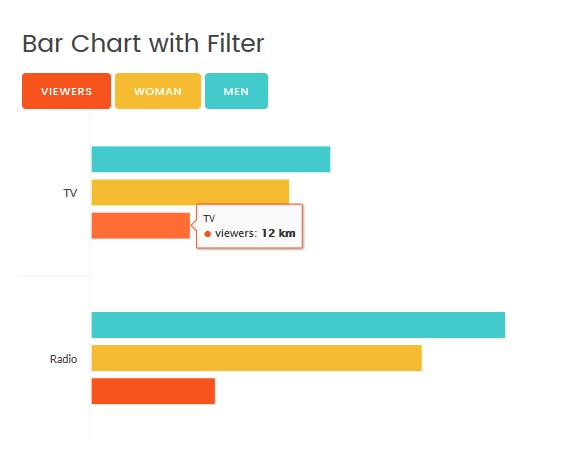
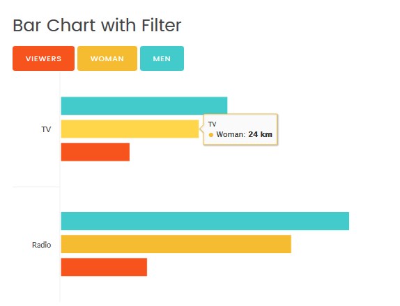
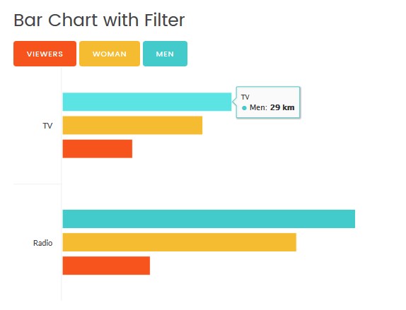
Bar Chart with Filter Type
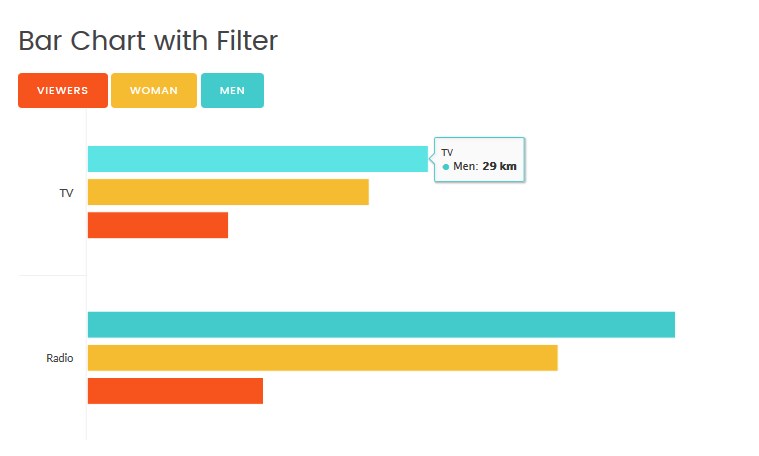
Click on the module title link ("Bar Chart with Filter") to be brought to the settings window of the module.
At the Module tab you may set up the following options:
- Type — select the diagram or graph type (the Bar Chart with Filter type is selected now);
- Item height — set the diagram or graph area height in pixels only;
- Item colors — choose a color for each data group (category). The color must be specified in hexadecimal format (for example, #aabbcc). Also, it is possible to select a color from a palette provided.
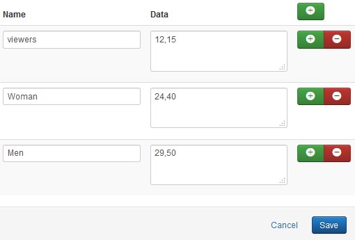
- Item data — specify the data you want to show on the chart. Enter a numerical value in the Data field (example: 12,22,33,15,66). You can assign the name to each value. The first numerical value of each data field refers to the first category (group of values) of the chart.
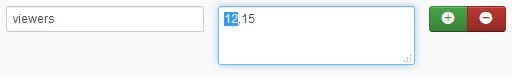
- Viewers - 12;
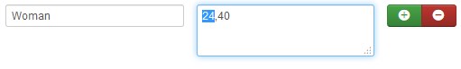
- Woman - 24;
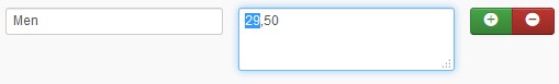
- Men - 29.
-
X axis categories — assign the name to each category of the chart. The default categories titles are 0, 1, 2, 3, 4, etc. Enter custom title for categories without space and separated by a comma. E.g. TV,Radio.
- Item background — choose a chart area background color. The color must be specified in hexadecimal format (for example, #aabbcc). Also, it is possible to select a color from a palette provided.
Example:
Column Chart with Filter Type
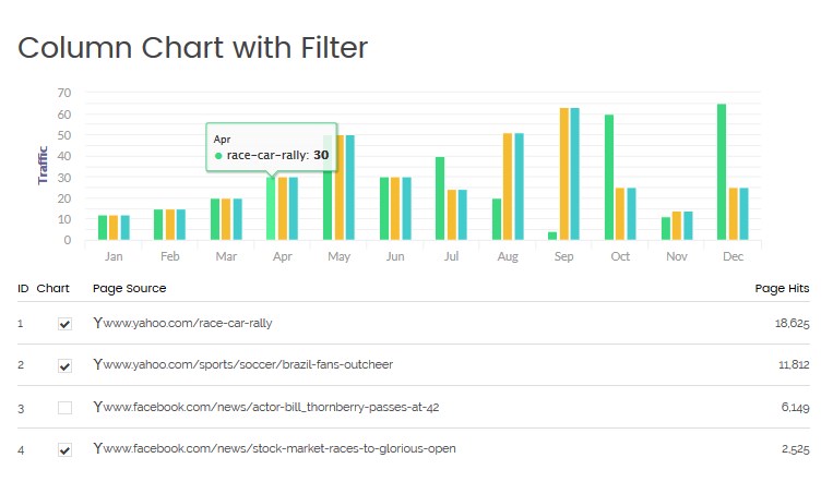
Click on the module title link ("Column Chart with Filter") to be brought to the settings window of the module.
At the Module tab you may set up the following options:
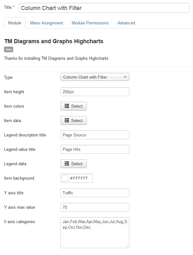
- Type — select the diagram or graph type (the Column Chart with Filter type is selected now);
- Item height — set the diagram or graph area height in pixels only;
- Item colors — choose a color for each data group (category). The color must be specified in hexadecimal format (for example, #aabbcc). Also, it is possible to select a color from a palette provided.
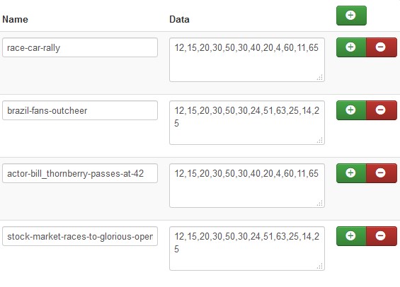
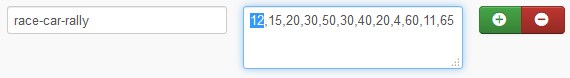
- Item data — specify the data you want to show on the chart. Enter a numerical value in the Data field (example: 12,22,33,15,66). You can assign the name to each value. The first numerical value of each data field refers to the first category (group of values) of the chart.
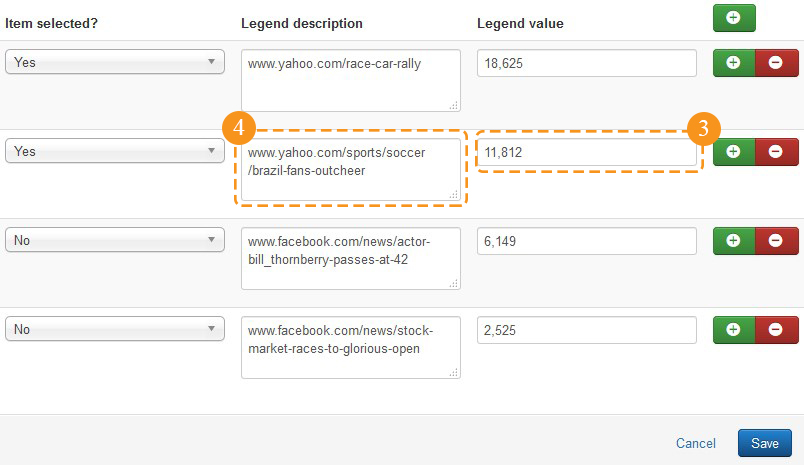
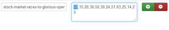
- race-car-rally - 12;
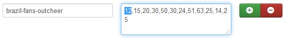
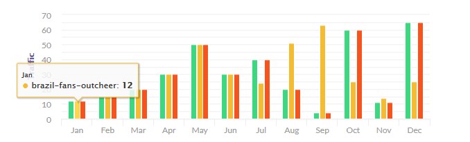
- brazil-fans-outcheer - 12;
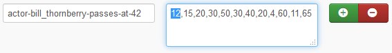
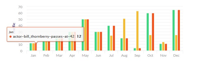
- actor-bill_thornberry-passes-at - 12;
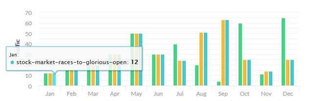
- stock-market-races-to-glorious-open - 12.
-
Legend description title — enter the title for the description (1) colunm.
-
Legend value title — enter the title for the value (2) column.
-
Item data — specify the data (3) you want to be shown in the legend box of the chart. You can add the description (4) to each legend item.
-
Item background — choose a chart area background color. The color must be specified in hexadecimal format (for example, #aabbcc). Also, it is possible to select a color from a palette provided.
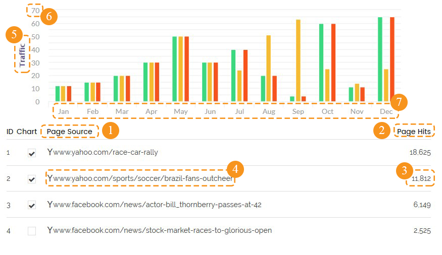
- Y axis title — enter the title (5) for the Y axis.
- Y axis max value — enter the Y axis max value (6).
-
X axis categories — assign the name 1o each category of the chart. The default categories titles are 0, 1, 2, 3, 4, etc. Enter custom title for categories without space and separated by a comma. E.g. Jan,Feb,Mar,Apr,May,Jun,Jul,Aug,Sep,Oct,Nov,Dec. (7)
Example:

Basic Chart with Filter Type
Click on the module title link ("Basic Chart with Filter") to be brought to the settings window of the module.
At the Module tab you may set up the following options:
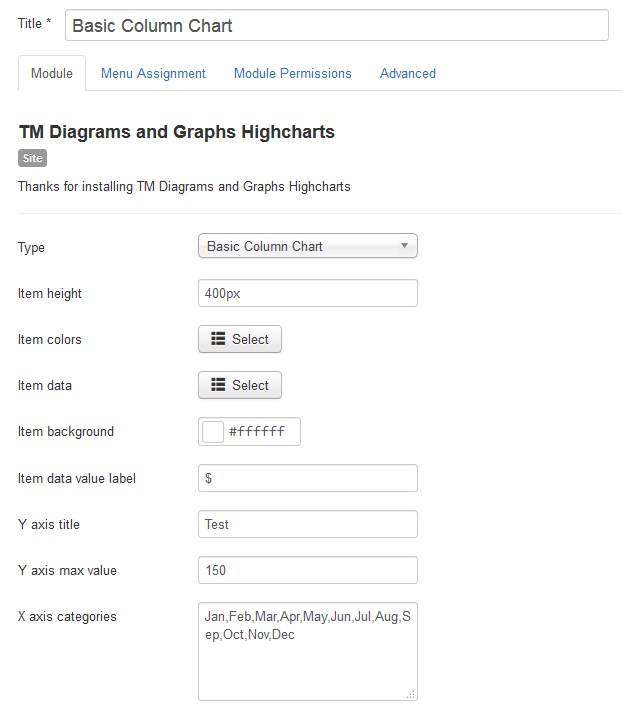
- Type — select the diagram or graph type (the Basic Chart with Filter type is selected now);
- Item height — set the diagram or graph area height in pixels only;
- Item colors — choose a color for each data group (category). The color must be specified in hexadecimal format (for example, #aabbcc). Also, it is possible to select a color from a palette provided.
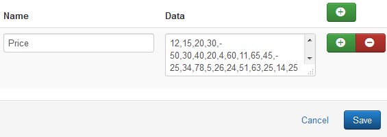
- Item data — specify the data you want to show on the chart. Enter a numerical value in the Data field (example: 12,22,33,15,66). You can assign the name to each value. The first numerical value of each data field refers to the first category (group of values) of the chart.
- Price - 12;
- Item background — choose a chart area background color. The color must be specified in hexadecimal format (for example, #aabbcc). Also, it is possible to select a color from a palette provided.
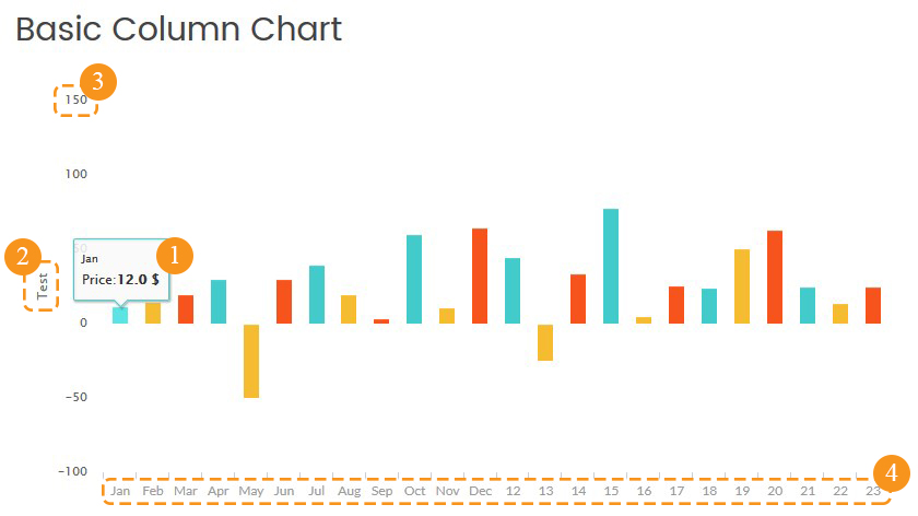
- Item data value label — enter the label (1) for the unit of measurement ($, %, km).
- Y axis title — enter the title for the Y axis (2).
- Y axis max value — enter the Y axis max value (3).
- X axis categories — assign the name to each category of the chart. The default categories titles are 0, 1, 2, 3, 4, etc. Enter custom title for categories without space and separated by a comma. E.g. Jan,Feb,Mar,Apr,May,Jun,Jul,Aug,Sep,Oct,Nov,Dec. (4)
Example:
Events Calendar
This module&component uses the calendar display format of Calendar module and gives its own content type and views. It manages colors of events based on their status that can be set on configuration page.
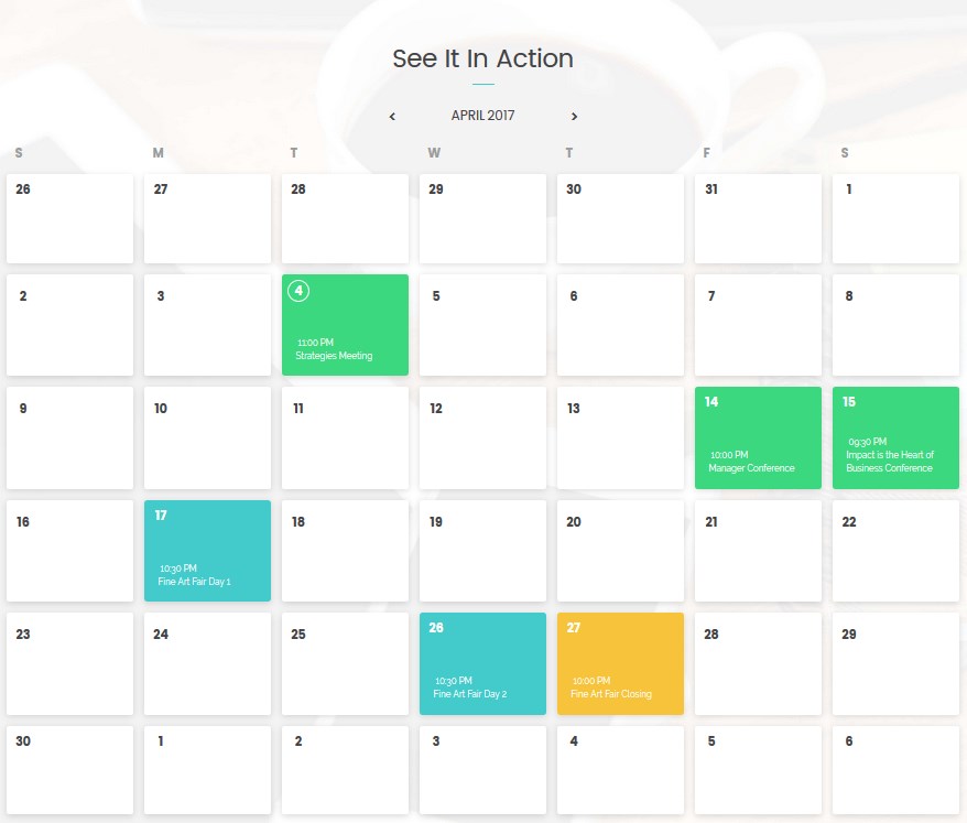
How output the Events Calendar to the Frontend
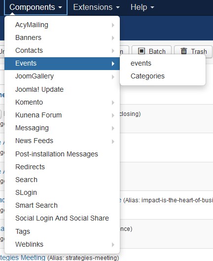
Navigate to Component > Events.
How to create new category
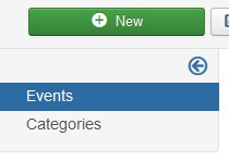
Go to the Category tab and press the New button.
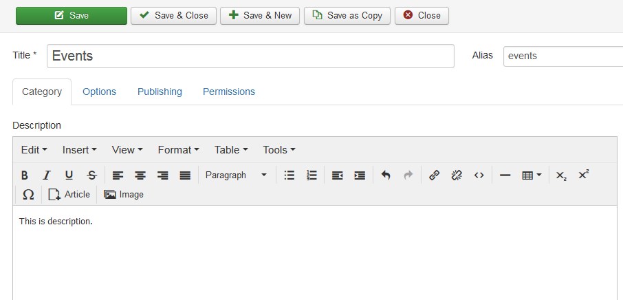
Enter the category title in the Title option field. You can add the category description. Save the category, pressing the Save button.
How to create new event
Go to the Events tab and press the New button.
Enter the event title in the Title option field. You can add the event description.
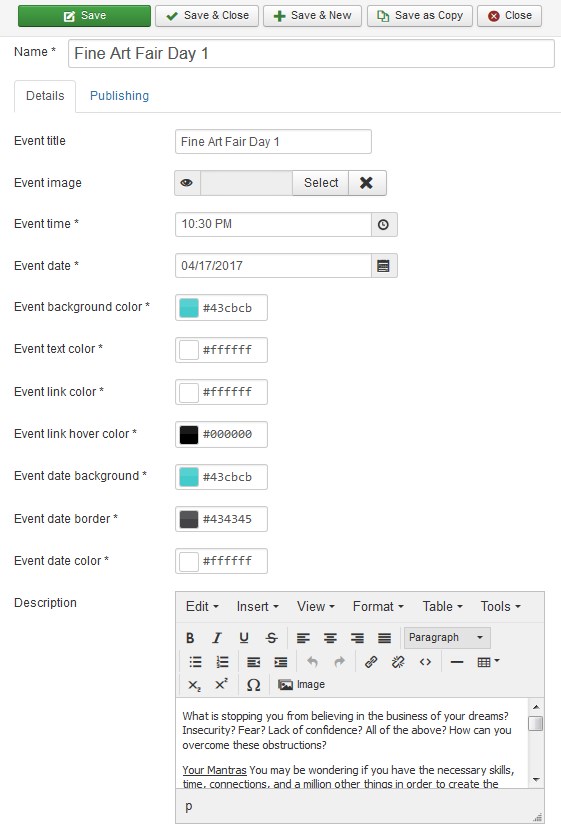
Event settings:
- Event title — enter the title of the event (the title will be displayed on the calendar);
- Event image — select an image for the event (press select button);
- Event time — set the event time;
- Event background color — choose the color of the event day calendar cell;
- Event text color — choose the event main text color;
- Event link color — choose the color of the link;
- Event link hover color — choose the link hover color;
- Event date background — choose the date section background color;
- Event date border — choose the date border color;
- Event date color — choose the date color;
- Description — enter the event description.
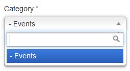
Select the category for the event. Note the Category field is required.
Save the event, pressing the Save button.
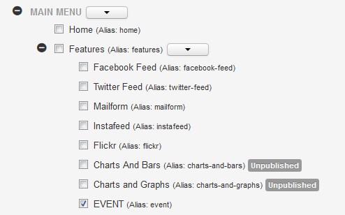
Now you need to create new Main Menu item.
Navigate to Menus > Main Menu > Add New Menu Item.
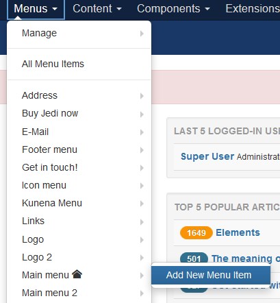
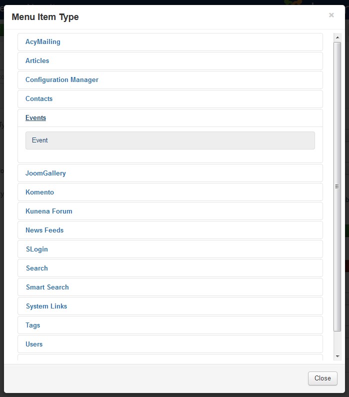
Enter the event title in the Title option field. Select the Event menu item type. In order to do this press the Select button.
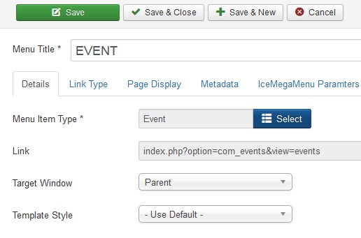
Choose the Event in the appeared window.
Save the menu item, pressing the Save button.
Frontend:
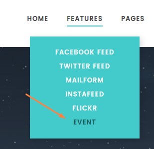
You can output the Events Calendar within the module only.
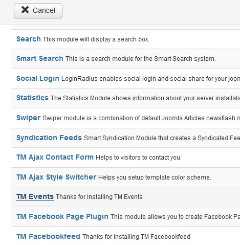
Navigate to the Extensions > Modules. Press the New button.
Select the TM Events type module to create.
Enter the module title in the Title option field.
Go to the Menu Assignment tab. Select the page to display the Event Calendar (It's the EVENT menu item, we've previously created)
Navigate to the Params tab.
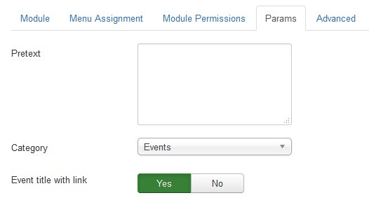
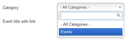
Choose the category of events to display on the
Save the module, pressing the Save button.
Go back to your website and refresh the page with the Event Calendar on it.
GoogleMap Plugin
GoogleMap is a plugin that allows you to display Google map on your website:
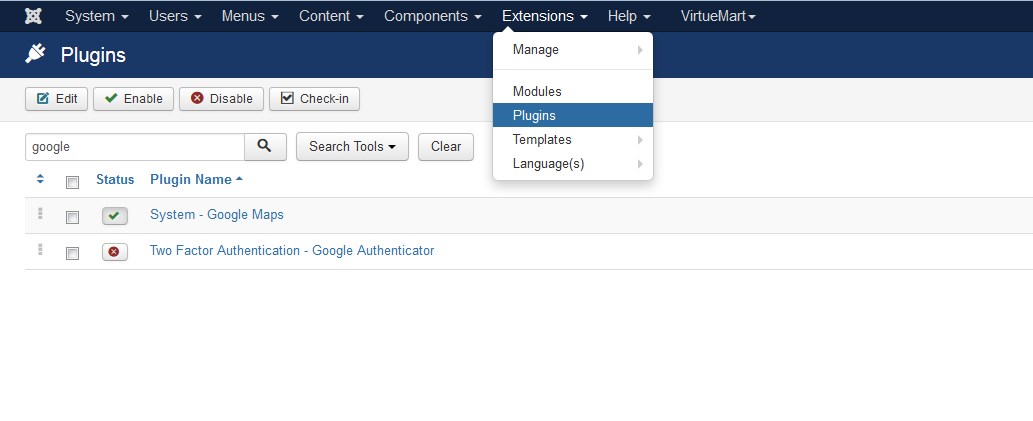
To customize the plugin go to Extensions > Plugins section. This will bring you to the Plugins Manager. Type "Google" into the search field and click the System - Google Maps title link.
This will take you to the main configuration page of the GoogleMap plugin. Feel free to check more details at the official website.
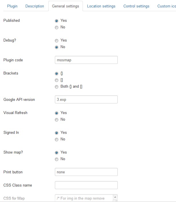
Let's review the configuration options:
| Published | - | If not all the maps will disappear. |
Debug? |
- | If the map shows debug messages [as comments] in the html-page. The comments can be shown by looking at the page source. |
| Plugin code | - | The code which is used to be placed in the article between {} to trigger plugin. Default is mosmap. |
| Brackets | - | What brackets should be used around the plugin code: {} [default with [] for multiple kml], [] [with () for multiple kml] or both. |
| Google API version | - | The version of the Google API that has to be used [3.exp latest developed version, 3.number for specific version and 3 for stable version (default)]. |
| Visual Refresh | - | Show new refreshed tiles in Google Maps. | Signed In | - | The visitor is recognized as a Google user and they will see the map customized by Google. | Show map? |
- | Show the map or hide it. Can be used to only show a lightbox link or streetview, or directions on a page. | Print button | - | Show a print button or link to print a map, streetview and its direction [none (default), icon, text, both or your own text/image as link]. |
CSS Class name | - | CSS class name for a map to use for styling of the map. Default is empty. |
| CSS for Map | - | CSS definition for the plugin to show the map and its related object correct. If Map class is changed then also change the class in the css. |
Load with mootools? | - | If mootools [default] should be used to load the map or a timeinterval. | Timeinterval | - | To show the map a timeinterval in ms is done to wait for the page is loaded correctly [default 500ms]. Especially for IE this can prevent a fatal error. |
Googlemaps API Key | - | Google API key for Google Maps 3 for Usage and billing. | Googlemaps Multi API Key |
- | The optional Google API key[s] for Google Maps version 3 for Usage and billing. With multi you can add multi domains for your site and behind it the key. The next domain goes on a new line. |
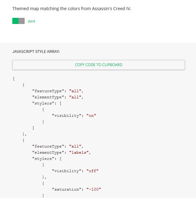
URL variable | - | Use HTTP_HOST [default] or Joomla setting. | Google website | - | What Google website should be used for geocoding and directions. | Styled Map | - | The JSON string to style the map; you can change your Map style. Check the more styles here. Copy the code and paste it into the Styled Map option field:
|
Align | - | How the map should be aligned within the content [parent html object]. | Language option | - | If the language of maps [buttons, tooltips] should be determined by: site — language of site; user — so browser language/location. |
Language | - | When language is determined by config then set language here. | Width | - | Width of the map. You must put the units behind the number like 100% or 400px. | Height | - | Height of the map. You must put the units behind the number like 100% or 400px. | Effect on Map | - | What effect has to be used on the Map [Horizontal uses absolute width!]. |
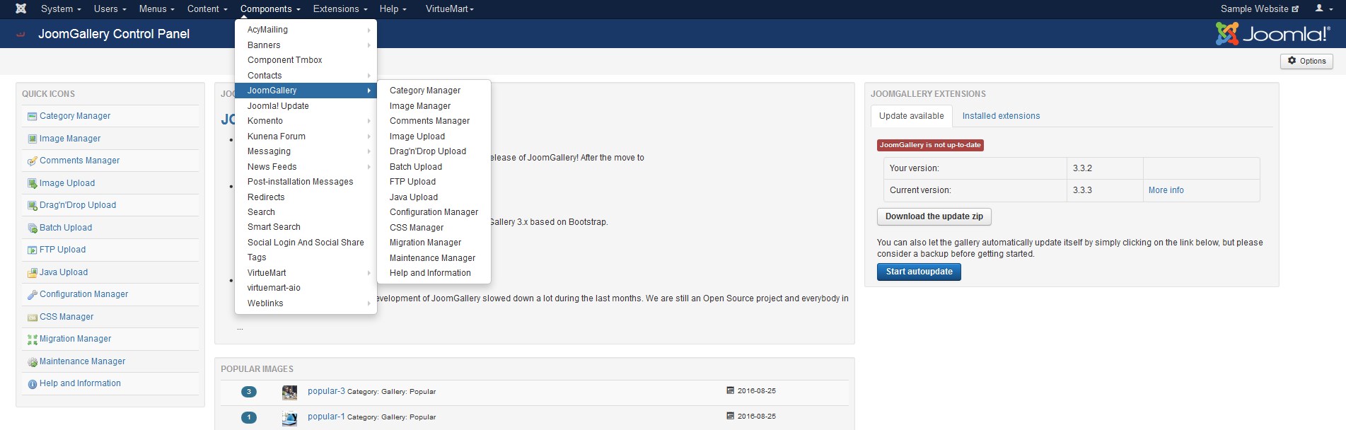
JoomGallery
JoomGallery is a component that allows to create a complete photo gallery based on Joomla! Feel free to check more details at the official website.
Category Creating
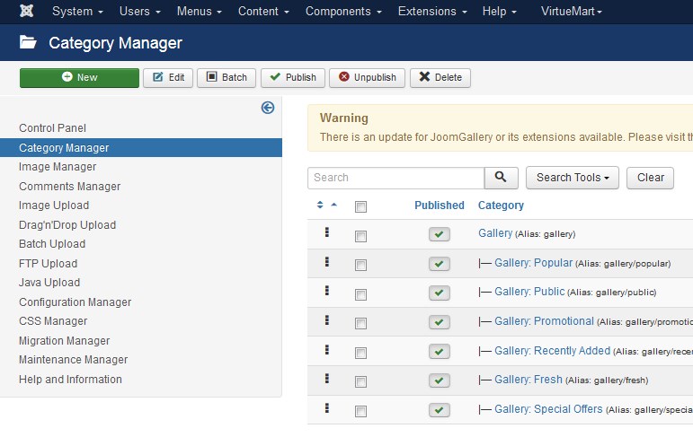
Go to Components > JoomGallery > Category Manager section.
Press the New button in the top left corner:
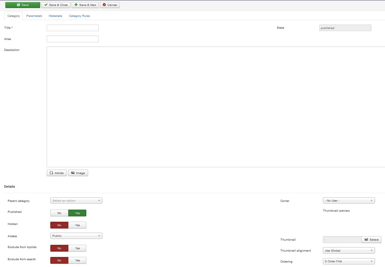
Input category Title and Description with images and Save the settings. You can also specify Meta Description for this category and set access restrictions if needed.
When configuring, you can face the settings in a table below:
| Alias | - | Leave this blank and JoomGallery will fill in a default value, which is the category path in lowercase and with dashes instead of spaces. You may enter the Alias manually. If you do so, please, use lowercase letters and hyphens [-]. No spaces or underscores are allowed. The Alias will be used in the SEF URL. |
| Hidden | - | With hiding this category it won't be displayed in a gallery or category view anymore, but it will still be available through direct linking. If you don't want it to be available, please, unpublish it instead. By hiding categories it is possible to create separate areas in the gallery, for example. For that, please, create menu items for the hidden categories. It is also possible to manage certain images in the gallery without showing them in it [e.g., you can use the gallery as the additional manager for images that are included into articles content]. |
| Access | - | Access level for this category. |
| Exclude from toplists | - | With enabling this option you can exclude this category from the toplists. Please, note, that this option is not automatically passed on to subcategories. Of course, enabling this option distorts the toplists which could be detected by your site visitors. |
| Exclude from search | - | With enabling this option you can exclude this category from the search results. Please, note, that this option is not automatically passed on to subcategories. Of course, enabling this option could create confusion at the visitors of your site, as some images won't appear in the search results even if they type in correct keywords. |
Thumbnail | - | Here you may select an image which is set as the thumbnail of this category. | Thumbnail alignment | - | Please, select the alignment for the category thumbnail you have chosen above. | Ordering | You may change the position of the category here. | Password | - | Here you can specify a password for the category. With that, the category will only be accessible for the users in frontend if they enter the correct password. Please, note, that restricting access via access levels is stronger which means that users cannot access categories with too high access level even if they know the respective password. |
Advise
To save changes, you should click the Save button.
Creating gallery items
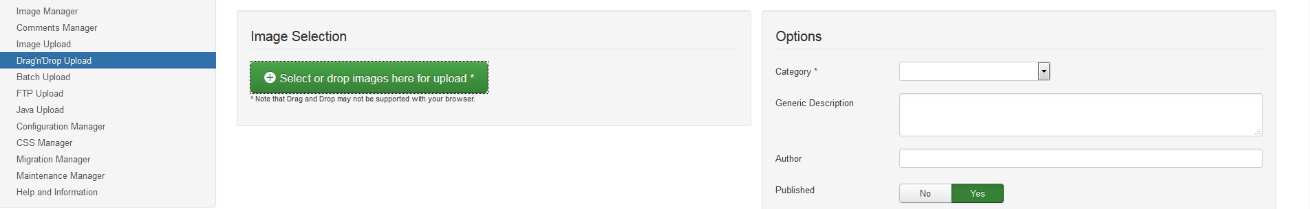
Choose the most convenient way for images uploading. You may use:
-
Image Upload
Drag'n'Drop Upload
-
Batch Upload
FTP Upload
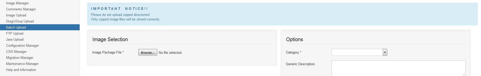
I M P O R T A N T N O T I C E ! !
Please, do not upload zipped directories! Only zipped image files will be stored correctly.
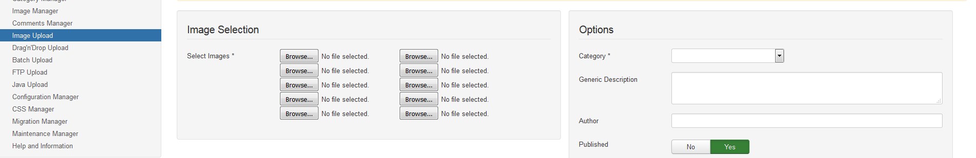
Let's try Image Upload.
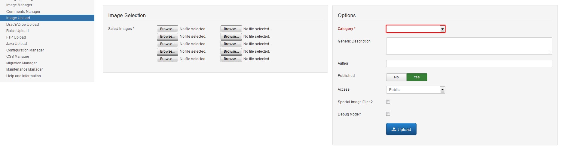
-
Press the Browse button in the Image Selection section and select media files on your computer.
-
Specify a Category for these images [you can upload bunch of images for each category this way], Generic Title for these images [for example, if you upload 3 files with generic title "test", they will appear in your Image manager as test_1, test_2 and test_3].
-
Specify Generic Description and Author if needed. Set the Access type: public, super users, registered, special.
-
Use the Special Image Files option. This option enables the upload of special image files. Solely choose this option in case your upload exclusively consists of animated or transparent .png or .gif files. Keep in mind that the files do not get resized and therefore are displayed full size in detail view.
-
Debug Mode. With activated debug mode all processing steps will be shown. In case of errors they are always displayed.
Please, click on the Upload button at the bottom after the configuration process is completed.
Editing existing Gallery item
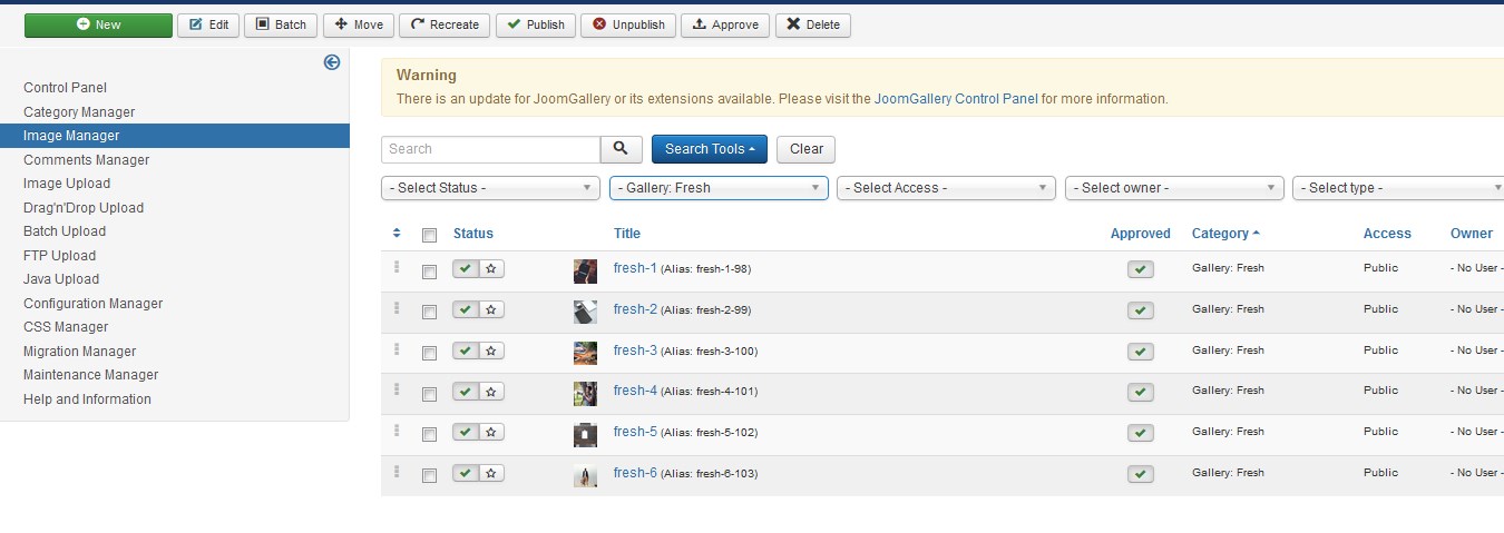
In case you need to modify them, you should perform the following:
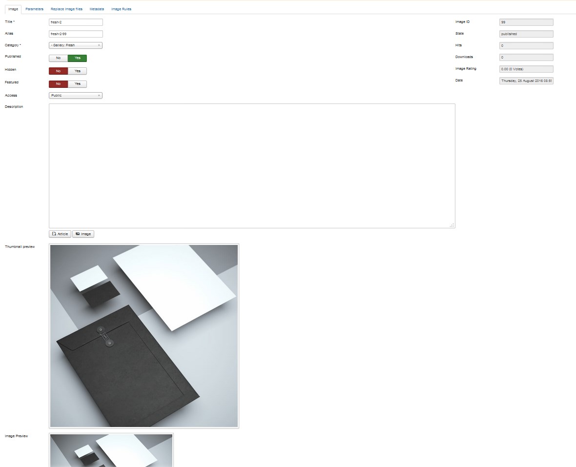
- Open any item from the list.
- Change the Title, Category, Description, Hits, etc. in the Image tab. Scroll down to check the Thumbnail preview and Image preview.
-
Use Hidden option. With hiding this image it won't be displayed in category view or recognized by search or the toplists anymore, but it will still be available through direct linking. If you don't want it to be available, please, unpublish it instead. By hiding images it is possible to use them as category thumbnails without showing them in the respective category, for example.
-
Featured option. Here you can mark an image as 'Featured'. For example, the JoomImages module can be configured to display just the featured images on a module position.
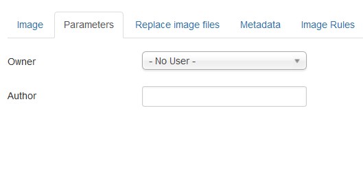
- Go to Parameters tab to change Owner and Author for this gallery item.
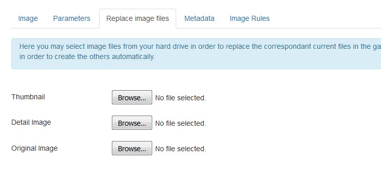
-
In the Replace image files tab you may select image files from your hard drive in order to replace the correspondent current files in the gallery. Upload new images using the Browse button.
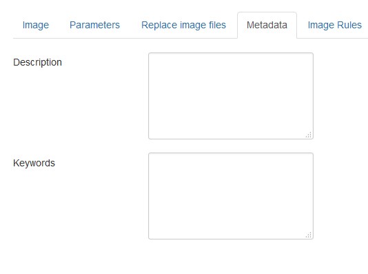
- You can also change the Description and Keywords at the Metadata tab:
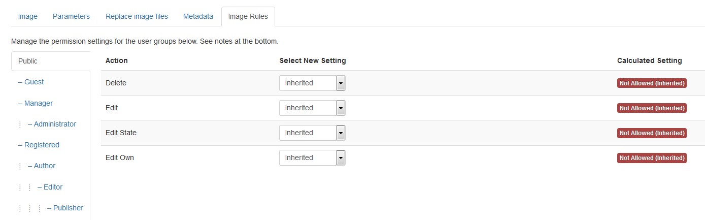
- You can manage permissions at the Permissions tab:
Creating a new Gallery menu item
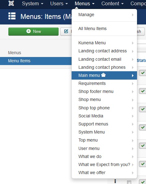
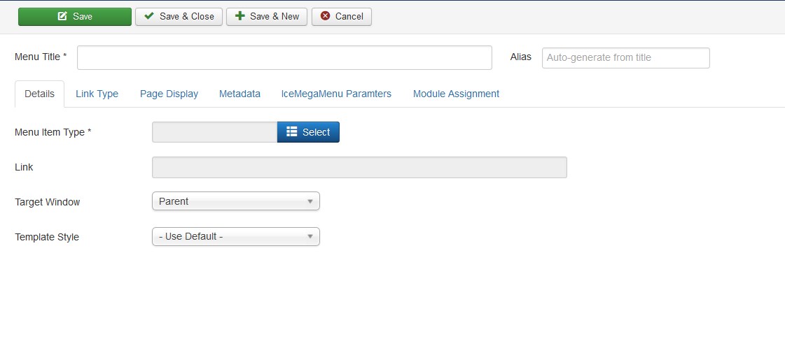
- Go to Menus > Main menu section. Press the New button in the top left corner:
- You will see the Menus: New Item window:
- Enter Menu item Title.
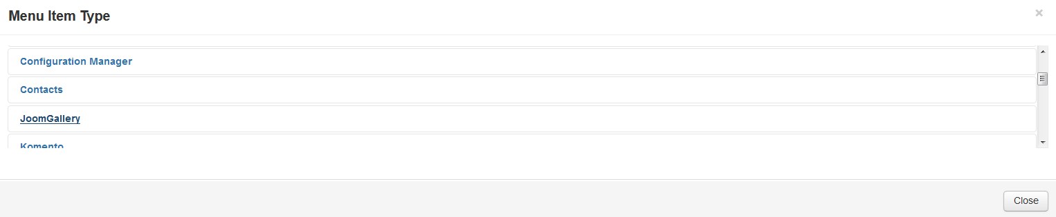
- Press Select near Menu Item Type and choose JoomGallery.
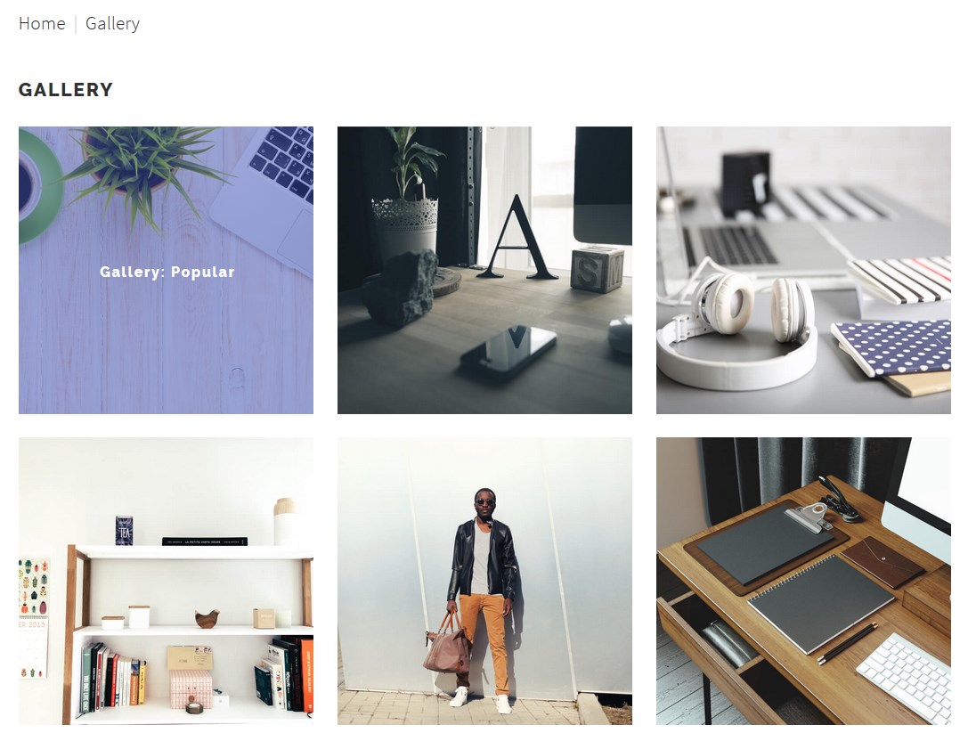
- Choose one of variants available that meets your needs best:
- Let's select Gallery View: Default Layout as an example. Specify the needed category in the dropdown list.
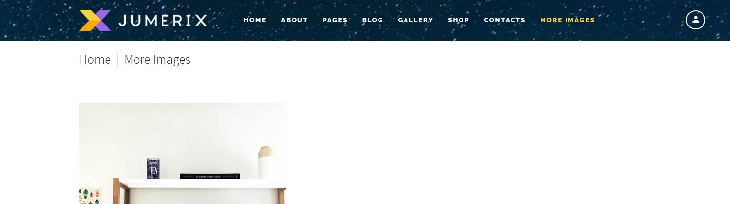
- Press Save&Close button, visit your site and refresh it, new Gallery menu button was added.
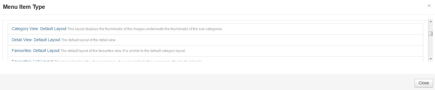
| Category View: Default Layout | - | This layout displays the images thumbnails underneath the subcategories thumbnails. |
| Detail View: Default Layout | - | The default layout of the detail view. |
| Favourites: Default Layout | - | The default layout of the favourites view. It is similar to the default category layout. |
| Favourites: List Layout | - | This layout displays the chosen images of a user similar to the userpanel with mini thumbnails. |
| Gallery View: Default | - | Layout The default layout of the gallery view. | Toplist: Default Layout | - | The default layout of the toplists. | Upload Form: Default Layout | - | The default upload form. | User Categories: Default Layout | - | The default layout for the user categories. |
User Panel: Default Layout |
- | The default layout of the user panel. |
Flickr Gallery
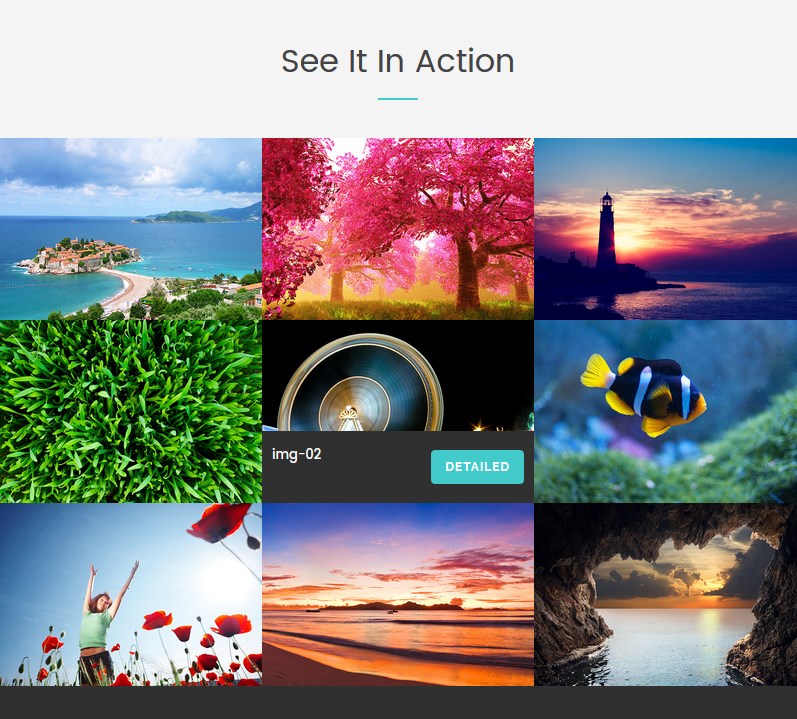
Flickr Gallery is a lightweight Image Gallery Module for Joomla. This module will allow you to quickly and easily incorporate your Flickr photos into your website. It shows thumbnail view of all images from selected Flickr.com album. You can use your own Flickr ID and Flickr Album ID to publish photo albums on your website. When user will click on thumbs he will be redirected into full size photo page.
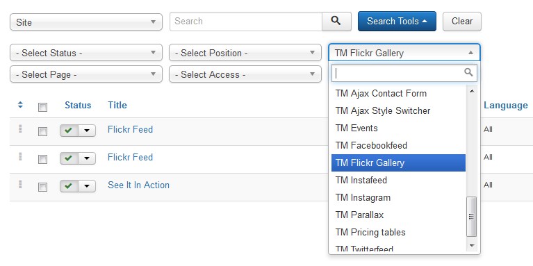
To configure the TM Flickr Gallery module navigate to Extensions > Modules.
Press "Search Tool" button and select the TM Flickr Gallery in the "- Select Type -" filter dropdown list. You will see the See It In Action Module.
Click on module title link to be brought to the settings window of the module.
At the Module tab you may set up the following options:
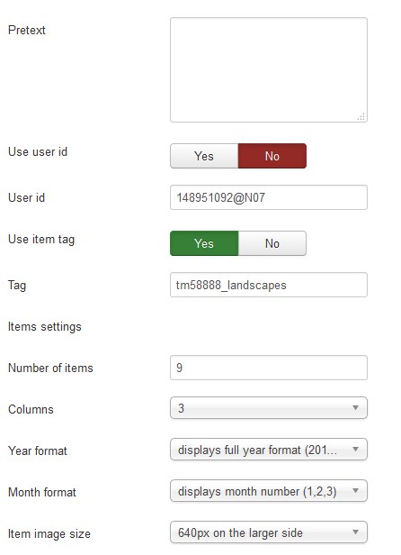
- Pretext — allows displaying custom text before the module content;
- Use user id — whether to use user id;
- User id — create Flockr account. Get the user id and insert here. You can get the user ID by the following link: http://idgettr.com/.
- Use item tag — whether to use tag to sort images;
- Tag — set the tag the items will be displayed by.
Items settings
- Number of items — the number of items to display within this module;
- Columns — set the number of columns;
- Year format — set a year format (display full year format/display 2 last digits of the year);
- Month format — set a month format (displays full month name/displays month number);
- Number of post comments — set the number of post comments to display in each item;
- Item image size — set the gallery image size.
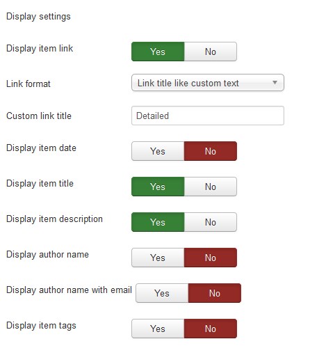
Display settings
- Display item link — whether to show the photo link;
- Link format — choose the link format [Link title like url/ Link title like custom text];
- Custom link title — specify the custom link title;
- Display item date — whether to show the picture publishing date;
- Display profile — whether to show the profile;
- Post item title — whether to show the pictures' title;
- Display description — whether to show the picture description;
- Display author name — whether to show the author name;
- Post link text — whether to show the link text;
- Display author name with email — whether to show the author name with email;
- Display tags — whether to show the tags.
How to get Flickr User id
Step – 1
First you need to login in your Flickr Account. Follow this link to redirect you to Flickr Account Login Page.
After login Flickr will redirect you to Home Photostream Page as below snap. Click the first menu link YOU.

Step – 2
Check the Browser URL to get your User ID as instructed in below screenshot.
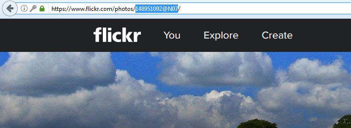
We found the User ID in opened You page URL like:
https://www.flickr.com/photos/148951092@N07/
Here “148951092@N07” is your User ID.
You may also set up the following options for the module at the Module tab:
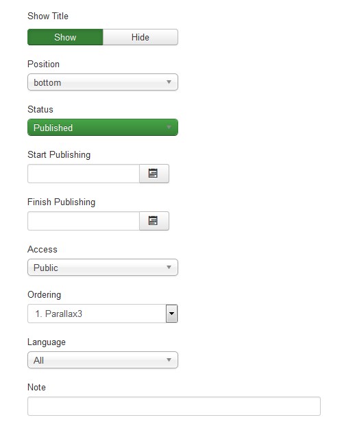
- Show Title. You can show or hide module title on display. Effect will depend on the chrome style in the template.
-
Position. You may select a module position from the list of predefined positions or enter your own module position by typing the name in the field and pressing enter.
- Status. If published, this module will display on your site Frontend or Backend depending on the module.
- Date for publishing [Start Publishing/Finish Publishing] An optional date to Start/Finish Publishing the module.
- Access. The access level group that is allowed to view this item.
- Ordering. Select the ordering.
- Language. Assign a language to this module.
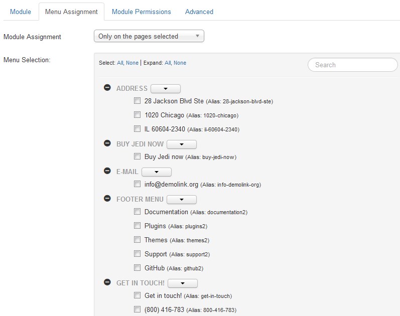
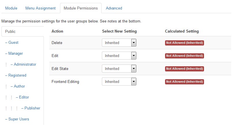
The Menu Assignment & Module Permissions tabs are standard for Joomla modules. You may set up menu items for the module to appear at and define the permissions.
Menu Assignment Tab:
Module Permissions Tab:
At the Advanced tab you will see the following options:
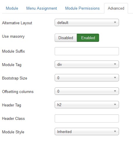
-
Module Suffix. A suffix to be applied to the CSS class of the module. This allows for individual module styling.
- Module Tag. The HTML tag for module.
- Bootstrap Size. An option to specify how many columns the module will use.
- Offsetting columns. Increase the left margin of a column by selected number of columns.
- Header Tag. The HTML tag for module header/title.
- Header Class. The CSS class for module header/title.
- Module Style. Use this option to override the template style for its position.
Joomla Cookie Directive Plugin
Joomla Cookie Directive Plugin is used to display a cookie acceptance banner at the top of the site. It warns that the site is using cookies.

To configure the Joomla Cookie Directive plugin navigate to Extensions > Plugins section. To find the needed plugin among the others, type "cook/.../" in the search field.
Click the "system - EUCookieDirectiveLite" title link and you'll see the main Joomla Cookie Directive plugin settings.
This screen allows you to edit the details and options for plugins.
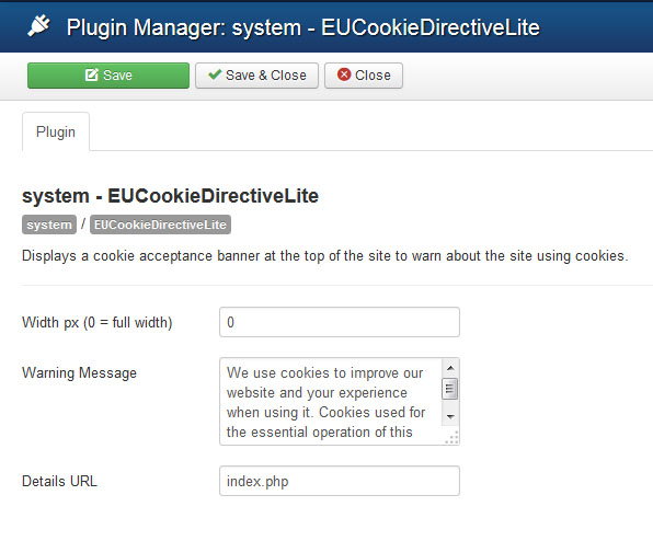
While configuring you may have to deal with the following settings:
| Width px [0 = full width] | - | The width of the message on the screen. 0 for 100%. |
| Warning Message | - | The message to display to users. |
| Details URL | - | A link to the details page on this site for more information. |
| Status | - | The enabled status of this plugin. |
| Access | - | The access level group that is allowed to view this item. | Plugin Type | - | Category/folder of plugins this plugin belongs to. | Plugin File | - | Plugin main file name. |
Feel free to check more details at the official website.
Joomla Social Login
Social Login, social network authentication component allows to login to Joomla web site via following social networks: Vkontakte, Twitter, FaceBook, Odnoklassniki, LinkedIn, Yandex services, Google, and Mail.ru.
Setting Slogin for the service Slogin.info
- After installation, go to the component settings: Components > Slogin.
- Then you need to get an ID and password, where to get them?
- Go to page: http://slogin.info
- If you have not registered yet, you can simply sign in through the social network.
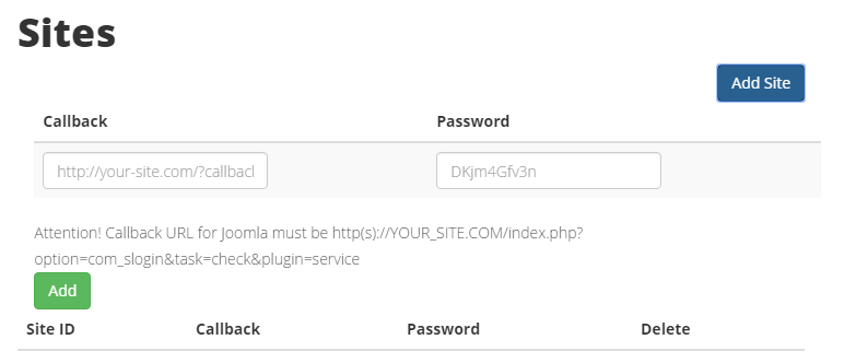
- Click on the button Add site.
- In the Callback referenced format http://site.ru/index.php?option=com_slogin&task=check&plugin=service.
- Site.ru replace on your website or you can copy the link from the field ready Callbsck URL in the settings Slogin. Go to Components > Slogin. Open any plugin settings.
- In the Password field, enter the secret word.
- Click on the button Add.
- After adding a site gets its user ID and password, which is entered in the previous step.
- Select the network that you want and save the settings.
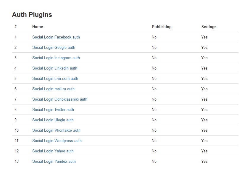
- Now you need to publish plugins and the module.
- You can publish plugins [ Social Login Facebook auth, Social Login Google auth, Social Login Instagram auth, ect] via component settings window [Components > Slogin].
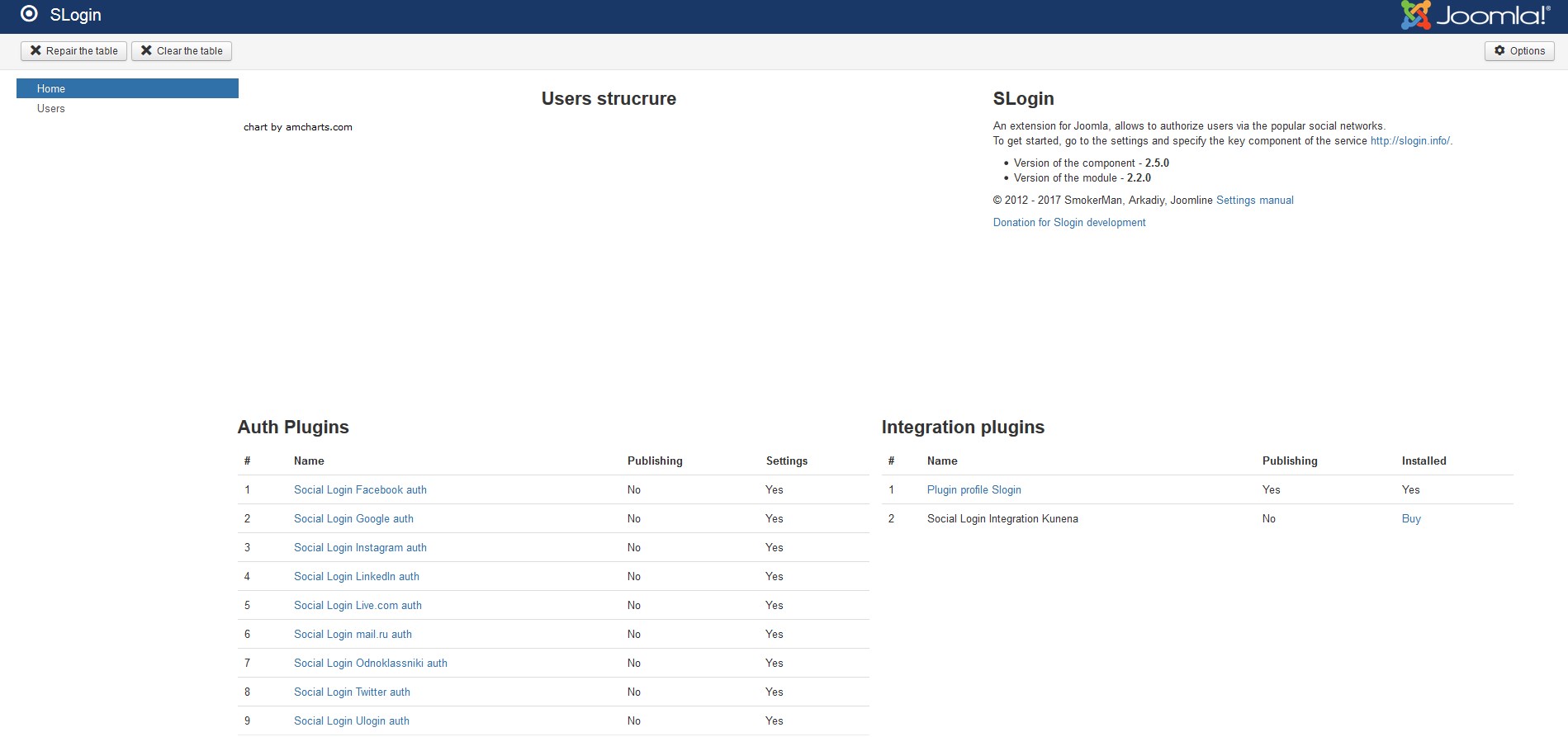
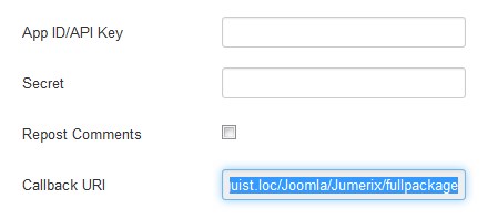
Find Callback URI option field and copy the URL path.
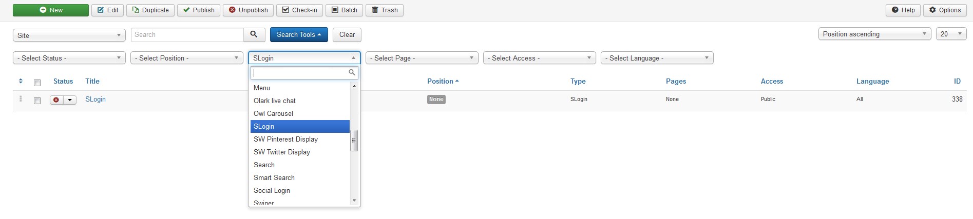
- To publish the Slogin module navigate to Extensions > Modules. Find the Slogin module using the filters. Select Slolin module type in the "-Select Type-" dropdown and you will see the Slogin module in the listing.
- Press the module title link to be brought to the module settings interface.
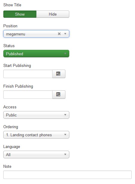
- Choose the module position. Let's select the megamenu position.
-
Publish the module [You can puplish the module via the Modules Manager, pressing the red "x" button near the modul title.].
- Save the settings.
-
Go back to your website and refresh the page. Now you are able to login to your Joomla web site via numerous social networks.
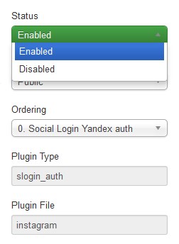
In order to this, open any plugin settings.
And change Slogin plugin to Enable.
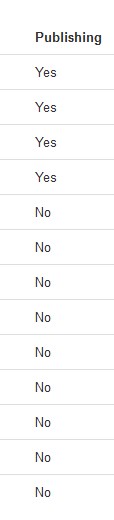
You will be able to see the Slogin plugin current status in the Publishing column.
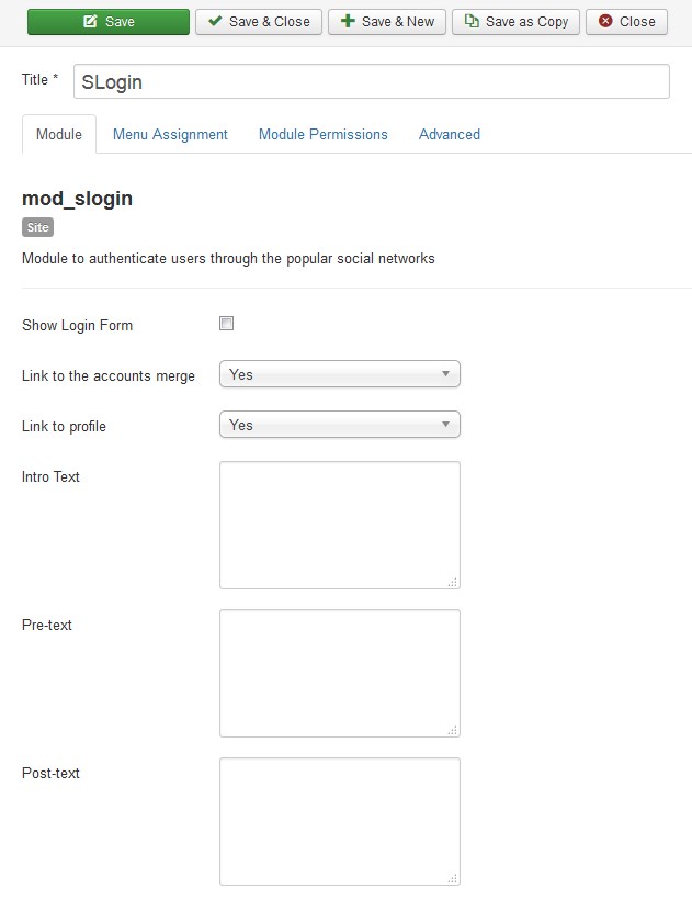
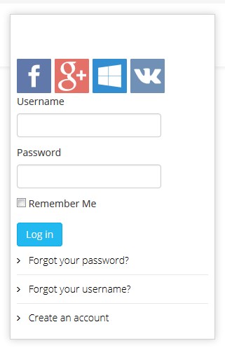
Let's learn more about the Slogin module settings:
| Show Login Form | - | Whether to show the Login Form. |
| Link to the accounts merge | - | Show the link to the linked profiles management of social networks. The link is displayed in the Slogin module for an authorized user. |
| Link to profile | - | Show the profile link. The link is displayed in the Slogin module for an authorized user. |
| Intro Text | - | HTML text to be displayed before authorizing on social networks. |
| Pre-text | - | This is the text or HTML that is displayed above the login form. |
| Post-text | - | This is the text or HTML that is displayed below the login form. | Login Redirection Page | - | Select the page the user will be redirected to after a successful login. Select one from the pages listed in the dropdown menu. Choosing Default will return to the same page. |
Logout Redirection Page | - | Select the page the user will be redirected to after log out. Select one from the pages listed in the dropdown menu. Choosing Default will return to the same page. |
This information was taken from the joomline.org/docs official documentation.
Komento Comments
Komento is an advanced comment extension for Joomla that allows your website visitors to comment on articles and blogs.
Komento Comments can be accessed under Components > Komento tab of your Joomla admin panel.
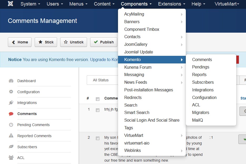
How to manage Komento component integrations
-
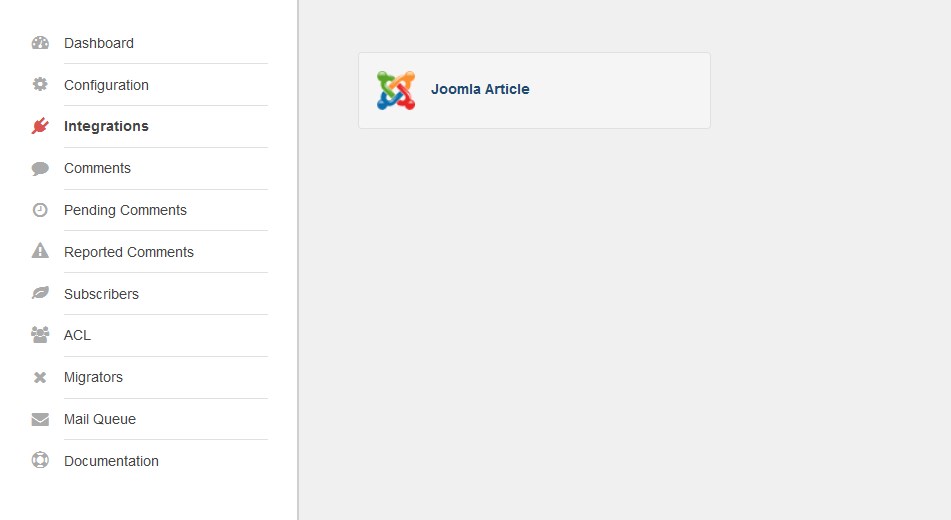
Log into your Joomla admin panel and go to Components > Komento > Integrations section.
Click on Joomla Article.
-
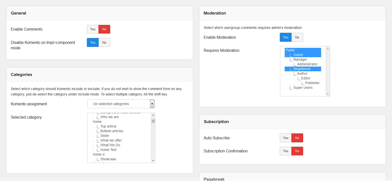
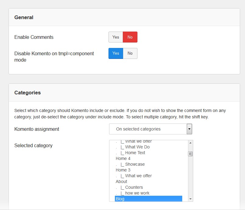
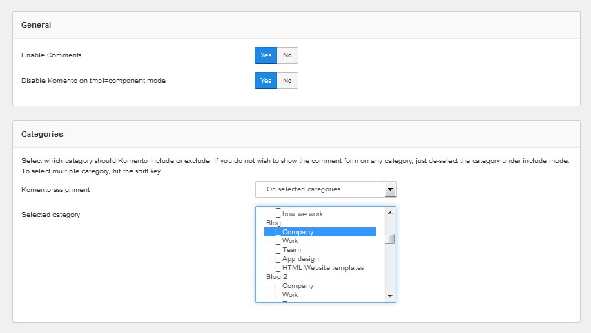
In the General tab you can Enable or Disable the comments. You can also change Moderation and other settings.
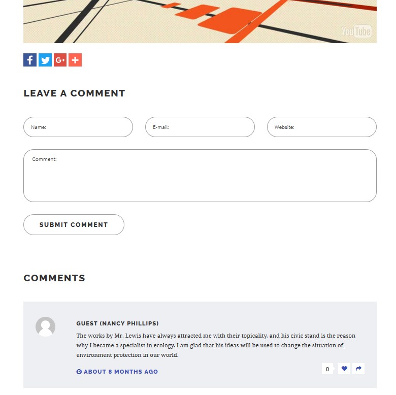
We have disabled [No] comments [check the screenshot below].
-
The comments block will be disabled on the website.
-
We have enabled comments back. You can assign Komento to all the site categories or select particular ones.
- We have assigned comments to “Company”.
-
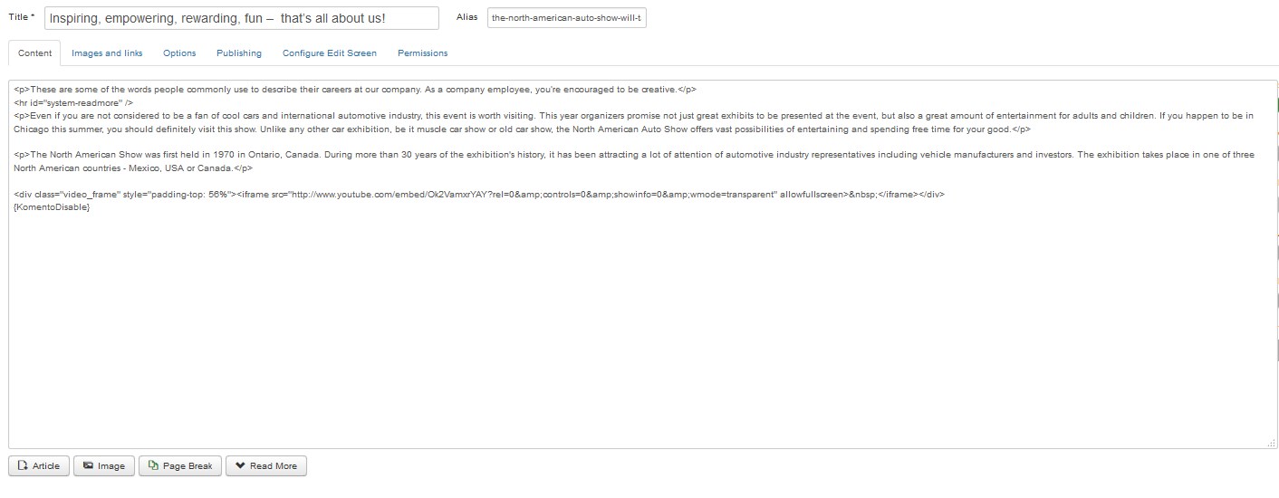
You can also disable comments for a particular article. Open the article in the Article Manager [Content > Articles] and insert the following code to the article body:
{KomentoDisable} -
Save changes. Comments do not appear on that article.
Enabled:
Disabled:
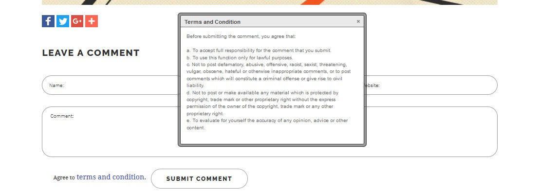
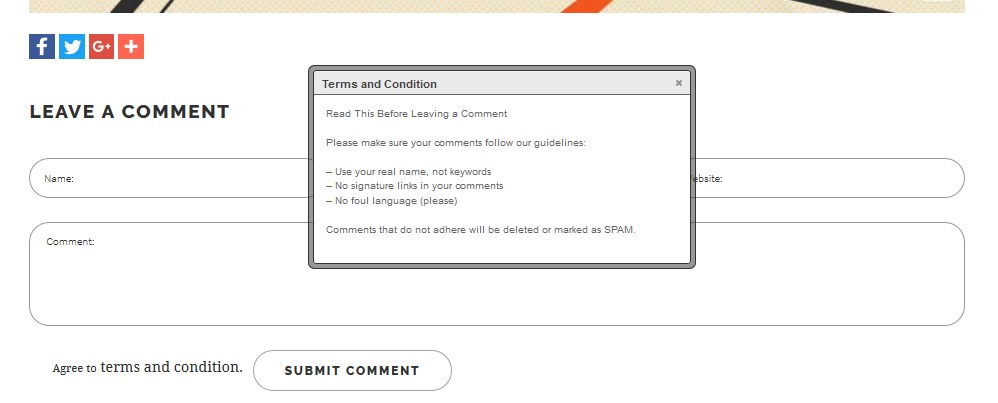
How to edit Komento "Terms and Conditions"
Komento Terms and Conditions text is displayed on single article pages. Site visitors have to agree with these terms in order to proceed with submitting their feedbacks if this option is activated. Please, refer to the screenshot below:
Please, perform the following steps to change the text:
-
Open your Joomla admin panel and navigate to Components > Komento > Integrations menu:
-
Open the “Joomla Article” component.
-
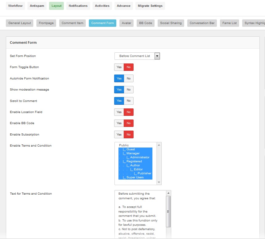
Then switch to Layout section and go to Comment Form tab:
-
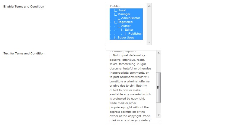
First, please, select the needed group of users at the bottom of the page, at 'Enable Terms and Conditions' section.
It's set to Guest by default, you may choose any other usergroup.We enable Terms and Conditions to all the users' types.
-
Next you may change the checkbox text in the Terms and Conditions text field.
Please, enter the desired text here and save changes pressing the Save button in the top left corner.

Text was successfully changed:
You can learn more about Komento on the official website.
Our templates have only standard version of Komento included. To get access to additional features and get complete support services for Komento extension we recommend that you purchase Komento Professional. You can check the full list of features on the following website: http://stackideas.com/komento.html?ref=kmfeature. With Komento Professional you will also get full technical support.
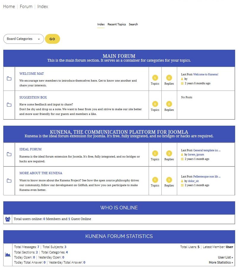
Kunena Forum
Kunena Forum is a discussion forum for the Joomla site. It is flexible and easy to work with. The default layout of forum for non-registered and registered users is different, as well as the options available.
Kunena is a component for Joomla that allows implementing a fully functional forum based on the engine.
This feature is located under the 'Pages' menu item at the site's front end.
General Kunena settings and its content can be controlled via your site admin panel.
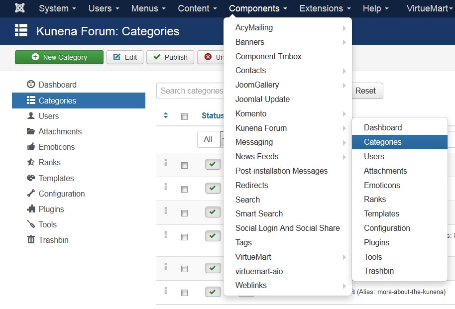
Scroll down the sidebar to Extensions and select Kunena Forum there:
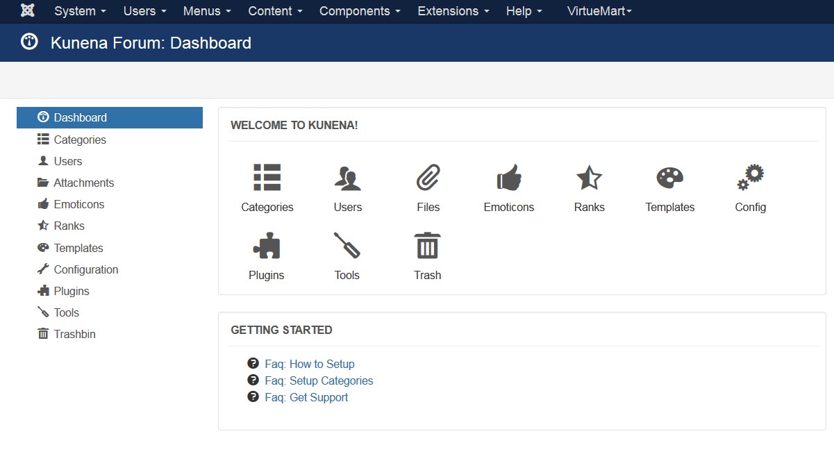
There will be several tabs available to work with:
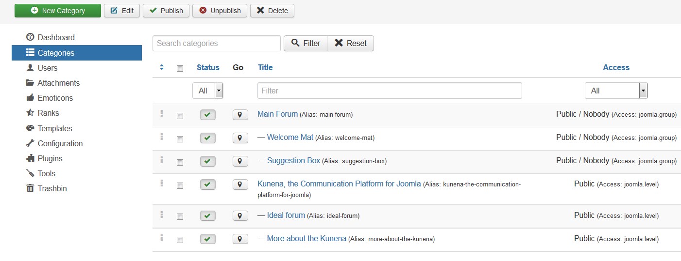
Category manager. In the middle there will be all current categories available in your Forum. Select any to modify if needed. You can edit its parent section, the name, alias, description, header and other settings:
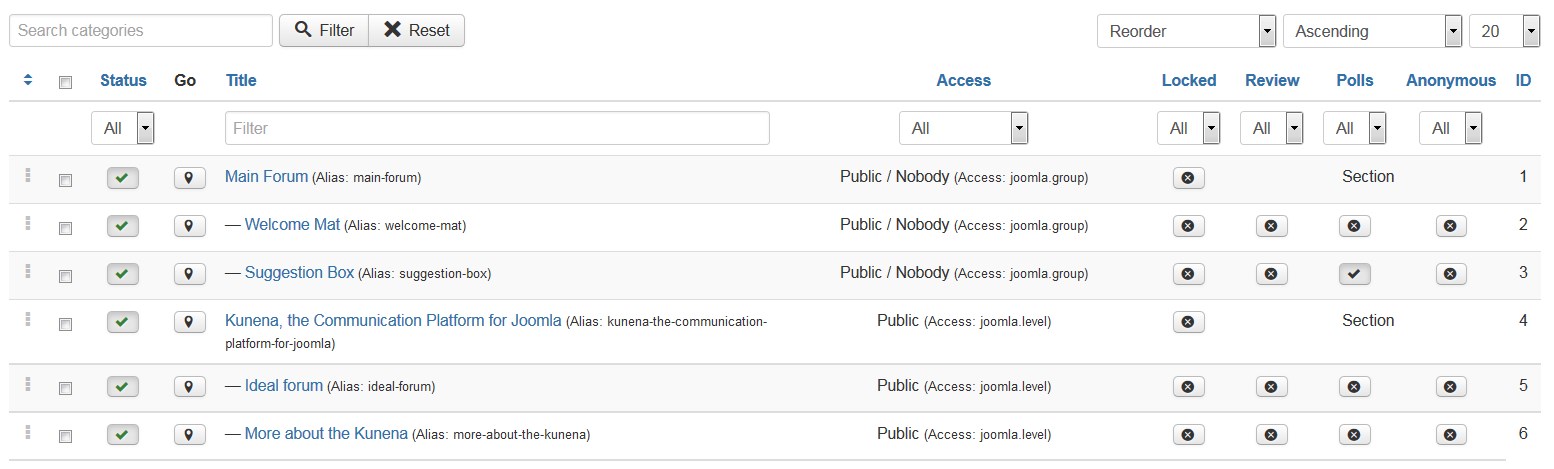
This will be the area that holds your member’s discussion. You can create as many discussions as needed. Each discussion should be assigned to the general Section [it is used as a header for forum topics].
Category Permissions tab specifies the access level of the specific category – groups of users to view and edit it.
Category Settings allows controlling general settings for category messages.
Users section. Here you can find users of the current forum and manage their account settings, permissions editing and viewing forum:
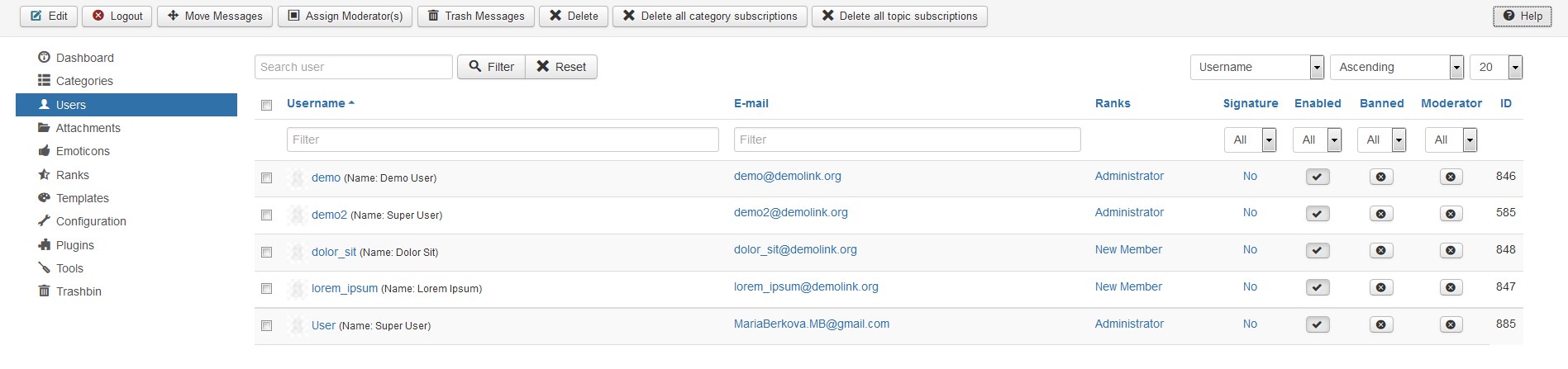
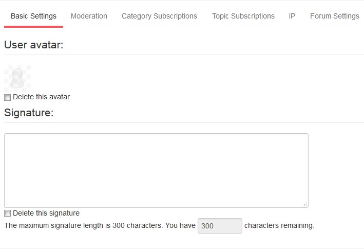
Press the username link and you will see the window, where you can select the avatar and signature text if needed under the Basic settings.
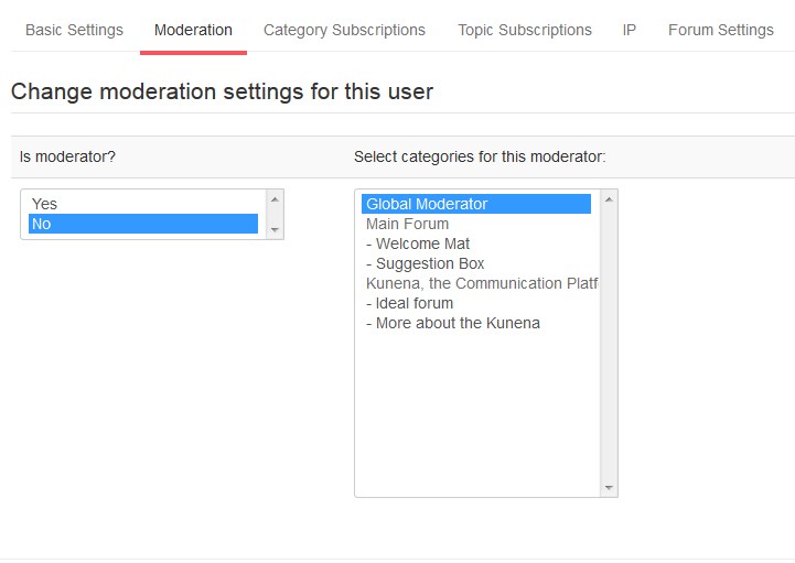
Moderation tab allows specifying if this user is moderator or not, selecting categories to moderate as well. Click Save & Close button on top once you are done with user settings.
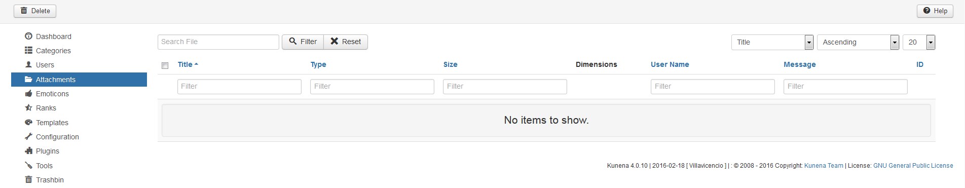
Attachments. Here you can work with uploaded files.
Emotions. All available emotions are located here.
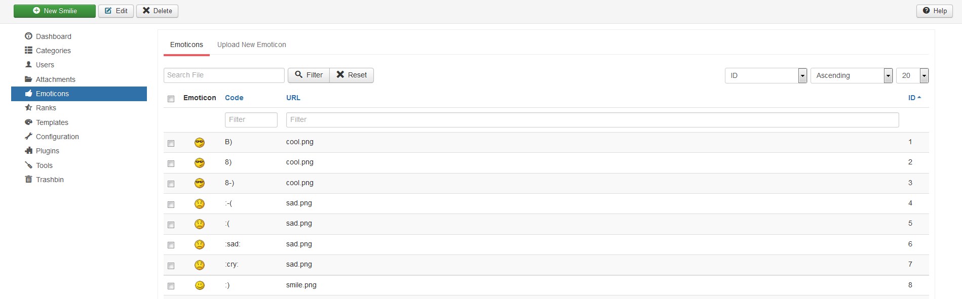
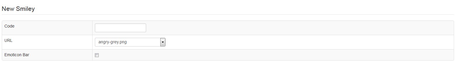
Use New Smile area to get some new ones if necessary:
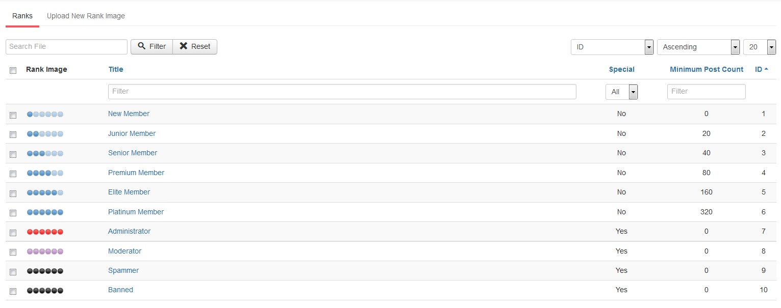
‘Ranks’. Here you can see all the available ranks for a single user. You can add a new rank, if you want. Each rank can be edited manually as well:
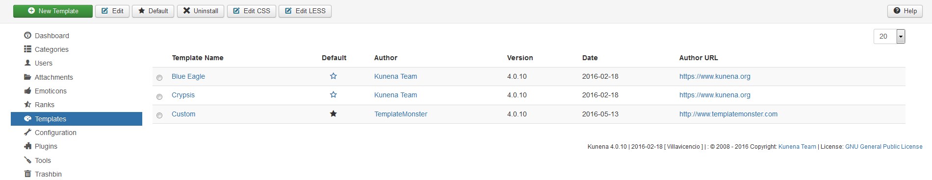
Templates. Select the template to apply Forum to:
Configuration. This tab allows controlling Forum settings in details. Titles, email address, SEO, cache and other settings can be managed under the General tab. With the Frontend section you can modify the layout of the Forum. General settings for users are managed with the Users section. Security tab controls the permissions for guests and registered users using the Forum. Avatars tab is the one to allow/forbid users uploading own avatars, and specifies the image settings. Using the Uploads you can allow/forbid uploading attachments to the messages, specify the settings of these files.
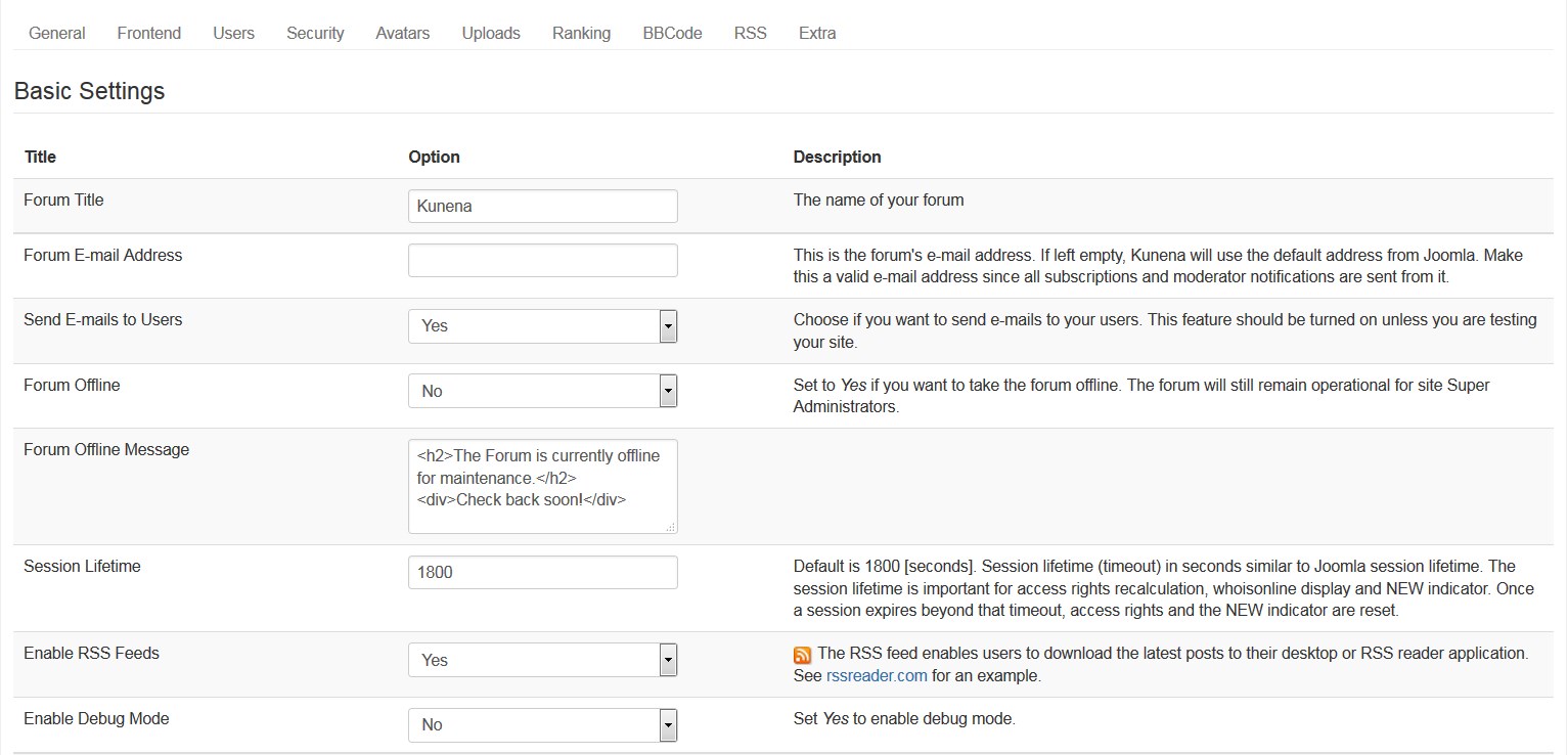
Click Save & Close button on top once you are done configuring forum settings.
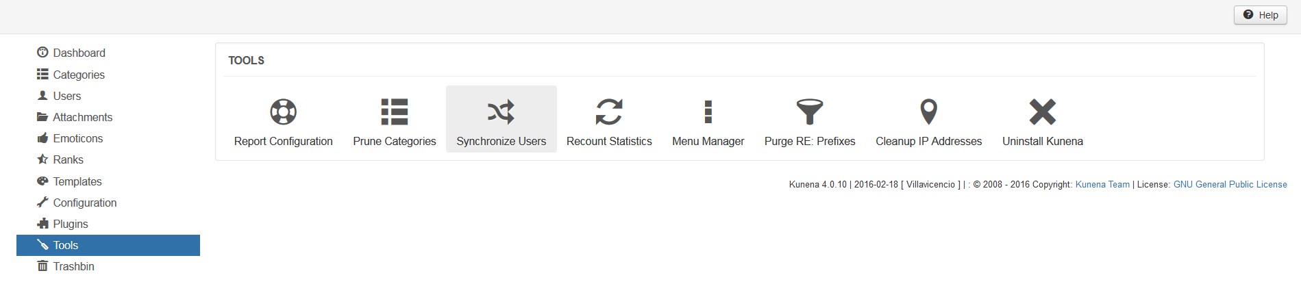
Tools. Here you can manage specific options like reports, synchronizing, IP’s and so on:
Refreshing the Forum page in the site you will see the implemented changes.
If you need additional features for Kunena, you can also choose from a large number of plugins specifically built for Kunena.
Create Categories
-
Go to Components > Kunena Forum > Categories.
-
Click New Category button in the top left corner.
-
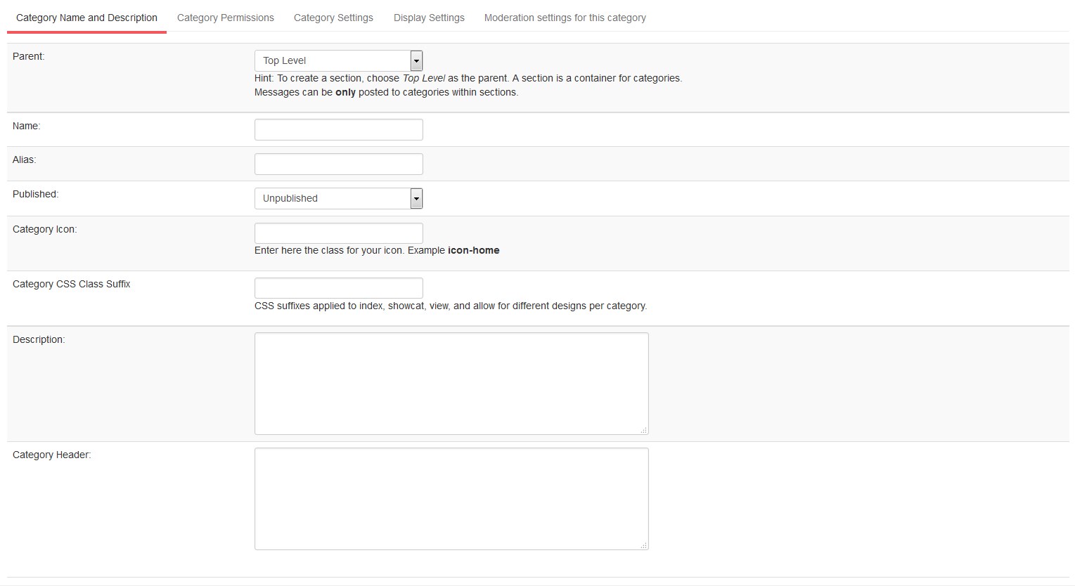
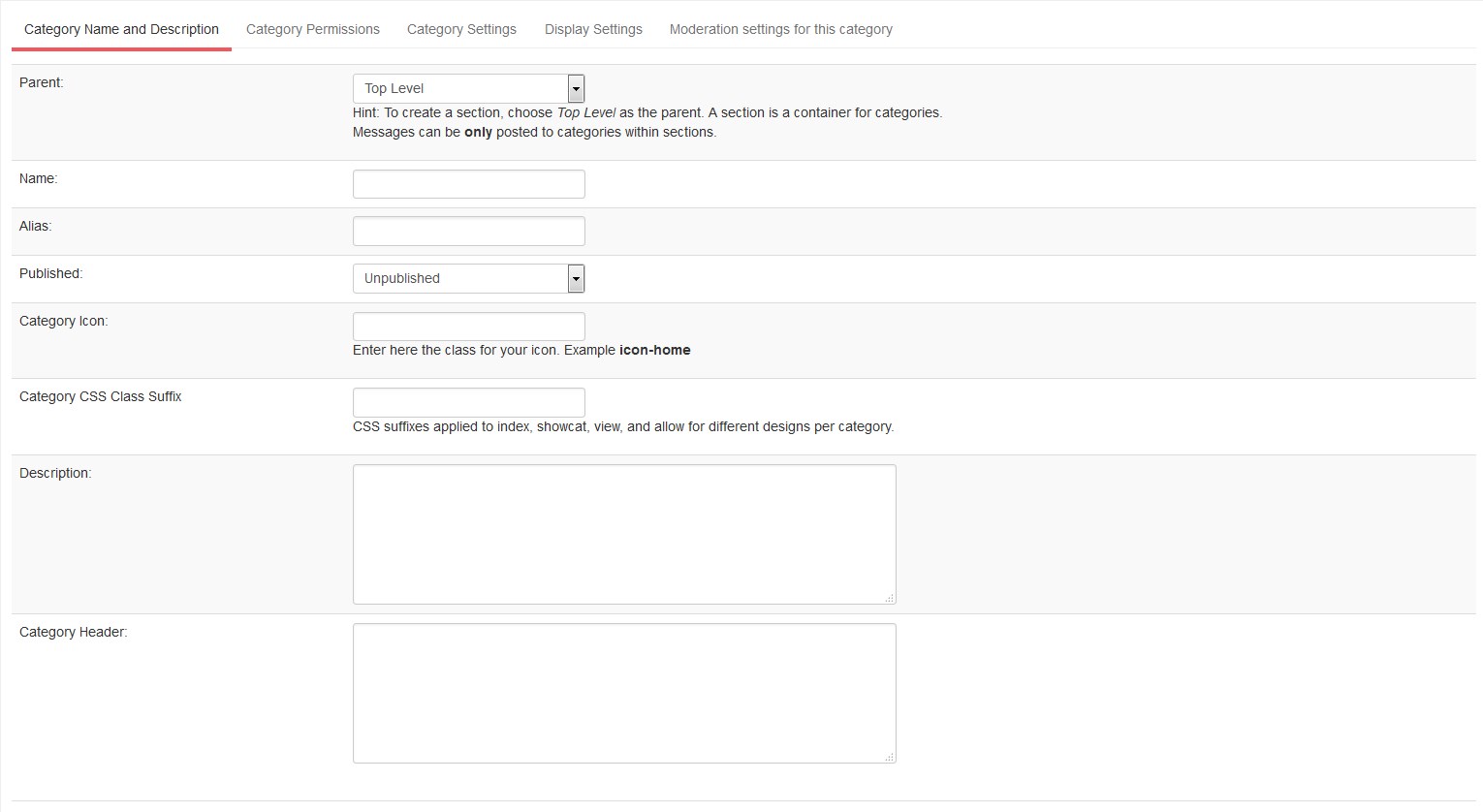
Enter general category settings under the Category Name and Description tab:
-
To create a section, choose Top Level as parent.
-
Enter category Name and Alias.
-
Make sure category is published.
-
Fill in the category's description and title to the corresponding fields.
-
You can add custom css class for your category.
-
-
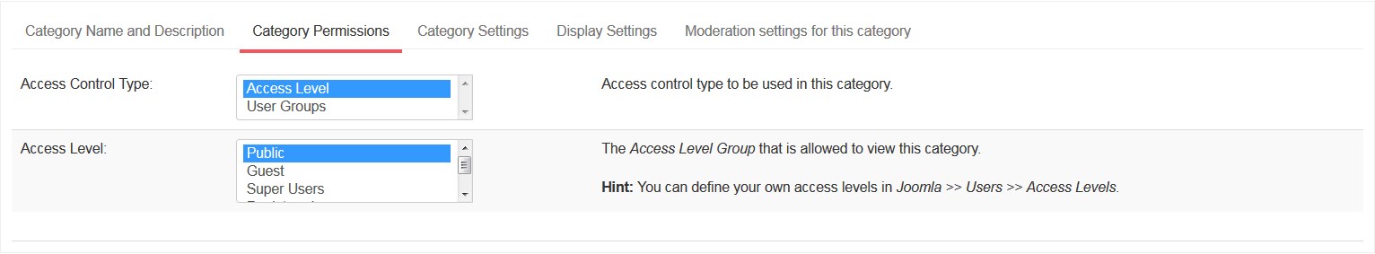
Click the Category Permissions tab to define permissions for categories:
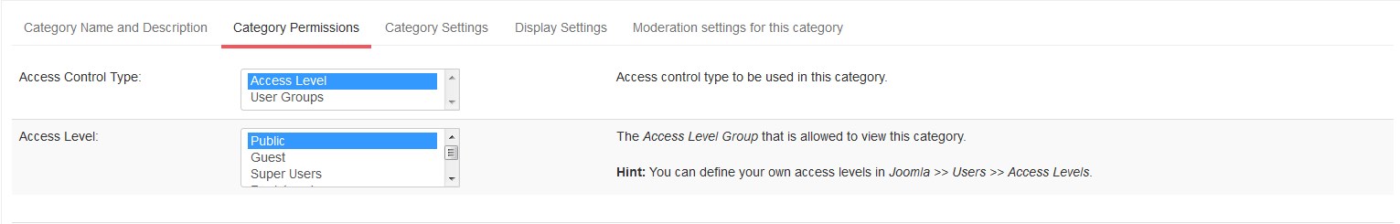
You can see two options available here:
-
Access Control Type to be used in this category.
-
The Access Level Group that is allowed to view this category. You can define your own access levels in Users > Access Levels section.
-
-
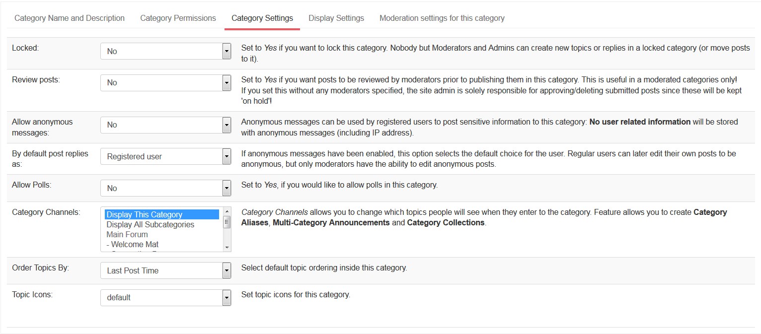
Category Settings tab:
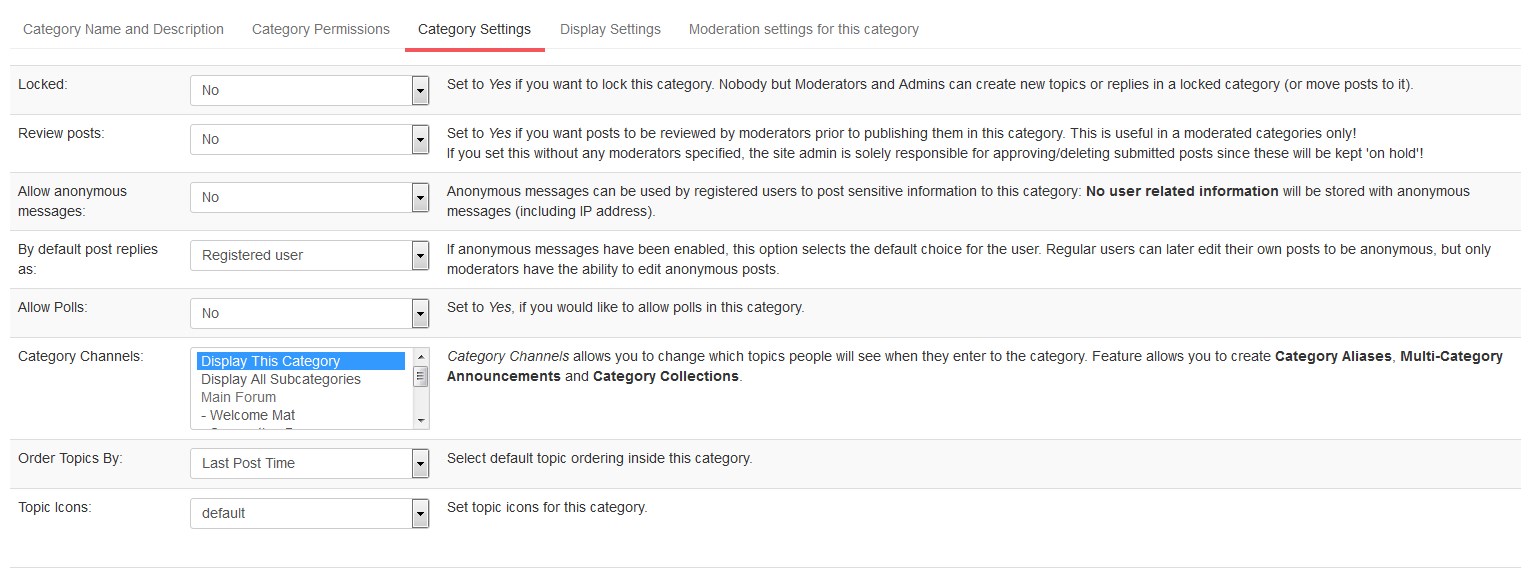
-
Locked. Set it to Yes if you want to lock the category. Site Moderators and Admins are the only ones who can create new replies to the locked category.
-
Review posts. Set to Yes if you want posts to be reviewed by moderators prior to publishing them in this category.
-
Allow anonymous messages option lets you enable/disable anonymous messages for the category.
-
By default post replies as option. If anonymous messages have been enabled, this option selects the default choice for the user. Regular users can later edit their own posts to be anonymous, but only moderators have the ability to edit anonymous posts.
-
You can Allow Polls for the category you create.
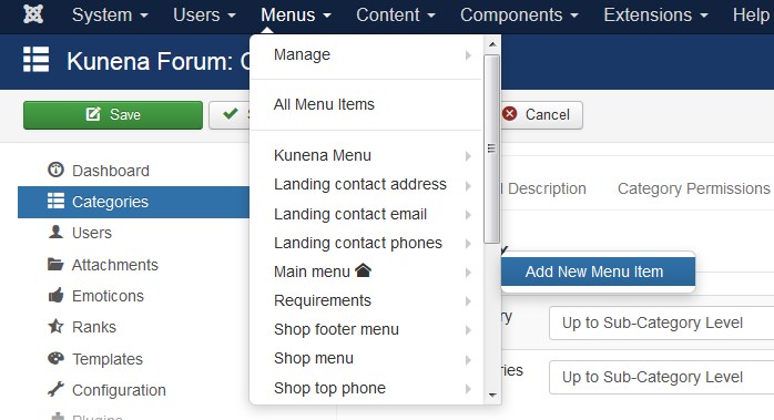
Add Forum page to the menu
-
Open Menus > Main Menu > Add New Menu Item:
-
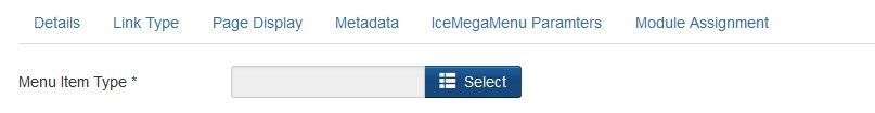
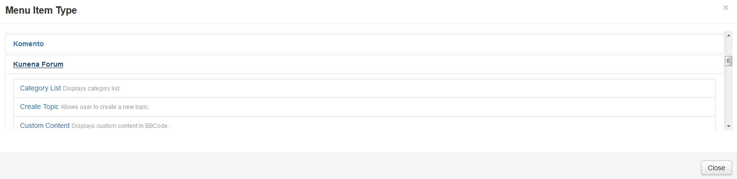
Select Menu Item Type on the next screen.
-
Select Kunena Forum menu type from the popup window:
-
Change menu item settings, save menu and check your site.
You can learn more about the use and configuration of Kunena component on the official website.
-
Owl Carousel
Owl Carousel module is a combination of default Joomla Articles Newsflash module and Owl Carousel jQuery plugin.
How to Access
To 'add' a new Owl Carousel module, navigate to the Module Manager:
Select Extensions > Modules.
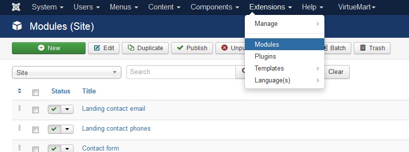
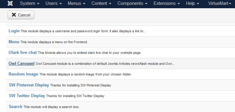
Click the 'New' button and click on Owl Carousel in the modal popup window.
Details
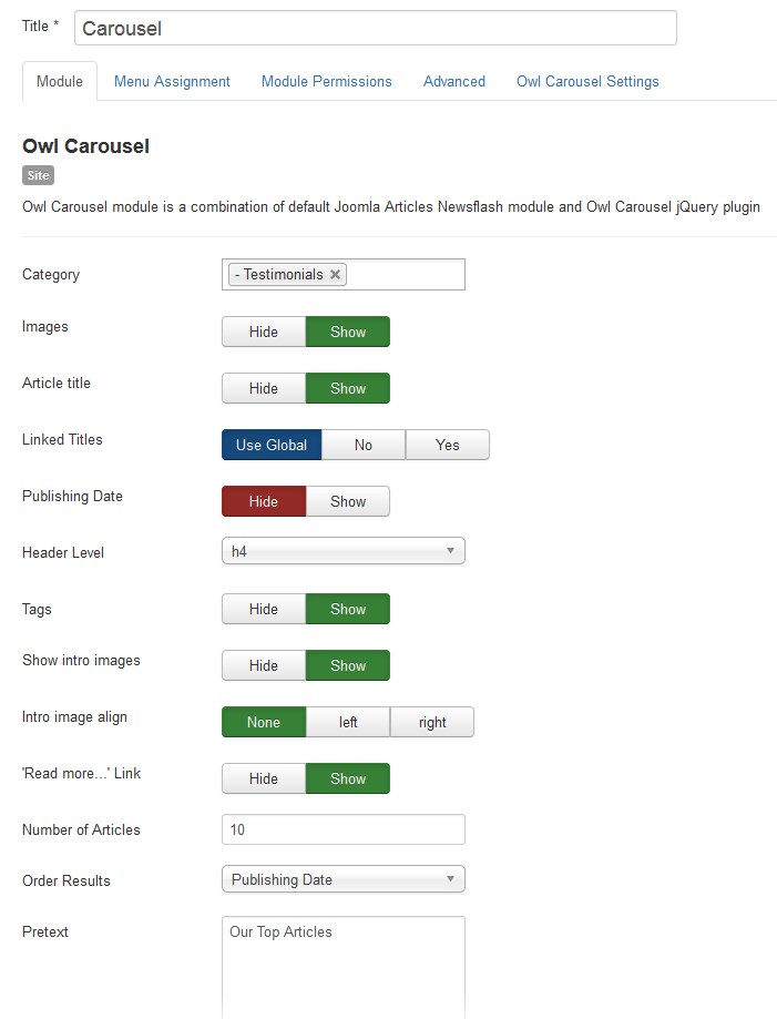
- Title: Module must have a title [in our case it is Carousel].
Module
The Owl Carousel Module will display a fixed number of Articles from a specific Category or a set of Categories.
-
Category: Select Articles from a specific Category or a set of Categories. With no selection it will show all the categories by default.
- Images: [Hide/Show]. Display Article images.
- Article title: Show/Hide Article title.
- Linked Titles: [Use Global/No/Yes]. Link the Article titles to Articles.
- Publishing Date: Display publishing date of an item.
- Header Level: [h1/h2/h3/h4/h5]. Select the desired HTML header level for the Article titles.
- Show intro images: Select if you want to display article intro images.
- Intro image align: [None/Left/Right] Select intro image alignment. Overrides article settings.
-
'Read more...' Link: [Show/Hide]. If set to Show, the 'Read more...' link will show up if Main text has been provided for an Article.
- Number of Articles: The number of Articles to display within this module.
-
Order Results: [Published Date/Created Date/Ordering/Random]. Select the order in which you want query results presented.
- Pretext: You can input text you want to display before module content. Doesn't support any HTML tags.
Common Details
-
Show Title. [Show/Hide] Choose whether to show or hide the modules title in the front end. The title will be the one from the Form Field above.
-
Module Position. Choose the module position you wish this module to be displayed in. A custom module position can be entered for use with the load position plugin or the position button can be pressed to select a module position from the template.
- Status. [Published/Unpublished/Trashed] The published status of the item.
- Access. The viewing Access Level for this item.
-
Module Ordering. This shows a dropdown of every module in the position that the current module is assigned to. This is the order that the modules will display in when displayed on in the frontend as well as in the Module Manager.
-
Start Publishing. Date and time to start publishing. Use this field if you want to enter content ahead of time and then have it published automatically later.
-
Finish Publishing. Date and time to finish publishing. Use this field if you want to have content automatically changed to Unpublished state at a future time [for example, when it is no longer applicable].
- Language. Item language.
-
Note. Item note. This is normally for the site administrator's use [for example, to document information about this item] and does not show in the frontend of the site.
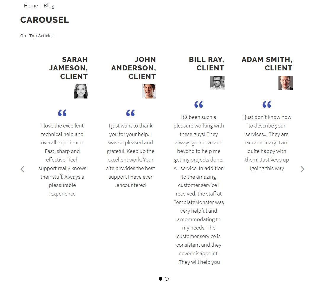
Now we should set the module parameters as shown in the image below [You should choose the feature position type in Position field]:
Next you choose the page, where to place the module in. You should use the Menu Assignment tab for this purpose.
On this tab there is a list of menu items. You can choose between 'On All Pages', 'No Pages', 'Only on the pages selected' and 'On all pages except those selected' from the List. If the latter two options are selected a list will show up with all the menu items on as shown in the screenshot above. This allows you to assign modules to some but not all the pages, and by selecting the menu links that you want the module associated with you can customize on what pages modules appear/don't appear.
Select Blog page and the module appears on that page of the website only.
Don't forget to press Save button on the toolbar.
After all these steps are accomplished, you will see the following on the Blog page of your website:
ADVISE
The first step to creating a new article is to navigate to the Article Manager's Add a New Article page. This can be done using the admin menu at the top of the Administrator side of your Joomla site. Just navigate to Content > Articles > Add a New Article and you should be brought to a page which includes a text editor and article-specific options [pictured above].
Olark live chat Module
TM Olark live chat is a live chat module for Joomla.
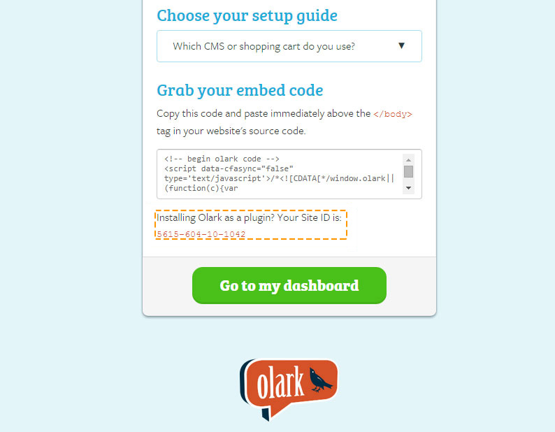
To configure the Olark live chat module navigate to Extensions > Modules.
Press "Search Tool" button and select the TM Olark in the "- Select Type -" filter dropdown list. You will see the Olark Module. You may need to activate the module pressing the red "X" sign.
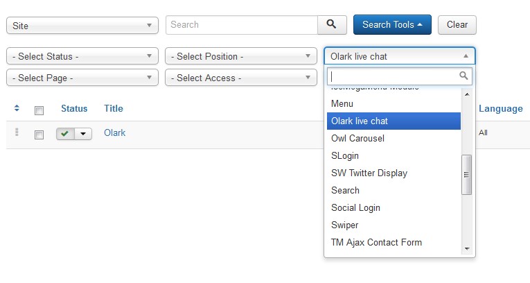
Click on module title link to be brought to the settings window of the module.
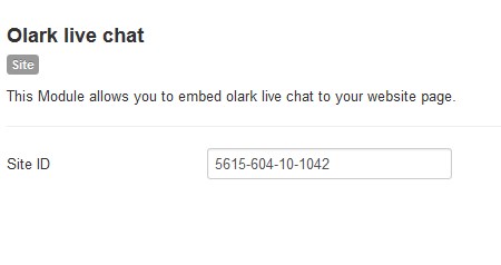
In general settings, you should add the website identifier, which will show up after completing registration and filling in all the details at https://www.olark.com/install.
Our company provides you with "Bronze" 6-month package for free. Please use the following link to register.
Swiper
Swiper Module is a wonderful adaptive slider that is an integration of standard Joomla Articles Newsflash module and a free jQuery Swiper plugin. Created for IOS, this plugin works perfectly on the latest Android, Windows Phone 8 and desktop PC browsers.
Let us check what kinds of slides can we add to the site slider using this module. First of all, it might be a regular animated slide with an image and a caption on it:

But it can be also a slide with the background video or a configurable slide with the parallax image background. There’s actually a vast of options to choose from. Let’s learn how to use them.
-
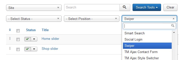
First, open your site admin panel and navigate to the Extensions > Modules section.
-
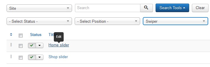
Use the Search field or the Search tools dropdown menu to find all the Swipe type modules. We will filter the Swiper type modules with the help of Filter by type option. In the dropdown list of the option select Swiper, as shown in the picture below:
-
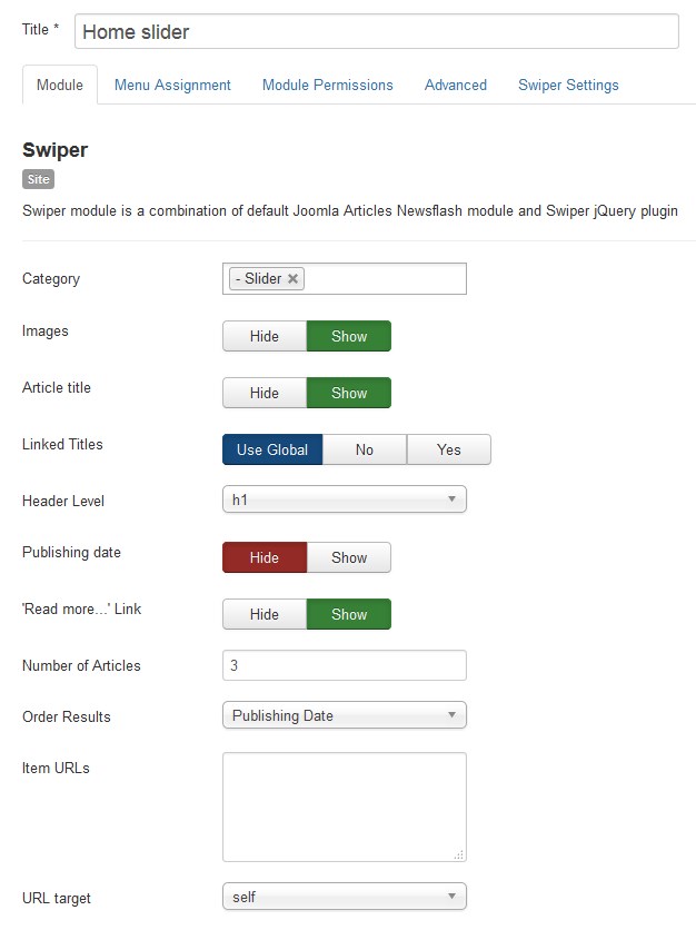
As you can see, this template has two Swiper slider modules, added by default. Let’s edit the Home slider. Click on a title link to open the module for editing [settings window].
-
The first tab allows you to edit general module settings [Module tab]. Here you can select the category for your slide articles, choose whether to display the slides’ titles and images, set the titles and links, etc. You may also define the number of articles to show within this module at this section:
-
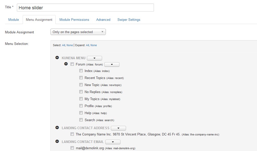
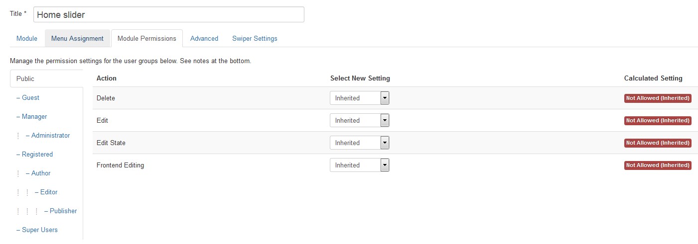
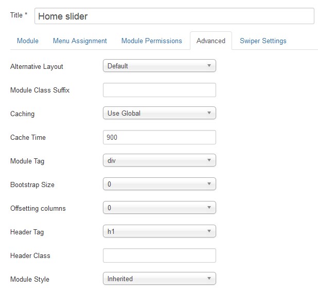
The Swiper slider module has the regular modules’ settings, such as Menu Assignment [here you can select what pages include the slider], Module Permissions [you may select group of site users who can see the module], Advanced [feel free to define slider bootstrap size and CSS classes here]. They can be set at the respective tabs.
Menu Assignment: -
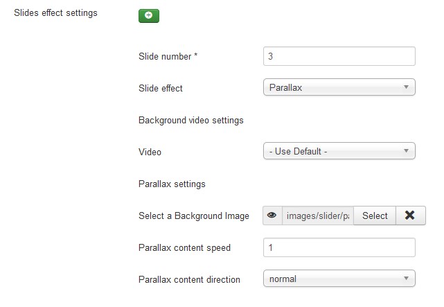
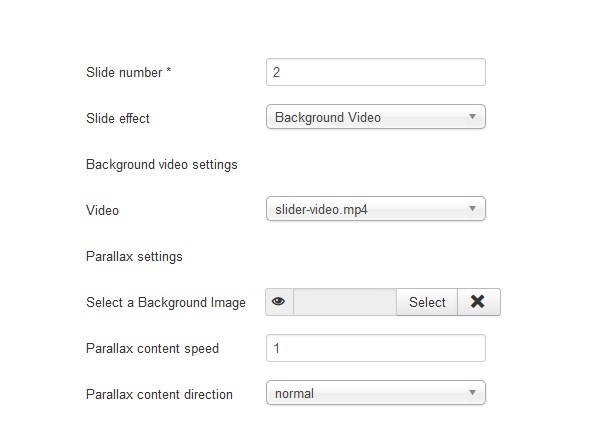
As to the unique module’s settings, they are available at the Swiper Settings tab. Here you can add specific effects to each slide if needed. Let’s take a closer look on this section:
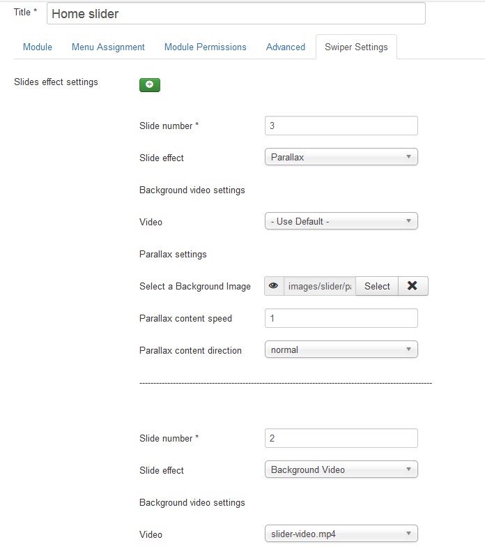
-
You may select the slide to apply the effect to. E.g., with ‘1’ entered you will add the effect to the first slide.
-
In our case slide #3 has the parallax effect applied to the background image. You may also select other options from the dropdown or specify the parallax settings in a respective section below:
-
Slide #2 is the video slide, you may select its video file from your site media library [to upload file go to the Content > Media].
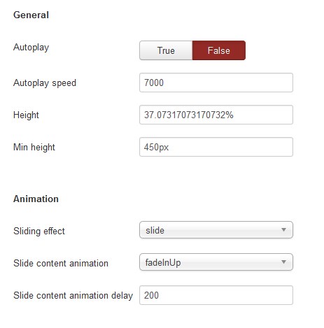
-
Below are the general slider settings. You may select if the slider starts automatically, choose the sliding speed, set slider height, use different kinds of animation and so on.
-
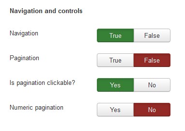
As to the Navigation and controls section, each option here has the ‘Yes/No’ or ‘True/False’ trigger that allows you to configure the desirable view for your slider in a few simple clicks.
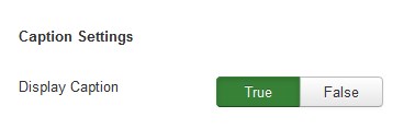
- You are able to select if caption should be displayed in the Caption Settings section.
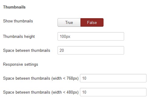
- In Thumbnails section you may set thumbnails height, space between thumbnails and so on.
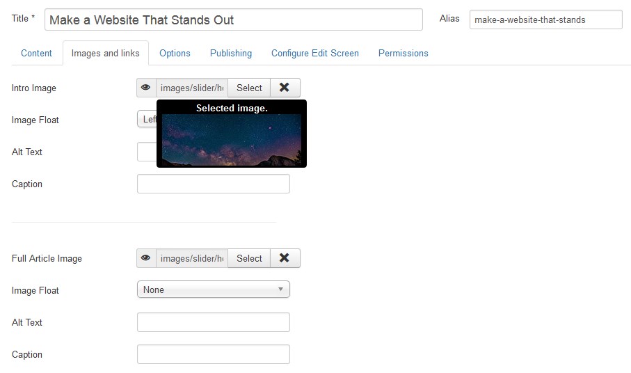
-
Slide #1 has no specific effects added, so its image is set at the slider article itself [to change an image go to Content > Articles, choose Slider in Select Category dropdown list [Search Tools]. Press the Make a Website That Stands Out title link and in the appeared settings window click the Images&Links tab].
NOTE
To upload file [image/video] to be used for parallax and video background effect of a slider go to the Content > Media section. You need to store the video files in media/swiper-videos/ folder for video files and in the images/slider/parallax/ folder for images. The uploaded media files will be available to choose in Video and Select a Background Image options' dropdown lists.
Click the Images&Links tab:
NOTE
To upload image file to be used for slider go to the Content > Media section. You need to store the image files in images/slider/ folder. The uploaded image will be available to choose in the Intro Image option dropdown list.
-
-
Feel free to try different options here to configure the Swiper slider up to your needs. Then save the module and check the result on your site [refresh it to see the edits, you might also need to clear your browser and/or Joomla! cache].
Module Permissions:
TM AddThis
AddThis is the world's largest content sharing platform. It provides tools that make it easier to share content across the social web, and provides publishers with the increased traffic and in-depth paralytics. AddThis can be integrated into a website with the use of a web widget. Once the widget is added, visitors to the website can bookmark an item using a variety of services, such as Facebook, MySpace, Google Bookmarks, Pinterest, and Twitter.
TM AddThis is a plugin for displaying social ‘share’ buttons:
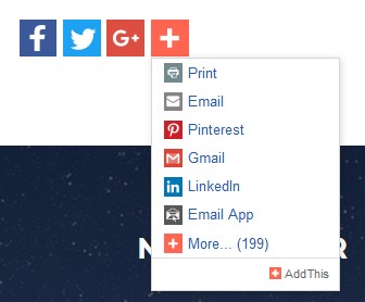
Adding the share buttons to your Joomla website is a great way to get more of your content distributed online. The more your content is shared, the more traffic you’ll drive back to your site. AddThis share buttons are easy to add, and also provide the detailed analytics that will help you become a more effective publisher.
FEATURES
- Choose where the share buttons appear on your page;
- Control the number of buttons to show up;
- Include share counts to encourage sharing;
- Personalize sharing buttons to each user or pick them yourself.
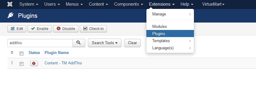
To customize the plugin go to the Extensions > Plugins section. This will bring you to the Plugins Manager. Type "Add" in the search field and you'll see the Content - TM AddThis.
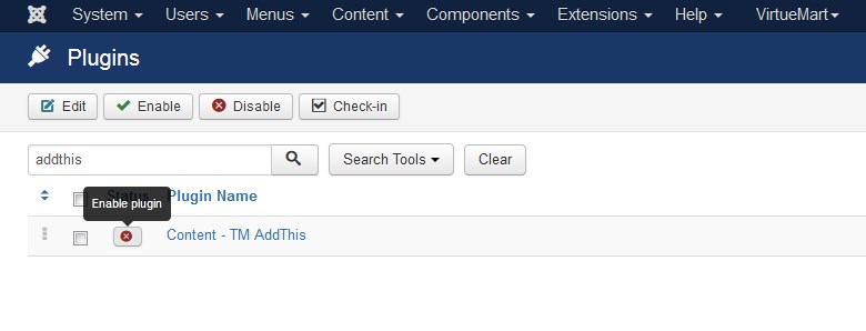
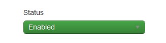
First you need to enable the plugin. Press the red "X" button to enable it.
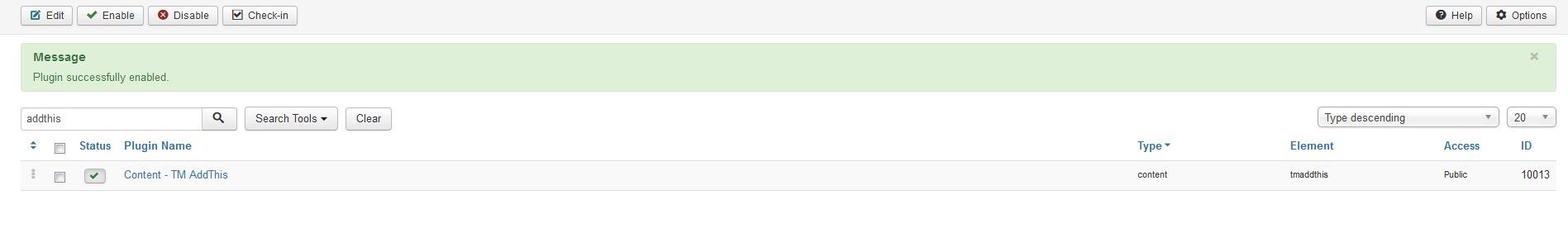
Once the plugin is enabled, you will see a confirmation message.
To get the main settings window of the plugin press the Content - TM AddThis title link and you'll be brought to the following window:
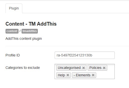
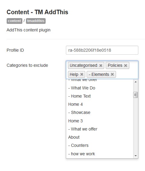
Here you can see the main TM Addthis settings. Set the categories to exclude in the corresponding field. Enter your Profile ID into the Profile ID field. You can get it after registering and creating an account at the following page: https://www.addthis.com:
Basically, you should get a new Profile ID in order to change the AddThis social share icons:
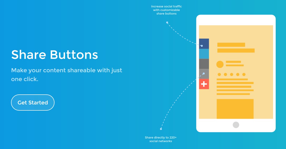
After you've registered, you need to add share buttons.
In order to do this press "AddThis" button on the profile toolbar.

Then you need to press the "Get Started" in Share Buttons section.
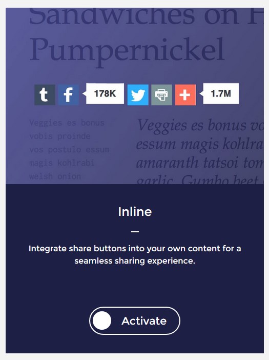
Activate the Inline Share Buttons.
You can choose Share Counters type. You're also able to select your own social networks and customize the order using the Select your own option.
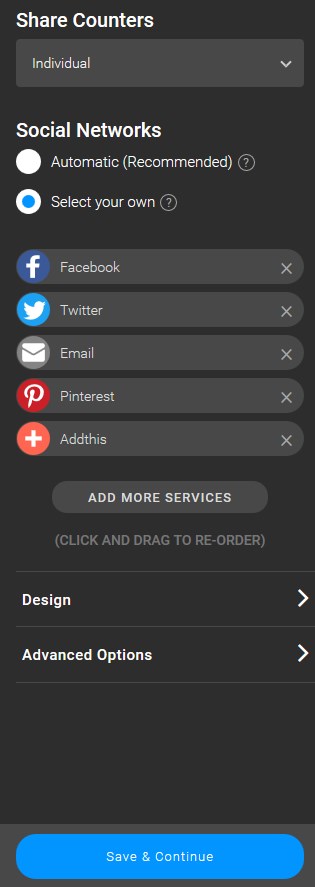
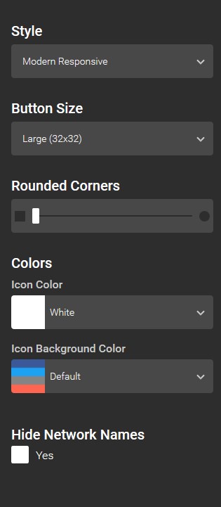
Change the design of the icons in the Design section. Customize the Style, Button Size and Colors of the icons. Set the Rounded Corners parameter and hide network names if needed.
Whenever you are done with the Share Buttons customization, press the Save&Continue to proceed to the next step.

Copy your profile ID in the "1" section.
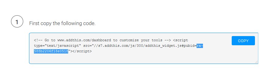
You need to insert it to the Profile ID field in the Content - TM AddThis plugin settings window to make the new Share Buttons appear on your site.
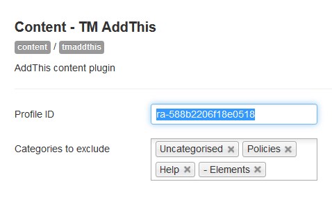
You have an option to exclude categories [pages] where you don't want to place the plugin.
Make sure you have enabled the plugin.
Save the changes and refresh the Share Buttons page.

TM Ajax Contact Form Module
TM Ajax Contact Form Module is a contact form module for Joomla engine. This module allows adding contact form to any page of your Joomla website.
Contact form is basically a set of questions filled out on the website page by your visitor that is automatically sent to your email when it is filled out. Usually a contact form includes fields for filling in name, address, phone, email and type of comment. Once the visitors of your website have filled out the contact form fields, they will click the Submit [Send] button to submit the information.
How to add a new field in TM AJAX Contact Form module
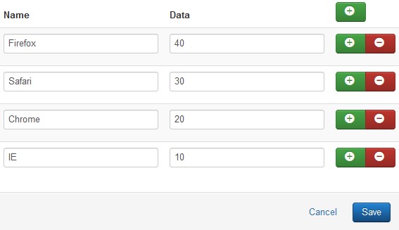
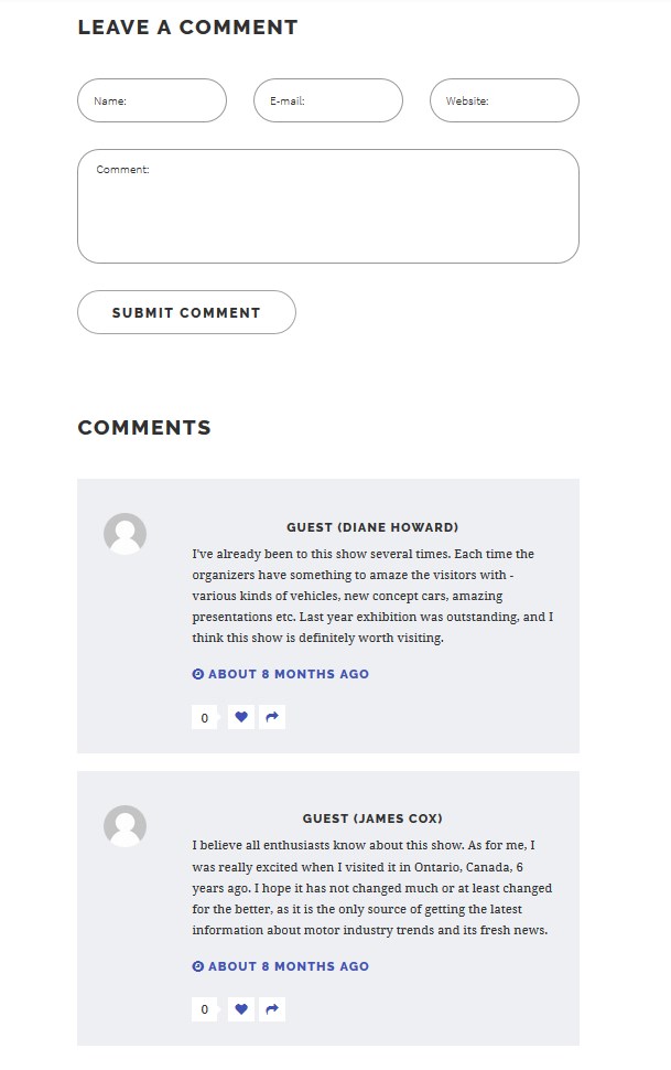
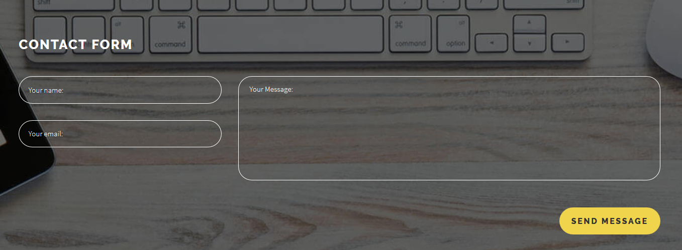
Every Joomla 3 template has a contacts page with the contact form included. Usually contact form has standard fields, e.g. "Name", "E-mail" and "Message":
In order to add a new field to the TM AJAX Contact Form module, perform the following steps:
-
Navigate to the Extensions > Modules tab:
-
Next, select the TM AJAX Contact Form module to edit.
- To open any edit required module settings, click on its title.
-
The TM AJAX Contact Form editing interface is opened in front of you. Now, click on the Module Settings tab to open the page with contact form main settings:
- The first thing you see is Pretext field, below is available contact form fields - this is where you should perform the changes.
-
Click on the plus [+] button next to the field you would like to add the new field after. Let’s assume that you want to add a Subject field after the Your email field. You can see a new empty field now:
-
Fill in the Label and Name fields and set the Type option for the newly added form field - in our case it should be the text type.
-
You should also choose whether the field is required or not by setting an appropriate option. Let’s make the subject field not required.
-
You probably noticed the Bootstrap Size option that also needs to be set. By configuring this option you will set the field size - by choosing 12, the field occupies the whole contact form container width just like the Message field does. Number 4 means the field will occupy the third part of the form container, number 3 - the fourth part and so on. Let’s set the field to occupy the third part of container width by choosing 4. Set 12 to Message form field width for better containers' arrangement view.
-
Scroll the page up and click the green Save button at the top left of the screen to apply your changes:
-
Navigate to the contacts page and refresh it to see the changes. The Subject field is successfully added:
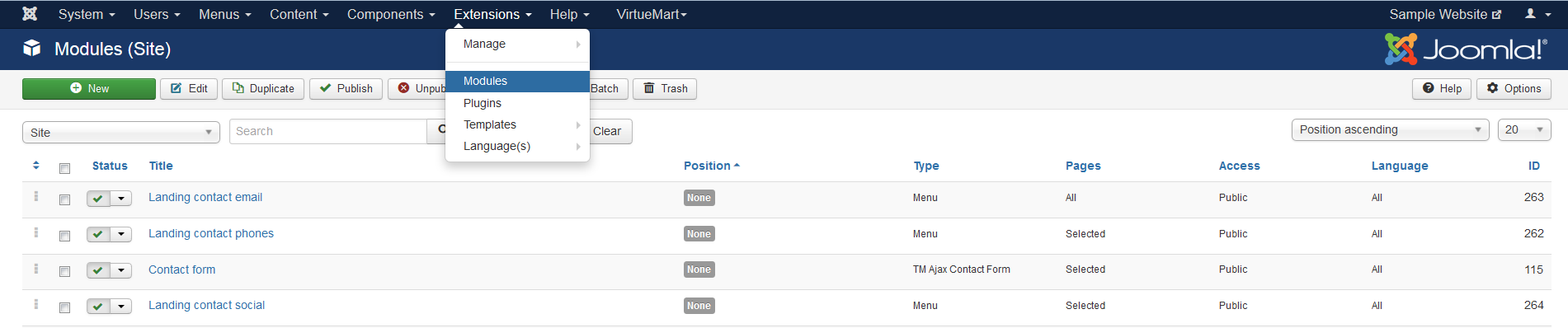
Tip: if you want to find all the TM AJAX Contact Form modules, use the filters to simplify the process. Press the "Search Tools" button and select the "TM AJAX Contact Form" type in the "- Select Type -" filter dropdown list. You will see the list of all the modules where the AJAX Contact Form is used.
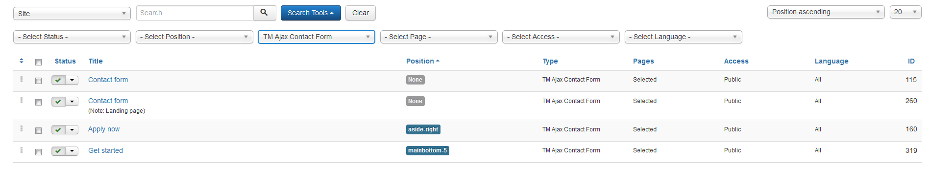
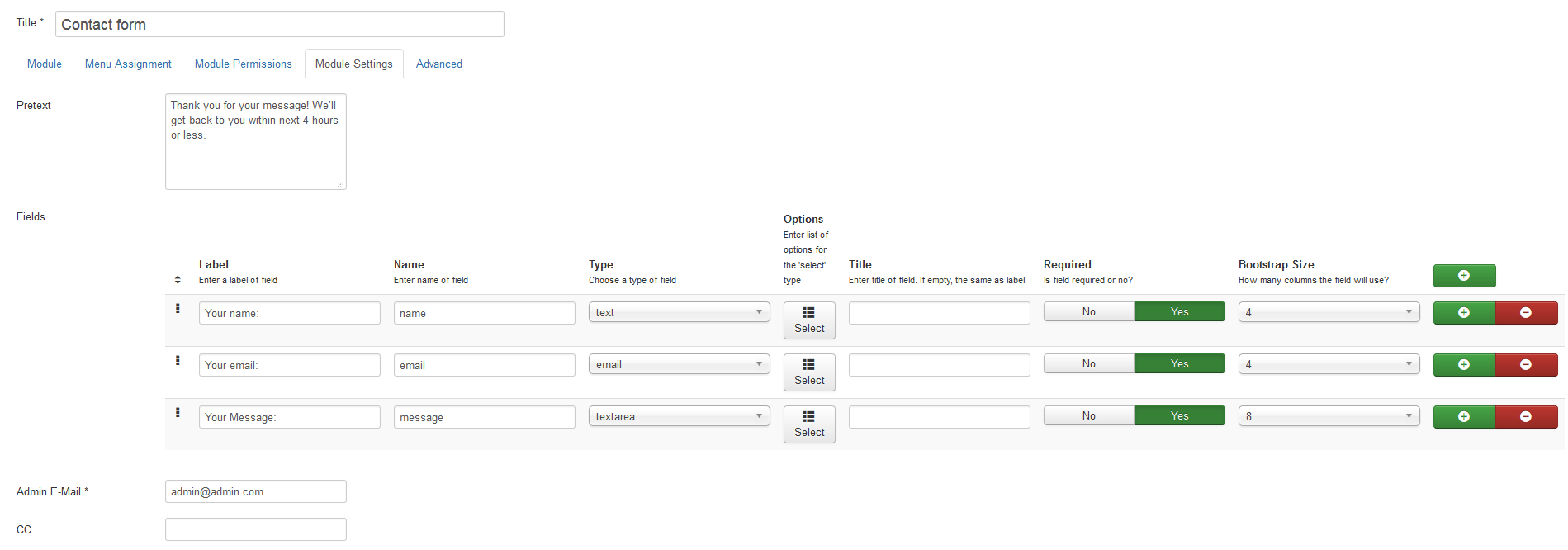
You will see the following options:
| Pretext | - | Input the text you want to display before the module content to this field. Doesn't support any HTML tags. |
| Fields | - | Select and configure fields to display. You can enter a label of the field, a name of a field, choose a type of a field [text/email/tel/url/textarea]. |
| Label | - | Enter a label of the field. |
| Name | - | Enter a name of the field. |
| Type | - | Choose a type of the field. | Title | - | Enter a title of the field. If empty, the same as label. | Required | - | If field is required [yes/no]. | Bootstrap Size | - | Set a number of columns the field will use. | Admin E-Mail | - | Includes the current email address messages will be sent to. |
| CC/BCC | - | Are the fields for additional email addresses. | Notification on Success | - | Is the field where the message on successful sending is being kept and can be changed to the one you need. | Notification on Failure | - | In case there were some issues in the process of the e-mail sending, you can change the message to the appropriate one. | Notification on Captcha Failure | - | You can change a message that appears in case a person enters incorrect captcha code. Note!!! To use captcha, you need to activate reCaptcha plugin. |
Captcha | - | Specify whether Captcha field is required or not. | Reset button | - | Can be visible or not. | Name of Reset/Submit buttons | - | Can be edited from the standard to custom one. | Labels position | - | This field provides the possibility to change the position to one of the following options: Inside/Outside. | Message min.length | - | In order to specify the quantity of symbols, you can change the limit to different. |
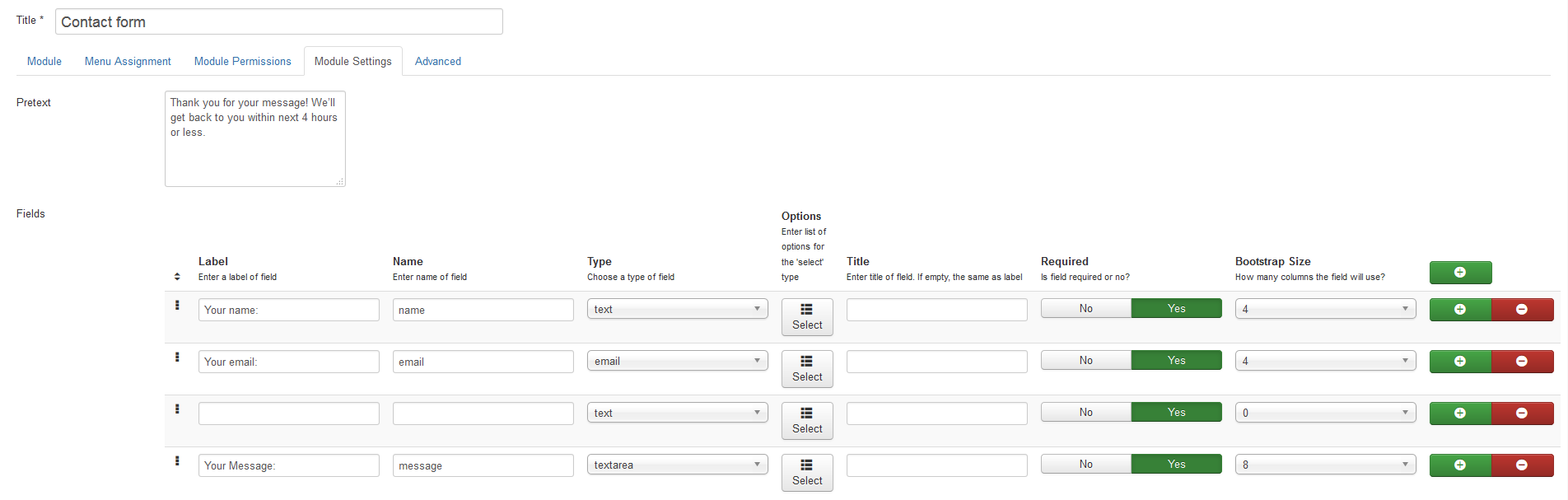
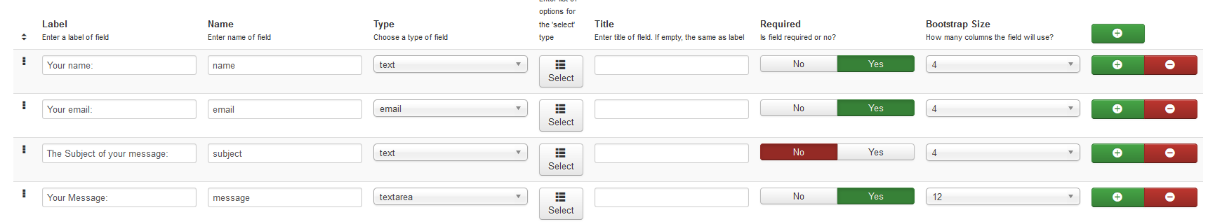

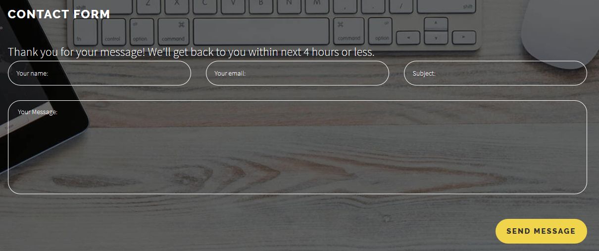
Advise
In case of problems regarding contact form display, the default layout should be used. Navigate to the Advanced settings tab and select Default in the dropdown list of an Alternative Layout option.
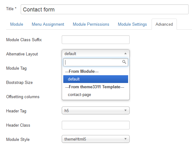
TM Ajax Style Switcher Module
TM Ajax Style Switcher Module is a module for switching color schemes directly at site frontend. The module automatically applies color schemes from the templates\themexxx\css\ folder of the current theme.
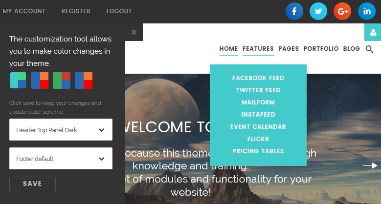
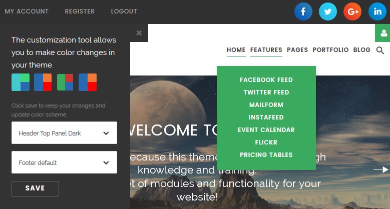
Note: on the template's Live Demo the template works in preview mode using cookies. On your website the module will work in full mode and will be available for authorized users with SuperAdmin user category rights.
How to manage the TM ajax style switcher module
To configure the TM Ajax Style Switcher Module navigate to Extensions >Modules section.
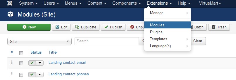
Press the "Search Tools" button and select the TM Ajax Style Switcher Module type in the "- Select Type -" filter dropdown list. You will see the Ajax Style Switcher Module.
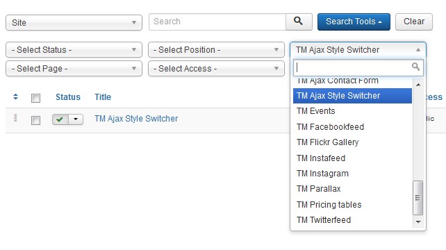
Click on module title link to be brought to the settings window of the module. There are no specific settings for the module in the admin panel, just the standard modules' settings:
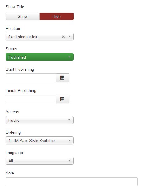
Make sure the module is published.
To activate style switcher, please, follow instructions listed below:
-
Log into your website via Login or register module at the front-end as super user (the username and the password you use to log into the Joomla website administrator panel);
-
Style switcher has been successfully activated. Refresh your website to see customization toolbox:
To activate new style switcher user, please follow instructions listed below:
-
Add a new Joomla user via Users > Manage.
- Enable and activate new user.
- Press the new user login link to be brought to the settings window.
- Make sure to assign your user to ‘Super Users’ group. Navigate to Assigned Users tab and tick off "Super Users".
-
Log into your website via Login or register module at the front-end:
-
Style switcher has been successfully activated. Refresh your website to see customization toolbox:

To make color changes in your theme, please, follow the steps listed below:
-
Select a desired color scheme.
-
Click Save button to keep your changes and update the color scheme.
If the color scheme is saved all the future visitors will see it on the website.
Remember!!! Nobody but users assigned to a Super Users group can change the color scheme of the website.
Note:
Once you've logged as Super User, you have all the site administration rights [Delete/Edit/Edit State/Frontend Editing]. So pay attention when assigning the user to ‘Super Users’ group.
TM Facebook Page Plugin
TM Facebook Page is a module that allows you to display your Facebook page feed on the website:
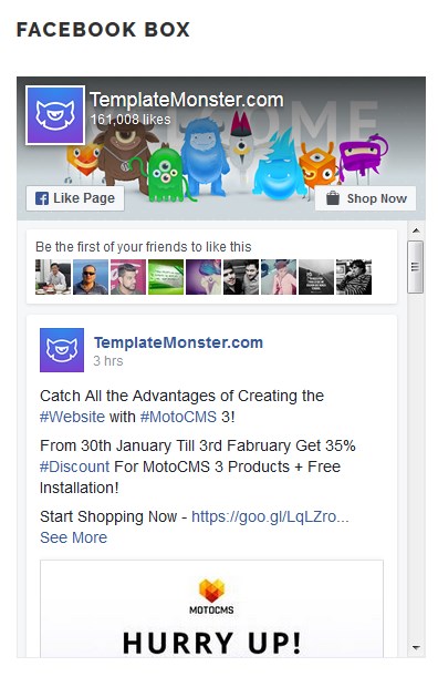
To configure the TM Facebook Page Plugin module navigate to Extensions > Modules section.
Press the "Search Tool" button and select the TM Facebook Page Plugin in the "- Select Type -" filter dropdown list. You will see the Facebook Box Module.

Click on the module's title link to open its settings window.
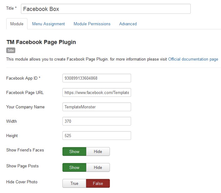
At the Module tab you may define the following options:
- Facebook App ID *.
- Facebook Page URL.
- Your Company Name.
- Width. The pixel width of the widget.
- Height. The pixel height of the widget.
- Show Friend’s Faces. Enabling this option allows profile photos to be shown in the module.
- Show Page Posts. Show posts from the Page's timeline.
- Hide Cover Photo. Hide cover photo in the header.
The Facebook App ID field is required. It’s a Facebook App Identifier. In order to get the identifier, please, open the following page: https://developers.facebook.com/ and create an app for your website.
Just follow the simple instructions, and you'll get the identifier in no time.
Step-by-Step Guide
1. Login to Facebook
Before creating a developer's account, log into your Facebook account.
Login to Facebook2. Developer Account
You'll need Facebook developer account to get started. If you don't have one upgrade your personal Facebook account to a Facebook Developer account now. Skip this step if you already have a developer account.
Create a Developer Account3. Create new Facebook app
Choose Apps in the header navigation and select Add a New App or use the button below.
Create new Facebook App4. Choose Platform
Choose the platform you want to add. If your app is on multiple platforms, you'll be able to add them to your Facebook app later.
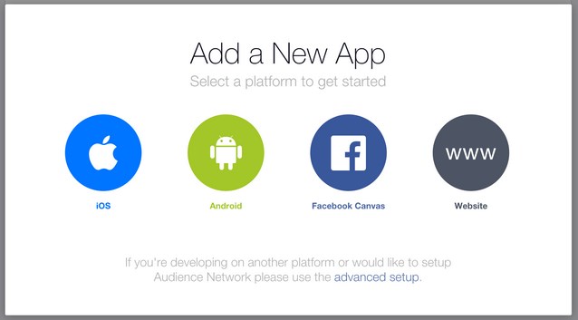
5. Choose a Name
Choose a name for your app and select Create New Facebook App ID. Choose a category for your app. If you're creating a test version of an existing Facebook app, select the app you're testing.
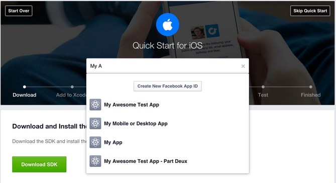
6. Follow "Quick Start" Steps
The quick start wizard will help you to set up your Facebook app for the selected platform. You can come back to the quick start wizard at a later time to either continue your setup or add a new platform to your app.
7. App ID
Your app will have a unique app ID. You will use this ID whenever you use one of our SDKs or Open Graph tags for sharing. You can find your app ID in your app's dashboard.
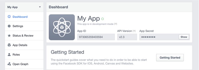
8. Protect your App Secret
Facebook auto-generates an app secret associated with your application. The application secret authenticates requests made by your application to Facebook servers and should be treated like a password.
Do not output your Facebook application secret in your web page markup; be careful when committing files containing this value into source control software such as a public Git or Subversion repository.
9. Contact Email
You need to add a contact email for each app. Go to your app's dashboard, select the Settings navigation item in the left sidebar and provide a valid contact email.
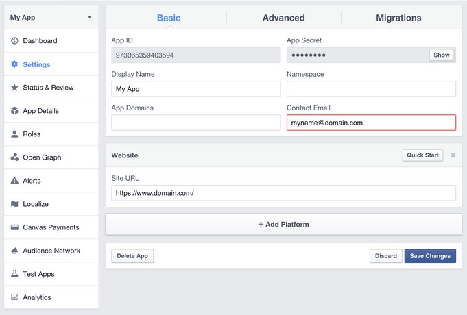
10. App Details
Select the App Details on the left sidebar to view and add additional information about your app.
If you want your app to be listed in app center, turn on the App Center Listed Platform setting for your website or mobile site. Add icons, promotional images, and videos. Make sure to follow the App Center Guidelines to be approved for listing in App Center.
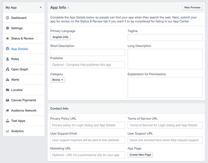
11. Disable Development Mode
New Facebook apps are set to development mode by default. This limits published actions and related objects such as friend tagging to Facebook Timelines owned by a developer of the application.
Once your application is ready for public use you can switch from development mode to public mode to allow your app to interact with Facebook accounts not associated with your app.
You may also set up the following options for the module at the Module tab:
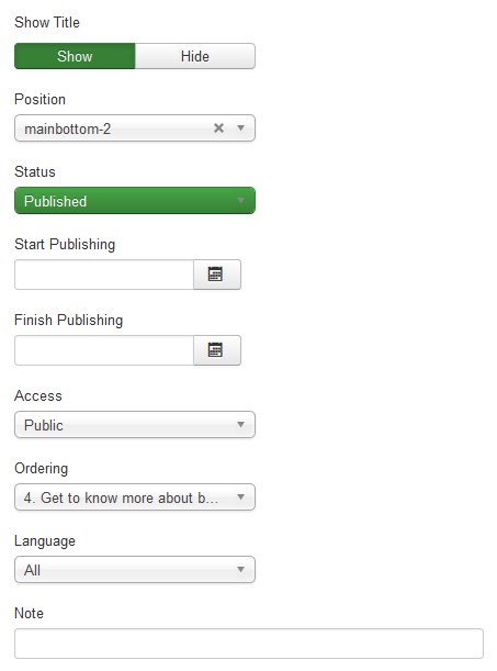
- Show Title. You can show or hide module title on display. Effect will depend on the chrome style of the template.
-
Position. You may select a module position from the list of predefined positions or enter your own module position by typing the name into the field and pressing Enter.
- Status. If published, this module will show up on your site Frontend or Backend depending on the module.
- Date for publishing [Start Publishing/Finish Publishing] An optional date to Start/Finish Publishing the module.
- Access. The access level group that is allowed to view this item.
- Ordering. Select the ordering.
- Language. Assign a language to this module.
The Menu Assignment & Module Permissions tabs are standard for Joomla modules. You may select menu items for the module to appear at and define the permissions.
Menu Assignment Tab:
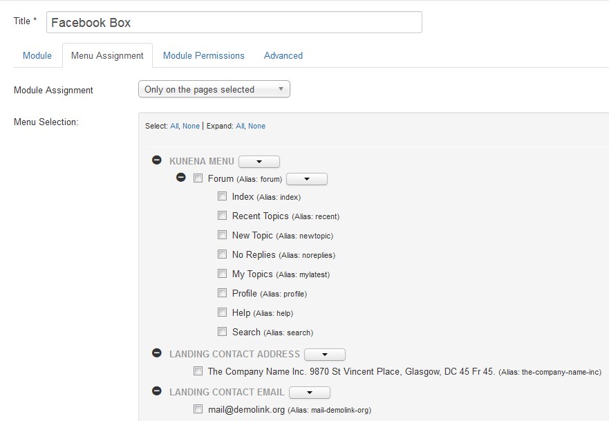
Module Permissions Tab:
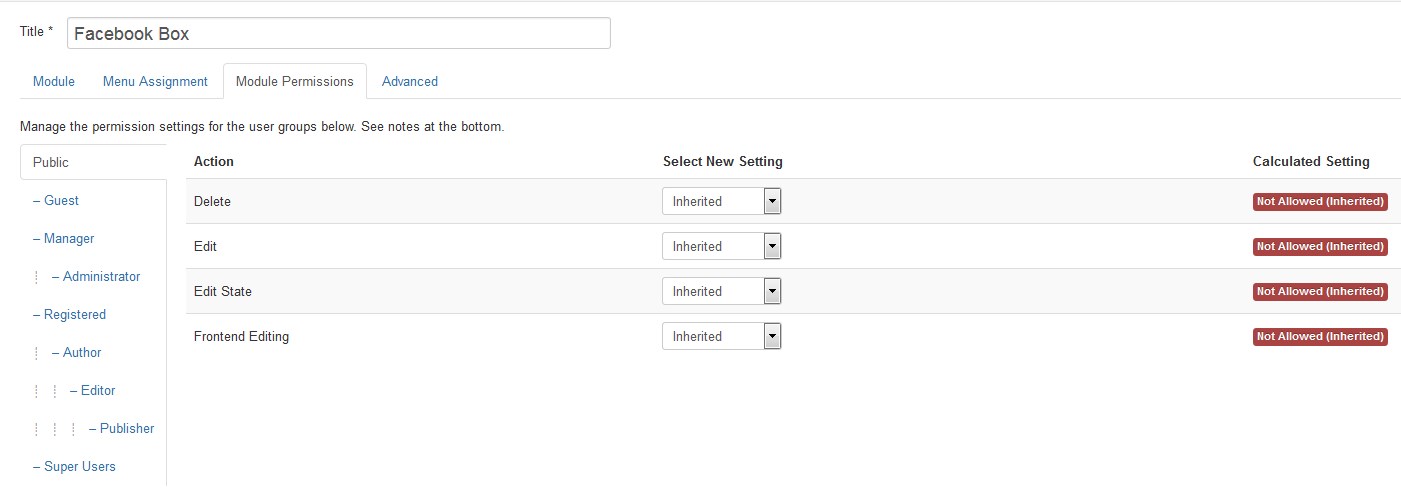
At the Advanced tab you will see the following options:
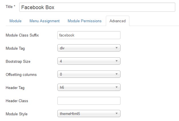
-
Module Class Suffix. A suffix to be applied to the CSS class of the module. It's used for individual module styling.
- Module Tag. The HTML tag for module.
- Bootstrap Size. An option to specify the number of columns the module will use.
- Offsetting columns. Increase the left margin of a column by selected number of columns.
- Header Tag. The HTML tag for module header/title.
- Header Class. The CSS class for module header/title.
- Module Style. Use this option to override the template style for its position.
TM Facebookfeed
TM Facebookfeed is a module that allows displaying your Facebook feeds on the website. It will grab facebook wall post automatically and display feeds of the posts of user's Facebook page or profile. Just put the facebook access token.
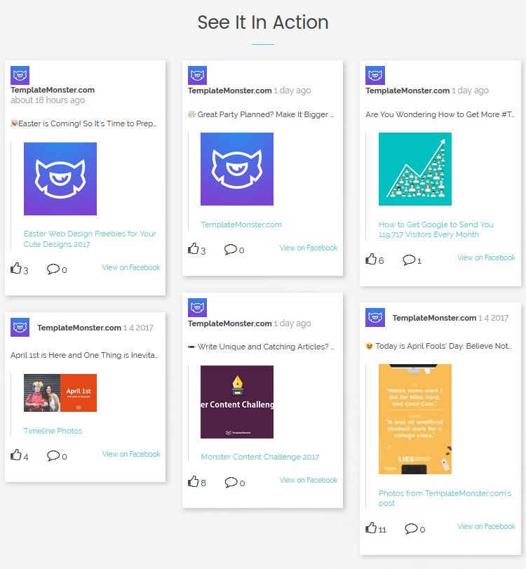
To configure the TM Facebookfeed module navigate to Extensions > Modules.
Press "Search Tool" button and select the TM Facebookfeed in the "- Select Type -" filter dropdown list. You will see the See It In Action Module.
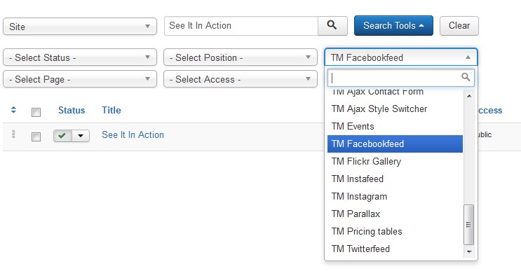
Click on module title link to be brought to the settings window of the module.
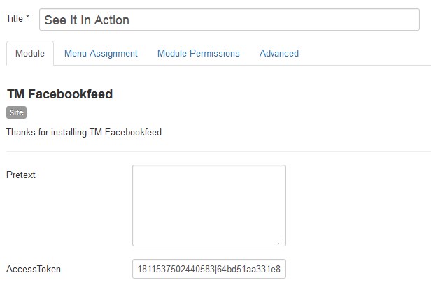
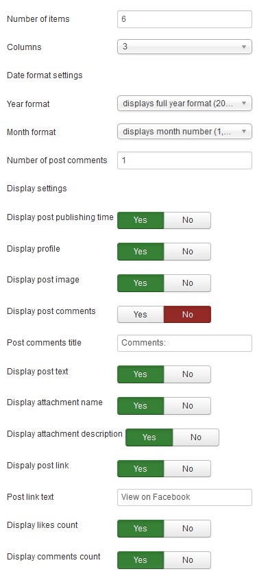
At the Module tab you may set up the following options:
- Pretext — allows displaying custom text before the module content;
- AccessToken* — create an application in your Facebook account, generate the AccessToken and insert here.
Items settings
- Number of items — the number of items to display within this module;
- Columns — set the number of columns;
Date format settings
- Year format — set a year format (display full year format/display 2 last digits of the year);
- Month format — set a month format (displays full month name/displays month number);
- Number of post comments — The number of post comments to display in each item.
Display settings
- Display post publishing time — whether to show the post publishing date;
- Display profile — whether to show the profile;
- Display post image — whether to show the post image;
- Display post comments — whether to show the comments;
- Post comments title — whether to show the comments' title;
- Display post text — whether to show the text of the post;
- Display attachment name — whether to show the attachment name;
- Display attachment description — whether to show the attachment description;
- Display post link — whether to show the post link;
- Post link text — whether to show the link text;
- Display likes count — whether to show the likes count;
- Display comments count — whether to show the comments count.
The field AccessToken is required. In order to get AccessToken, please open the website: https://developers.facebook.com/ and create an app for your website.
You may also set up the following options for the module at the Module tab:
- Show Title. You can show or hide module title on display. Effect will depend on the chrome style in the template.
-
Position. You may select a module position from the list of predefined positions or enter your own module position by typing the name in the field and pressing enter.
- Status. If published, this module will display on your site Frontend or Backend depending on the module.
- Date for publishing [Start Publishing/Finish Publishing] An optional date to Start/Finish Publishing the module.
- Access. The access level group that is allowed to view this item.
- Ordering. Select the ordering.
- Language. Assign a language to this module.
The Menu Assignment & Module Permissions tabs are standard for Joomla modules. You may set up menu items for the module to appear at and define the permissions.
Menu Assignment Tab:
Module Permissions Tab:
At the Advanced tab you will see the following options:
-
Module Suffix. A suffix to be applied to the CSS class of the module. This allows for individual module styling.
- Module Tag. The HTML tag for module.
- Bootstrap Size. An option to specify how many columns the module will use.
- Offsetting columns. Increase the left margin of a column by selected number of columns.
- Header Tag. The HTML tag for module header/title.
- Header Class. The CSS class for module header/title.
- Module Style. Use this option to override the template style for its position.
TM Instagram
TM Instagram is a module that allows you to display Instagram widget.
Here you can see the main TM Instagram settings:
Note that if you are going to work with square photos on your website then turn on the non-square media option. Just edit your client and find “Migrations” section. Don’t forget to click “Update Plugin” so that changes take effect.
Instagram non-square media section:
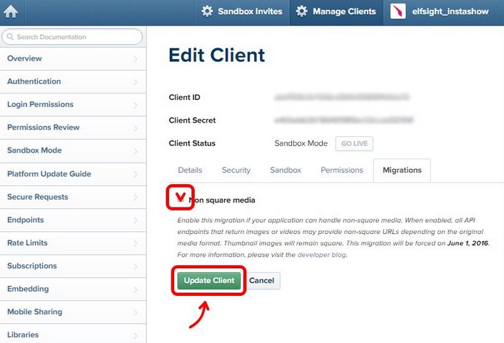
3. Get Instagram Access Token using Client ID and Client Secret
Copy your all-new Instagram Client ID and Client Secret and paste here.
Instagram Access Token page:
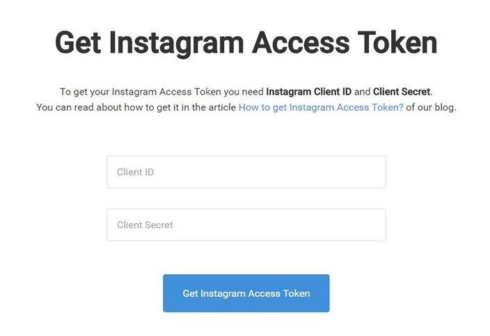
We created this page so that you will be able to get your Instagram Access Token in the fastest way. Note that Instagram will request your authorization as a sandbox user. That’s why click “Authorize” on the next page in order to complete the task.
Sandbox authorization window:
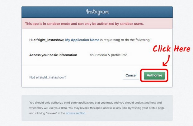
Copy the Generated Access Token
Congratulations! You’ve achieved the task and got your Instagram Access Token. Feel free to use it and display Instagram photos on your website with the help of TM Instagram plugin.
You’ve received your Access Token:
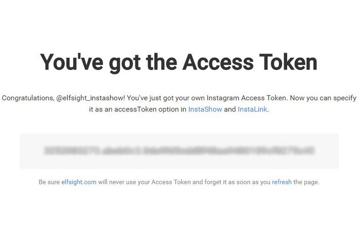
You Don’t Feel Secure?
You might have another question about your newly achieved Instagram plugin and its security: “What if someone gets my Access Token?”. Simply – nothing terrible. Here’s why.
You can’t do anything with Instagram Access Token except for browsing photos. This token doesn’t give any access to your personal data. Moreover, it doesn’t allow making any action from your name.
TM Instafeed
This module displays recent photo you posted on Instagram using your Instagram access_token.
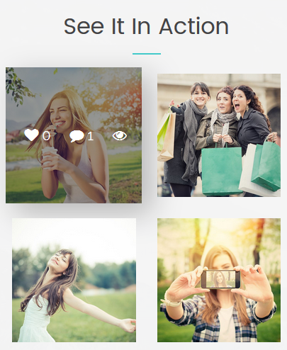
To configure the TM Instafeed module navigate to Extensions > Modules.
Press "Search Tool" button and select the TM Instafeed in the "- Select Type -" filter dropdown list. You will see the See It In Action Module.
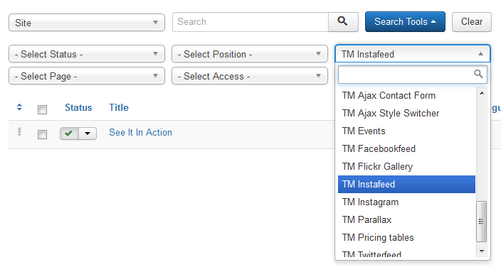
Click on module title link to be brought to the settings window of the module.
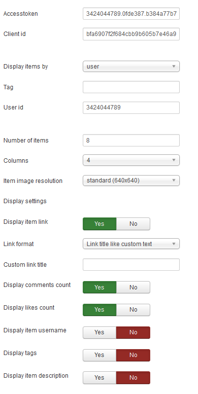
At the Module tab you may set up the following options:
- Accesstoken — create an application in your Instagram account, generate the AccessToken and insert here;
- Client id — create an application in your Instagram account, get the client id and insert here;
- Display items by — choose if you want to display items by the username or tag;
- Tag — set the hashtag the items will be displayed by;
- User id — set the user id the items will be displayed by;
- Number of items — the number of items to display within this module;
- Columns — set the number of columns;
- Item image resolution — set the item image resolution [low/standard/thumbnail].
Display settings
- Display item link — whether to show the photo link;
- Link format — choose the link format [Link title like url/ Link title like custom text];
- Custom link title — specify the custom link title;
- Display comments count — whether to show the comments count;
- Display profile — whether to show the profile;
- Display post image — whether to show the post image;
- Display post comments — whether to show the comments;
- Display likes count — whether to show the comments' title;
- Display item username — whether to show the text of the post;
- Display tags — whether to show the attachment name;
- Display item description — whether to show the attachment description.
You may also set up the following options for the module at the Module tab:
- Show Title. You can show or hide module title on display. Effect will depend on the chrome style in the template.
-
Position. You may select a module position from the list of predefined positions or enter your own module position by typing the name in the field and pressing enter.
- Status. If published, this module will display on your site Frontend or Backend depending on the module.
- Date for publishing [Start Publishing/Finish Publishing] An optional date to Start/Finish Publishing the module.
- Access. The access level group that is allowed to view this item.
- Ordering. Select the ordering.
- Language. Assign a language to this module.
The Menu Assignment & Module Permissions tabs are standard for Joomla modules. You may set up menu items for the module to appear at and define the permissions.
Menu Assignment Tab:
Module Permissions Tab:
At the Advanced tab you will see the following options:
-
Module Suffix. A suffix to be applied to the CSS class of the module. This allows for individual module styling.
- Module Tag. The HTML tag for module.
- Bootstrap Size. An option to specify how many columns the module will use.
- Offsetting columns. Increase the left margin of a column by selected number of columns.
- Header Tag. The HTML tag for module header/title.
- Header Class. The CSS class for module header/title.
- Module Style. Use this option to override the template style for its position.
TM Parallax Module
TM Parallax is a module that uses RD Parallax script for implementing parallax functionality to the template.
The module will now be available from the Module Manager found under the Extensions tab in the top menu of the admin interface. You can create additional modules by clicking on the New button. Select the modules you have already made in order to configure them. Don't forget to publish them in the correct positioning and on the right pages.
In order to configure the TM Parallax module, perform the following steps:
Navigate to the Extensions > Modules tab:
Next, select the TM Parallax module to edit.
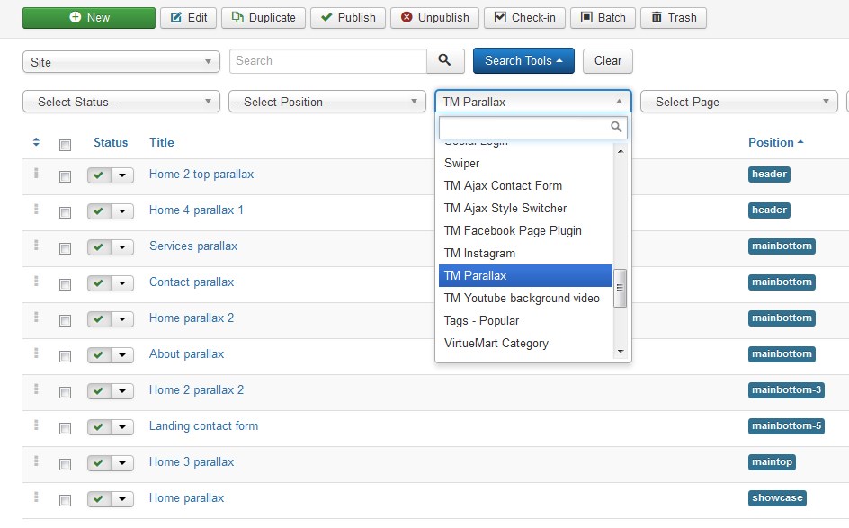
- To open and edit the required module settings, click on its title. [Let's edit the Home parallax module.]
-
The TM Parallax module editing interface is opened in front of you.
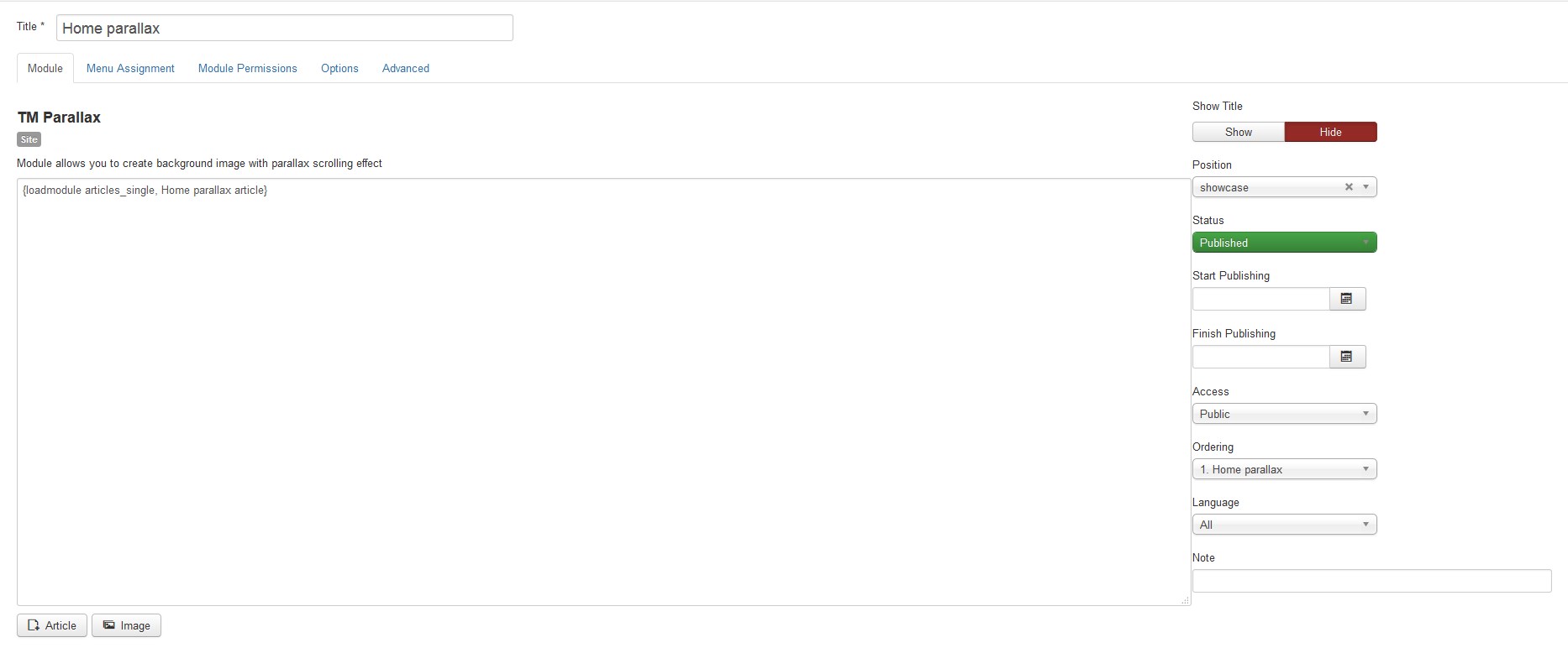
- Press the Article button to open the article selection modal window, as shown below.
- Open the Advanced tab.
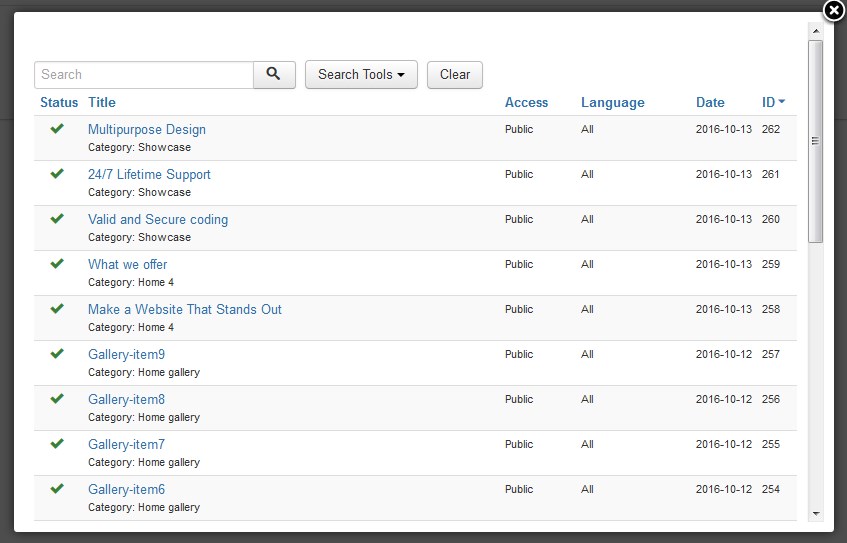
To edit the Home parallax article module, navigate to Extensions > Modules tab. Search for Home parallax article using the search field. To open the Home parallax article module settings, click on its title.
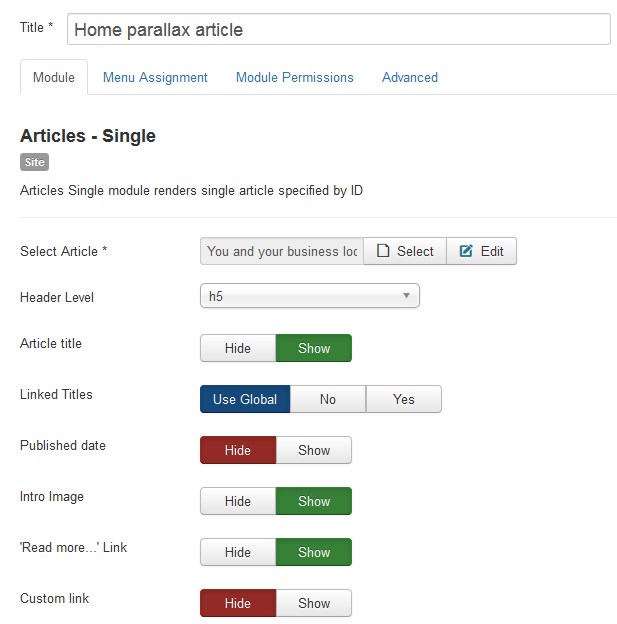
Now you have an opportunity to edit an article. Click the Edit button to see the Edit Article window. Here you have an option to edit the article content with its images and links.
To add a new article go to Content > Articles > Add New Article.
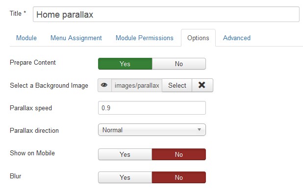
| Prepare Content | - | Optionally prepare the content with Joomla Content Plugins. |
| Select a Background Image | - | If you select an image here, it will automatically be inserted as an inline style for the wrapping div element. Store image files in the images/parallax folder. [To upload images go to the Content > Media section.] |
| Parallax speed | - | Sets the speed ratio for the parallax, relative to the base rate. Value: from 0 to 2. |
| Parallax direction | - | Sets the direction of parallax motion. Normal - parallax scrolling moves in the opposite direction, Inverse - parallel to it. |
| Show on Mobile | - | Turn on / off parallax effect on mobile devices. |
| Blur | - | Turn on / off the effect of blurring the image when its size is too small. |
SW Pinterest Display
SW Pinterest is a module to display "Pinterest Board Widget". This one Module can help you to display Pinterest Profile Pins or Board Pins. Width and Height can be scalable.
Go to Module Manager. You will see a module available on list named “SW Pinterest Display”, click on it for editing. Alternatively, you can click on a “New” Button to create a new Module.
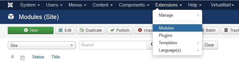
Module Configuration
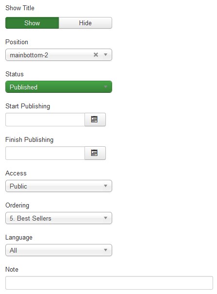
| Title | - | You can enter a suitable title name here. |
| Show Title | - | Yes or No. Show or hide module title on display. Effect will depend on the chrome style in the template. |
| Position | - | Check your template position and select your preferable Module Position. |
| Status | - | Choose to Published. |
| Start/Finish Publishing | - | An optional date to Start/Finish Publishing the module. |
| Access | - | The access level group that is allowed to view this item. | Ordering | - | Select the ordering. | Language | - | Assign a language to this module. | Note | - | An optional note to display in the Module Manager. |
Now you have to configure the module.
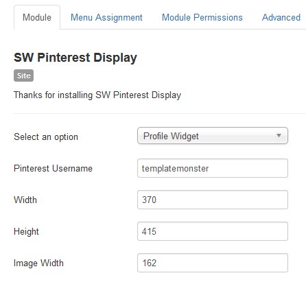
| Select an Option | - | By using this module you can show your pinterest profile images or even show your pinterest board images instead. So select the option you prefer. |
| Pinterest Username | - | Your pinterest username. |
| Width | - | Width of your module in pixels. |
| Height: | - | Height of your module in pixels. |
| Image width | - | Width of your images thumbnails. |
On Advanced Options you can give the module a class suffix if needed.
Next you should choose the page, where to place the module in. Use the Menu Assignment tab for this purpose.
On this tab there is a list of menu items. You can choose between 'On All Pages', 'No Pages', 'Only on the pages selected' and 'On all pages except those selected' from the List. If the latter two options are selected a list will show up with all the menu items on as shown in the screenshot above. This allows you to assign modules to some but not all the pages, and by selecting the menu links that you want the module associated with you can customize on what pages modules appear/don't appear.
To configure the Pinterest Profile Widget module navigate to Extensions > Modules.
Press the "Search Tool" button and select the SW Pinterest Display in the "- Select Type -" filter dropdown list. You will see the Pinterest Profile Widget module. Click on the module title link to be brought to the settings window of the module.

Pricing Tables
The Pricing Tables allows you to showcase the prices for your product, services, or packages in a beautiful and responsive pricing table.
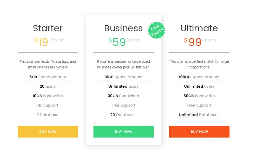
How output the Pricing Tables to the Frontend
Navigate to Component > Pricing Tables.
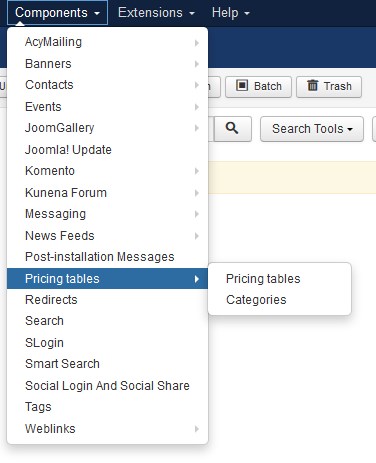
How to create new category
For adding new price table item you have to create category first.
Go to the Categories tab and press the New button.
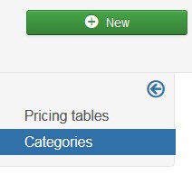
Enter the category title in the Title option field. You can add the category description. Save the category, pressing the Save button.
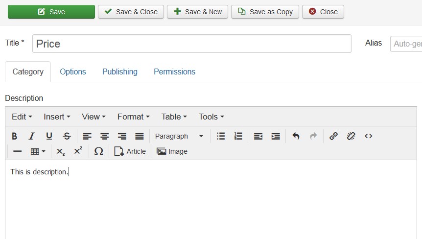
How to create new price table item
After creating category you have to create price table item.
Go to the Pricing Tables tab and press the New button.
Enter the price table item title in the Title option field. You can add the Item pretext. Save the price table item, pressing the Save button.
Event settings:
- Item title — enter the title of the item (the title will be displayed on the frontent);
- Price — set the item price;
- Currency — enter the currency sign;
- Period — set the period (day, month, year, etc);
- Item image — select an image for the item (press select button);
- Event label — enter the item label;
- Item pretext — enter the item pretext;
- List — set the pricing table list;
- Show button — whether to display the "Show" button;
- Button text — specify the text of the button;
- Button link type — select whether you wish to set a link to the menu item or URL;
- Menu * — choose the menu item you want to set a link to.
- Url — specify the URL link.
Select the category for the price table item. Note the Category field is required.
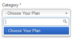
Save the price table item, pressing the Save button.
You can output the Pricing Tables within the module only.
Navigate to the Extensions > Modules. Press the New button.
Select the TM Pricing tables type module to create.
Enter the module title in the Title option field.
Go to the Menu Assignment tab. Select the page to display the module.
Navigate to the Params tab.
Choose the category of pricing tables to display on the
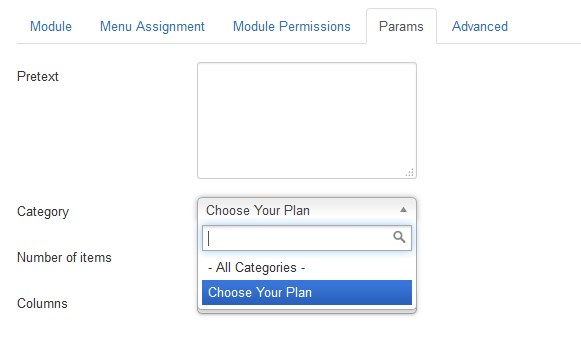
Save the module, pressing the Save button.
SW Twitter Display
SW Twitter Display is a module to display Twitter Widget:
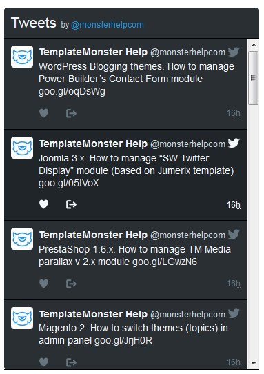
In order to configure the SW Twitter Display module, perform the following steps:
Navigate to the Extensions > Modules tab:
Next you should select the SW Twitter Display module to edit it.
The Twitter Timeline module editing interface is opened in front of you.
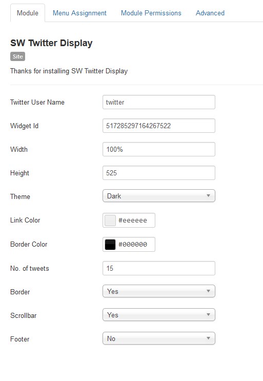
| Twitter User Name | - | Username of your twitter account. |
| Widget id | - | Go to the Twitter settings page to create a widget in your Twitter account. |
Width |
- | Module width in pixels. |
| Height | - | Module height in pixels. |
| Theme | - | Choose between Light or Dark. |
| Link Color | - | Choose from color picker. | Border Color | - | Choose from color picker. | No. of tweets | - | Integer Number. Choose the number of tweets to show up on the site. | Border/Scrollbar/Footer | - | Choose if you want to display the border/scrollbar/footer. |
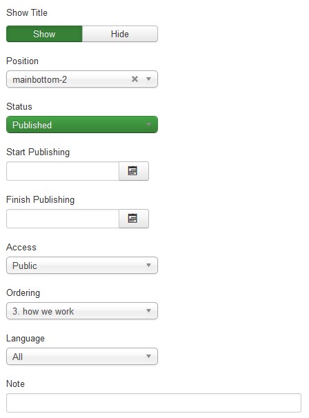
Find your Twitter widget ID
If a Twitter widget you are attempting to enable asks for a Twitter widget ID, you will need to create a new widget at your Twitter widget settings page.
To access the Twitter widget settings, log into the Twitter account that you want to use with your widget. Then click the gear in the top right-hand corner and click the Settings link. From the settings' sidebar, pick the Widgets tab at the very bottom.
On this page, locate the Create new button and press it to create a new widget. From here, you will be offered configuration options and a preview of the widget. You can always change the widget's configuration options later.
After you've created the widget, the Create new button will be replaced by the Save changes button. Now that your widget is created, you can grab the widget ID from the URL. Look at your browser's address bar. It should have a URL that looks something like this:
https://twitter.com/settings/widgets/512253083833733120/edit?focus_textarea=1¬ice=WIDGET_CREATED
Your widget ID is the 18 digits number. In this example it's 512253083833733120. Remember to keep this number private, so your widget will not be used by others without your permission.
Copy your ID and paste it into the text field that asks for your widget ID. After saving your settings, your new Twitter widget should be functional.
Some standard settings are available within the module:
| Title | - | You can enter a suitable title name here. |
| Show Title | - | Yes or No. Show or hide module title on display. Effect will depend on the chrome style in the template. |
| Position | - | Check your template position and select your preferable Module Position. |
| Status | - | Choose to Published. |
| Start/Finish Publishing | - | An optional date to Start/Finish Publishing the module. |
| Access | - | The access level group that is allowed to view this item. | Ordering | - | Select the ordering. | Language | - | Assign a language to this module. | Note | - | An optional note to display in the Module Manager. |
TM Twitterfeed
This module will help you to show feeds from your twitter profile.
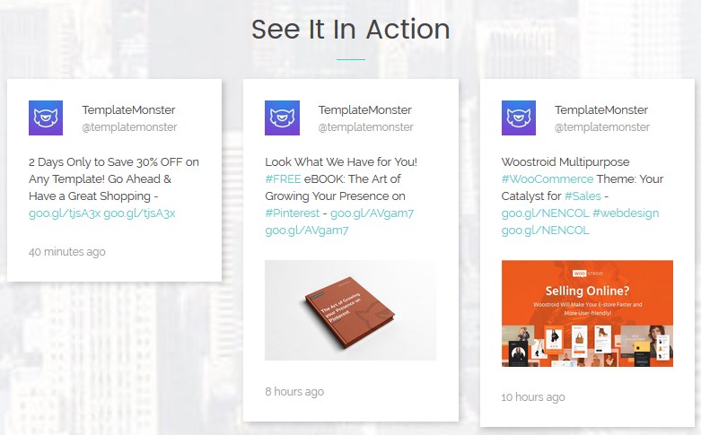
To configure the TM Twitterfeed module navigate to Extensions > Modules.
Press "Search Tool" button and select the TM Twitterfeed in the "- Select Type -" filter dropdown list. You will see the See It In Action Module.
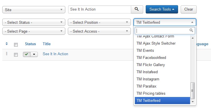
Click on module title link to be brought to the settings window of the module.
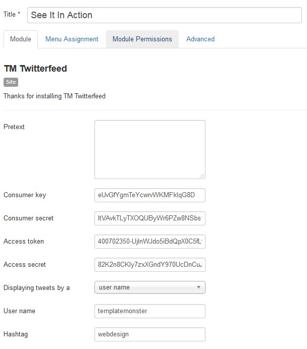
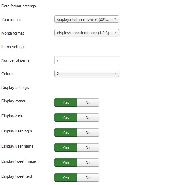
At the Module tab you may set up the following options:
- Pretext — allows displaying custom text before the module content;
- Consumer key — consumer key generated for Twitter application;
- Consumer secret — consumer secret key generated for Twitter application;
- Access token — consumer access token generated for Twitter application;
- Access secret — consumer access secret generated for Twitter application;
- Displaying tweets by a — choose if you want to display feeds by the username or hashtag;
- User name — set the user name the tweets will be displayed by;
- Hashtag — set the hashtag the tweets will be displayed by
Date format settings
- Year format — set a year format (display full year format/display 2 last digits of the year);
- Month format — set a month format (displays full month name/displays month number);
Items settings
- Number of items — the number of items to display within this module;
- Columns — set the number of columns;
Display settings
- Display avatar — whether to show the avatar;
- Display date — whether to show date;
- Display user login — whether to show the user login;
- Display user name — whether to show the user name;
- Display tweet image — whether to show the image or the tweet;
- Display tweet text — whether to show the text of the tweet.
You have to create a twitter app for your website.
Go here — https://dev.twitter.com/apps — then click on “Create a new application” button on top right.
A form will open – Give a Name of your application, description and website url you have installed our module – accept the agreement and then click on “Create your Twitter application” – button at bottom.
Then you will get your Consumer Key and Consumer Secret – for access token and access token secret click on the button “Create my access token” – from bottom.
You may also set up the following options for the module at the Module tab:
- Show Title. You can show or hide module title on display. Effect will depend on the chrome style in the template.
-
Position. You may select a module position from the list of pre-defined positions or enter your own module position by typing the name in the field and pressing enter.
- Status. If published, this module will display on your site Frontend or Backend depending on the module.
- Date for publishing [Start Publishing/Finish Publishing] An optional date to Start/Finish Publishing the module.
- Access. The access level group that is allowed to view this item.
- Ordering. Select the ordering.
- Language. Assign a language to this module.
The Menu Assignment & Module Permissions tabs are standard for Joomla modules. You may set up menu items for the module to appear at and define the permissions.
Menu Assignment Tab:
Module Permissions Tab:
At the Advanced tab you will see the following options:
-
Module Suffix. A suffix to be applied to the CSS class of the module. This allows for individual module styling.
- Module Tag. The HTML tag for module.
- Bootstrap Size. An option to specify how many columns the module will use.
- Offsetting columns. Increase the left margin of a column by selected number of columns.
- Header Tag. The HTML tag for module header/title.
- Header Class. The CSS class for module header/title.
- Module Style. Use this option to override the template style for its position.
TM YouTube background video module
TM YouTube background video is a module for adding a youtube background video to your website.

In order to configure the TM YouTube background video module, perform the following steps:
Navigate to the Extensions > Modules tab:
-
Next you should select the TM YouTube background video module to edit.
- To open and edit the required module settings, click on its title. [Let's edit Home youtube module.]
-
The Home youtube module editing interface is opened in front of you.
- Press the Article button to open the article selection modal window, as shown below.
-
Here you can find the Options tab, where you will be able to change:
-
Prepare Content - optionally prepare the content with the Joomla Content Plugins.
-
Enter a YouTube video url * - allows specifying custom URL for the YouTube video that has to be visible on the page.
-
Start video - the video starts from the specified seconds.
-
Mute - change video to silent or loud mode.
- Autoplay - the video starts automatically, once the webpage is loaded.
- Show play/pause button - you can either show or hide the buttons.
- Play/Pause button text - specify the buttons' text.
-
Mobile Image - this image shows up on mobile devices instead of a video. [To upload images go to the Content > Media section.]
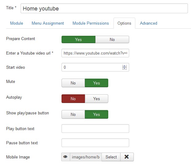
-
-
In order to change the video, simply replace video URL with the previously copied youtube video link.
-
Scroll the page up and click the green Save button at the top left of the screen to apply changes:
-
Go back to your website and refresh the page that you changed. Now we can see that the edits were applied successfully.
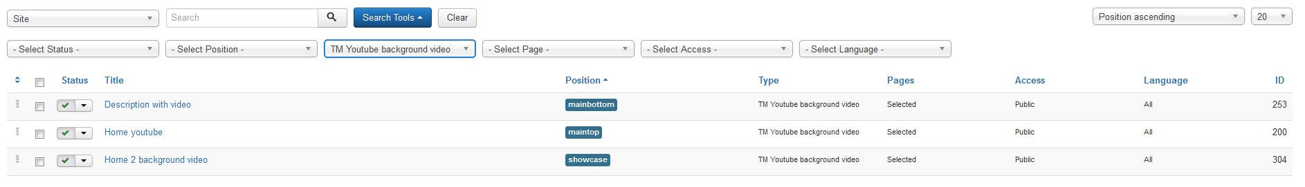
You can click the "New" Button to create a new Module.
To add a new article go to Content > Articles > Add New Article.
In our templates TM Youtube background video content is presented by loading certain module or position, for example, "{loadmodule articles_single, About us}". In order to prevent Error 404 on your website, please, make sure that the name of the loaded module is identical to the one, specified for loading. In this case, the "About us" module should be published. The module name should not contain more than one space. You can learn more about loadmodule/loadposition at the official website.